Chicuelo Theme
-
@movisman
Thank you! The list of pending systems is bigger every day! So Im trying to make the most common and then adding the rest -
@chicuelo said in Chicuelo Theme:
I search not only in google (big images and if possible in png), also on deviant art but there is a lot of garbage there too
Also I have to clean the images that have a background, if I considere the image is great I take the time to clean the rest and use it.Ok, so you don't have a magic method, you're just more patient than I am :D
Thanks :)@chicuelo said in Chicuelo Theme:
@movisman
Thank you! The list of pending systems is bigger every day! So Im trying to make the most common and then adding the restI saw that you have added a LOT of systems lately. Do you have a todo list ? I feels like it's not missing much, you're on your way to be more complete than ComicBook, which was the most complete theme before :D
Well, maybe not more complete, there are a LOT of unknown things in ComicBook... :D did you know the Channel F ? :D I'm not sure it's necessary to include all the weirdness out there...
-
Yes, patience and a bit of taste to select the best images
This is my pending list, I don't know if there is any other system that matters to be included, what do you think?
Atari ST
Daphne
Game and watch
Colecovision
Intellivision
Kodi
Neo geo Pocket
Neo geo pocket color
Vectrex
Wonder swan
Zxspectrum
MSX
MSX2
Nintendo DS
Sega SG1000
VideoPac (Odyseey2)Update:
Atari ST and Daphne added -
-
@ectoone
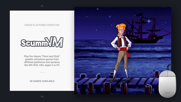
I have scummvm, maybe its the same or its another emulator?
-
@chicuelo said in Chicuelo Theme:
@red2blue
Sorry for not including that! I tried yo use just the basic infoI agree - personally I like the clean / minimal look of the theme, it's one of my favourite elements. I think 'less is more' works well. This is just my personal view, as I avoid themes which show too much metadata, plus often it's incomplete.
-
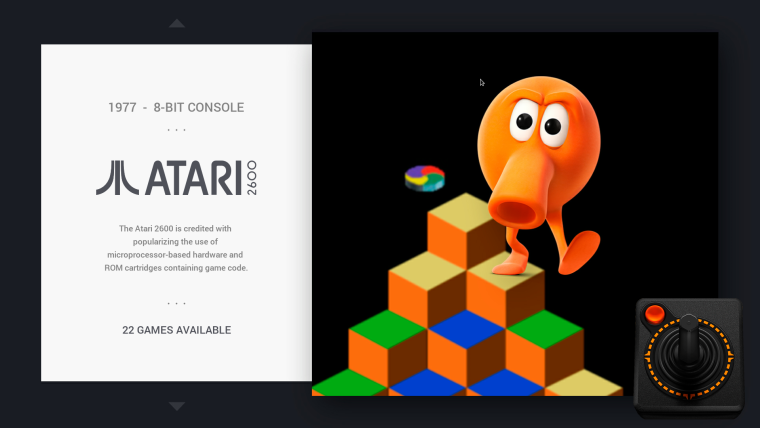
Are you happy if I go through each current supported theme.xml and put in the 'year released' and check the console 'bits' and correct if needed? So for example:
Atari 2600
1977 // 8-BIT CONSOLESomething like this maybe? The double slashes might look quite nice. I am happy to do this for all systems?
Cheers
-
@movisman said in Chicuelo Theme:
Are you happy if I go through each current supported theme.xml and put in the 'year released' and check the console 'bits' and correct if needed?
Of course I do! We could try double slashes or a simple " - ". As you prefer
-
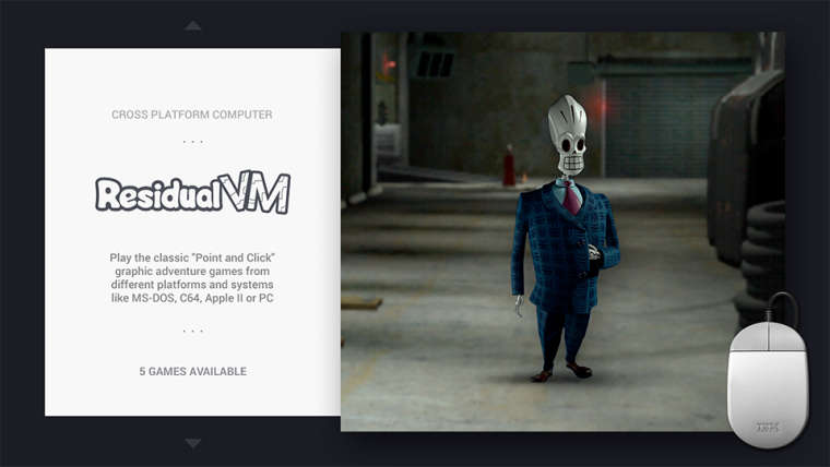
@chicuelo ResidualVM is some kind of fork of ScummVM, it only runs 3 games that ScummVM can't run. Otherwise it's basically the same, I even wouldn't care if you used the same images and text for that system and only make a new logo (I really wish there was an easy way to merge systems, just to avoid those problems).
If I could suggest a game to use as image tho, I would go with Grim Fandango. -
@chicuelo said in Chicuelo Theme:
Yes, patience and a bit of taste to select the best images
This is my pending list, I don't know if there is any other system that matters to be included, what do you think?
Atari ST
Daphne
Game and watch
Colecovision
Intellivision
Kodi
Neo geo Pocket
Neo geo pocket color
Vectrex
Wonder swan
Zxspectrum
MSX
MSX2
Nintendo DS
Sega SG1000
VideoPac (Odyseey2)Update:
Atari ST and Daphne addedI think the most popular systems are probably Kodi (very common), ZX Spectrum (very popular in the UK), MSX/2 (very popular in Japan), and Nintendo DS (well... :D).
Then Colecovision, Intellivision (both have good arcade conversions), Vectrex (many people are interested in discovering it).
Then the rest :)@ectoone said in Chicuelo Theme:
@chicuelo ResidualVM is one system I have. that is not on your list.
@cosmo0 I assume the art for the action genre is based on Resident Evil? If so, I would suggest trying to find an image of the First Aid Spray instead of a standard Kit.
Unfortunately the RE healing items (plant, powder, spray...) are not very readable or pretty at this size... :/
@movisman said in Chicuelo Theme:
I agree - personally I like the clean / minimal look of the theme, it's one of my favourite elements. I think 'less is more' works well. This is just my personal view, as I avoid themes which show too much metadata, plus often it's incomplete.
I also agree. I think the clean look is a large part of the theme appeal. I find that the other informations are not very useful, and the ratings have always seemed random to me. I largely prefer having a video, it's much more telling of the game.
-
Great, no worries! I will get these done and raise a PR for it.
I can try double slashes on a few and see how it looks - just thought it would be something different and a nice separator between year and machine spec.
If you are not keen we can simply use a " - ". I'll do a few and post it here, you can see how it looks yourself before I do the rest.
Thanks!
-

or

?
Whichever separator you prefer, I definitely think it's cool to have the year in there. I can also reword any descriptions which contain the year already - as to not duplicate information on screen.
FYI, the above has two spaces either side of the separator, as I think that looks better.
Let me know and i'll start applying to all other themes. I have created a separate text file with the release information ready to go.
Cheers!
-
@movisman
I do prefer the "-", because its more discreet and take less space on the upper area so the logo could have more presence.
Thanks! -
@ectoone said in Chicuelo Theme:
@chicuelo ResidualVM is some kind of fork of ScummVM, it only runs 3 games that ScummVM can't run. Otherwise it's basically the same, I even wouldn't care if you used the same images and text for that system and only make a new logo (I really wish there was an easy way to merge systems, just to avoid those problems).
If I could suggest a game to use as image tho, I would go with Grim Fandango.I can duplicate the theme so you have the same art, and work on a fandango version. This is very exclusive :D
Which name do the system have? "residualvm"? -
Great, i'm glad you said that because I was actually in favour of the " - " having looked at it properly on screen. I will apply this to all XML files with the correct release year :)
Thanks!
-
@ectoone
If you update you will find a custom Residualvm theme
-
@chicuelo said in Chicuelo Theme:
@ectoone
If you update you will find a custom Residualvm themeAwesome, I really like the image.
@cosmo0 said in Chicuelo Theme:
Unfortunately the RE healing items (plant, powder, spray...) are not very readable or pretty at this size... :/
Oh, i wasn't paying attention to the resolutions when i did a quick google image search, it was just a suggestion anyways. :)
@movisman said in Chicuelo Theme:
Great, i'm glad you said that because I was actually in favour of the " - " having looked at it properly on screen. I will apply this to all XML files with the correct release year :)
Thanks!
How about using the pipe symbol
|or the middot·? When I was doing webdesign some years ago, I used those as alternatives to separate things. In fact i used the middot when i first recreated this theme instead of having the 3 dots above and below the logo directly on the background image. -
Hi there,
I did try the pipe image but the font used made it look ever so slightly more like a 1 or something. I didn't think about the middot though, I could potentially try that.
For now, I actually just raised a PR using " - " before I saw this post.
@chicuelo - what are your thoughts on using a " · " instead of the " - " to separate? If you prefer this, I can make those adjustments and raise a further PR.
Thanks
-
-
@movisman
Yes, at first I was going to suggest using a middle dot because the separators, its a great choice!
Contributions to the project are always appreciated, so if you would like to support us with a donation you can do so here.
Hosting provided by Mythic-Beasts. See the Hosting Information page for more information.
