Pixel Theme
-
@hiulit That one is great too
-
@sergioad Haha, 3rd one doesn't have any coloring... it was just the outline for the next attempt at a logo.
-
@rookervik I meant the one that looks from the 80's, like OutRun :)
-

Can change folder colors. Not sure what to do for "All". Other than maybe an infinity symbol, or some sort of dual box with the boxes having a check mark in them.
-
@rookervik Maybe a folder with a list view symbol to contrast with Carbon's icon virw controller?
-
Thought maybe a more stylized folder would look nicer.

-
@rookervik
Personally I prefer the original folder design though both do look good.
Have you come up with an 'All Games' icon yet? I also found that the most difficult to think of an icon for. -
@ruckage Working with this so far. Fiddling with colors and stuff.

-
@rookervik
That symbol works perfectly.Just a quick note on your 'Last Played' icon. Shouldn't the arrow be going anti-clockwise? Otherwise you're implying the future where as you want to imply the past.
-
@ruckage YOU AND YOUR LOGIC!!! SHUSH YOUR MOUTH! XD
-
@rookervik said in Pixel Theme:
@ruckage Working with this so far. Fiddling with colors and stuff.

it reminded arduino symbol, but I loved it anyway!

-
@meleu Ugh, that's strikingly similar. I might have to try something else.
-
@rookervik
It is very similar but I wouldn't worry too much. It's used in a different context and only people who use Arduino are likely to notice. I knew the Arduino logo but I still didn't notice the similarity before @meleu posted the comparison, I just thought what a clever idea it was to use the infinity symbol to represent a controller. -
@rookervik said in Pixel Theme:
ave to try something else.
how about a raspberry pi, or an SD card/USB drive? i was making a pixel version of the pi but gave up because i'm a lousy artist:

you're welcome to it
-
By far the best theme in my opinion. I was just wondering if there might be video support coming this year? I understand all the time and sweat you have put into this and we are extremely appreciative.
I noticed some how someone did it, but I don't thinks it's your version:
Thanks
-
@Rookervik did you saw what I has to say to you un the luminous theme's tread?
-
@sergioad I did, I haven't had time to run over and check it. I work late today so I will try to check it before I go in.
-

Not so sure about the tab colors. But that's what I have so far.
-
@g0nz0uk The video support, when I was adding it, was buggy and didn't have layers support. The pixel2 theme supports videos now. I just haven't fixed the errors on the carousel. Some logos appear FAR larger than they are supposed to and I'm not sure how to fix them right now.
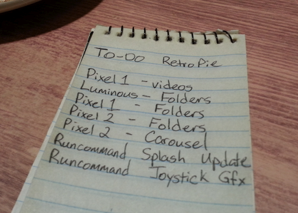
I am getting help with Luminous right now to get folder support in. I just don't have the time anymore. I'll see what I can do about Pixel1. I was supposed to re-draw all of the pixel systems but that's not going to happen with work. I am almost done with the folder artwork though. I just need to finalize colors and create logo art.
I will make me a TO-DO list and add all of this to it. I've been away far too long. :D
-
Is there any chance you could add 5:4 support for Pixel Metadata or under detail? The "Choose" part is blocked out on a 5:4 monitor.
Contributions to the project are always appreciated, so if you would like to support us with a donation you can do so here.
Hosting provided by Mythic-Beasts. See the Hosting Information page for more information.