Pixel Theme
-
@rookervik Ready for it, just waiting until it is finished :)
-
@sergioad said in Pixel Theme:
@rookervik Ready for it, just waiting until it is finished :)
Can't wait either!
-
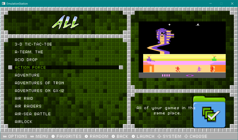
@rookervik On the Pixel-Metadata theme, while viewing the recent, all and last played categories, there're folder icons and some text behind the game's information in the lower right. This makes it hard to read and should probably be removed.
-
@quackwalks Ok, that sounds like I didn't copy the correct themes' xml files when creating the collections. Thanks for this. I will try to fix that after I have something to eat.
Update: I have made the changes. You can try to update the theme and see if that fixes it. I didn't test it. I don't have any metadata right now. I'm a mess. LOL.
-
Thank you very much friend, just onet thing that I noticed is that a remanent of the ES carrousel is visible on the basic gamelist mode
-
@rookervik That fixed it. Thanks a bunch!
-
@sergioad OH YEAH! I forgot those 2 images were linked. This is where it gets complicated for me. The background images in Pixel all have color codes. So I can't easily use a search and replace to fix all of the backgrounds in one pass. I am going to have to modify each system one-by-one. Haha. So I think I am going to fix up the xmls while I'm at it.
Give me a little time. I'll get those BASIC views fixed. I might even change the basic view to a detailed view but put the system graphic in the box art slot. I think that would look a lot nicer than the normal wide empty space.
-
6 out of 97 systems updated with new formatting. Long, long, way to go.
PS, this does not mean any visual changes, (other than fixing the background in BASIC view) only code is different making later changes much easier.
-
How about a selector graphic to make it easier to see which game you have selected? Not sure on the design. Have to be careful not to make CrazySpence or Muriani mad. LOL

-
Might like this better:

Also easier to code the color... you know... unless the background is black. Then the selected text will be black #(-_-) -
@rookervik I like it, and about the detailed view I also like it, by the way; right now the favorites section in detailed view displays the description of the Gameboy, also ports has not description
-
@sergioad Thanks, I'll get to these. Takes forever to edit each system theme. Hopefully I won't have to do this again once the edits are made.
-
@rookervik I'm impressed by how well you got the game titles to line up with the background blocks.
-
@mattrixk Haha, you noticed that huh? Maths. They are hard but useful :D
-
OMG, what if I draw anime girls interacting with each console. o_o yessssss
-
@rookervik I mean, Erza Scarlet would be the perfect choice. So much variety with all of those different requips to go with that flowing red hair... :D
-
52/95 system themes updated.
/me limps back to dungeon...
-
@rookervik thanks friend, did you allready updated Luminous with my changes? It is all allready done
-
@sergioad Probably not. I'll check it in a minute.
-
PIXEL 1.4
Ok, I think Pixel is updated and ready to go. Give it a whirl (update theme from setup script) and lemme know of errors.
Changes over the last 2 weeks:
- Moved carousel down and added graphic outline. Moved game count below that.
- Moved Pixel consoles up, slightly, and shrunk them to be fully visible above the carousel.
- Added a gamelist selection graphic to increase readability.
- Added support for videos.
- Added collections.
- Repositioned flair text and icons to stay separate from each other.
- Positioned gamelist text to match background.
- Changed the background color and selected text color of some systems to increase visibility.
- Simplified the XMLs greatly to make changes easier in the future.
Contributions to the project are always appreciated, so if you would like to support us with a donation you can do so here.
Hosting provided by Mythic-Beasts. See the Hosting Information page for more information.