Chicuelo Theme
-
@movisman
Great man! can you update to the latest version and then apply the changes? I just have updated some files, or if you do prefer, send me the texto to paste in the xml and I place where you told me.
Thanks! -
@stephensmattlee
If you update now you will find some changes
-
Wish the Theme Helper software was on the mac as I'd have a go at creating a theme – obviously not as nice as this one ;) – but I'm sure I'd have fun doing it.
(If anyone doesn't mind me asking does anyone here produce themes on a Apple Mac and with what?)
-
@chicuelo said in Chicuelo Theme:
@stephensmattlee
If you update now you will find some changes
Just did what you suggested and removed the theme and then reinstalled directly through RetroPie. Everything is now running perfectly! All issues I had with the dots on the left side are no longer there plus I noticed your updated FDS image. Looks absolutely amazing!
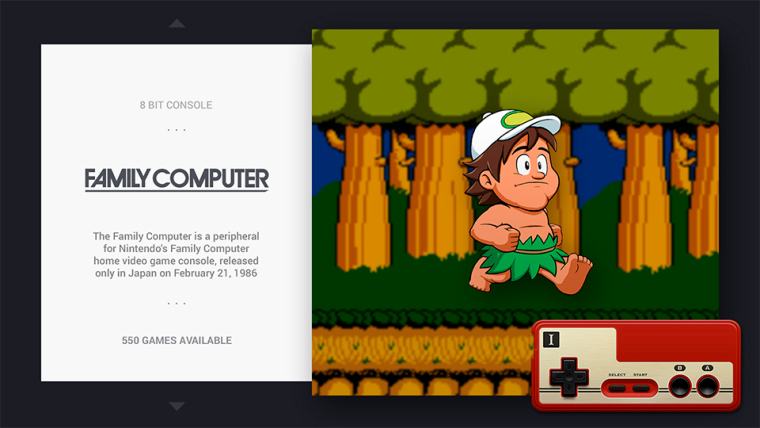
Only one minor change I might cheekily suggest but it’s up to you, shouldn’t it be called ‘disk system’ as a pose to Family Compurer?
Maybe using this logo?..
Only reason I ask is I believe the Disk System was the addon for the Family Computer (Famicom), much like the sega cd and 32x to the megadrive/Genesis.
Like I said though I’m very happy as it is and certainly wouldn’t complain either way.Thanks again chicuelo :D
-
No worries at all, and thank you for being open about letting me contribute something!
I have made a fork of the very latest theme just now, implemented my changes, and submitted a pull request here:
https://github.com/chicueloarcade/es-theme-Chicuelo/pull/2If you can verify all is ok and merge into your master that would be great! I can then update and test it out.
Thanks!
-
@nevsan
Hi there! I use a mac and I try my themes right on the Pi, very tedious but there is no other choice except installing boot camp and run a windows version with retropie -
@movisman
Its running now! -
@stephensmattlee
I was wondering about using that logo, but sincerely I think the family computer looks nicer and its more simple. I also remember playing with this console on my childhood and It was called simply Family, so I decided to use that one instead the other. Hope you don't mind! If you have ftp access you can replace the svg logo and use the one you prefer! -
@chicuelo that’s okay, I’m happy with it as is and don’t mind at all :) thanks for all the hard work
-
I have a Game Boy Zero, would this be any good on a 3.5" screen 320x240?
-
Great! When I get home i'll update the theme and make sure my changes work as specified.
Cheers!
-
@edwardthehuman said in Chicuelo Theme:
have a Game Boy Zero, would this be any good on a 3.5" screen 320x240?
Not sure about that, you could try and give us the feedback!
-
As I don't have Illustrator at this time, when you have any free time would you make up a white transparent SVG from one of the below for basic Gamecube support?
https://commons.wikimedia.org/wiki/File:Nintendo_Gamecube-Logo.svg
http://nintendo.wikia.com/wiki/File:Nintendo_Gamecube.svg
https://worldvectorlogo.com/logo/nintendo-gamecube-4I think it also needs the theme directory adding in as it doesn't seem to be supported at all yet - but I assume one of the others could be copied and then an appropriate name/description inserted within the XML. I can do this if you would like.
Also, the Atari logo I mentioned before, the correct 2600 logo (which matches the 5200 and 7800 you already have in place) is here if you were able to update it for consistency:
https://en.wikipedia.org/wiki/File:Atari_2600_logo.svgNo worries if not. At some point I will try and get something sorted to edit SVG files, then I may be able to help with a few missing logos.
Cheers
-
@movisman
Great! I will take a look soon! -
No worries, thank you so much!
Tell you what, i'll create a theme.xml for GC with a description which won't take me long ,and then raise another PR for it if you like.
Cheers
-
-
@keigan really digging your custom loading screens, go hand in hand so well with chicuelos theme :)
I don't suppose you could add the FDS, SegaCD and 32X to your collection? Unfortunately I don't have photoshop nor am I very good at photo/picture editing.
Thanks
-
@movisman Great stuff you did with the video mode :)
I just quickly edited the theme so it wasn't "broken" anymore (the video was displaying on top of the image), I wasn't aware you could display the image before the video. That's just plain awesome :) -
Hey there! Thanks a lot, appreciate it!
I cannot take credit for coming up with the idea of moving md_image out of video though - I got some of that information from the thread for the also excellent Pixel theme, although for some reason it's not been implemented into the main theme yet.But it works well, plus the re-position and size changes I made for those elements seems to look good too. It's only small stuff but just polishes the theme up a bit more.
I have a few more positional tweaks in mind for the system logo and description in gamelist view, just to tighten things up a tiny bit further. But I need to look into that.
I'd like to get my hands on Illustrator and try to finish off the rest of the system logos! Although it has been many years since i've used it so not sure i'd be able to create anything as good.
Cheers
-
@movisman no need for Illustrator, Inkscape is enough.
You can find vectorized logos of most systems (just search "[system] logo svg") and you just have to put everything in white before saving it in svg.
If you have to re-make the logo, then yes, you will want Illustrator, as Inkscape is a bit cumbersome to use.
Contributions to the project are always appreciated, so if you would like to support us with a donation you can do so here.
Hosting provided by Mythic-Beasts. See the Hosting Information page for more information.