Chicuelo Theme
-
Great work! I see no difference at all!
I think the amiga keyboard looks big, it may be because the upper structure. Im going to work on finding a perfect one.
Do you need me to scale all the controllers? -
We can maintain the blister and change the orange color to a green one, what do you think?
-
@chicuelo said in Chicuelo Theme:
We can maintain the blister and change the orange color to a green one, what do you think?
Do you mean you would still want character + items ? Or multiple versions of the character in the same blister ?
-
Yes, the Amiga had all it's internals in that part so that is a picture of the whole system. There was no official joystick that I know of, so a picture of the whole system is best. Other models (A4000 etc) had a separate casing but these were not the classic (popular) ones most people owned at home.
Regarding the controllers, how do you want to do this? Do you want me to explain how i've done it so you can recreate it to your taste, or are you happy to use the PNG's i've put together and adapt as you like? As I say, a couple I scaled up (like DC as the source was too small), so this might be preferable.
Basically each image is a 480 x 480 transparent PNG, with the controllers justified to the bottom right with the same amount of padding to the edge. If you download the below PNG files and open in Illustrator, you'll see what I mean if it's unclear. As long as the overall image size stays at 480x480, you can resize the object inside however you want.
When I did them to demonstate above, horizontal images were scaled to around the maximum width, vertical ones were scaled to around the maximum height (or a bit less depending how wide they were), and more square controllers/systems are somewhere inbetween. Exact square ones like Atari 2600 a bit smaller still.
Here are some examples:
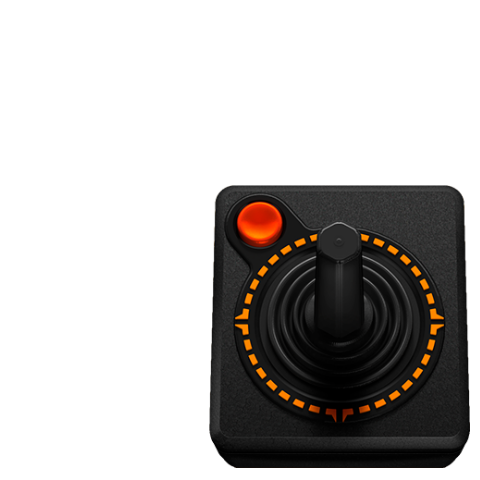
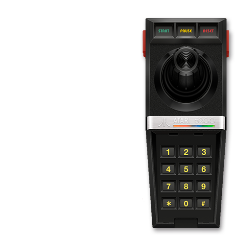
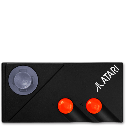
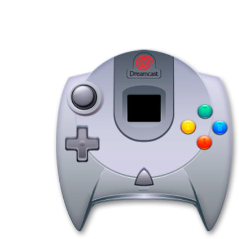
Do you want me to send you the files I made so you can work on them to your preference? Or do you want to go through all of them and recreate yourself with the original source images? (or I can do it). It's up to you what you prefer, let me know.
I also have an SVG of all the controllers as separate layers, maybe you would prefer this. Whatever works for you for the best outcome.
Regarding the theme.xml, the change i made on my copy is very simple, but needs to be applied the same time as the images being uploaded.
You just need to place the following underneath the <pos> tag in the image name="controller" bit:
<size>0.25 0</size>Again, I can do this and raise a PR but if you want to mess about with the images it might be worth you putting this into your copy.
Thanks
-
If I understand well, this will be a different type of collection? or just a variant?
If is another kind of custom collection, we could use another color of blister and only a character in it suit.If it is an alternative image or a variant I wouldn't do it because you did a great job on those.
You tell me! -
@chicuelo
It would be different collections ; instead of "genre" (action, platform...) it would be "game series" (Mario, Sonic...).
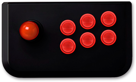
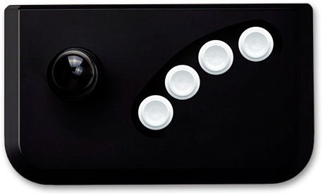
By the way, looking at @movisman video, it striked me that the arcade controller looks out of place compared to the other ones. It's very simplistic, while the others are a bit more realistic.
Maybe you could use something more like one of these ?
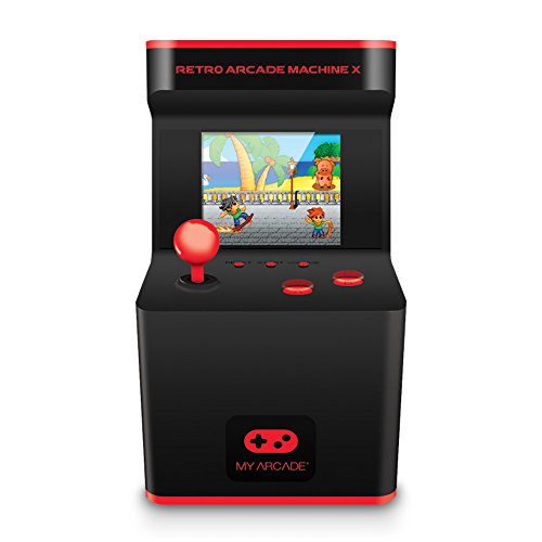
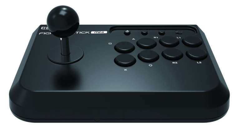
-
@movisman
Great, we can proceed like this: I adjust all the controllers to a 480x480 px area, and then I update the repo and the xml.
Is it possible to set a 45 px margin from the bottom and the right to the image? something like the image below. That would make the controller cover more area of the character in case its small: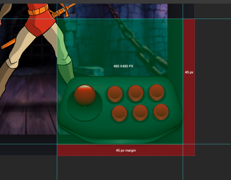
When I rasterize the layer, the shadow will take some pixels extra so I have to decide between removing the shadow or reducing the controller size a bit
-
@cosmo0
Yes, I notice that, but I left that adjustment for a final instance so I could progress on creating all the remaining systems.
I will have to create a controller from scratch because there are no good front images of an arcade controller -
@chicuelo Ok cool :)
-
Hi there,
That all sounds good to me! Once you have updated the repo i'll check it over.
Don't forget, we don't have to do 480, we can do smaller or another size, but we would just need to adjust the XML accordingly for optimal results. Eg. 384x384 would be 0.20 (20%) horizontal in the XML to avoid any scaling at all on 1080p (384 is 20% of 1920). I just picked 480 as it was quarter of the screen for 1080p and that seemed like a good maximum.
It all depends how big you want the controllers. You can always create the box larger and reduce by scaling with the XML, as scaling down to fit obviously doesn't have as much negative effect as scaling up. Difficult to explain without visual.
Regarding the margins, at the moment the controller is set to 0.98 0.98 on the XML for position, and origin 1 1 (drawn from bottom right), which means it is displaying 2% in from the bottom right of the users resolution. That 2% translates to 38.4 and 21.6 px for a 1080p resolution, so this is what the margins probably are at the moment on 1080p. If you want this to be closer to 45px, we can simply change the <pos> tag to be something like 97.65 97.65 which would give you about 45px horizontal and 25px vertical. We can play with the positioning to increase or decrease the margin to the edge of the screen with no problem at all.
Cheers
-
@movisman
Great I understand! let me work on every controller and I will update the repo soon! -
Awesome, look forward to trying it out!
I can also test in 720p to make sure everything still scales as intended.
Cheers!
-
@movisman
I have a doubt now, most of controllers are bigger than the max size we pretend to use, so why we don't use those and scale them down right from the xml?
We can improve only the ones which are smaller. What do you think? -
Hey,
Actually i'm a bit confused exactly what you mean - are you saying you prefer to use a larger canvas (for example 576x576 or 768x768 or something) to make use of the larger images, correct/improve the smaller ones to be the same as the larger ones, and then scale the whole canvas back down in the XML?
If so, you can do this for sure, however I think the only major benefit of this is if the user is viewing ES in higher than 1080p, as the images would need to scale less and would for sure look sharper. However aren't the other objects (characters etc) optimised for a maximum of 1920x1080 already? If so, these would need to scale up anyway if the resolution was higher, right? By using 480x480 and 0.25 in the XML, it causes no scaling upwards or downwards in 1080p (as 480 is 25% of 1920), and only in smaller resolutions will the image scale (downwards which is ok). You would need a larger canvas if you wanted the max size to be more than 25% of the horizontal resolution though.
In resolutions above 1080p, there is certainly a benefit to using a larger canvas size. However, I don't know if it makes too much difference to go larger, and then scale down in the XML. Also there is file size to consider I guess (not sure how much of a difference this makes on Pi).
What size were you thinking of by the way?
To be honest, either is fine - for sure you can for sure make them larger to start with, and the XML will scale it back down to 25% width if you think that would look sharper, rather than displaying 1:1 to begin with.
I guess it depends if a) you might want to make the controllers bigger than 25% in the future - if so you can adjust the XML a bit without having to scale 'up' (the image will have more headroom if it's bigger to begin with) or b) if you want people running resolutions above 1080p to have sharper looking controllers. And c) depends whether you feel larger image scaled downwards is better than a smaller image displayed in 1:1 at 1080p (if using 25%).
Thinking as i'm writing this, if it doesn't make huge difference to file size and isn't much more effort, you might as well make them a bit larger and we can scale down in the XML - as long as the scaling down in the XML doesn't affect quality (it shouldn't). As long as all the images are the same dimensions we can ensure consistency when scaling in the XML.
Makes sense?
Cheers!
-
@movisman
Sorry if I dont explained well. This is my idea:The tests you've made with the resize were amazing, so why don't we use the same png files that are fine and resize the ones that are scaled up?
I mean, all the theme is designed in 1920x1080 so the controllers png are saved for that resolution. the idea is seting a max witdh or height for lower resolutions, so I understand the existing controller files should work fine. What do you think about?If its messy you could use the controllers and make all the adjustments and if you find some with scale issues I will provide in the size you tell me. It's ok for you?
I will make an update on the repo now, also replacing the mame and Neo geo controllers
-
Hey,
Yeah cool, that does make sense - but just to check, are all controller PNGs the same canvas size now (eg 480x480 or whatever)? Did you edit all of them?
We would require all images to be the same size (in terms of canvas/technical dimensions) in order for the scaling to work nicely. Objects/controllers inside that can be whatever we want of course as long as they stay within the canvas. However all images do need to be the same technical dimensions otherwise the scaling will look odd. This is because we can only scale the XML to all the controllers with that one size parameter, not individual ones. And if we use the original images we will run into the problem where taller controllers will look small but horizontal ones ok, or vice versa depending on how the XML is set. It's hard to explain and my explain probably isn't very good. My few examples above should help if you open these in illustrator, you'll see the white space around each image but all of them are actually 480x480.
If this hasn't been done, I can do this on every image. I know what needs to be done and it won't take too long, but a couple of the existing PNGs on github aren't quite big enough.
You could provide me all controllers in a larger format if you have them (eg. bigger than 480 on one or both axes), then I can work on it, I don't mind. I think we can use 480x480 if you are targeting users who don't render ES in anything higher. I don't know how well ES can scale down images so probably better to try and make them 1:1 if possible.
I can wait for you to update the repository, and then can take a look at it just in case i'm misunderstanding something. Did you find a better Amiga image btw?
Thanks!
-
I might even suggest we scale down slightly to 22.5% for the controller max width (0.225) - because this then allows the character 'feet' to be seen on more of the character images whilst still having a nice size controller.
This equates to a 432 x 432 pixel image on a 1080p resolution when you calculate the percentages for XML.
If I do this, I might be able to just use the existing PNGs as a basis, the only one which I might need a larger version of is the DC controller. However if you have larger versions 'ready to go' you can send them to me and I can make the necessary amendments once you have your repo fully up to date with all the revised controllers (arcade, etc).
Cheers
-
@movisman
I updated the repo, all the controllers are in the size that works fine in 1920x1080, example: 494x208, 458x277, 326x352, there is no a custom resolution. The idea is that if a image exceeds a limit it will reduce. Do you still want me to scale all the controllers below the 480x480 area?I have updated Arcade and Neo geo controllers
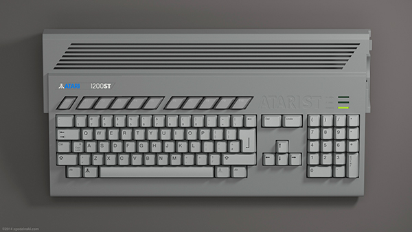
For amiga, do you think this will be fine a little bit white?
-
Hi,
Ah, I definitely wouldn't use that image for Amiga - that's some sort of weird Atari ST hybrid! :) Sorry!
As for the images, whilst they look fine in 1080p when there is no size parameter set, if we set a maximum size for each axis in the XML (eg 25%), this will "mostly" work ok for horizontal and vertical controllers, but square ones will always appear oversized (Atari 2600, N64 etc). Also any smaller controllers with smaller dimensions than the max size set will get scaled up to 25% and this may not look so great. Having a set "canvas size" for all images will eliminate these issues - the controllers won't really look any different in 1080p, but they will look better in 720p.
Do you want me to make a video tomorrow to demonstrate? Its really difficult to explain and there's definitely a misunderstanding of sorts which is causing confusion somewhere - regarding using a set canvas size I think. I'm not too sure how to break it down. I am off to bed shortly but happy to do so tomorrow?
I can always make the changes if you like based on the existing PNGs - happy to do that also, it won't take me much more than an hour max.
Or I can send you a layered SVG with each controller on a 480x480 canvas and it might help explain better what I think needs to be done.
Thanks!
-
@movisman
Oh I got now! I will set a bigger size than 480 for the controllers who look small at that maximum size, and the ones who are square or smaller will fit fine inside that limit. What about 512 x 512 px?
Contributions to the project are always appreciated, so if you would like to support us with a donation you can do so here.
Hosting provided by Mythic-Beasts. See the Hosting Information page for more information.