Chicuelo Theme
-
@qrayg How are you? I make contact with Ricky Romero and I ask for his request (assuming he made all the art) , he agreed and told me he wasn't the only one who created all the controllers and provided me the contact of the other guys who work on the project. David McLeod, Craig Erskine (you) and Memory Noise. Ricky also told me that is an open source project so I could use the art with the crediting of the respective authors. I sent a message to all of you via dribble to request your authorization but I have no response. Then I stop working on this project and forgot about this pending.
Of course this is a free theme with no profit purposes and your names and work are detailed and credited on the readme file (https://github.com/chicueloarcade/es-theme-Chicuelo#user-content-thanks-and-credits).
If you don't agree on using your controllers please tell me which one of them are so I will replace. As a designer I respect your work and I am not trying to take credit of it. Its only a helpful resource for a free theme created from multiple resources. Thanks! -
@ectoone said in Chicuelo Theme:
<view name="detailed">
<image name="logo2" extra="true">
<origin>0 0</origin>
<pos>1 1</pos>
</image>
<text name="longdescription" extra="true">
<origin>0 0</origin>
<pos>1 1</pos>
</text><text name="md_lbl_genre, md_genre, md_lbl_releasedate, md_lbl_developer, md_developer, md_lbl_players, md_players, md_lbl_rating">
<fontPath>./_assets/Roboto-Medium.ttf</fontPath>
<forceUppercase>0</forceUppercase>
<fontSize>0.02</fontSize>
<color>818181</color>
<alignment>left</alignment>
</text>
<text name="md_lbl_genre">
<origin>0.5 0.5</origin>
<pos>0.56 0.761</pos>
<size>0.16 0.16</size>
</text>
<text name="md_genre">
<origin>0.5 0.5</origin>
<pos>0.62 0.761</pos>
<size>0.16 0.16</size>
</text>
<text name="md_lbl_releasedate">
<origin>0.5 0.5</origin>
<pos>0.56 0.791</pos>
<size>0.16 0.16</size>
</text>
<datetime name="md_releasedate">
<fontPath>./_assets/Roboto-Medium.ttf</fontPath>
<fontSize>0.02</fontSize>
<color>818181</color>
<pos>0.54 0.711</pos>
<size>0.16 0.16</size>
</datetime>
<text name="md_lbl_developer">
<origin>0.5 0.5</origin>
<pos>0.56 0.821</pos>
<size>0.16 0.16</size>
</text>
<text name="md_developer">
<origin>0.5 0.5</origin>
<pos>0.62 0.821</pos>
<size>0.16 0.16</size>
</text>
<text name="md_lbl_players">
<origin>0.5 0.5</origin>
<pos>0.56 0.851</pos>
<size>0.16 0.16</size>
</text>
<text name="md_players">
<origin>0.5 0.5</origin>
<pos>0.62 0.851</pos>
<size>0.16 0.16</size>
</text>
<text name="md_lbl_rating">
<origin>0.5 0.5</origin>
<pos>0.56 0.881</pos>
<size>0.16 0.16</size>
</text>
<rating name="md_rating">
<origin>0.5 0.5</origin>
<pos>0.62 0.881</pos>
<size>0.16 0.02</size>
<color>818181</color>
</rating><text name="md_description">
<fontPath>./_assets/Roboto-Medium.ttf</fontPath>
<forceUppercase>0</forceUppercase>
<fontSize>0.02</fontSize>
<color>818181</color>
<origin>0.5 0.5</origin>
<pos>0.789 0.821</pos>
<size>0.25 0.16</size>
</text>
</view>I tested your mod and confirm some overlap with description and long text dev/genre. There's just not enough space for both. But guess you can live with that. Think i will stick with my mod which leave only long description scroll.
-
@darishzone thanks for testing. Maybe the size of the text elements can be reduced so the text will be cut off instead but I've never done that to be certain. The other option would be to remove the developer data again and reposition the other Metadata, but I'm not going to do that. It would be a simple fix and also a good way to get into theme creating. At least that's how I started, by dismantling an existing theme.
Personally I would probably use the description text and replace the system logo with the game marquee. -
@ectoone said in Chicuelo Theme:
@darishzone thanks for testing. Maybe the size of the text elements can be reduced so the text will be cut off instead but I've never done that to be certain. The other option would be to remove the developer data again and reposition the other Metadata, but I'm not going to do that. It would be a simple fix and also a good way to get into theme creating. At least that's how I started, by dismantling an existing theme.
Personally I would probably use the description text and replace the system logo with the game marquee.Yaw, i'm glad to test further if you want to do some text size change, honestly the overlap is very sporadic and occurs when very long developer or genre name is displayed, as i said can be ok, i'm simply perfectionist, dsnt matter much :D
To tell the truth what I like best is the long game description, which is missing in the chicuelo default, so I started experimenting with my limited knowledge :p
-
@darishzone Well, since I was bored while watching SGDQ here you go:
<view name="detailed, video">
 <image name="logo2" extra="true">
	<origin>0 0</origin>
	<pos>1 1</pos>
 </image>
 <text name="longdescription" extra="true">
	<origin>0 0</origin>
	<pos>1 1</pos>
 </text>

 <text name="md_lbl_genre, md_genre, md_lbl_releasedate, md_lbl_developer, md_developer, md_lbl_players, md_players, md_lbl_rating">
	<fontPath>./_assets/Roboto-Medium.ttf</fontPath>
	<forceUppercase>0</forceUppercase>
	<fontSize>0.02</fontSize>
	<color>818181</color>
	<alignment>left</alignment>
	<size>0.11 0.02</size>
 </text>
 <text name="md_lbl_genre">
	<origin>0.5 0.5</origin>
	<pos>0.536 0.761</pos>
 </text>
 <text name="md_genre">
	<origin>0.5 0.5</origin>
	<pos>0.59 0.761</pos>
 </text>
 <text name="md_lbl_releasedate">
	<origin>0.5 0.5</origin>
	<pos>0.536 0.791</pos>
 </text>
 <datetime name="md_releasedate">
	<fontPath>./_assets/Roboto-Medium.ttf</fontPath>
	<fontSize>0.02</fontSize>
	<color>818181</color>
	<pos>0.535 0.781</pos>
	<size>0.11 0.02</size>
 </datetime>
 <text name="md_lbl_developer">
	<origin>0.5 0.5</origin>
	<pos>0.536 0.821</pos>
 </text>
 <text name="md_developer">
	<origin>0.5 0.5</origin>
	<pos>0.59 0.821</pos>
 </text>
 <text name="md_lbl_players">
	<origin>0.5 0.5</origin>
	<pos>0.536 0.851</pos>
 </text>
 <text name="md_players">
	<origin>0.5 0.5</origin>
	<pos>0.59 0.851</pos>
  </text>
 <text name="md_lbl_rating">
	<origin>0.5 0.5</origin>
	<pos>0.536 0.881</pos>
 </text>
 <rating name="md_rating">
	<origin>0.5 0.5</origin>
	<pos>0.59 0.881</pos>
	<size>0.11 0.02</size>
	<color>818181</color>
 </rating>

 <text name="md_description">
	<fontPath>./_assets/Roboto-Medium.ttf</fontPath>
	<forceUppercase>0</forceUppercase>
	<fontSize>0.02</fontSize>
	<color>818181</color>
	<origin>0.5 0.5</origin>
	<pos>0.789 0.821</pos>
	<size>0.25 0.16</size>
 </text>
</view>
Text should be cut off now, ending with ...
-
@ectoone said in Chicuelo Theme:
@darishzone Well, since I was bored while watching SGDQ here you go:
<view name="detailed, video">
 <image name="logo2" extra="true">
	<origin>0 0</origin>
	<pos>1 1</pos>
 </image>
 <text name="longdescription" extra="true">
	<origin>0 0</origin>
	<pos>1 1</pos>
 </text>

 <text name="md_lbl_genre, md_genre, md_lbl_releasedate, md_lbl_developer, md_developer, md_lbl_players, md_players, md_lbl_rating">
	<fontPath>./_assets/Roboto-Medium.ttf</fontPath>
	<forceUppercase>0</forceUppercase>
	<fontSize>0.02</fontSize>
	<color>818181</color>
	<alignment>left</alignment>
	<size>0.11 0.02</size>
 </text>
 <text name="md_lbl_genre">
	<origin>0.5 0.5</origin>
	<pos>0.536 0.761</pos>
 </text>
 <text name="md_genre">
	<origin>0.5 0.5</origin>
	<pos>0.59 0.761</pos>
 </text>
 <text name="md_lbl_releasedate">
	<origin>0.5 0.5</origin>
	<pos>0.536 0.791</pos>
 </text>
 <datetime name="md_releasedate">
	<fontPath>./_assets/Roboto-Medium.ttf</fontPath>
	<fontSize>0.02</fontSize>
	<color>818181</color>
	<pos>0.535 0.781</pos>
	<size>0.11 0.02</size>
 </datetime>
 <text name="md_lbl_developer">
	<origin>0.5 0.5</origin>
	<pos>0.536 0.821</pos>
 </text>
 <text name="md_developer">
	<origin>0.5 0.5</origin>
	<pos>0.59 0.821</pos>
 </text>
 <text name="md_lbl_players">
	<origin>0.5 0.5</origin>
	<pos>0.536 0.851</pos>
 </text>
 <text name="md_players">
	<origin>0.5 0.5</origin>
	<pos>0.59 0.851</pos>
  </text>
 <text name="md_lbl_rating">
	<origin>0.5 0.5</origin>
	<pos>0.536 0.881</pos>
 </text>
 <rating name="md_rating">
	<origin>0.5 0.5</origin>
	<pos>0.59 0.881</pos>
	<size>0.11 0.02</size>
	<color>818181</color>
 </rating>

 <text name="md_description">
	<fontPath>./_assets/Roboto-Medium.ttf</fontPath>
	<forceUppercase>0</forceUppercase>
	<fontSize>0.02</fontSize>
	<color>818181</color>
	<origin>0.5 0.5</origin>
	<pos>0.789 0.821</pos>
	<size>0.25 0.16</size>
 </text>
</view>
Text should be cut off now, ending with ...
Whoo, tested and it works like a charm mate, fantastic, thank you :)
-
@darishzone No problem, at least I learned something from that. :)
-
@ectoone said in Chicuelo Theme:
@darishzone Well, since I was bored while watching SGDQ here you go:
<view name="detailed, video">
 <image name="logo2" extra="true">
	<origin>0 0</origin>
	<pos>1 1</pos>
 </image>
 <text name="longdescription" extra="true">
	<origin>0 0</origin>
	<pos>1 1</pos>
 </text>

 <text name="md_lbl_genre, md_genre, md_lbl_releasedate, md_lbl_developer, md_developer, md_lbl_players, md_players, md_lbl_rating">
	<fontPath>./_assets/Roboto-Medium.ttf</fontPath>
	<forceUppercase>0</forceUppercase>
	<fontSize>0.02</fontSize>
	<color>818181</color>
	<alignment>left</alignment>
	<size>0.11 0.02</size>
 </text>
 <text name="md_lbl_genre">
	<origin>0.5 0.5</origin>
	<pos>0.536 0.761</pos>
 </text>
 <text name="md_genre">
	<origin>0.5 0.5</origin>
	<pos>0.59 0.761</pos>
 </text>
 <text name="md_lbl_releasedate">
	<origin>0.5 0.5</origin>
	<pos>0.536 0.791</pos>
 </text>
 <datetime name="md_releasedate">
	<fontPath>./_assets/Roboto-Medium.ttf</fontPath>
	<fontSize>0.02</fontSize>
	<color>818181</color>
	<pos>0.535 0.781</pos>
	<size>0.11 0.02</size>
 </datetime>
 <text name="md_lbl_developer">
	<origin>0.5 0.5</origin>
	<pos>0.536 0.821</pos>
 </text>
 <text name="md_developer">
	<origin>0.5 0.5</origin>
	<pos>0.59 0.821</pos>
 </text>
 <text name="md_lbl_players">
	<origin>0.5 0.5</origin>
	<pos>0.536 0.851</pos>
 </text>
 <text name="md_players">
	<origin>0.5 0.5</origin>
	<pos>0.59 0.851</pos>
  </text>
 <text name="md_lbl_rating">
	<origin>0.5 0.5</origin>
	<pos>0.536 0.881</pos>
 </text>
 <rating name="md_rating">
	<origin>0.5 0.5</origin>
	<pos>0.59 0.881</pos>
	<size>0.11 0.02</size>
	<color>818181</color>
 </rating>

 <text name="md_description">
	<fontPath>./_assets/Roboto-Medium.ttf</fontPath>
	<forceUppercase>0</forceUppercase>
	<fontSize>0.02</fontSize>
	<color>818181</color>
	<origin>0.5 0.5</origin>
	<pos>0.789 0.821</pos>
	<size>0.25 0.16</size>
 </text>
</view>
Text should be cut off now, ending with ...
Thank you! Just tested and works very well!!! At last my game description is displayed!
Very nice new theme!! I switched from artbook to chicuelo! -
@Wildfire Can you please share your modified theme?
-
I made a picture for custom-collections that have all my collections in one Folder with sub-folders.
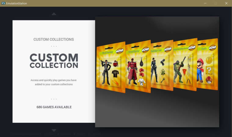
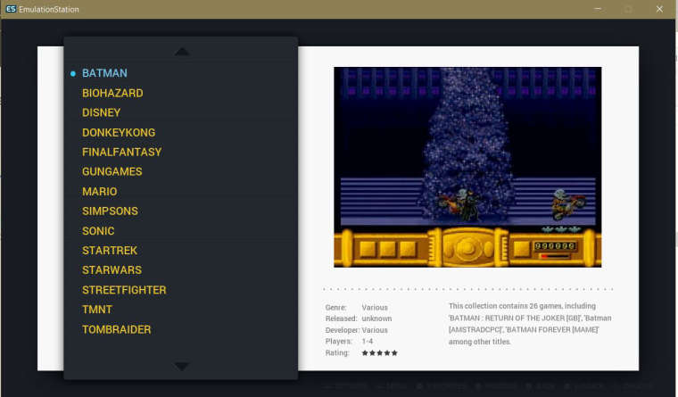
Is that good?
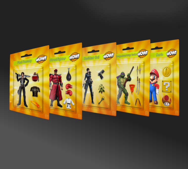
This too:
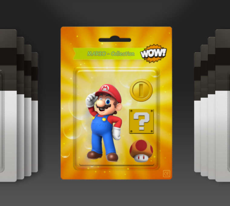
-
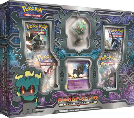
@pittstone Nice one! I will only maintain a center image wich contains all of the stuff. For example a blister with mixed characters and objects, or you can use this way and leaving a bigger margin on the edges
-
@chicuelo Nice Idea. A package like this?
-
@pittstone I like it! it would be great
-
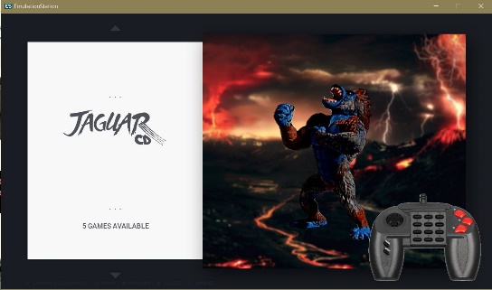
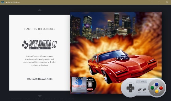
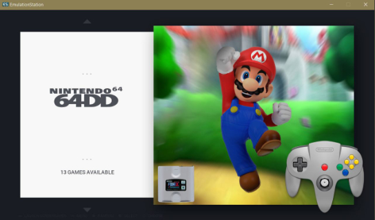
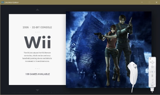
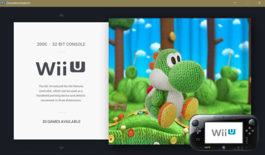
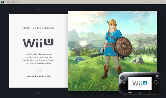
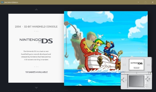
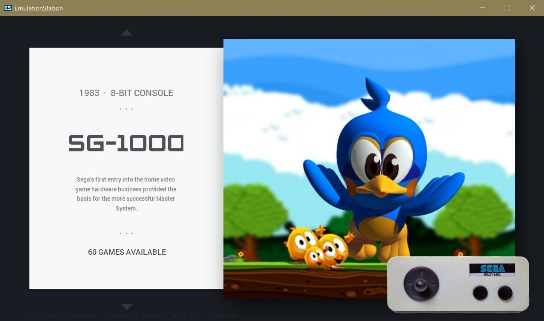
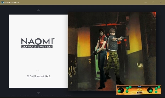
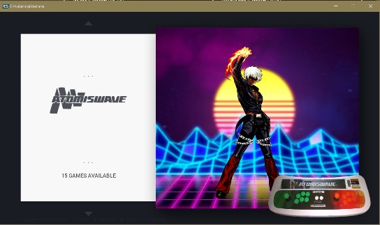
First Tests of my System Updates.
#1 atarijaguarcd
#2 snesmsu
#3 n64dd
#4 wii
#5 wiiu
wiiu alternate
#6 nds
#7 nintendo3ds
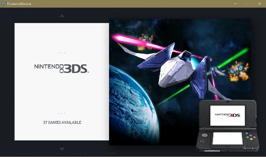
#8 sg-1000
#8 naomi
#9 atomiswave
#10 ps2
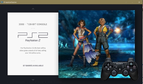
#11 pspminis
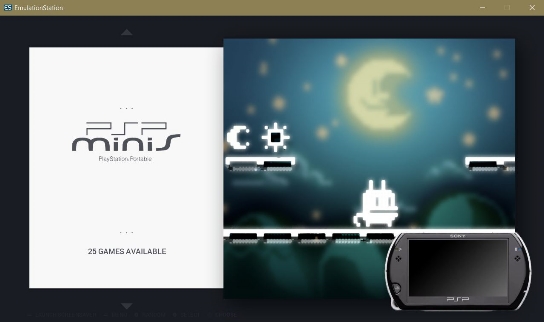
#12 pce-cd
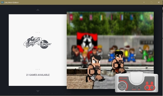
#13 pc-fx
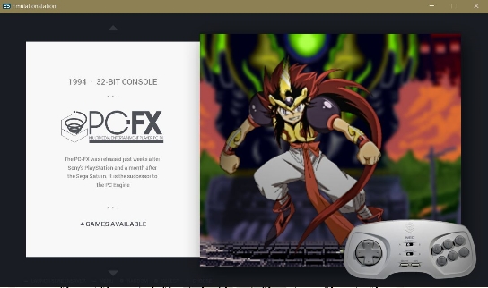
#14 amigacd32
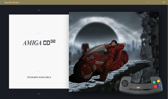
#15 neogeocd
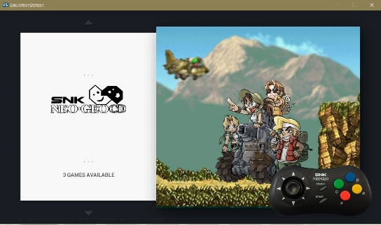
#16 ngp
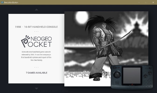
#17 ngpc
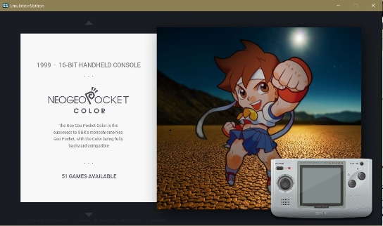
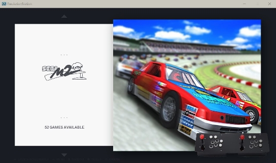
#18 segamodel2
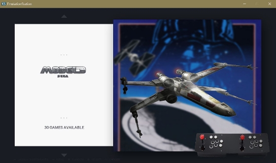
#19 segamodel3
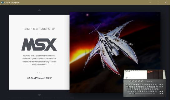
#20 msx
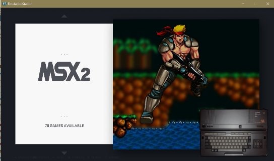
#21 msx2
#22 dos
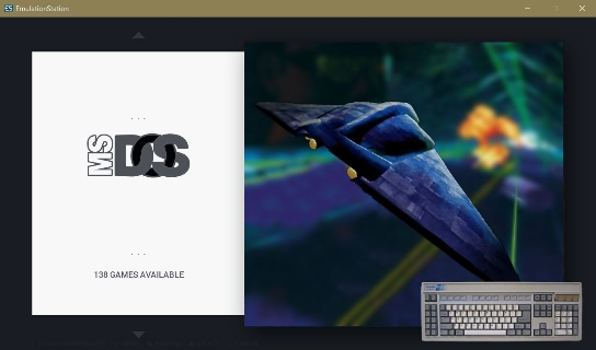
dos alternate
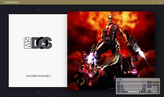 #
#
#23 win95/98
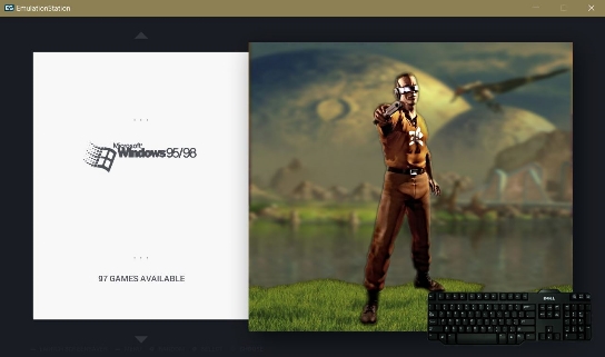
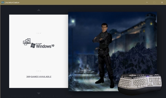
#24 win2k/xp
#25 win10
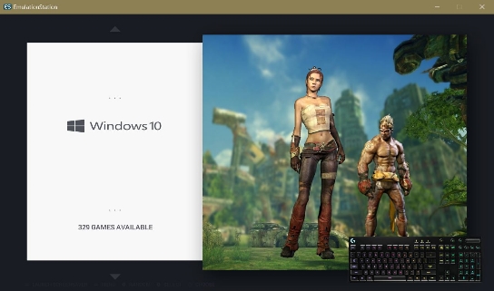
26 indiegames
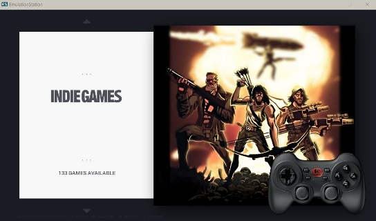
indiegames alternate
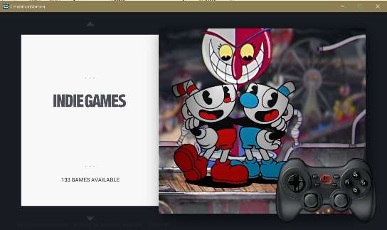
#27 winpointnclick
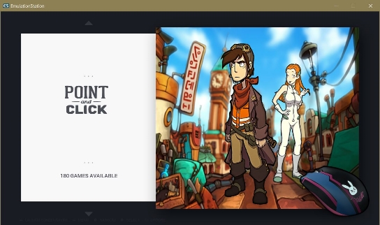
#28 openbor
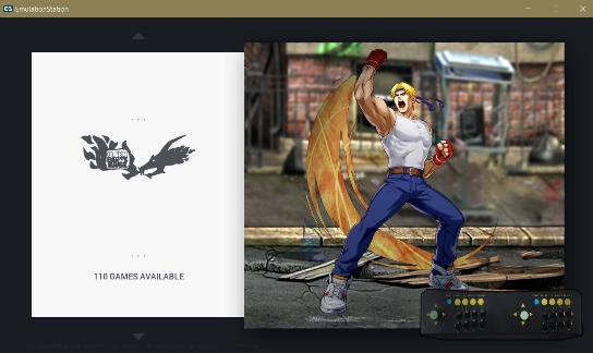
#29 mugen
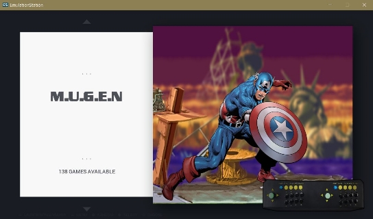
#30 videos
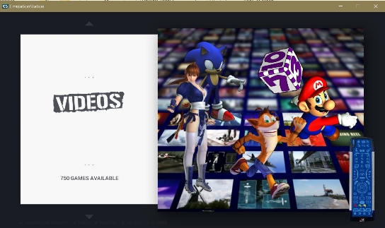
#31 gamemagazines
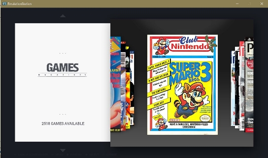
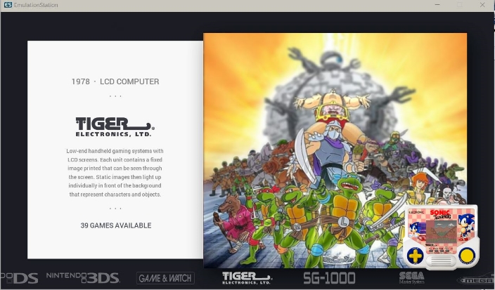
#32 tigerhandheld
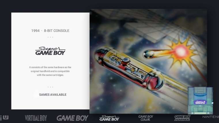
#33 supergameboy
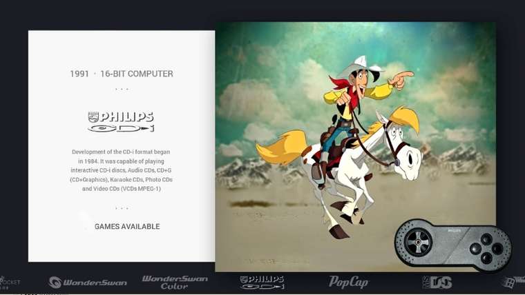
#34 philips cdi
#35 popcap

Download theme update:
Chicuelo_PittStone Update 1.3 -
How can I add the systems list to the bottom as @Wildfire posted above. I did ask for his modded files the same as a few others have but he seems to have vanished from here.
-
@pootis-spencer Try adding the following lines before the final
</theme>tag in the theme.xml<feature supported="carousel"> <view name="system"> <image name="logo2" extra="true"> <path>./_assets/logos/${system.theme}.svg</path> <origin>0.5 0.5</origin> <pos>0.232 0.415</pos> <color>4f5159</color> <maxSize>0.16 0.16</maxSize> </image> <image name="logo"> <color>eeeeee</color> </image> <carousel name="systemcarousel"> <type>horizontal</type> <color>00000000</color> <origin>0.5 1</origin> <pos>0.5 1</pos> <size>1 0.08</size> <logoScale>0.7</logoScale> <logoSize>0.3 0.075</logoSize> <maxLogoCount>7</maxLogoCount> </carousel> </view> </feature>This will replace the orignal carousel with a static logo and will change the carousel to a horizontal version on the bottom of the screen with white colored logos.
-
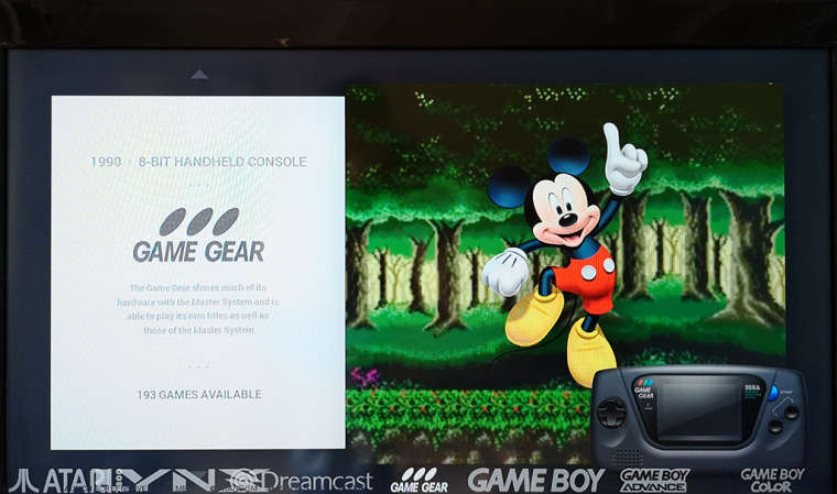
@ectoone I did that but the logos on the bottom horizontal bar are too big as you can see in this picture.
-
@pootis-spencer
You can also use the indicator system that is disabled but included in the theme
you have to use a indicator file for each system that will display the position on the screen. You can replace with a system logo or even a scroll bar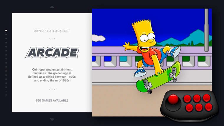
-
Yea but I really wanted the same that @Wildfire posted hence the bar at the bottom. I think it really finishes it off.
-
@chicuelo Sorry just read again what you posted. I will try that thanks.
Contributions to the project are always appreciated, so if you would like to support us with a donation you can do so here.
Hosting provided by Mythic-Beasts. See the Hosting Information page for more information.