RetroPie forum home
    • Recent
    • Tags
    • Popular
    • Home
    • Docs
    • Register
    • Login

    [WIP][Theme] Retrolution

    Scheduled Pinned Locked Moved Projects and Themes
    retropie themetheme
    26 Posts 12 Posters 7.7k Views
    Loading More Posts
    • Oldest to Newest
    • Newest to Oldest
    • Most Votes
    Reply
    • Reply as topic
    Log in to reply
    This topic has been deleted. Only users with topic management privileges can see it.
    • simpleethatS
      simpleethat
      last edited by

      This is pretty awesome! I'd love to see that stylized Samus as a T-Shirt

      1 Reply Last reply Reply Quote 1
      • mituM
        mitu Global Moderator @blackshadow
        last edited by mitu

        @blackshadow said in [WIP][Theme] Retrolution:

        on serious note i quite like how this theme looks the red yoshi on the poster is a nice added soviet touch :P

        Soviet you say ? @lipebello - maybe you can use some Dendy artwork on the NES system to keep it in line with the theme (NOTE: I know the Dendy didn't appear until the '90s, so it's not theoretically from the soviet period).

        lipebelloL 1 Reply Last reply Reply Quote 1
        • lipebelloL
          lipebello @Clyde
          last edited by

          @Clyde I think they removed it, I had some removed from republic as well, lol


          Retrorama Tshirts:
          https://www.teepublic.com/user/lipebello
          https://www.instagram.com/phillbello/

          1 Reply Last reply Reply Quote 0
          • lipebelloL
            lipebello @mitu
            last edited by

            @mitu lol, didn't knew about that. In the 80s we had a bunch of 2600 and NES clones too, because of our dictatorship period.


            Retrorama Tshirts:
            https://www.teepublic.com/user/lipebello
            https://www.instagram.com/phillbello/

            1 Reply Last reply Reply Quote 0
            • lipebelloL
              lipebello
              last edited by

              A little change in the design
              0_1540427813105_new.jpg


              Retrorama Tshirts:
              https://www.teepublic.com/user/lipebello
              https://www.instagram.com/phillbello/

              1 Reply Last reply Reply Quote 2
              • J
                jrochagouveia
                last edited by jrochagouveia

                Looks awesome... :D

                Vote for the first design!

                lipebelloL 1 Reply Last reply Reply Quote 1
                • lipebelloL
                  lipebello @jrochagouveia
                  last edited by

                  @jrochagouveia i think i'm gonna bring the red background back and use the posters on the carousel. :)


                  Retrorama Tshirts:
                  https://www.teepublic.com/user/lipebello
                  https://www.instagram.com/phillbello/

                  ClydeC J 2 Replies Last reply Reply Quote 0
                  • ClydeC
                    Clyde @lipebello
                    last edited by

                    @lipebello I don't know, I like both of them. The second design has a better contrast, the first one drowns a bit in all the red. :)

                    That said, I like both the wheel of the first design and the horizontal carousel of the second.

                    Maybe you could make two versions? :D (or four, wheel and carousel with either red or dark background)

                    lipebelloL 1 Reply Last reply Reply Quote 1
                    • lipebelloL
                      lipebello @Clyde
                      last edited by

                      @Clyde Yup, i'll make and use the logos anyway. It's just a matter of making 2 different main theme.xml files.


                      Retrorama Tshirts:
                      https://www.teepublic.com/user/lipebello
                      https://www.instagram.com/phillbello/

                      1 Reply Last reply Reply Quote 2
                      • J
                        jrochagouveia @lipebello
                        last edited by

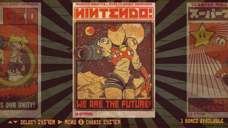
                        @lipebello Zangief poster is the best one... Can't wait for it.

                        1 Reply Last reply Reply Quote 1
                        • lipebelloL
                          lipebello
                          last edited by

                          @jrochagouveia - It's one of my favorites too! i'll definitely will make a shirt of it.

                          0_1540701518742_new2.jpg


                          Retrorama Tshirts:
                          https://www.teepublic.com/user/lipebello
                          https://www.instagram.com/phillbello/

                          ClydeC 1 Reply Last reply Reply Quote 2
                          • ClydeC
                            Clyde @lipebello
                            last edited by

                            @lipebello Yep, after seeing both of them, I definitely like the dark background more. 😊

                            That said, could you try a colour that is in the middle between the light and the dark version? Though I like the dark version more, it admittedly looses a bit much of the red.

                            Just a suggestion, feel free to ignore it. 😇

                            lipebelloL 1 Reply Last reply Reply Quote 1
                            • lipebelloL
                              lipebello @Clyde
                              last edited by

                              @Clyde Agreed. i've changed the color to give more contrast and also gave the wall texture more depth.
                              0_1540735194270_new3.jpg


                              Retrorama Tshirts:
                              https://www.teepublic.com/user/lipebello
                              https://www.instagram.com/phillbello/

                              ClydeC 1 Reply Last reply Reply Quote 1
                              • ClydeC
                                Clyde @lipebello
                                last edited by

                                @lipebello Oh yes, that looks much better, more plastic. Thanks!

                                1 Reply Last reply Reply Quote 1
                                • simpleethatS
                                  simpleethat
                                  last edited by

                                  I'm really digging this, keep it up!

                                  1 Reply Last reply Reply Quote 1
                                  • S
                                    SsorcererR
                                    last edited by

                                    Nice work there!

                                    1 Reply Last reply Reply Quote 1
                                    • L
                                      L4chesis
                                      last edited by

                                      @lipebello Wow this is SOOOO amazing ! Dude I just can't wait you present us the final version. Hero theme !

                                      1 Reply Last reply Reply Quote 1
                                      • L
                                        lockescow
                                        last edited by

                                        Just wondering if this theme is still being worked on. Would love to get a progress update. The initial screens look awesome!

                                        1 Reply Last reply Reply Quote 2
                                        • First post
                                          Last post

                                        Contributions to the project are always appreciated, so if you would like to support us with a donation you can do so here.

                                        Hosting provided by Mythic-Beasts. See the Hosting Information page for more information.