Epic Noir - Dark Mode Theme
-
@chicuelo said in Epic Noir - Dark Mode Theme:
@AdamBeGood If you have some photoshop skills you can easily edit the dots and make your own indicators. It would be great if ES includes this as a native feature
I am still slightly confused by the dots issue - even after trying to read through this thread. I have 30 systems; can I use the dots or not? They don't move at all after the initial install - apart from the options dot which does work when that is selected.
If the dots don't work at all with more than 16 systems, that is fine. But if I can pick my favourite 16 systems and use the dots for those, with the other ones just not working, then I'd try that. I don't intend to get rid of systems.
-
@AdamBeGood
First of all, the dots are only a simulation. Not a system capability, so in order to work you have to match them with your systems. They are just another artwork in the theme. When you install the theme the dots are named as "1st-system.png", "2nd-system.png", "3rd-system.png", "4th-system.png" and so. They will not work untill you rename them.Having said that you will find 19 png files inside the indicators folder: 16 of them represent a system and the other 3 are favorites, power and retropie setup (represented with a gear, power icon and a star). they work like the dots but instead of circles they are icons.
If you have 30 systems you will have to create 30 new graphics with 30 dots each and higlight the one that matches each system in each position. the actual graphics won't fit your need. they only display up to 16+3 extras.
Here's an example of how they look, in this case, I have NES in the 4 position of my xml, so I highlighted the fourth dot. When you are on the fourth system the fourth dot will display. You have to name this PNG file as nes.png, because in this case nes is the fourth system. And you have to do the same with all the 19 images matching everyone with their respective system.

This is how 30 systems will look, not fine in my opinion, in the 21st position, if you have openbor (for example) you will name that file openbor.png, and you will have 20 files before this with a different position of the dot and 9 after.

If you like, for the amount of systems you have you could replace the dots with a scrollbar and have a 30 steps scrollbar. You will simulate the scroll moving the bar a bit down for every sistem because it's the same logic. You have to be smart and know the systems order to have a smooth scroll and not a jumping bar.
Hope this helps you -
@chicuelo Thanks so much for the lengthy response! I will have a look into this and see what I can do.
Thank you!
AdamEdit : I went for two rows of dots in the end - I might try your slider idea later but the two rows look okay, and didn't take long.
-
@AdamBeGood Great! glad you could solve it
-
How do you see this? I'm thinking more about the future!

-
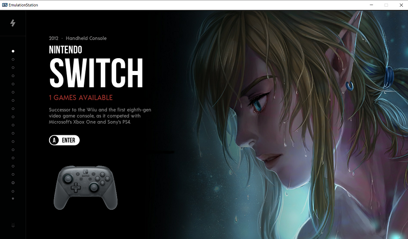
@jmfdsa Looks good so far! but maybe a more action-epic image?
I also think the switch will pop out more because the colors and the format -
@chicuelo
This looks simply AMAZING!
Much love and kudos.One question though you pointed out:
Recomendation for Pi3B+:
Split memory up to 512 mb
Set Vram up to 150 mbI have bumped the Vram already (to 150MB), but how would I do the split memory to 512?
I thought the max was 256MB for Pi3B+?Also I would like to know how add a power menu to RetroPie so I can make use of the Power Menu icon.
-
@Panja Hey, if you have updated to retropie 4.2 or newer, you really dont need to split memory.
I am using a 3b and without the split it works great. Just increase the vram.check this: https://retropie.org.uk/docs/Memory-Split/
The power button is a free script you can find here:
just download the files and create the power folder on your roms directory.
enjoy!
-
Thanks for the fast reply!
I'm using RetroPie v4.6.9 and indeed it works great! (vram set to 150MB).I've created all the systems and added the indicators as well.
It's just plain lovely!! -
@Panja I created my own power and reboot icons, in case you want to match them with the theme.
Grab them hereshutdown.png

reboot.png

-
@chicuelo
You are just AWESOME!
Thanks a lot. Using them as we speak. :-)One question though.
For some reason the Virtualboy section is a lot darker than other systems.
It sorta looks like there is more shadow over it. Also the left dotbar is darker/shadow-ish.
Do you have a clue what's going on?
Here is a video showing what I mean:
https://www106.zippyshare.com/v/SbHEVsT8/file.htmlAnother question...
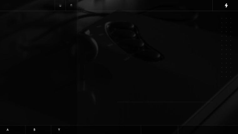
When I'm in the gamelist, on the left lower corner I see:
A = enter
B = Return
X = FavoriteBut, at least for me, the Y button is for favorites. X is for random.
Can I change the X in to a Y?
I think it's in ingame-global-bg.jpg. Could you alter that with the Y instead of the X? -
@Panja I think it´s a tv effect because red is darker than blues. On my screens it looks as the others!
Regarding the buttons someone mentioned that too. I will see if I can edit the files to make that text.
By now you can edit the jpg file if you have some skills -
@chicuelo
I do have "some" skills. Not much but some. haha
What font is used on the jpeg?Ok, I will have a look at my TV settings than. Thx!
Btw would it be possible to have less systems instead of 16.
I want to use the indicator dots and have 14 systems active.[UPDATE]
I've edited the file myself.

-
@Panja Great! but in an easy way you could have edited the xml and simpy change the text maintaining the bitmap letters!
If you want less systems you will have to edit all the 19 indicators and removing 2 dots from everyone. Also removing 2 indicators files. You will have 17 files, 14 for each system and one for retropie, favorites and power. You could edit those too and make whatever you want to achieve.
-
I'll have a try once I have some more time on my hands.
Thanks! -
Hey that's AWESOME.
Really.
Can't wait for new systems to be added to the theme.
Currently I have those systems that appear as blank, maybe they are not yet supported?Amiga CD32
Fairfield Channel F
Neo Geo CD
Philips Videopac
Openbor
PC engine CD (aka Turbografx 16 CD)
PSP Minis
Super Nintendo CD
TI99I saw in comments that @roslof is working in adding new systems: great!
@roslof, is your work in progress downloadable somewhere?Ps.
With this theme, Famicom appears as "Famicom Disk system" to me ... So I see "Famicom Disk System" twice. Is it a bug or does it depend on my build?
I'm using the latest Virtualman build. -
I managed to edit all the system indicator files and created a 14 systems theme.
AWESOME! -
@Panja could you please share it? can your edit be downoaded somewhere?
-
@Lendersmark said in Epic Noir - Dark Mode Theme:
@Panja could you please share it? can your edit be downoaded somewhere?
Sure, if that’s ok with @chicuelo, I would be able to upload them.
-
@Lendersmark There is a "famicom" folder and a "FDS" one, I think both are the same and you have roms in both folders. I suggest to move all on a single folder and make the other dissapear.
Contributions to the project are always appreciated, so if you would like to support us with a donation you can do so here.
Hosting provided by Mythic-Beasts. See the Hosting Information page for more information.