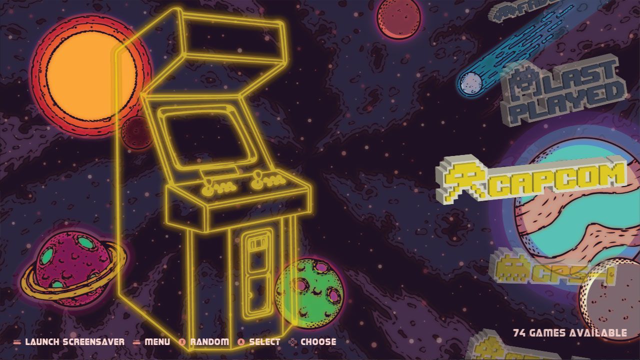
Space Oddity theme
-
@lipebello Thats too bad, I'm sure a bunch of others like us that are into retro gaming would order some of your stuff with the retrorama stuff on it if they let you post it up :) Ya good call, I turned the DMX accelation off and it seems to display properly for stills anyways. Didn't think to check that as the video review from ETA prime although a couple years old video appeared to display using the same physical size as when it displays video, might have been previous version or some other settings used. I personally like the look of how you currently have it when displaying still image. Don't go out of your way, however if you do have some time to make a few changes at some point in time these are the only things I would suggest:
- Modify frame size for still image (such as screen shot with or without boxart) to start underneath system logo and end just above onscreen help. That way there would no overlap regardless if on screen help is on or off.
- Same as above for video, however if possible display screen shot first and if remain on same screen game selection after a few seconds switch over to video playback using same location/boundaries.
- Unused space above and below just have your current background fill empty space
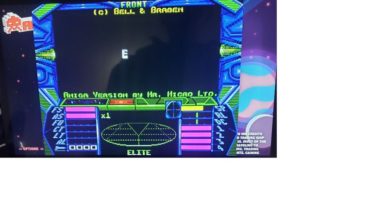
This is Intro video for Elite, adjust so left border starts at far left, top underneath Amiga logo and bottom about onscreen help
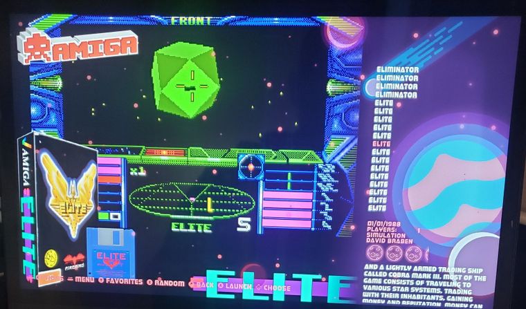
Stills very little issues, I don't mid the system logo overlap on this game, other games don't display quite as nice. I would just keep the stills and video consistent with the same borders and sizing. I have just changed my settings to display the screen shot and not video for the Space Oddity theme since you let me know about DMX issue seems to work pretty good in this setting.
Now to check out retrorama and a few other themes :)
Thanks again and all the best to you.
-
@harkonnen0 said in Space Oddity theme:
l image (such as screen shot with or without boxart) to start underneath system logo and end just above onscreen help. That way there would no overlap regardless if on screen help is on or off.
The first image is a video playing?
thanks for the suggestions. i'm remodelling it to make it look better
-
@lipebello yup sorry looks like it put a large white border when i resized image so my text didnt appear proper. first image is video with omx enabled. Video doesnt appear to play when omx is off not sure if thats normal or not. Remodeling to look better cool appreciate it as long as not taking you away from other projects :-) My best friend had a tape drive for his c64 lol Hi tech back then i tell ya lol. Sorry I don't have a 4:3 screen but if you need someone to do testing for you just let me know. I actually had to look up what a MSX 1.0 is lol
-
@harkonnen0 Yes, msx was our first computer at home, lol
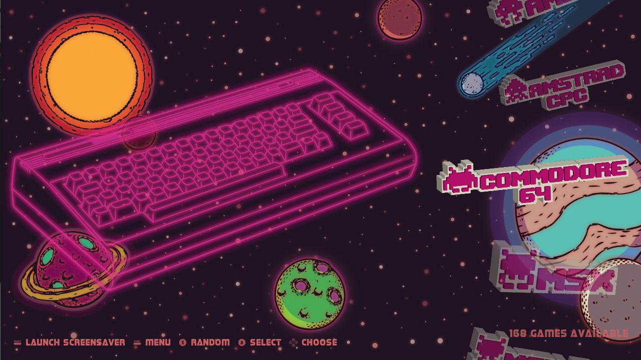
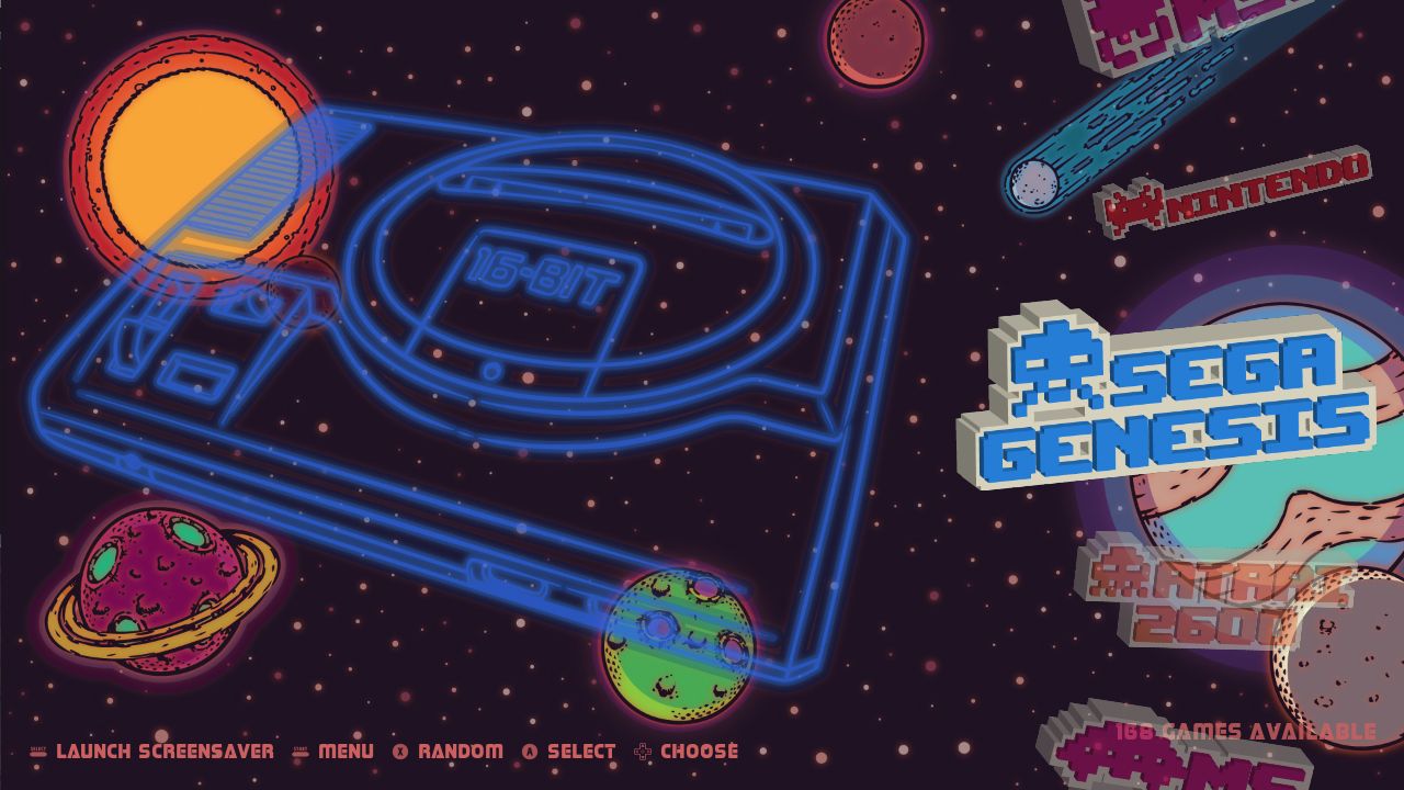
Made a little change on the theme. Still in progress...
-
game list done, just 30 systems to go
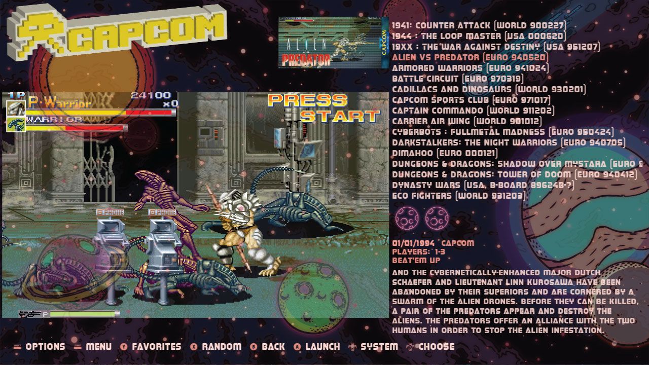
Edit: How a game like that only have 2 stars? -
@lipebello Can't wait for the 4.3 version. This would look so cool on my crt!
-
@rion You can install it on esthemes menu
-
@lipebello Great updates for this theme, thank you!
Any chance you could add TurboGrafx-CD? You have it in Retrorama Turbo and others, but it seems to be missing from Space Oddity.EDIT: Just watched your video and I see it listed there, but Space Oddity doesn't show anything for me under "TG-CD". Weird.
-
@greengriffon I think it's called td16-cd or something. You can just copy it and rename to the name of your system
-
@lipebello Understood, thanks.
Contributions to the project are always appreciated, so if you would like to support us with a donation you can do so here.
Hosting provided by Mythic-Beasts. See the Hosting Information page for more information.