New Comic Book Theme!
-
I don't have a 4:3 screen so I can't test, but if you were to release it for 16:9 screens I'd definitely download! I can't think of any alterations you could make.
-
@TMNTturtlguy I think @lipebello is more active in the recalbox community. I know he is a brazilian guy and I saw him promoting this theme in a brazilian recalbox group on facebook. I'll try to make him know you want to contact him.
-
@robertybob I also vote for a 16:9 version! 😊
-
@FlyingTomahawk video now supports
maxSizelike image. Using it will maintain the aspect ratio of the video. -
Cool! Time to play around with it then, thanks.
-
Thanks for all the kind words! I plan to try and give each detail view its own color behind the new Shaka Pow System Name in the top left corner so that not each view is blue. The only issue i have run into is using full size images behind each system is pushing the limits of ES. In the newest update to ES it runs pretty smooth, but in the modified ES with video screen saver i have to be careful with the art and files sizes. Here are some answers to above questions/comments:
@FlyingTomahawk the futura theme is awesome and I have it loaded on my system! As for the video aspect ratio, here is my .xml
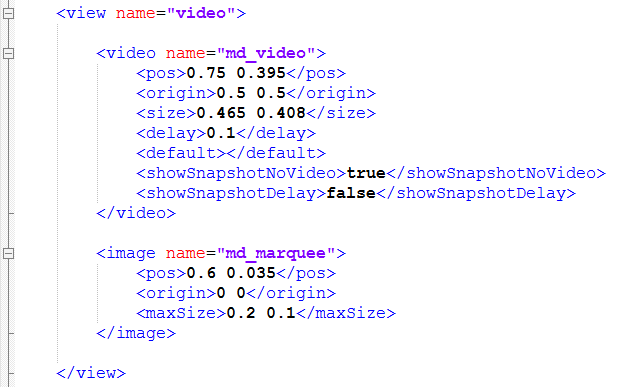
I am not using the <special feature "Video"> in the theme. In the older ES with screen saver when i do that I lose the ability to have a scraped image appear if there is no video for a specific rom. @jdrassa, In the ES from @pjft based on @fieldofcows screen saver theme the new maxSize feature is not available so I was not able to use it. My .mp4 are all from screenscraper.fr and I ran them all through handbreak to reduce their size. When building this theme, i just tweaked the <size> until it fit my comic box, the .mp4 just scaled as if it were a standard video size, even though it is a different aspect ratio. When I tested the exact theme in the most updated ES just released, the sizes and locations of my images/videos appear larger, even though nothing has changed in my theme .xml. I also noticed that the tall videos like 1941 stretch as you describe. My guess is that I will need to set a maxSize in the version for the new ES. This causes me problems as I am already creating 2 themes, a 4:3 for my arcade cabinet, and a 16:9 for my TV (i have 2 pie builds going right now!) Now running 2 ES that handle my .xml differently, I might have to have a total of 4 themes....that is not ideal.@Kischa 1: Fonts - I originally had it left aligned, however in doing that the only way to get the dark grey highlight over the selected game to go edge of my comic box to edge of box was to align the text all the way tight to the black boarder, then the first letter touched the comic box outline. I adjusted to center so that the selection highlight can span the entire comic box, and the text does not touch the edge, except for very long text. I have to decide if i like the larger font size, or if i want long titles to fit. When you highlight text that is longer than the box, it scrolls so you can see the entire title.
2: I agree with you, but i don't have a great solution yet. The black box behind the video looks heavy and makes the view unbalanced. I will play with it more and see if i like anything. In the end you might be right, a solid color may be what we end up with in that square.@meleu, that would be great, let me know if you hear anything from @lipebello
16:9 ratio will definitely be created. I want to get the bugs worked out of this one first. I then have to figure out how to handle the different versions of ES. It is apparent that if I continue to build on the video screensaver ES, the theme will not display correctly as built for the new ES. If I build it in the new ES, it runs smoother, and I can use the new features like adjusting the opacity of the wheel, but i will need to change the video size settings to use maxSize and if I do that, the theme will not load in the screensaver ES - what a dilemma! The theme will also probably look a little different as I adjust it to a wide screen format, I might have to adjust images, and possible change the comic boxes on the detail view so that there isn't a lot of empty space. The good thing with the 16:9 is that I can make the game text all fit into the box at a large text size! Thanks everyone.
-
Hey bro, Filipe is my brother, I already contacted him
-
@FlavioBello11 Great! Let him know that his idea is awesome and that I respect any decision he makes. If he would rather I not share this theme, I have no problem with that. Thanks
-
Update:
-
Per suggestions I have reduced the font size, I don't want to go any smaller as this is for an arcade cabinet, i think it looks good for most titles.
-
I have been playing with different colors behind the system name for each system, it seems to be to much switching from screen to screen/color to color, so i am sticking with the blue pattern.
-
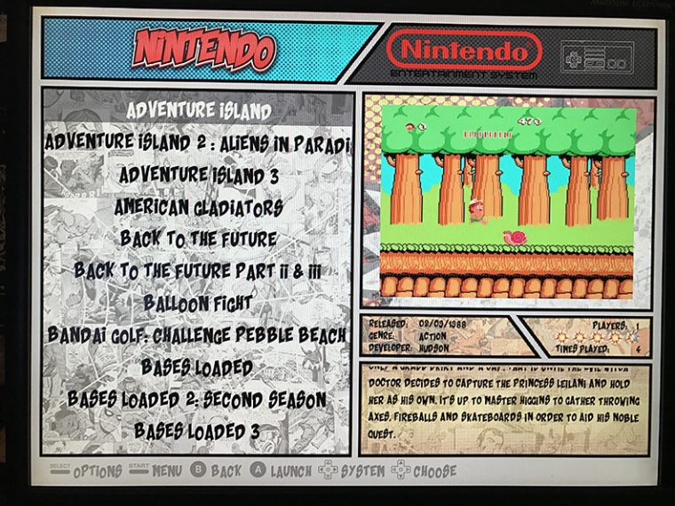
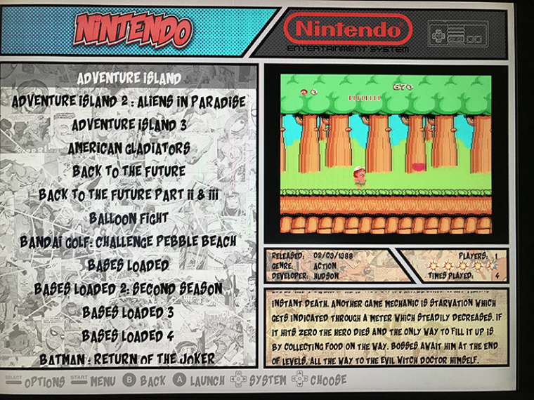
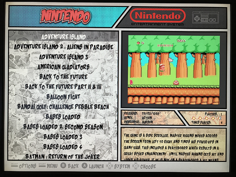
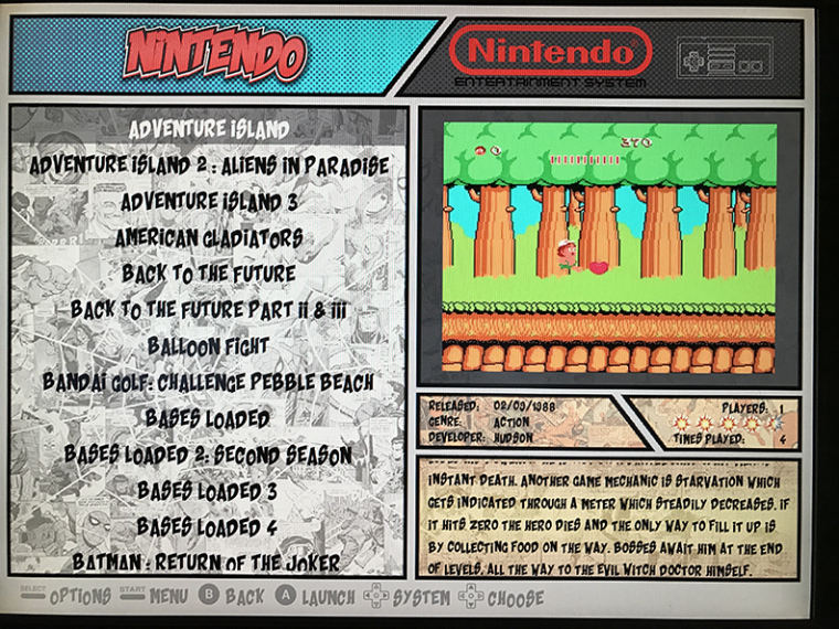
I am testing different options behind the video, Not sure what i like. Here are some photos. Photo 1 is the original with the text bubble graphic. Photo 2 is black background. Photo 3 is dark grey background. Photo 4 is grey background with ghosted comic overlay. I have also posted video of the transitions, but my camera doesn't do so well with clarity of the screen so it is hard to tell the difference on the grey videos. Video 1
Video 2Video 3
-
-
Great work with smaller fonts and maby black background ;)
One more thing...I think its quite hard to read the roms with that sharp contrast spiderman background. Maby you could dim it down a bit?
Thanks!
-
@TMNTturtlguy
Your theme is really great.
Videosnap are great too, but for those who don't use videosnap, I wan't to try a dedicated MIX for UXS.
Have you a "beta" version of your theme I can use to try to make a MIX ?
Are you OK If I adapt it for Recalbox too ? (with your name and all the Credits you deserve ;) ) -
@Kischa - yes the smaller fonts do look nicer, good suggestion. I am still not sure on the background behind the video/images. I start to lean one direction, but then change my mind! As for the sharp contrast, that is my camera increasing the contrast when it takes the picture of the bright screen, it is trying to compensate for the brightness by increasing the dark. It is hard to tell, but the color is not black and white, it has an aged yellow to it, looks like a newspaper.
@screech - Thanks for the kind words. I also use USX and have mixes for every game. Not every game has a video, so in those cases the UXS mix shows. I have the theme set up so that if you don't have any video, it will simply show your UXS mix, that being said, your mix has to be a single image. If you go to the 59 second mark of the video i posted in the first post you can see a PSP mix. As for sharing the theme, I am still waiting to hear back from @FlavioBello11 and/or @lipebello as the original concept is based of some design images that @lipebello posted a while back. With his approval I will share. Also note the theme is currently only for 4:3 and it is based of off an ES version before maxSize video was available, so if run on the updated ES, the video sizes are not correct. I will need to work on an alternate theme for that. Once i get the OK to share, you can definitely adapt to recalbox, however i have heard that @lipebello may have stopped working on the theme for retropie and instead is working on it for recalbox already? not sure.
-
UPDATE!: 16:9 Version up and running!
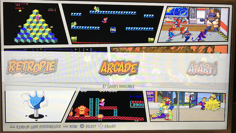
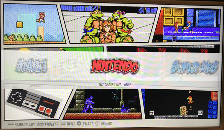
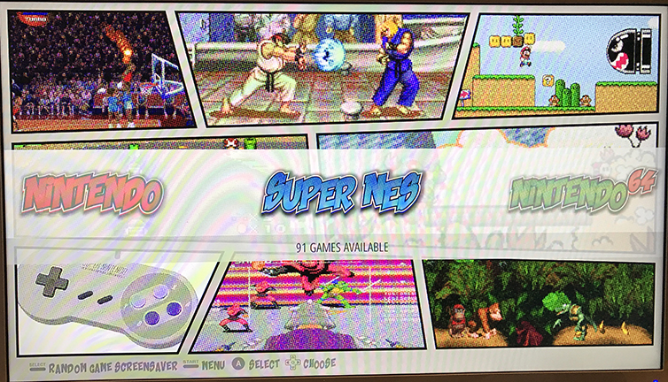
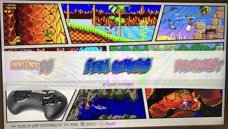
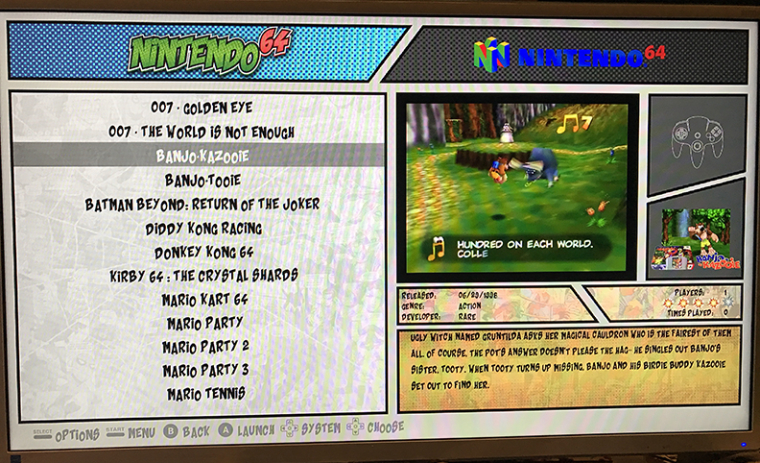
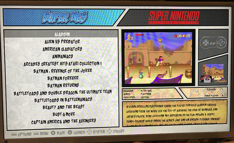
Over the last week I have reworked the 4:3 theme for my arcade machine build to a 16:9 format for standard HDTV use. I had to make some adjustments to the graphics/layout on the system selection screens to accommodate the new aspect ratio. I am partial to my original images and layouts, but the new 16:9 layouts look nice as well. The exciting update happens in the detail view pages! The new 16:9 format allowed me to make some adjustments to the video preview location and I really like how this looks. For the time being I have my USX scraped images in the smaller box to the right of the video preview. Unfortunately all my image scrapes are compilation views and I am placing the "md_image" in that area. If and when i get the time, I think what i would rather do is get either the game logo/spin wheel art, or the game box and put it in that space. My plan is to go get the art for each game and add it to my game list under "thumbnail" then i can place "md_thumbnail" instead of image and have a larger art/logo in that box. It will look slick, but I don't have the time to manually go get that art and enter it into my .xml right now. Still haven't heard anythig from @FlavioBello11 or @lipebello regarding their thoughts on my sharing the theme. I think that I will try to upload to github next week sometime when i get the chance. Here are some photos (From my phone, sorry) and a link to a video of the theme in action. I have tested it on a 55" 4k and it looks awesome at that scale!
-
@TMNTturtlguy this theme is awesome I can't wait till it is released
-
@TMNTturtlguy Love It!! 😊
-
Great effort, looks really good.
-
I really want this theme . is it complete and available yet?
-
@fatelvis1 thanks! I am out of town this weekend but plan to post to github next week. I have the 16:9 version completed for the systems shown on the video. I will have more information on the theme when i post, as the theme does not have maxSize incorporated yet, and a few other things. More to come in a few days! Thanks for the kind words
-
@TMNTturtlguy This looks fantastic.
I'll certainly at least install it to take a look. I think there are a few systems I'm missing there, but one step at a time :)
Well done!
-
@pjft shoot me a list of systems you need and I will start a log and work on them as i get time. The one issue this theme does face is that each system has its own background image. The more systems you run, the slower the transitions from theme to theme are, and if running on the older ES build with screensaver, the theme can suffer from the white screen of death when to many systems are loaded. I can run the current systems shown with a VRAM setting of 120 on the screensaver build with not issues. I intend to build an alternate image with the up to date main ES build so i can run them side by side and make adjustments including maxSize, i believe the newer updated help elieviate the white screen issues. All I need is time!
Contributions to the project are always appreciated, so if you would like to support us with a donation you can do so here.
Hosting provided by Mythic-Beasts. See the Hosting Information page for more information.