PS1 theme
-
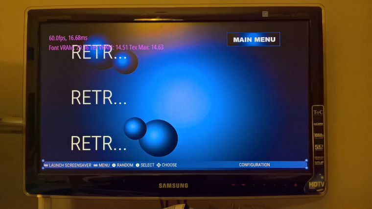
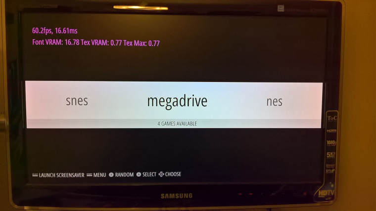
@lostless i like this. However i think it should be 3 games like your latest pick, but i think the games should be much closer together, closer to how your first pick is. I would use this on my pi-station.
-
@lostless i also like that you changed the nintendo logo to the white font. You could name super nintendo to super nes if you want to shorten the name since that name is stupid long.
-
I believe there's a pack around the forums for Windows, with a theme starter kit as well, but I don't recall the exact name for it. I think @mattrixk could know, though?
@lostless: It's called the ES Toolkit. I made it to help people who wanted to make their own themes, but didn't know where to start.
You're probably best off starting with the v1.1 Release put together by @herb_fargus. You just need to download the .zip and extract it where ever you want, then double click on one of the
Launch ES.batfiles and you're off and racing.You can also follow the Tutorial in the RetroPie documentation. It's a bit out of date as it doesn't cover the newer stuff like Custom Carousels and Video Previews, but it should be enough to get you started. I might get some time to update it soon, but considering it took me months to write in the first place, it may take a while.
-
Ok, I think I figured out this theming. Got it down by just using XML. Its all just percents for positions. So heres my final post on this until i finish it.
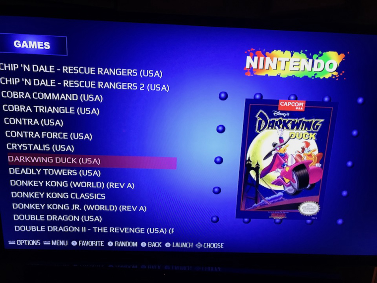
Heres an example of the game list

I like the simplicity of the lack of meta data. Just the game name and its artwork. I may go back later on (or let someone else do it) and make a version that adds meta data for those who like it. But no guarantee. But this is the final product as I envisioned it yesterday. Feedback welcome. -
@lostless I think it looks quite elegant. Are you considering adding video support?
-
@lostless i like simplicity. I dont even have a single image or any metadata scraped on any of my pies. Plus with the amount of games i have my pi's would probably blow up trying to scrape. I would definitely use this theme on my pi-station.
-
@pjft I haven't put in video support yet. But I can probably put it in easily once I get the main theme up and running
-
@lostless It's not awfully hard to implement, and I imagine that it would help quite a few people move to this theme.
Well done!
-
What about that font on the game list btw ? Nothing wrong with it, but have you been thinking about other fonts ?
-
@dd-indeed I have. Looking to switch to the skinny font used in the memory card menu for the game names for the info on the bottom. Trying to find that font. For the game list I used a font that's supposed to look like a PlayStation font, but doesn't look as good in all caps. It's not bad. Any suggestions?
-
The font could be slighly more blocky, but it could have smoothed edges thou. Currently, that font on the last picture looks perhaps too modern to my eyes at least. So yea, you're on the right tracks.
-
@dd-indeed i don't know if I want more blocky. The ps1 menu fonts were blocky because of the low res. But at the same time the backgrounds looked smooth. So the pixelation look is not exactly what I'm going for as I'm trying to make it what it would look like if the ps1 put out a high def signal. I've found a few skinny fonts online that may work. The font is quite basic, but the original font was just a pixel thin in the ps1. Ill experiment when I get off work.
-
Allright, let's see what you come up then. This project nevertheless is great, because I would wanna have this as my UI as well.
-
All right, I am putting out a test build that only supports, NES, SNES, GENESIS/MEGA DRIVE, GAMEBOY AND GBA. (ironically not PS1 yet, LOL) This is for all of you to try and give feed back. The system select icons are done at a 720P resolution and i m debating if i need to make them 1080P so the text doesn't pixelate. Opinions? These are pain to build to get the look just right.
This theme is also made to work at any resolution, 4:3 or 16:9. NO video support as of yet. Have fun
link here
Removed link bugs oops -
-
@dd-indeed I'll have to check on that. Somwere there's an oops. I'll reupload a new file in a tad after I test
-
I unpacked the package and moved the folder into the Raspi. There was two subfolders, one was named Mac-something and the other one was ps1_beta. I'll delete that Mac-folder first, maybe that's the reason.
-
@dd-indeed you should have put the subfolder on. Not the folder with both folders.
-
Allright, I'll move the main subfolder up in folder structure, next to the other theme folders.
Edit: Got it, now it works:

-
Quick feedback:
The images makes it slow down a bit, when you move between the working console images. But when going into the PS1/PSP/RetroPie icons, they move smoothly due the lacking photos and finish. Otherwise, I love it!
Contributions to the project are always appreciated, so if you would like to support us with a donation you can do so here.
Hosting provided by Mythic-Beasts. See the Hosting Information page for more information.
