RetroPie forum home
    • Recent
    • Tags
    • Popular
    • Home
    • Docs
    • Register
    • Login

    [Theme Changes] Attention Theme Makers: Upcoming Game Collections in ES

    Scheduled Pinned Locked Moved Ideas and Development
    themescollectioncustom system
    224 Posts 21 Posters 122.0k Views
    Loading More Posts
    • Oldest to Newest
    • Newest to Oldest
    • Most Votes
    Reply
    • Reply as topic
    Log in to reply
    This topic has been deleted. Only users with topic management privileges can see it.
    • pjftP
      pjft @mediamogul
      last edited by

      @mediamogul Were you per-chance referring to the hearts under the name?

      I believe creating something like the "ghosts" for Carbon would not be ideal, as Carbon is meant to be a low-memory, lightweight theme - hence all backgrounds being the same image.

      Still, wonderful idea for a new theme. :)

      UDb23U 1 Reply Last reply Reply Quote 0
      • UDb23U
        UDb23 @pjft
        last edited by

        @pjft He surely means just the hearts.

        pjftP mediamogulM 2 Replies Last reply Reply Quote 1
        • pjftP
          pjft @UDb23
          last edited by

          @UDb23 Got it.

          Yeah, I'm certainly supportive of something like that - and, keeping with the theme, I love your font work in the other arcade logos and such, so I'm sure whatever you come up with will be great!

          Thanks for the hard work in this :)

          UDb23U 1 Reply Last reply Reply Quote 1
          • UDb23U
            UDb23 @pjft
            last edited by

            @pjft It's not that hard... it's fun ;-)
            Just requires time. That's always the point: finding time. As for any of us I believe.

            1 Reply Last reply Reply Quote 3
            • mediamogulM
              mediamogul Global Moderator @UDb23
              last edited by mediamogul

              @UDb23

              He surely means just the hearts.

              Yeah, I was just referencing the hearts. However, I'm also not suggesting that they be directly copied either. I was just posting them as an example of how the graphical elements could be used to make the basic fonts look more like logos and blend more naturally with the overall look of the theme.

              RetroPie v4.5 • RPi3 Model B • 5.1V 2.5A PSU • 16GB SanDisk microSD • 512GB External Drive

              UDb23U 1 Reply Last reply Reply Quote 0
              • UDb23U
                UDb23 @mediamogul
                last edited by

                @mediamogul No intention to copy at all.
                It's a good idea of adding some small related graphics to the text, thanks.

                mediamogulM 1 Reply Last reply Reply Quote 2
                • ChoccyHobNobC
                  ChoccyHobNob Banned
                  last edited by

                  Cygnus and Eudora-Updated are both ready to go now.

                  0_1499962458411_1.png
                  0_1499962471407_2.png
                  0_1499962484774_3.png
                  0_1499962499547_4.png
                  0_1499962513185_5.png
                  0_1499962530038_6.png

                  1 Reply Last reply Reply Quote 2
                  • mediamogulM
                    mediamogul Global Moderator @UDb23
                    last edited by mediamogul

                    I have the day off and woke up with a little inspiration. I designed these for myself as a stopgap, but in the interest of sharing ideas, I thought I'd also post them here for feedback.

                    alt text

                    alt text

                    alt text

                    RetroPie v4.5 • RPi3 Model B • 5.1V 2.5A PSU • 16GB SanDisk microSD • 512GB External Drive

                    pjftP cyperghostC 2 Replies Last reply Reply Quote 2
                    • pjftP
                      pjft @mediamogul
                      last edited by

                      @mediamogul I love it!

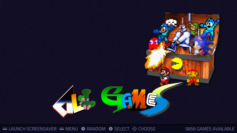
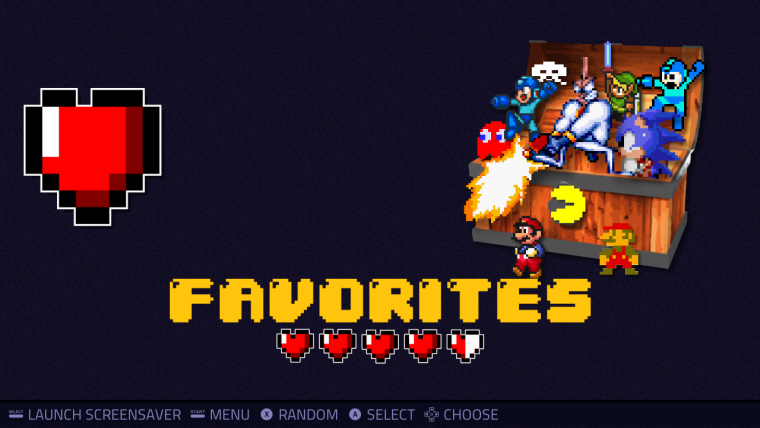
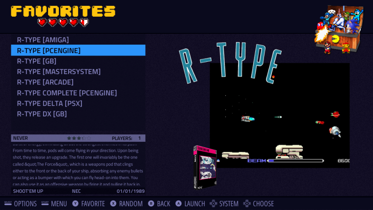
                      The folders look stellar, and the logos also look quite nice, but as I'm used to seeing them in landscape, 16:9, I'm having a hard time comparing to the others :)

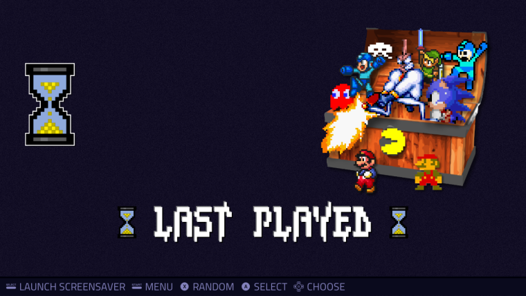
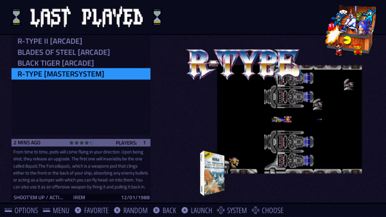
                      The "All Games" and "Favorites" look great, though without more "theme" context, I'm having a hard time figuring out whether the "Last Played" one is just a little too "big" vertically when compared to the rest or if it's just right. That's my only question.

                      mediamogulM 1 Reply Last reply Reply Quote 0
                      • mediamogulM
                        mediamogul Global Moderator @pjft
                        last edited by mediamogul

                        @pjft

                        Context is key. Here they are in their natural habitat...

                        alt text

                        alt text

                        alt text

                        RetroPie v4.5 • RPi3 Model B • 5.1V 2.5A PSU • 16GB SanDisk microSD • 512GB External Drive

                        pjftP 1 Reply Last reply Reply Quote 1
                        • pjftP
                          pjft @mediamogul
                          last edited by

                          @mediamogul Context is key indeed!

                          It still looks slightly "taller" than other logos overall, but it's minor.

                          Looks great - thanks for sharing!

                          mediamogulM 1 Reply Last reply Reply Quote 1
                          • mediamogulM
                            mediamogul Global Moderator @pjft
                            last edited by mediamogul

                            @pjft

                            It still looks slightly "taller" than other logos overall

                            Keep in mind that the logo in front is always enlarged. 'Last Played' is a bit taller than it's neighbors in the picture, but it's still in-line with the larger logos found in Carbon.

                            RetroPie v4.5 • RPi3 Model B • 5.1V 2.5A PSU • 16GB SanDisk microSD • 512GB External Drive

                            pjftP 1 Reply Last reply Reply Quote 1
                            • pjftP
                              pjft @mediamogul
                              last edited by

                              @mediamogul Hah, you are indeed correct! Forgot about that. :)

                              UDb23U 1 Reply Last reply Reply Quote 1
                              • UDb23U
                                UDb23 @pjft
                                last edited by

                                @pjft Found some nice new fonts I believe would fit. As usual will update logos and custom texts over the weekend.

                                pjftP 1 Reply Last reply Reply Quote 2
                                • pjftP
                                  pjft @UDb23
                                  last edited by

                                  @udb23 Looking forward to it! I'm sure we'll have plenty of great options here to update Carbon then :)

                                  Thanks all for the hard work!

                                  UDb23U 1 Reply Last reply Reply Quote 1
                                  • UDb23U
                                    UDb23 @pjft
                                    last edited by

                                    @pjft "controller" and Text icons for Carbon finalized (download here).

                                    "Controllers" now all line art as requested (no fills); added one alternative "controller" for "custom collections.
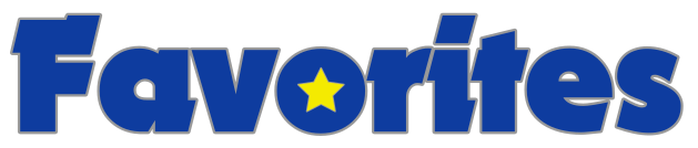
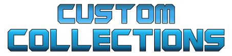
                                    Added new "custom collection" and "Favorites" texts.
                                    0_1500216824503_fav txt.PNG

                                    0_1500216834368_coll txt.JPG
                                    (size should fit properly when in ES)

                                    Can you test them and give me your feedback ?
                                    Thanks.

                                    mediamogulM pjftP 2 Replies Last reply Reply Quote 1
                                    • mediamogulM
                                      mediamogul Global Moderator @UDb23
                                      last edited by

                                      @udb23

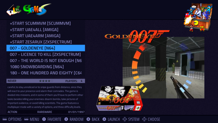
                                      One thought off hand is that 'Custom Collections' is really close to the AdvanceMAME artwork currently in Carbon as seen below.

                                      alt text

                                      What about something that would evoke the notion of custom creation? There are probably more than a few solutions there, but one example would be an architect drafting font like the one below.

                                      alt text

                                      RetroPie v4.5 • RPi3 Model B • 5.1V 2.5A PSU • 16GB SanDisk microSD • 512GB External Drive

                                      UDb23U 1 Reply Last reply Reply Quote 0
                                      • pjftP
                                        pjft @UDb23
                                        last edited by

                                        @udb23 thanks. I'll test them during the week, as I am unable to do so today. Thank you!

                                        A thought on the naming of custom collections: that's actually mostly the internal name for it. It can end up being called that in the theme of you'd like it, but I don't object it having a more user-friendly name like "my collections", "game collections" or something.

                                        Maybe I should stop naming things as that's clearly not my forte :p

                                        Thank you!

                                        1 Reply Last reply Reply Quote 0
                                        • UDb23U
                                          UDb23 @mediamogul
                                          last edited by

                                          @mediamogul @pjft mmm...
                                          ok let me think how I can get it right for both your comments...

                                          btw: I referred to "Guardians of the galaxy" for font and colors for "collections".
                                          Maybe different colors (metal like) could be enough and "My collections" as text ?

                                          mediamogulM 1 Reply Last reply Reply Quote 0
                                          • mediamogulM
                                            mediamogul Global Moderator @UDb23
                                            last edited by

                                            @udb23

                                            Maybe different colors (metal like) could be enough and "My collections" as text ?

                                            I think a change in colors would help to delineate the two logos nicely and metal seems like a great choice. As for naming conventions, it might be more cohesive to use 'Collections' rather than 'My Collections', due to the convention already existing for 'Favorites' rather than 'My Favorites'.

                                            RetroPie v4.5 • RPi3 Model B • 5.1V 2.5A PSU • 16GB SanDisk microSD • 512GB External Drive

                                            pjftP 1 Reply Last reply Reply Quote 0
                                            • First post
                                              Last post

                                            Contributions to the project are always appreciated, so if you would like to support us with a donation you can do so here.

                                            Hosting provided by Mythic-Beasts. See the Hosting Information page for more information.