RetroPie forum home
    • Recent
    • Tags
    • Popular
    • Home
    • Docs
    • Register
    • Login

    PS1 theme

    Scheduled Pinned Locked Moved Ideas and Development
    ps1theme
    87 Posts 6 Posters 34.9k Views
    Loading More Posts
    • Oldest to Newest
    • Newest to Oldest
    • Most Votes
    Reply
    • Reply as topic
    Log in to reply
    This topic has been deleted. Only users with topic management privileges can see it.
    • DD-IndeedD
      DD-Indeed
      last edited by

      Quick feedback:

      The images makes it slow down a bit, when you move between the working console images. But when going into the PS1/PSP/RetroPie icons, they move smoothly due the lacking photos and finish. Otherwise, I love it!

      My soul rests, when I hear the PS1 boot music

      lostlessL 1 Reply Last reply Reply Quote 0
      • edmaul69E
        edmaul69 @lostless
        last edited by

        @lostless looks good so far. Still could use some more systems of course. I only need the splash logos myself. I am going to remove the consoles to use on mine. I really prefer the simplicity with no photos. Thanks for making this sweet theme. Cant wait for more.

        1 Reply Last reply Reply Quote 0
        • lostlessL
          lostless @DD-Indeed
          last edited by

          @dd-indeed I've only tested on a pi3 and noticed no slow down. What are you using?

          DD-IndeedD 1 Reply Last reply Reply Quote 0
          • DD-IndeedD
            DD-Indeed @lostless
            last edited by DD-Indeed

            @lostless

            Pi3 too. But, it seems that the carousel-effect does that. I now disabled it and it's much more smoother. But with carousel, it looks even better. I lifted up the RAM limit for EmulationStation up to 300 MB, but that didn't do any difference.

            My soul rests, when I hear the PS1 boot music

            lostlessL 1 Reply Last reply Reply Quote 0
            • lostlessL
              lostless @DD-Indeed
              last edited by

              @dd-indeed I've seen slowdowns other themes with a lot of separate assets. To make mine work at different resolutions and ratios, I had to separate out all the different elements and not just make them all part of the backeound image.

              DD-IndeedD 1 Reply Last reply Reply Quote 0
              • DD-IndeedD
                DD-Indeed @lostless
                last edited by DD-Indeed

                @lostless

                Okay, cool. I'm not worried about it, it's great theme, just what I had wanted. And this is still in beta nevertheless, so surely you will optimize and polish it more.

                Edit: Btw, when we were talking about the fonts, I think that this is the true PS1-style font:
                (http://www.dafont.com/zrnic.font)

                My soul rests, when I hear the PS1 boot music

                lostlessL 1 Reply Last reply Reply Quote 0
                • lostlessL
                  lostless @DD-Indeed
                  last edited by lostless

                  @dd-indeed lol that's the font I originally used that someone said that looked too modern.

                  DD-IndeedD 1 Reply Last reply Reply Quote 0
                  • DD-IndeedD
                    DD-Indeed @lostless
                    last edited by

                    @lostless

                    For real haha ? They used the same font on PS2 stuff, so maybe that's why some people think it as too modern. But it's up to you, I like the looks nevertheless, but of course, I wanna help you to polish this into something it truly should be. You could create some variations of the theme with different fonts, if that's not too much asked.

                    My soul rests, when I hear the PS1 boot music

                    lostlessL 1 Reply Last reply Reply Quote 0
                    • lostlessL
                      lostless @DD-Indeed
                      last edited by

                      @dd-indeed 0_1500241018729_IMG_0727.JPG
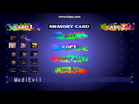
                      Look at this and the only 2 fonts. I'm trying to recreate this as close as possible. The thin plain font for the game name and the big bold for the paint splatters. If you want to add your own font, by all means make it your own.

                      DD-IndeedD 1 Reply Last reply Reply Quote 0
                      • DD-IndeedD
                        DD-Indeed @lostless
                        last edited by

                        @lostless

                        Aah, so you wanna use that bold font for the consoles and that thin font for the game lists?

                        My soul rests, when I hear the PS1 boot music

                        lostlessL 1 Reply Last reply Reply Quote 1
                        • lostlessL
                          lostless @DD-Indeed
                          last edited by

                          @dd-indeed that's the plan to make it close to the original as possible.

                          DD-IndeedD 1 Reply Last reply Reply Quote 0
                          • DD-IndeedD
                            DD-Indeed @lostless
                            last edited by DD-Indeed

                            @lostless

                            Okay, now that you explained it, go ahead. The bold font for the consoles is the right one, but as you propably also know, the thin font for the gamelists is not correct yet. The one on the original console is very narrow font, when you look other images of that memory card manager menu.

                            alt text

                            A-letter and 1-letter are narrow ones especially.

                            My soul rests, when I hear the PS1 boot music

                            lostlessL 1 Reply Last reply Reply Quote 0
                            • lostlessL
                              lostless @DD-Indeed
                              last edited by lostless

                              @dd-indeed I'm going to put it in the close enough category unless someone wants to find it. Unless theres a way to make a font more condensed.

                              DD-IndeedD 1 Reply Last reply Reply Quote 0
                              • DD-IndeedD
                                DD-Indeed @lostless
                                last edited by DD-Indeed

                                @lostless said in PS1 theme:

                                @dd-indeed I'm going to put it in the close enough category unless someone wants to find it. Unless theres a way to make a font more condensed.

                                I have too much time haha:

                                Attentica 4F Font

                                It's free to use and it's the closest I could find. Some minor differences can be found, when comparing this last image to the example list of the font. Like the middle line on E-letter and the circular shape of the R-top. I keep looking for another options.

                                My soul rests, when I hear the PS1 boot music

                                lostlessL 1 Reply Last reply Reply Quote 0
                                • lostlessL
                                  lostless @DD-Indeed
                                  last edited by

                                  @dd-indeed Im torn. But the new font is WAY to condensed. Its actually skinnier (its thinness is fine) than the original font from the main menu and the numbers dont look right. decisions decision. Roboto condensed, the one I'm using now, is still closer in my opinion all around.

                                  DD-IndeedD 1 Reply Last reply Reply Quote 0
                                  • DD-IndeedD
                                    DD-Indeed @lostless
                                    last edited by DD-Indeed

                                    @lostless

                                    Hmm, tricky indeed. I know, that the one you use now on it is close and pretty much the correct shape, except for the width of it. You couldn't find that font in more narrow form ?

                                    My soul rests, when I hear the PS1 boot music

                                    lostlessL 1 Reply Last reply Reply Quote 0
                                    • lostlessL
                                      lostless @DD-Indeed
                                      last edited by

                                      @dd-indeed Thats the narrowest of that font. the original is wider

                                      DD-IndeedD 1 Reply Last reply Reply Quote 0
                                      • DD-IndeedD
                                        DD-Indeed @lostless
                                        last edited by

                                        @lostless

                                        Well keep it like it is, it's fine. It's smoother, than the other front, but I'm sure that was your intention as well.

                                        My soul rests, when I hear the PS1 boot music

                                        lostlessL 1 Reply Last reply Reply Quote 0
                                        • lostlessL
                                          lostless @DD-Indeed
                                          last edited by

                                          Slowly working on the carousel icons right now. These thing are a such a pain to make. Why do i do this to myself?

                                          1 Reply Last reply Reply Quote 0
                                          • lostlessL
                                            lostless
                                            last edited by

                                            It's beginning to look like a real theme. I should have it completed for most systems in a week or 2. Going to do the basics and then maybe the odds and ends.
                                            0_1500259303161_IMG_0733.jpg

                                            edmaul69E 1 Reply Last reply Reply Quote 2
                                            • First post
                                              Last post

                                            Contributions to the project are always appreciated, so if you would like to support us with a donation you can do so here.

                                            Hosting provided by Mythic-Beasts. See the Hosting Information page for more information.