Long standing ES bugs
-
@ruckage I think I have the scaling issue fixed. I need to clean up the code some and I will get a build for you to test.
-
@jdrassa
That's great :). I'd be happy to test it. -
Fixes are ready for testing.
I tested it against all of themes that are currently installable through RetroPie-Setup. There are a few that have the side effect of the last entry being cut off slightly. Before I submit this I plan to go through and submit the necessary fixes for those themes.
Code is here:
https://github.com/jrassa/EmulationStation/tree/gamelist-fixesWindows build can be downloaded here:
https://ci.appveyor.com/api/buildjobs/yolhkm014epxeqpk/artifacts/EmulationStation-Win32.zip -
@jdrassa
Fantastic, I'm downloading it now to test, I'll let you know how it goes. I'm expecting my themes to break due to the font hack I'm currently using but that should be an easy fix (just a font change). -
@jdrassa
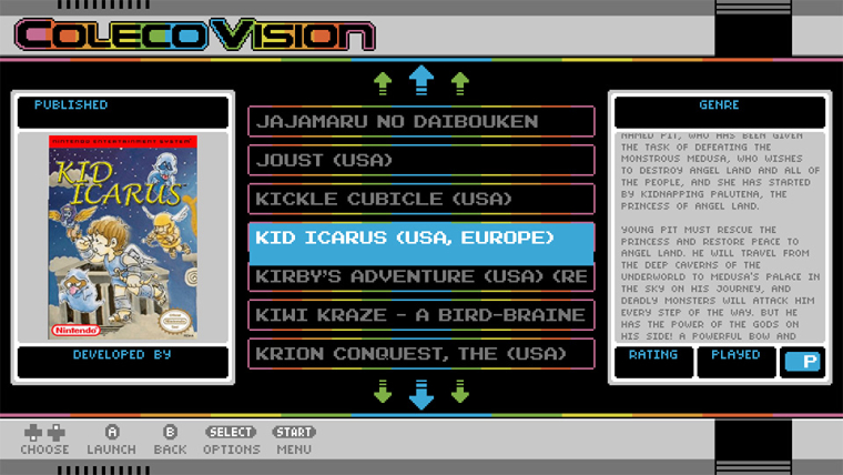
Sadly seems to have broken my theme. The text now lines up and is spaced exactly as you would expect based on what's in the xml so that's good but the selector bar itself is huge. I've attached a screenshot, before the selector bar would fit within the boxes in the background but now it's much higher than the text and overhangs by a huge margin.
-
@ruckage Complete tangent on this topic, but your theme looks really good!
-
@ruckage I saw that same behavior. I believe the issue is with your font. The font you are using appears to have a some empty space below the actual characters. I assumed that this is what you had to do to work around the bugs. You mentioned this above.
@ruckage said in Long standing ES bugs:
I know the line spacing bug fix will definitely break my themes as I modified a font to specifically work around it
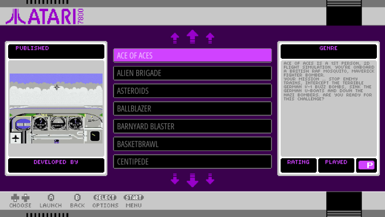
I disabled your custom font and with a little tweaking to the font size and line spacing I got the following.

-
@jdrassa said in Long standing ES bugs:
@ruckage I saw that same behavior. I believe the issue is with your font. The font you are using appears to have a some empty space below the actual characters. I assumed that this is what you had to do to work around the bugs. You mentioned this above.
@ruckage said in Long standing ES bugs:
I know the line spacing bug fix will definitely break my themes as I modified a font to specifically work around it
I disabled your custom font and with a little tweaking to the font size and line spacing I got the following.

Hi, the original font was shifted down below the baseline to make it line up with the selector bar however the screenshot I posted above was with the unedited font. The fonts were designed in bitfontmaker2 which is an online tool for designing pixel fonts.
Obviously I need that font as my theme relies on keeping that particular look. Previously the selector bar was the correct size with my font, it just didn't line up with if I altered the line spacing. -
@ruckage If you can post a link to the unedited font, I can test it out and see what I can come up with. Currently, the height of the selector bar is 1.5 times the size of the text. This corresponds to the default line spacing. Worst case scenario, I may just need to add an additional theme option to make the selector bar size configurable.
-
@jdrassa said in Long standing ES bugs:
@ruckage If you can post a link to the unedited font, I can test it out and see what I can come up with. Currently, the height of the selector bar is 1.5 times the size of the text. This corresponds to the default line spacing. Worst case scenario, I may just need to add an additional theme option to make the selector bar size configurable.
Thanks. Heres a link to the font : http://www.pentacom.jp/pentacom/bitfontmaker2/gallery/?action=dl&id=2639
I actually think having the ability to define the selector bar height would be a real bonus if you could add it - along with an option to change the 'y offset' so that it's vertical position in relation to the text could be set as well. The more we can edit ourselves the better, gives us more freedom with design options.
-
@ruckage I have added
<selectorScale>and<selectorOffsetY>options to the textlist. Default values are 1.5 and 0. '<selectorOffsetY>' works like size and position where it is a fractional value based on the screen size.Updated Windows build:
https://ci.appveyor.com/api/buildjobs/m089lslea07kxe1i/artifacts/EmulationStation-Win32.zip -
@jdrassa said in Long standing ES bugs:
<selectorOffsetY>
Thanks, those new options work brilliantly - perfect, I love it. It's really nice to have that extra control.
Are the <horizontalMargin> fixes in this build as well? I only ask because when the name scrolls it's still not scrolling enough to show the end of the game name.
Are the scaling fixes in place as well? If so I'll test that next.
Thanks again.
@pjft said in Long standing ES bugs:
@ruckage Complete tangent on this topic, but your theme looks really good!
Sorry for not replying sooner. Thank you, it's really nice to know people like it. It's been far more popular than I expected. It was made for personal use originally and only covered, nes and gameboy but has grown dramatically.
-
@ruckage The build should have had fixes for all 3 of the issues that you called out, but I retested and you are correct that it still wasn't scrolling enough. I have a new build running and will post a link when it is done.
-
@jdrassa
Thanks.
I'll check the scaling next then and give feedback on how that's working. -
@ruckage Here is the updated build.
https://ci.appveyor.com/api/buildjobs/3m688cj649xnp2m4/artifacts/EmulationStation-Win32.zip
-
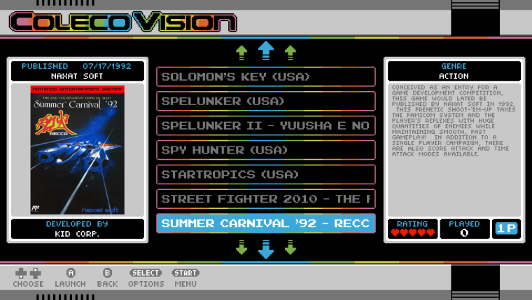
I just tested the scaling between resolutions and it's still off a bit. Below you can see that at 1920x1080 the selector bar text fits the box exactly but at 1280x720 it doesn't quite line up.


-
@ruckage The way I "verified" that I thought scaling was working properly was for each entry to log the y position as a percentage of the gamelist size. I believed it to be working when the percentages were the same regardless of resolution. I did this testing with some more basic themes. I see now that for your theme the percentages were still different. I think the issue is that eventually some rounding is unavoidable as you decrease the resolution.
For example, for your theme.
fontSize = 0.0592592592592593
@ 1080p = 63.999 = 64 pixels
@720p = 42.6666 = 43 pixelsHowever, if you set fontSize = 0.0611111111111111111111
@ 1080p = 66 pixels
@ 720p = 44 pixelsSince no rounding is required, it scales consistently.
So with a little tweaking, I was able to get the y position percentages to match for your theme when switching between 1080p and 720p.
<textlist name="gamelist">
			<forceUppercase>0</forceUppercase>
			<scrollSound>./sounds/se_sys_cursor.wav</scrollSound>
			<fontPath>./art/NESCyrillic_gamelist.ttf</fontPath>
			<pos>0.2958333333333333 0.225</pos>
			<size>0.4083333333333333 0.55</size>
			<alignment>left</alignment>
			<horizontalMargin>0.0083333333333333</horizontalMargin>
			<fontSize>0.0611111111111111111</fontSize>
			<lineSpacing>1.3</lineSpacing>
		</textlist>
Now I am not suggesting that you have to make these changes, since obviously they would require you to redo all of the background images for your theme. These numbers are just meant to illustrate the issue. I think that the changes I have made may be the best we can achieve.
-
@jdrassa
Thanks for the explanation, I completely understand. I do have very precise fontsizes in this as I was was very keen to make sure all the pixels that make up my theme were exactly the same size (most people probably wouldn't notice but I'd know ;)). Regardless, the scaling fix you've made is still a vast improvement over how it was before and along with the other changes you've made it will make my life much easier (especially when I make the 4x3 version of this theme).Regarding your last upload, the <horizontalMargin> works perfectly now as far as I can tell.
Thanks again for all your hard work, it is appreciated.
If you wouldn't mind could you let me know when these fixes are officially added to retropie as I can then get a fixed version of my theme uploaded. -
@ruckage Posting here since it will be included with these fixes. I implemented image support for the the selector bar in the gamelist.
I have implemented two additional theme options.
<selectorImagePath>allows you to set the path to the image.<selectorImageTile>allows you to specify if the image should be tiled. The image size is automatically set to the same size as selector bar. In addition,<selectorColor>will be applied to the image.Any feedback/suggestions is welcomed.
Code is available here for anyone that wants to build it themselves.
https://github.com/jrassa/EmulationStation/tree/gamelist-fixesWindows build available here:
https://ci.appveyor.com/api/buildjobs/mq89003fj8ai8v36/artifacts/EmulationStation-Win32.zip -
@jdrassa said in Long standing ES bugs:
@ruckage Posting here since it will be included with these fixes. I implemented image support for the the selector bar in the gamelist.
I have implemented two additional theme options.
<selectorImagePath>allows you to set the path to the image.<selectorImageTile>allows you to specify if the image should be tiled. The image size is automatically set to the same size as selector bar. In addition,<selectorColor>will be applied to the image.Any feedback/suggestions is welcomed.
Code is available here for anyone that wants to build it themselves.
https://github.com/jrassa/EmulationStation/tree/gamelist-fixesWindows build available here:
https://ci.appveyor.com/api/buildjobs/mq89003fj8ai8v36/artifacts/EmulationStation-Win32.zipAnd after all my hard work using overlays to theme the selector bar...... ;)
I'll test this out shortly but I'm sure it's going to be great. It will open up even more options to make unique looking themes.
Contributions to the project are always appreciated, so if you would like to support us with a donation you can do so here.
Hosting provided by Mythic-Beasts. See the Hosting Information page for more information.