Odd behavior with transparent backgrounds
-
Hello,
Not sure if anyone else has noticed but there seems to be some issues using transparent background images in Emulationstation. It looks like the system view is visible behind the background image:
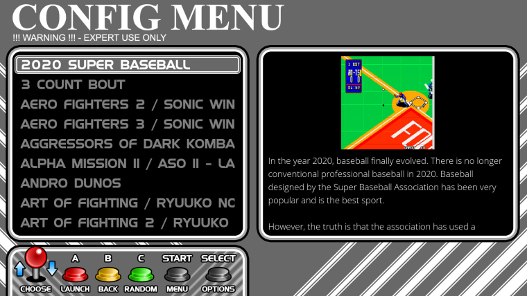
Here is how my theme should look:

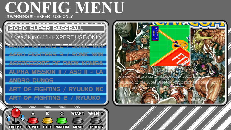
But this is how it actually looks:

You can see the system view through the transparent areas of the image. I realise the transparent areas aren't necessary for this particular sytem but I'm using it to overlay screenshots etc. on other systems to give them rounded corners.
My workaround is to draw an entirely black image behind the backgound so that the system view is hidden, however on the pi it takes a while to load all the images when you exit out of a game so it looks like a garbled mess as each element is loaded one by one and the system view is visible behind everything while this is happening.
-
@ruckage i'll try and take a look at it later today. I think it may have an idea what the cause is. As a test could you try switching the carousel to horizontal and see if you still have the issue?
-
@jdrassa said in Odd behavior with transparent backgrounds:
@ruckage i'll try and take a look at it later today. I think it may have an idea what the cause is. As a test could you try switching the carousel to horizontal and see if you still have the issue?
Thanks. I just changed the carousel to horizontal and it does indeed fix the issue.
-
Here is some detail on what is happening. Currently, when you use a horizontal carousel everything is rendered as show below. GL# represents the game list views, SV the system view, and EX# the extras that are rendered for the slide animation of the system view.
[EX1][EX2][EX3][SV ][EX5][EX6][EX7]
[GL1][GL2][GL3][GL4][GL5][GL6][GL7]
When switching to a vertical carousel, the extras are now rendered vertically with regard to the system view.
[EX1]
[EX2]
[SV ]
[EX3]
[EX4]
So the question now is what is the best way to fix it. My first thought was to just have the gamelists rendered a black rectangle. This is essentially what you tried to do on your own, but since its not an image I think it may work better/faster. This works, but I think you may still be able to see a bit of the extra during the slide transition. This may appear worse than it really is since I have been testing this by simply disabling the background image for the gamelist view.
The second option would be to change the layout of the rendering to prevent the overlap. This would be a bigger effort and would have the side effect of having the slide transition between system view and gamelist view to become a horizontal slide when using using a vertical carousel.
-
@jdrassa
Thanks for the explanation.I think your second option sounds perfect as it would mirror the behaviour of the horizontal carousel (which slides vertically when moving from system view to gamelist).
However I do understand if this would be too big of job to implement so any fix you decide to use would be greatly appreciated.Thanks for your help.
-
I see.
So, effectively, what's happening is that the gamelist is overlapping with the extras in the system view, because they're both positioned "under" the current system view, is that it?
The second option is definitely one to consider. However, if now the gamelists are "to the right" of the system view, one would expect that moving between different systems' gamelists would also happen via "up" and "down".
[EX1]  [GL1]
[EX2]  [GL2]
[SV ]  [GL3]
[EX3]  [GL4]
[EX4]  [GL5]
However, that can't be the case as up and down are used to navigate the actual games list. :) And pressing left and right but seeing a vertical animation... I'm not sure. I'd need to see it to make an informed comment on that.
A question on a hybrid approach: could we not avoid rendering the system view extras when on the gamelist view? Would that solve the issue?
-
-
@ruckage Yeah, I mean, it should certainly be able to be stopped from what I recall, and it would/could have the added benefit of increasing performance, though I'm not sure if it'd be in any meaningful way.
The main reason we render those neighboring views is for pre-caching purposes and navigation smoothness, but as I'm thinking about it, when in the gamelist view we likely only need to pre-cache the respective system view and the neighboring gamelists as there shouldn't be any "diagonal" camera movements -- unless I'm missing something @jdrassa ?
Of course, I don't know enough about the carousel implementation, so whatever I'm thinking of here may not be applicable.
-
I did briefly explore the idea of disabling the rendering of the system view. The problem is the slide transition. While transitioning, there is a small window of time where you need to render the gamelist and the system view. I didn't think about disabling the extras for the non-selected systems. That is another option to look at.
Contributions to the project are always appreciated, so if you would like to support us with a donation you can do so here.
Hosting provided by Mythic-Beasts. See the Hosting Information page for more information.