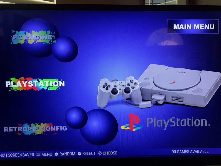
PS1 theme
-
Okay, cool. I'm not worried about it, it's great theme, just what I had wanted. And this is still in beta nevertheless, so surely you will optimize and polish it more.
Edit: Btw, when we were talking about the fonts, I think that this is the true PS1-style font:
(http://www.dafont.com/zrnic.font) -
@dd-indeed lol that's the font I originally used that someone said that looked too modern.
-
For real haha ? They used the same font on PS2 stuff, so maybe that's why some people think it as too modern. But it's up to you, I like the looks nevertheless, but of course, I wanna help you to polish this into something it truly should be. You could create some variations of the theme with different fonts, if that's not too much asked.
-
@dd-indeed

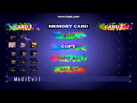
Look at this and the only 2 fonts. I'm trying to recreate this as close as possible. The thin plain font for the game name and the big bold for the paint splatters. If you want to add your own font, by all means make it your own. -
Aah, so you wanna use that bold font for the consoles and that thin font for the game lists?
-
@dd-indeed that's the plan to make it close to the original as possible.
-
Okay, now that you explained it, go ahead. The bold font for the consoles is the right one, but as you propably also know, the thin font for the gamelists is not correct yet. The one on the original console is very narrow font, when you look other images of that memory card manager menu.

A-letter and 1-letter are narrow ones especially.
-
@dd-indeed I'm going to put it in the close enough category unless someone wants to find it. Unless theres a way to make a font more condensed.
-
@dd-indeed I'm going to put it in the close enough category unless someone wants to find it. Unless theres a way to make a font more condensed.
I have too much time haha:
It's free to use and it's the closest I could find. Some minor differences can be found, when comparing this last image to the example list of the font. Like the middle line on E-letter and the circular shape of the R-top. I keep looking for another options.
-
@dd-indeed Im torn. But the new font is WAY to condensed. Its actually skinnier (its thinness is fine) than the original font from the main menu and the numbers dont look right. decisions decision. Roboto condensed, the one I'm using now, is still closer in my opinion all around.
-
Hmm, tricky indeed. I know, that the one you use now on it is close and pretty much the correct shape, except for the width of it. You couldn't find that font in more narrow form ?
-
@dd-indeed Thats the narrowest of that font. the original is wider
-
Well keep it like it is, it's fine. It's smoother, than the other front, but I'm sure that was your intention as well.
-
Slowly working on the carousel icons right now. These thing are a such a pain to make. Why do i do this to myself?
-
It's beginning to look like a real theme. I should have it completed for most systems in a week or 2. Going to do the basics and then maybe the odds and ends.

-
@lostless i cant wait to see more systems added. I really want this as my main pi station theme. Great work. Love it.
-
@edmaul69 what system do you need for your pistation and I will prioritize those to get you up and running. Basically do you have anything odd like zx spectrum or whatever. Im starting with game consoles and handhelds first an moving on from there. I have about 9 left for me.
-
@lostless thank you for this. I dont even need the system pics if you get the splatter logos first i am ok with that. So on my pi station i dont have most of all the weird systems. Those are all on my apple pi iie. Only retroarch systems are used on this pi. So here is my list. Again thank you.
Atari 2600
Atari 7800
Atari lynx
Capcom
Gameboy
Gameboy color
Gameboy advance
Genesis
Mame
Master system
Msx
Nes
Neo geo
Neo geo pocket
Sega 32x
Sega cd
Sg-1000
Super nintendo
Turbografx-16
Turbografx cd
Supergrafx
Psp
playstation
Virtual boy
Wonderswan -
You should do that list of consoles, what ed wrote. If someone would need some other systems, you car create a custom package for him by request, because usually it's only a couple that you have to add more.
But about the console images, is it too much asked to have the PAL-versions of them on the images, or the ones the people have actually seen ? I noticed, that you used the US version of SNES on the picture, which I didn't have, as I live in PAL-region. Also, I didn't play with that original MegaDrive/Genesis back in the day, I remember playing with the Model 2-one.
-
@dd-indeed I can make a PAL folder and call snespal or something. All you would have to do is rename the folder to snes and delete or rename the other one.
Contributions to the project are always appreciated, so if you would like to support us with a donation you can do so here.
Hosting provided by Mythic-Beasts. See the Hosting Information page for more information.