[Theme] Art Book
-
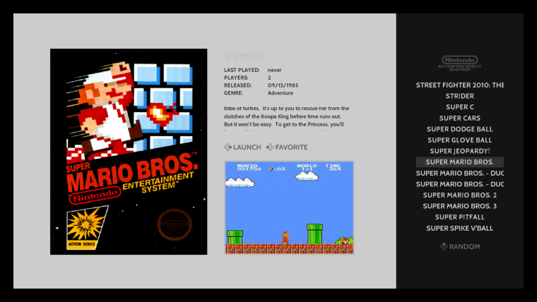
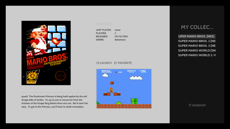
@alphatoanant I noticed when I was testing the Game Collections feature that the video gamelist looks different for the Collections than it does on the normal NES, SNES system pages.
Are you using the new DEFAULT theme feature? It would be awesome if unthemed systems look the same as your theme systems, minus the logo of the system of course. Is this possible?
https://github.com/RetroPie/RetroPie-Setup/wiki/EmulationStation-Advanced-Theming
NES Themed

Collection Un-themed

-
Is possible put a screenshot instead of a video?
-
@hurricanefan I am not sure if the recent, all, favs, custom-col systems support the fallback to a specific system theme on a game by game basis (as you scroll). Thinking about it now it would be awesome; but not sure if it works that way. I'll run the idea/question by @pjft in his thread. Thank you for helping test!
@JuL1Xxx One thing I could do is add in the marquee tag to display behind the video on view views. With that setup the marquee(screenshot) would show for any game that doesn't have a video scraped. That said you would need to make sure you scrape screenshots for the marquee tag. There might be other workarounds but thats the first thing that comes to mind. I will play around with it.
@herb_fargus for sure I need to think about that. A quick and dirty way would be to make a separate version made specifically for scraping screenshots =). For now I made the default the square layout (which doesn't help for systems I setup for portrait and landscape view). More to think about.
Also starting to look at Arcade/MAME/FBA in earnest. I am not totally happy with the look for those so far and need to spend more time with the different scrapers and what type of artwork they can pull in. My preference for an "art book" style would be flyers but I don't know of a non-command line way to make that the default with any of the major scrapers. Onward to research...
-
Hey, just downloaded the theme from GitHub, transferred it over...and I'm getting no graphics whatsoever! Just the default "theme didn't work" setup...you know the one, all white, simple black text...what happened?
-
@kampfverein checking it now. Can you let me know are you on the latest version of retropie/es (e.g. updated through the setup script)?
-
@alphatoanant Ah, that did it! It's a fresh install, so EmulationStation wasn't updated. Sorry! Thanks for your hard work.
-
@kampfverein all good! I tried adding some backwards compatibility checks but still working on it. Glad the update to ES worked well. Please let me know if you find anything else.
-
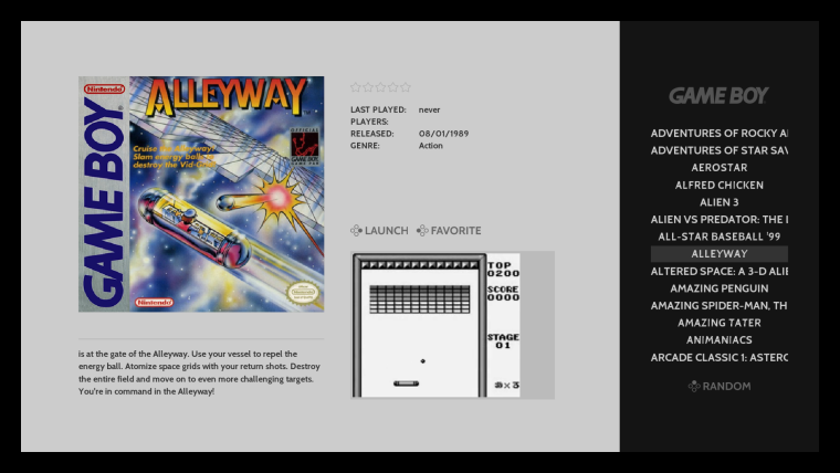
@alphatoanant Where did you get your gb videos? Mine don't use the whole gray box apparently.

-
For the videos, you may want to use "size" rather than maxSize, to force them to adhere to a specific region and stretch if needed - such as the case here in the GameBoy theme.
An alternative is to center the elements (rather than align them to the top/left) and perhaps use a fake image in the background to delineate the region, with a dark-grey background, kind of like letterbox, in case some artwork isn't exactly the size you expect. I can imagine for Arcade at least that that may be a problem with different resolutions and such.
I'll reply to your comment in the other thread - haven't had the time to actually draft a proper response :)
Thanks!
-
Thank you @pjft, great advice. Will look at that this evening (likely will go with origin changes so I can keep maxSize for proper scaling to keep things like arcade looking good). Regarding my comment in the other thread, not urgent at all - I know you are busy.
@HurricaneFan, I am using videos from emumovies.com. That said i'll plan to update how I have origin set that should help to center videos that arent' 320 width. Should be able to do that tonight.
-
@alphatoanant Hmmm, I used videos from that site too. Wonder why mine look so much smaller than your screenshot.
-
Ok, so a few more comments here then :)
First of all, this is an extremely elegant theme. I wholeheartedly love it, and plan on using it in a build I have, for sure! Thanks for putting it together :)
The main 4 systems I'm personally missing are:
- Daphne
- Dreamcast
- Game and Watch
- PC
but I believe they are in your backlog, so all in due time :)
A few comments on the sizes then:
- Indeed what I was suggesting you to do for the images is actually what you're already doing for the videos! My videos show centered (though only with OMX Player -- with VLC they show exactly like @HurricaneFan 's ones... weird). Your GB videos probably show centered as it seems you actually have the black borders as part of the videos - at least in your screenshot there are black borders around the videos, which I don't have. But your "grey" background box does exactly what I expected, and my video shows centered.
- For images, then, definitely centering them and using a similar grey box to delineate the expected area might help, for systems whose boxes or images aren't always the same size. And you could have the same 3-5px border surrounding them, should they have the exact size you expect them to :) For instance, in the arcade system right now, since I have screenshots as images, the images show aligned to the top, and with a large empty space underneath, which feels suboptimal.
- A question: does maxSize scale an image up, if it's smaller than the maxSize we specify? I know it scales down, but I'm curious.
- For the custom collections/favorites/all/last played, my recommendation is that you follow the same suggestions as the previous two items, and pick a layout that you feel would be the most common across the systems you use. Truth be told, I wonder if the "getting the layout from the system for the game you're showing" would be visually cohesive, as the metadata text would jump around depending on the system, but I get where you were coming from and it would likely be a more elegant overall experience. Alas, in ES, the hierarchy (in simplistic terms) is:
- Each system has a theme
- Each system has a view
- The view gets themed with the system's view, and is populated with the games from the system
What you are proposing would be quite hacky to implement in the current architecture, because what you'd be requesting is, for each new game selected, to see what system it belongs to and dynamically move things around as needed to reflect... the theme for that particular game's system, given that we are effectively restricted to the current system's view.
It's not that it's not "feasible", but I'm not certain that that is something we want to pursue, given that it'd change the rendering pipeline in a significant manner. At least for the short term.
I am sorry, and I do hope you understand, and I appreciate your detailed explanation over video - it was extremely easy to follow! :)
Hopefully you can design a consistent "generic" layout for these collections that can work reasonably well for all.
Thank you very much for the hard work here!
-
Thank you @pjft & @HurricaneFan here a few more updates over lunch
System theme status
- I organized a quick roadmap to see what I have open to complete: https://docs.google.com/spreadsheets/d/1gzaP0klzaBaE5_oB1_hQwr46qOmQnacSvSU3o-p5Q7U/edit#gid=0
- With this it should hopefully be straightforward to knock the rest out soon. (@pjft I have Daphne, Dreamcast, Game & Watch and PC included as systems to finish)
Video Size and Centering
2 things were going on here-
l had my origin set to "0 0" for videos and because I was using OMX player I didn't notice that they weren't being centered when using VLC (it looks like OMX may auto center the video based on the size provided and VLC does not?).
So over lunch I updated the video origin to be "0.5 0.5" which should fix the VLC use case.
That change is up on Github now
I'll need to check what that does to OMX player when I get home tonight - fingers crossed it works the same there =) -
For the black background - I had simply missed that commit to Github. Its something I had added for my testing but hadn't yet added it to my master branch yet. I fixed that and its up on Github now as well. Essentially its a black box that sits directly behind the video and will show up if the video doesn't span to fit the 320x240 space I have allotted for.
The All Games, Last Played and Favorites Use Case
- Totally understood on this and your explanation makes perfect sense.
- I will work on the default square layout more to clean things up and really like your idea of having say a gray box placeholder that an image can sit centered inside. If the image fills the space thats best case if it doesn't then it still might look clean.
- Considering your arcade screenshot use case I am thinking having the square layout as default would work best for those cases - considering you are running into this on the Arcade system it helps confirm something I was running into last night when working on mame. I would still like to keep the portrait and landscape layouts for systems like nes and snes so I'll continue to tweak.
- Also this point is solid "I wonder if the getting the layout from the system for the game you're showing would be visually cohesive". I was thinking about that this morning and having things jump around on a given view could be odd.
Adding a gray box background behind images
- I mentioned this above but wanted to call it out separately... this is an awesome idea! Thank you. I try out a few options and post back results.
RE: does maxSize scale an image up
- you know I thought it didn't but it looks like it does scale it up.
- I just did a quick test with one of my boxarts and it is definitely sizing it up to the fit the width of the maxSize I set
-
@alphatoanant @pjft maxsize will scale your image up or down to fit the size of the set "restraints" an keep the image in its native aspect ration. If you image is 4 x 8 and you set the <maxsize> to 4 x4 your image will be resized to 2 x 4 so that it fits within the size parameters. It will also do the opposite and scale up if your image is 2 x 2 it will display it as 4 x 4.
-
This looks fantastic, will 100% use this all the time when it comes out. Would love to see all systems supported too.
-
@tundra You can use it right now. Just download it from GitHub.
-
@alphatoanant said in [New Theme] 'Art Book' (WIP):
Considering your arcade screenshot use case I am thinking having the square layout as default would work best for those cases - considering you are running into this on the Arcade system it helps confirm something I was running into last night when working on mame. I would still like to keep the portrait and landscape layouts for systems like nes and snes so I'll continue to tweak.
I'm supportive of that, even though the majority of arcade games may be horizontal - but not necessarily all the same size. Also, some people may have screenshots, others may have flyers or cabinet art, so a square layout may perhaps be the best?
Following that, I wonder if a square layout may also be the best for the All/Custom/Favorites/Recent, as it does seem to be the most generic one.
Or, alternatively, pick the horizontal one and use a black box (inside the picture frame, like you had for the video) to cover the space that's not catered for. Maybe that could also be a good solution for the arcade layout as well, as the SNES horizontal layout you have is glorious.
-
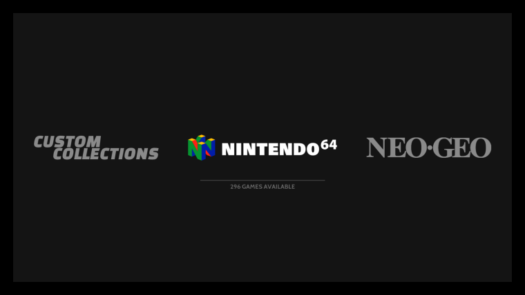
@alphatoanant My N64 logo has color showing up, not sure how thats possible when your GitHub doesn't show color.
Has anyone else had this issue?

-
@hurricanefan happens to me as well. I thought it was a stylistic option but truth be told I also prefer it grey like the other logos. It happens both there and in the gamelist view.
-
Thats really odd - will try to address tonight.
Related - how is the n64 gamelist view looking on your end? (i don't have n64 set up on my test rig yet so I had my fingers crossed it works similar to snes)
Contributions to the project are always appreciated, so if you would like to support us with a donation you can do so here.
Hosting provided by Mythic-Beasts. See the Hosting Information page for more information.