Chicuelo Theme
-
Hi! Thanks for the reply.
Very grateful you decided to share your work with everyone, it's clearly very popular and the images you have created are excellent.At this stage, I may not be too much use on graphics, I used to use Photoshop a long time ago but am a bit out of touch with it these days. If I get time though, I might get it reinstalled and have a look at some of the logos.
Regarding the image sizes, what res are you running and what sizes are your preview images? In the original post I can see the preview images line up perfectly. If you let me have the dimensions of them I might be able to work out if the percentages can be improved in the XML. Certainly capping the maximum horizontal size further might be an idea, otherwise videos in widescreen which are scraped will appear too wide and go off the edge.
For now, I can always submit a PR just for the video improvements while I look into maximum image sizes, as I think some people may benefit from the changes to the video code.
Thanks!
-
Looks nice, is this part of the built-in theme set now? @chicuelo
-
Im using a 1920x1080 resolution, and the game snaps are 550x382 px BUT they are resized to 824x572.
about the logos, they are vector files so you have to use illustrator. If I have time I will modify them to match the proper names and consoles.
I can't test the theme because I only have a pi with some installed systems, and I have a Mac so I can't run retropie on my OS.
but if you succeed with your tests you can send me a preview video or snapshots and we merge the changes!
This is a size template:
-
@ohmycommodore
Yes! you can look on the Emulation Station Themes menu and install, its called Chicuelo and I think its on the bottom list -
Hi there,
Ahhh of course, sorry my brain wasn't in gear - of course the logos are vectors so Illustrator is required. I wasn't thinking! :)
Regarding the sizes, all of the information you provided is very useful indeed (both templates and your snap sizes). Most of my snaps are 800x600 (4:3 aspect) from screenscraper.fr, and videos except PSP are 640x480 (still 4:3), so they are a slightly different aspect to the snaps you are using, but looking at the percentages for maximum image / video sizes I think we can adjust them to make use of the space but cap the horizontal size so images / videos can be no more than 824px wide on a 1920x1080 res. That will stop overshoot from clips captured in widescreen like PSP.
I am quite busy today and tomorrow in the evenings, but will have a play around when I get chance, maybe over lunchtime. Otherwise definitely at the weekend! I'll do a few tests with the sizes, make sure it displays correctly, and then i'll get you to test, and I can raise a PR for it.
Regarding the other systems, if you do create any logos for Gamecube, I can always check these as I have dolphin installed.
Cheers!
-
Wow, I have to admit this theme is simply stunning!!! Blown away by how amazing the visuals are.
Are there plans to add the Famicom Disk System and make it compatible in a later version?Thanks
-
@stephensmattlee
Thanks! It could be possible, I can duplicate the Nes theme and change the original controller to the famicom one -
@chicuelo That would be awesome, many thanks. Not sure what you could use as the main image? Might be wrong but think the Japanese version of Mario Bros 2 was the best selling game for the FDS although maybe an image of Doki Doki Panic in the same style as the other systems might work better?
I'll leave it your capable hands to decideOne small problem I've come across is that when scrolling through the main menu through the systems, the white 'dots' on the far left seem to appear and disappear depending on the console as well as not changing in a set up/down order when flicking through. e.g. Sega 32X has the dots but Sega CD doesn't have any.
Many thanks
-
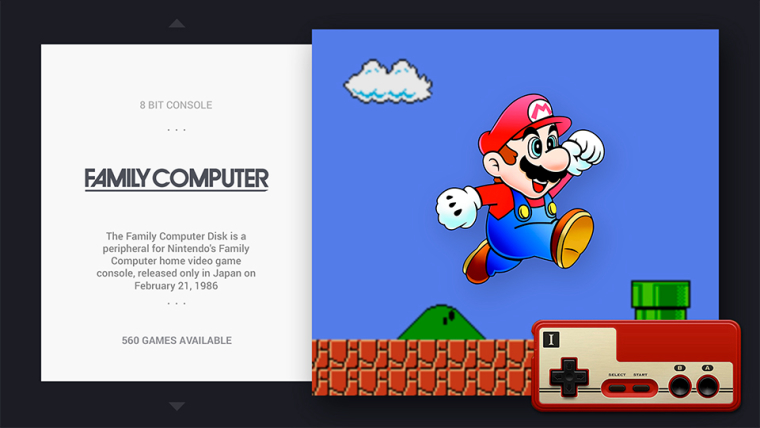
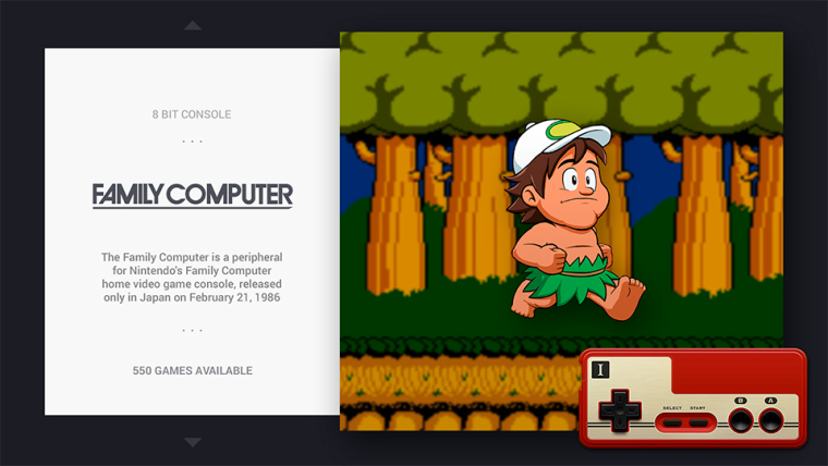
I updated the theme with FDS, the character is still Mario because it was the best game on that console too in my opinion :P , maybe when I have some time I make an alternative image. Adventure island is a great game too.
If you update the theme now you should get a theme like this
The dots are no longer available, they are hidden because its a fake indicator made for my systems so if you uninstall and reinstall the theme you will not see them again.
Thanks
-
@chicuelo looks great! certainly can't complain at more Mario haha, adventure island would definitely make a great alternative image though :)
ah thats cool, I installed the theme through the theme installer directly on retropie and updated but still had the dots showing up on certain systems such as the Sega 32x. I can try and update again and see if it corrects it, if theres still a problem with them showing I'll make a note of them and get back to you
thanks again
-
@stephensmattlee said in Chicuelo Theme:
@chicuelo looks great! certainly can't complain at more Mario haha, adventure island would definitely make a great alternative image though :)
ah thats cool, I installed the theme through the theme installer directly on retropie and updated but still had the dots showing up on certain systems such as the Sega 32x. I can try and update again and see if it corrects it, if theres still a problem with them showing I'll make a note of them and get back to you
thanks again
Please let me know if the dots are still showing, and I will check whats happening, I think if you delete the theme and reinstall you will get the updated XML and it will show up fine
-
Here you are, I found a little bit of time to put this together to demonstrate the changes I made:
Before my changes (original theme.xml):
https://drive.google.com/open?id=1gwtQOxNIg9VBFZNtEaPnvxjnP5Oryd2wAfter changes:
https://drive.google.com/open?id=1-TImtW6jrJhEO31Xeo2gpA-krkYg-r9jChanges noted:
- Move md_image out of video view, so that images no longer remain under a video while playing. Not shown in the above videos as I forgot to provide an example, but it happens unless md_image is moved out of video view :)
- Under video features, change delay to 2, and enable showSnapshotDelay. This means if you have scraped both an image and video for the same game, the image will display first for 2 seconds before fading and playing the video, as shown
- Very slight horizontal re-position of image/video in gamelist view so it is more exactly central within the surrounding space, as shown
- Change maximum size (horizontal and vertical) of md_image and video to stop widescreen videos appearing oversized, causing overshoot (eg. PSP). However the max size on 16:9 still allows for images of 824x572 which is what you mentioned you use. More conventional image sizes (800x600) still appear central but will have slight variable padding either side depending on size. Images below the threshold will be scaled up until one of the maximum size values is met. You can see this on the examples.
Feel free to compare the before/after and let me know what you think. They are only minor improvements of course. If all good I can share the code!
Cheers
-
@movisman
Great man! can you update to the latest version and then apply the changes? I just have updated some files, or if you do prefer, send me the texto to paste in the xml and I place where you told me.
Thanks! -
@stephensmattlee
If you update now you will find some changes
-
Wish the Theme Helper software was on the mac as I'd have a go at creating a theme – obviously not as nice as this one ;) – but I'm sure I'd have fun doing it.
(If anyone doesn't mind me asking does anyone here produce themes on a Apple Mac and with what?)
-
@chicuelo said in Chicuelo Theme:
@stephensmattlee
If you update now you will find some changes
Just did what you suggested and removed the theme and then reinstalled directly through RetroPie. Everything is now running perfectly! All issues I had with the dots on the left side are no longer there plus I noticed your updated FDS image. Looks absolutely amazing!
Only one minor change I might cheekily suggest but it’s up to you, shouldn’t it be called ‘disk system’ as a pose to Family Compurer?
Maybe using this logo?..
Only reason I ask is I believe the Disk System was the addon for the Family Computer (Famicom), much like the sega cd and 32x to the megadrive/Genesis.
Like I said though I’m very happy as it is and certainly wouldn’t complain either way.Thanks again chicuelo :D
-
No worries at all, and thank you for being open about letting me contribute something!
I have made a fork of the very latest theme just now, implemented my changes, and submitted a pull request here:
https://github.com/chicueloarcade/es-theme-Chicuelo/pull/2If you can verify all is ok and merge into your master that would be great! I can then update and test it out.
Thanks!
-
@nevsan
Hi there! I use a mac and I try my themes right on the Pi, very tedious but there is no other choice except installing boot camp and run a windows version with retropie -
@movisman
Its running now! -
@stephensmattlee
I was wondering about using that logo, but sincerely I think the family computer looks nicer and its more simple. I also remember playing with this console on my childhood and It was called simply Family, so I decided to use that one instead the other. Hope you don't mind! If you have ftp access you can replace the svg logo and use the one you prefer!
Contributions to the project are always appreciated, so if you would like to support us with a donation you can do so here.
Hosting provided by Mythic-Beasts. See the Hosting Information page for more information.