Chicuelo Theme
-
@chicuelo Thanks for the advice :) I'll work on the images.
-
@movisman I also understand @chicuelo about the fact that people know more consoles by the "bitness" than the generation. What is 4th generation? I have no idea without looking up Wikipedia.
Although, after the PS1 generation it's harder to tell. For instance, the PS2 generation has been marketed as 128bit consoles, but no 128bit customer-grade processor has ever existed...In the end, maybe just adding the year would be enough? It's probably more telling to people.
-
Hi guys,
Yep agreed with both, it is quite hard to tell what is actually a 4th generation console without checking online for sure, and again what determines a generation is subjective too. I think having the year released is a good idea though, along with the marketed or true "bits" for the console. @chicuelo you have a good point - this is what people are familiar with (including myself!), especially from the 8 / 16 bit era.
After PS1 it does start to get unclear, Dreamcast / GameCube / PS2, they all have "128 bit" components of sorts but not sure what to put them as to be honest. I probably should go with whatever they were marketed to the public as. Maybe I should put any suspicious ones in inverted commas haha!
Cheers
-
I've made some updates according to your guidelines. Can you tell me what you think, before I move on to the other ones?
I changed the "games by genre" tagline with the genre name. I think it fits, but maybe I can find something else? What about a description of the content? The Survivor ; The Adventurer ; The Ninja ; The Gobbler... Things like that.
It might be weird and not match the theme, though, and the genre name is fine. Let me know what you think.
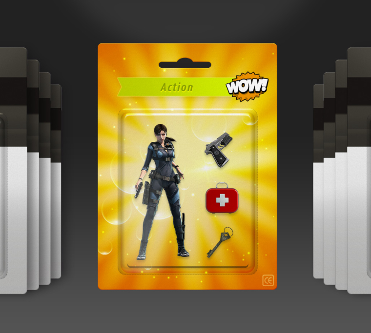
Action has a new "medkit" item instead of the plant
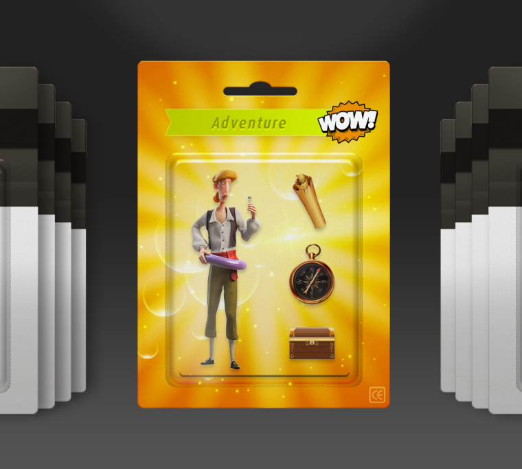
Adventure uses a "front-facing" Guybrush, and items from the image you provided
Beat them up uses the pizza slice you provided, another more "front-facing" turtle and all TMNT items.
It's surprisingly hard to find a good-looking turtle. Most 3D ones come from the movies (the 90's one or the Michael Bay one), and are pretty ugly.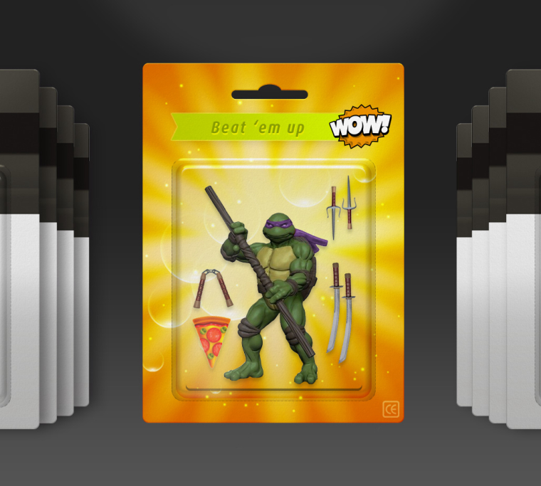
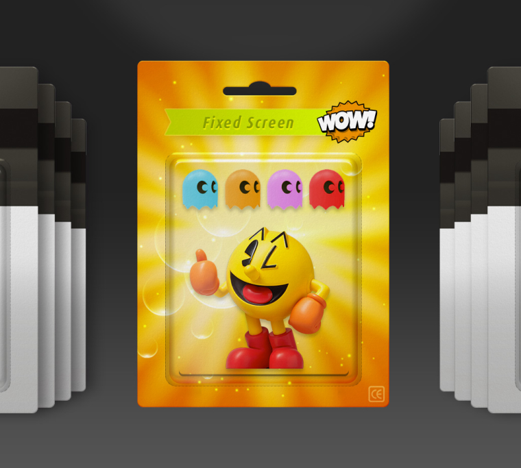
Pacman doesn't have the grey pedestal anymore, and there's space for the 4 ghosts now, for which I tried to match the "official" colors.
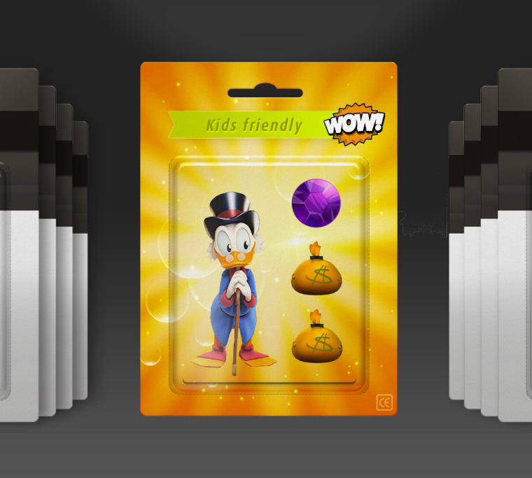
Kids has a "front-facing" Scrooge, and your diamond, even though it doesn't have the same shape as in the game. I'm not so sure about the money bags, but I can't find one that matches. I'm pretty bad at finding images it seems... :(
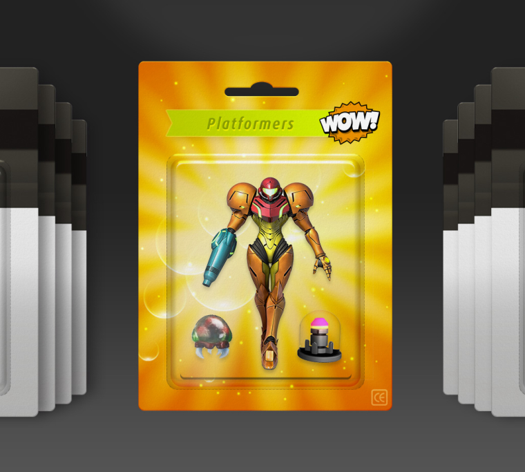
I changed the items for Samus : the Metroid comes from an actual figurine, the missile upgrade has a slightly weird perspective.
It's absolutely impossible to find a 3D Bubble Bobble. If you search for "bubble dragon 3D" you will find a lot of ugly things, as well as this cute figurine. They are not the dragons, and they look pretty "large" for the blister, but I think they're really cute. Should I look for something else?
Maybe I should just switch to another game (finding 3D Tetris pieces should be easy), but I like the logo I made :(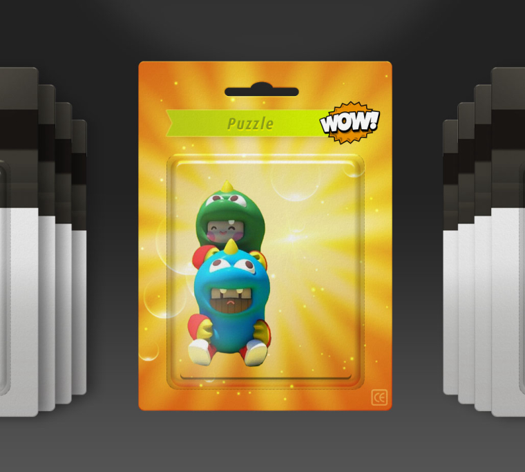
-
@cosmo0
Wooow! I am really impressed with this shots, you have improved not only the looking but your skills and finishing too! you have solved very good the elements and the characters. I love Donatello, its the 90s one and it looks amazing! I also love all of the setFor the upper ribbon, I like more the genre, for the shorter ones like Action or adventure, we can complete the space with the word games. Adventure games or action games so the text completes all the row. Also if you want to try you could change the color of the ribbon trying to match the character and items color: action red like the case, adventure brown, beat em up green, fixed screen orange, kids friendly purple and like that. If you considere its bad its ok to me
Here are some others items I believe it will work fine
For kids a top hat and a coin?
Bubble bobble some balls? or switching to bomber man, you decide
a weapon for metroid?
For the pacman you can try using one ghost, two white dots and another ghost, just an idea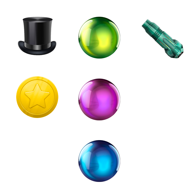

-
Looks great, but i wish you had the Ratings and max players in the theme.
-
@chicuelo Thanks ^^ I'm doing the best I can :)
I'll try to change the color of the ribbon, it's a good idea.
Where do you find your images? They're really good-looking, I just cannot find ones like that :(
For Pac-Man, I must admit I like the fact that the 4 ghosts are there. I felt something was missing when there was only 2 :D
-
-
@red2blue
Sorry for not including that! I tried yo use just the basic info -
I search not only in google (big images and if possible in png), also on deviant art but there is a lot of garbage there too
Also I have to clean the images that have a background, if I considere the image is great I take the time to clean the rest and use it.
The bomber man balloon is a composition, I pick a balloon, adjust the color, add some eyes and the mouth, it was impossible to find that image otherwise!For the pacman I meant to make like a gag, using two white dots like the game, but its a matter of try and error, maybe it looks strange. Its all in your hands!
-
@movisman
Thank you! The list of pending systems is bigger every day! So Im trying to make the most common and then adding the rest -
@chicuelo said in Chicuelo Theme:
I search not only in google (big images and if possible in png), also on deviant art but there is a lot of garbage there too
Also I have to clean the images that have a background, if I considere the image is great I take the time to clean the rest and use it.Ok, so you don't have a magic method, you're just more patient than I am :D
Thanks :)@chicuelo said in Chicuelo Theme:
@movisman
Thank you! The list of pending systems is bigger every day! So Im trying to make the most common and then adding the restI saw that you have added a LOT of systems lately. Do you have a todo list ? I feels like it's not missing much, you're on your way to be more complete than ComicBook, which was the most complete theme before :D
Well, maybe not more complete, there are a LOT of unknown things in ComicBook... :D did you know the Channel F ? :D I'm not sure it's necessary to include all the weirdness out there...
-
Yes, patience and a bit of taste to select the best images
This is my pending list, I don't know if there is any other system that matters to be included, what do you think?
Atari ST
Daphne
Game and watch
Colecovision
Intellivision
Kodi
Neo geo Pocket
Neo geo pocket color
Vectrex
Wonder swan
Zxspectrum
MSX
MSX2
Nintendo DS
Sega SG1000
VideoPac (Odyseey2)Update:
Atari ST and Daphne added -
-
@ectoone
I have scummvm, maybe its the same or its another emulator?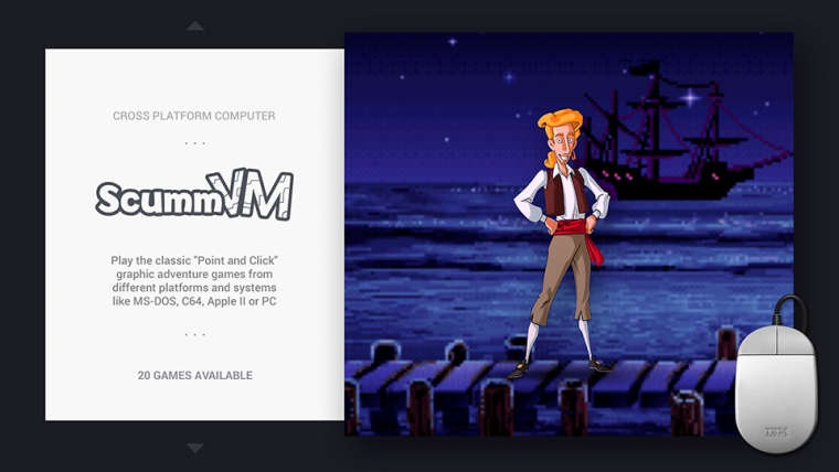
-
@chicuelo said in Chicuelo Theme:
@red2blue
Sorry for not including that! I tried yo use just the basic infoI agree - personally I like the clean / minimal look of the theme, it's one of my favourite elements. I think 'less is more' works well. This is just my personal view, as I avoid themes which show too much metadata, plus often it's incomplete.
-
Are you happy if I go through each current supported theme.xml and put in the 'year released' and check the console 'bits' and correct if needed? So for example:
Atari 2600
1977 // 8-BIT CONSOLESomething like this maybe? The double slashes might look quite nice. I am happy to do this for all systems?
Cheers
-
@movisman said in Chicuelo Theme:
Are you happy if I go through each current supported theme.xml and put in the 'year released' and check the console 'bits' and correct if needed?
Of course I do! We could try double slashes or a simple " - ". As you prefer
-
@chicuelo ResidualVM is some kind of fork of ScummVM, it only runs 3 games that ScummVM can't run. Otherwise it's basically the same, I even wouldn't care if you used the same images and text for that system and only make a new logo (I really wish there was an easy way to merge systems, just to avoid those problems).
If I could suggest a game to use as image tho, I would go with Grim Fandango. -
@chicuelo said in Chicuelo Theme:
Yes, patience and a bit of taste to select the best images
This is my pending list, I don't know if there is any other system that matters to be included, what do you think?
Atari ST
Daphne
Game and watch
Colecovision
Intellivision
Kodi
Neo geo Pocket
Neo geo pocket color
Vectrex
Wonder swan
Zxspectrum
MSX
MSX2
Nintendo DS
Sega SG1000
VideoPac (Odyseey2)Update:
Atari ST and Daphne addedI think the most popular systems are probably Kodi (very common), ZX Spectrum (very popular in the UK), MSX/2 (very popular in Japan), and Nintendo DS (well... :D).
Then Colecovision, Intellivision (both have good arcade conversions), Vectrex (many people are interested in discovering it).
Then the rest :)@ectoone said in Chicuelo Theme:
@chicuelo ResidualVM is one system I have. that is not on your list.
@cosmo0 I assume the art for the action genre is based on Resident Evil? If so, I would suggest trying to find an image of the First Aid Spray instead of a standard Kit.
Unfortunately the RE healing items (plant, powder, spray...) are not very readable or pretty at this size... :/
@movisman said in Chicuelo Theme:
I agree - personally I like the clean / minimal look of the theme, it's one of my favourite elements. I think 'less is more' works well. This is just my personal view, as I avoid themes which show too much metadata, plus often it's incomplete.
I also agree. I think the clean look is a large part of the theme appeal. I find that the other informations are not very useful, and the ratings have always seemed random to me. I largely prefer having a video, it's much more telling of the game.
Contributions to the project are always appreciated, so if you would like to support us with a donation you can do so here.
Hosting provided by Mythic-Beasts. See the Hosting Information page for more information.