RetroPie forum home
    • Recent
    • Tags
    • Popular
    • Home
    • Docs
    • Register
    • Login

    Chicuelo Theme

    Scheduled Pinned Locked Moved Projects and Themes
    chicuelochicuelo themeemulationstaionthemethemes
    996 Posts 113 Posters 871.1k Views
    Loading More Posts
    • Oldest to Newest
    • Newest to Oldest
    • Most Votes
    Reply
    • Reply as topic
    Log in to reply
    This topic has been deleted. Only users with topic management privileges can see it.
    • M
      movisman
      last edited by movisman

      @chicuelo

      0_1521752949519_Screenshot at 2018-03-22 21-07-32.png

      or

      0_1521752960537_Screenshot at 2018-03-22 21-08-29.png

      ?

      Whichever separator you prefer, I definitely think it's cool to have the year in there. I can also reword any descriptions which contain the year already - as to not duplicate information on screen.

      FYI, the above has two spaces either side of the separator, as I think that looks better.

      Let me know and i'll start applying to all other themes. I have created a separate text file with the release information ready to go.

      Cheers!

      chicueloC 1 Reply Last reply Reply Quote 0
      • chicueloC
        chicuelo @movisman
        last edited by

        @movisman
        I do prefer the "-", because its more discreet and take less space on the upper area so the logo could have more presence.
        Thanks!

        M 1 Reply Last reply Reply Quote 0
        • chicueloC
          chicuelo @EctoOne
          last edited by

          @ectoone said in Chicuelo Theme:

          @chicuelo ResidualVM is some kind of fork of ScummVM, it only runs 3 games that ScummVM can't run. Otherwise it's basically the same, I even wouldn't care if you used the same images and text for that system and only make a new logo (I really wish there was an easy way to merge systems, just to avoid those problems).
          If I could suggest a game to use as image tho, I would go with Grim Fandango.

          I can duplicate the theme so you have the same art, and work on a fandango version. This is very exclusive :D
          Which name do the system have? "residualvm"?

          1 Reply Last reply Reply Quote 0
          • M
            movisman @chicuelo
            last edited by

            @chicuelo

            Great, i'm glad you said that because I was actually in favour of the " - " having looked at it properly on screen. I will apply this to all XML files with the correct release year :)

            Thanks!

            1 Reply Last reply Reply Quote 1
            • chicueloC
              chicuelo @EctoOne
              last edited by

              @ectoone
              If you update you will find a custom Residualvm theme

              0_1521755912807_25.jpg

              E 1 Reply Last reply Reply Quote 1
              • E
                EctoOne @chicuelo
                last edited by

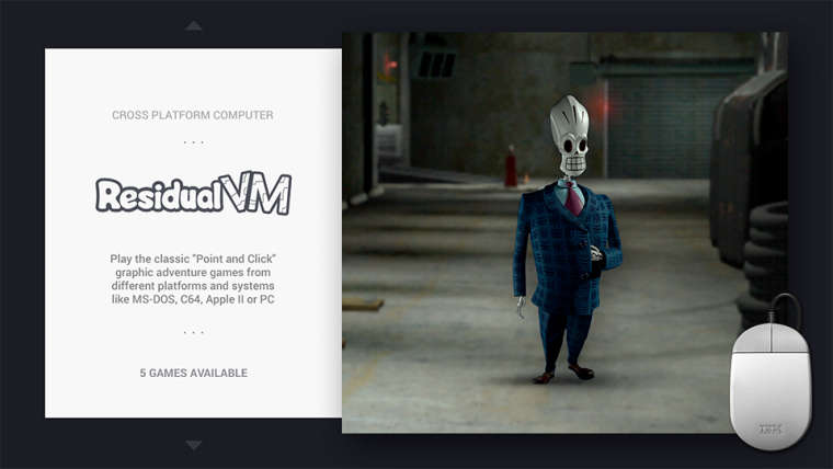
                @chicuelo said in Chicuelo Theme:

                @ectoone
                If you update you will find a custom Residualvm theme

                Awesome, I really like the image.

                @cosmo0 said in Chicuelo Theme:

                Unfortunately the RE healing items (plant, powder, spray...) are not very readable or pretty at this size... :/

                Oh, i wasn't paying attention to the resolutions when i did a quick google image search, it was just a suggestion anyways. :)

                @movisman said in Chicuelo Theme:

                @chicuelo

                Great, i'm glad you said that because I was actually in favour of the " - " having looked at it properly on screen. I will apply this to all XML files with the correct release year :)

                Thanks!

                How about using the pipe symbol |or the middot ·? When I was doing webdesign some years ago, I used those as alternatives to separate things. In fact i used the middot when i first recreated this theme instead of having the 3 dots above and below the logo directly on the background image.

                M 1 Reply Last reply Reply Quote 1
                • M
                  movisman @EctoOne
                  last edited by

                  @ectoone

                  Hi there,

                  I did try the pipe image but the font used made it look ever so slightly more like a 1 or something. I didn't think about the middot though, I could potentially try that.

                  For now, I actually just raised a PR using " - " before I saw this post.

                  @chicuelo - what are your thoughts on using a " · " instead of the " - " to separate? If you prefer this, I can make those adjustments and raise a further PR.

                  Thanks

                  M 1 Reply Last reply Reply Quote 0
                  • M
                    movisman @movisman
                    last edited by movisman

                    @EctoOne @chicuelo

                    Actually, I just tried the middot ( · ) and I think that looks really nice? Of course, it's another dot to add to the other dots, but it fits pretty well on first glance. There is a double space either side.

                    0_1521758817435_Screenshot at 2018-03-22 22-46-45.png

                    Perhaps we should use this?

                    Thanks!

                    chicueloC 1 Reply Last reply Reply Quote 1
                    • chicueloC
                      chicuelo @movisman
                      last edited by

                      @movisman
                      Yes, at first I was going to suggest using a middle dot because the separators, its a great choice!

                      M 2 Replies Last reply Reply Quote 0
                      • M
                        movisman @chicuelo
                        last edited by

                        @chicuelo

                        Great, let's do that then, thanks for confirming. Let me close my PR, make the adjustments and raise a new one.

                        Cheers @EctoOne for the suggestion.

                        Thanks!

                        1 Reply Last reply Reply Quote 0
                        • M
                          movisman @chicuelo
                          last edited by

                          @chicuelo

                          All done, revised PR raised for my changes :)

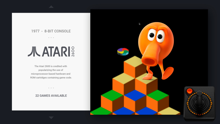
                          • All consoles have release year, bits and type - separated by middot
                          • A few long descriptions altered to remove year (as it's now in the short description) and tidy up a few bits of grammar, spacing etc.

                          Thanks!

                          1 Reply Last reply Reply Quote 0
                          • A
                            allahandro
                            last edited by

                            Would we be able to update now to reflect these changes?

                            E chicueloC 2 Replies Last reply Reply Quote 0
                            • E
                              EctoOne @allahandro
                              last edited by EctoOne

                              @allahandro Nope, some changes are done but there is still a pending PR. Just look at the github page to see when the last change was made.

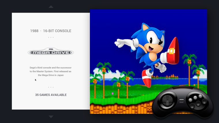
                              @chicuelo @cosmo0 I just noticed that MS Dos is also missing on your list. The system name is just pc and it is probably not as exclusive as as ResidualVM. :)

                              chicueloC 1 Reply Last reply Reply Quote 0
                              • chicueloC
                                chicuelo @allahandro
                                last edited by

                                @allahandro @movisman
                                Done with the merge! you can now see the changes

                                1 Reply Last reply Reply Quote 0
                                • chicueloC
                                  chicuelo @EctoOne
                                  last edited by

                                  @ectoone
                                  I thought pc was ports, I will make a version from there, thanks!

                                  E 1 Reply Last reply Reply Quote 0
                                  • E
                                    EctoOne @chicuelo
                                    last edited by EctoOne

                                    @chicuelo nah, ports are standalone emulators/tools. Everything that doesn't fit into it's own category. Stuff like Doom, Kodi (if installed the normal way), Raspbian Desktop or Chromium (from the extra repo) will show up in Ports.

                                    Edit:
                                    That's why I actually don't like the Ports image, because it has the potential to have Applications in there. On the other hand, I can't think of anything else that would make a good image for both games and applications.

                                    chicueloC 1 Reply Last reply Reply Quote 1
                                    • chicueloC
                                      chicuelo @EctoOne
                                      last edited by

                                      @ectoone
                                      uploaded Pc

                                      E 1 Reply Last reply Reply Quote 1
                                      • E
                                        EctoOne @chicuelo
                                        last edited by

                                        @chicuelo Awesome, one last complaint/suggestion. I don't know where you got the controller image for Amiga, but that looks more like a mockup based on a C64. I think it was already suggested to either use an Amiga 500 or Amiga 1200. Those were the most common gaming versions. Or an Amiga 600 if you can't find a good image of the other two.
                                        As an old Amiga user, I almost feel offended by that image. ;)

                                        M 1 Reply Last reply Reply Quote 0
                                        • M
                                          movisman @EctoOne
                                          last edited by movisman

                                          @ectoone

                                          Yes, it was me who suggested a stock A500 or A1200 image before - I was an old Amiga user too :) agreed an A500 or A1200 is a good image to use, or A600. However on Wikipedia, there is a decent A500+ image which is top down and transparent - @chicuelo, perhaps this could be used?

                                          https://upload.wikimedia.org/wikipedia/commons/4/41/Amiga_500_Plus_(transparent_background).png

                                          or the non-shadow version:

                                          https://upload.wikimedia.org/wikipedia/commons/4/47/Amiga_500_Plus_(transparent_background)_(no_shadow).png

                                          chicueloC 1 Reply Last reply Reply Quote 1
                                          • chicueloC
                                            chicuelo @movisman
                                            last edited by

                                            @movisman @chicuelo
                                            Thank you guys, that keyboard was a composition of various keyboards so its no accurate, I am going to Digg a little bit more and try to use an exact one

                                            M 1 Reply Last reply Reply Quote 0
                                            • First post
                                              Last post

                                            Contributions to the project are always appreciated, so if you would like to support us with a donation you can do so here.

                                            Hosting provided by Mythic-Beasts. See the Hosting Information page for more information.