Chicuelo Theme
-
@cosmo0
yes, at first there was a max height, but the gameboy controllers look very tiny so I removed. I test the theme on a 7" pi screen and it looks fine, also on a 1440x900 px screen and with an RCA cable on a small crt tv and it looks fine too. I dont know that the issue could be -
Hi,
When I made some tweaks previously to the sizes and positioning in the gamelist view, plus the video fix - the controller wasn't an area which I touched, as on my system it looked fine so didn't see any need for adjustment.
However, looking at it, I would say there needs to be a "max" size configured, because then in smaller resolutions it should scale according to the maximum percentage value which has been set and not go beyond it. If the image is bigger than the max size set, it should scale both axis until one of the maximum values has been met. However if the image is smaller than the max size set, it will scale up which might look a bit rubbish. I think that's how it works but am not certain.
I am out this evening, but I can try to take a look when I get back later or tomorrow. However if you had a maxSize set before, it would seem strange that the gameboy controllers looked so small. You should be able to set a max size on both axes and in theory the image should not scale beyond those whilst keeping it's aspect ratio. I can have a play around with it.
At the moment, with no maximum size set, I guess the theme will always try to show the image 1:1 irrespective of resolution, which in the N64's case, ends up being a pretty big image on a 720p screen. I think this is the problem.
-
@movisman
I think that's the problem, but what happens in smaller resolutions? I test the theme on smaller screens and always seems fine -
I am finally done!
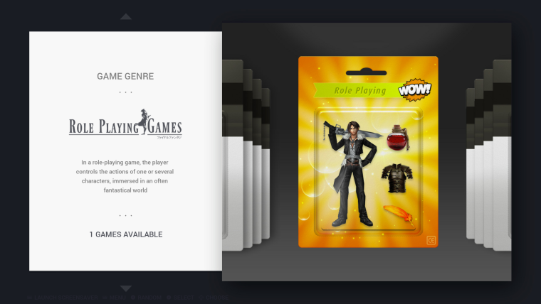
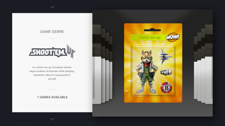
It took way more time than I anticipated, so I will leave it at that, and provide the sources for anyone wanting to make modifications : https://we.tl/heSmZbuZ6oI have created a pull request: https://github.com/chicueloarcade/es-theme-Chicuelo/pull/12
What can be "easily" improved:
- Beat'em up: write the whole "beat'em up" in "turtle" font (but what do you write above ?)
- fighting: switch the "N" to uppercase
- fixed screen: not sure about the lines around, I wanted a throwback to Pac-Man mazes, but I think it could look better
- kids: not sure about the bananas (it's for Donkey Kong Country). There was a money bag, but coin + diamond + money bag was very capitalistic :D I tried an apple (for Mickey Castle of Illusion) but with the red heart it didn't work.
- platformers: the ring (for Sonic) looks a little bit weird, some rings look better but they're not up-front
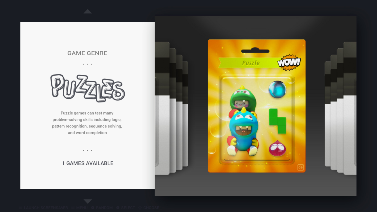
- puzzle: the costumed couple do look better. Not sure about the puzzle pieces; finding a 3D Tetris piece is surprisingly hard! I may not be hard to create but I don't have 3D software.
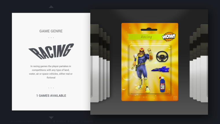
- racing: the NOS tank is a little weird-looking (it's a pillow...), but it's either that or a very-realistic-looking one
I think the rest is fine, they can be improved but I quite like them.
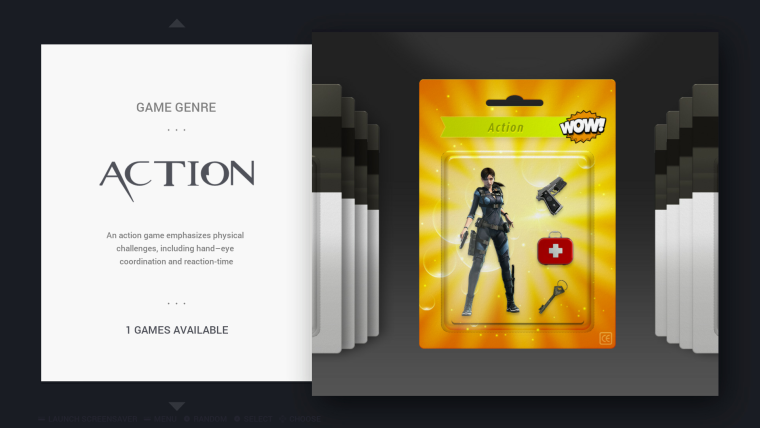
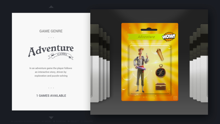
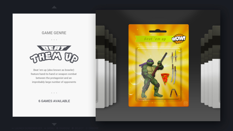
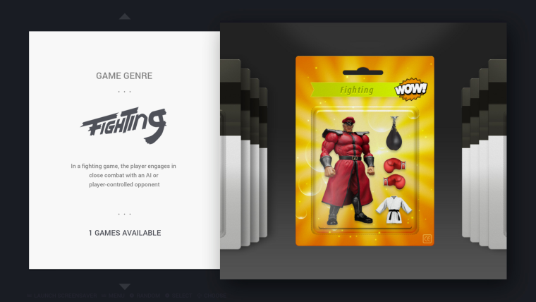
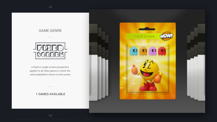
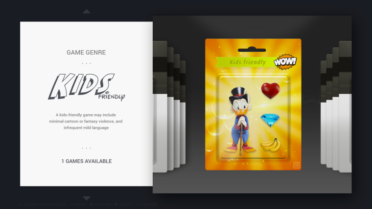
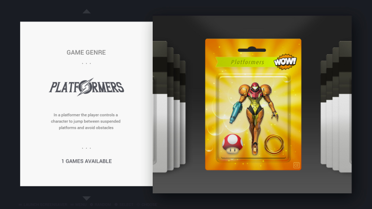
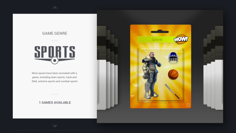
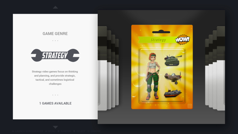
-
@cosmo0
I love them!
The bananas are the only item that is bothering me because I notice they are a photograph, everything else is great!
If you want we can merge the PR and then I can help to adjust some little items if you want.
Great work! -
@chicuelo Well it's your theme :) I won't mind even if you change most things, you have a better eye than me anyway. I'm just glad I could help :)
I provided the sources (including the PSD, fonts, source images, etc) at the top of the post.I wanted to do "game series" (Mario, Sonic, Megaman, Batman, Star Wars, Disney, Castlevania, Zelda, Final Fantasy and Dragon Quest) but I don't have the courage anymore :D
-
@cosmo0
I really love what you do so I dont want to change too much, so I only suggest some minor adjustments, Ill take a look to those files and I send the updates back! -
Wow! These are really fantastic. Great work. I'm very impressed with the work you've put in to create these. I do think the 'beat them up' should perhaps be 'beat 'em up' to match the blister packaging, like 'shoot 'em up' is already. But that is personal preference.
I am having a quick look at the max size now for the controller images, and it is a bit of a pain. Just thinking of the best solution, but certainly when I reduce my PC monitor to 720p the controllers are huge, so a max size of some description definitely needs to be implemented, or possibly reducing the size of the images themselves - need to have a think.
@chicuelo - when you have some time to make more character images, I found a ZX Spectrum system which is a good image - perhaps you could work your magic to use this when you get round to making a character background for the system. I think as @cosmo0 mentioned, Dizzy is an iconic character for the Spectrum so a good choice - or my personal favourite game Head Over Heels (which was one of the highly regarded Speccy games).
Also there is that 'correct' Amiga system image I posted a few days ago which could do with being updated.
-
@movisman
Great I will update that keyboard now and send me the art for that systems so I create them! -
Oh yeah, the Spectrum image - of course! The original 48k I found here:
https://cdn.dribbble.com/users/10384/screenshots/813866/attachments/83988/ZX-Spectrum-iPad.pngThe Amiga images I posted above, but here they are again:
https://upload.wikimedia.org/wikipedia/commons/4/41/Amiga_500_Plus_(transparent_background).png
or the non-shadow version:
https://upload.wikimedia.org/wikipedia/commons/4/47/Amiga_500_Plus_(transparent_background)_(no_shadow).pngRegarding the ZX Spectrum system character art, if you search "zx spectrum head over heels cover" in Google images you will see the second and third result are the loading screen and actual cover respectively. And for Dizzy, same kind of thing, there are lot of Dizzy games though so many covers.
Not sure if you can do anything or get any inspiration from these games?
Regarding the sizing thing - I think I have come up with a way to fix it, I have tested a few images in 1080p and 720p, but it does mean I have to edit every single controller file. I think I have cracked it though and then I can let you know how I achieved it. Going to try and work on it tomorrow. Watch this space....fingers crossed.
-
@movisman
Wonderful, I have already updated the amiga keyboard. I will look forward to zx spectrum and some other pending systems.
Let me know how do you achieve the controller sizes! -
@movisman
zx spectrum added, not a great one, wit a little more time I will try to make a better shot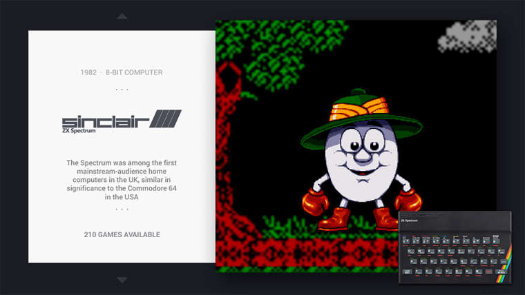
-
-
Thanks for creating the ZX Spectrum system! Looks great. I guess it's just Dizzy who needs sharpening up a bit, as at the moment he is scaled up from a smaller image, is that correct?
One question, which Amiga model is that you used for the controller - it's much different to the link I sent? It isn't one I've seen before, but I only really know the classic A500, A500+, A600 and A1200 machines. Just curious!
Regarding the controller size I'm looking into, because some controllers are vertical (Atari 5200, Gameboy etc) and some horizontal (NES, Master System etc), and some square (N64, Dreamcast etc) - using the images "as is" and trying to apply the max size parameter is always going to a compromise, eg. You could make the horizontal ones perfect, but the other shapes will suffer or appear small, like you noticed. Also we want to avoid messing up aspect ratios and scaling images above what they should be.
My proposal (which I've started and it seems to work) is to have a canvas of 480x480 square for each image (480px is 25% of the horizontal resolution for 1080p - which comes into play later).
Then I have the controller justified to the bottom right of the canvas to the size we want. Depending if it's a horizontal or vertical controller I generally make it a max of 480px on the relevant axis while keeping the overall canvas square. If the image is smaller I'm not scaling up otherwise the quality is lost, but most are large enough to downsize without issue. For square controllers you would make those about 360x360 or so, otherwise they look too large.
Once this has been done across the board, I can then apply a "size" parameter for the controller in the XML, to be 0.25 (25 percent) on the horizontal axis. This is essentially 480 pixels wide on a 1080p screen, which is perfect 1:1. I leave the vertical size axis as "0", so it calculates automatically based on horizontal size but keeps the aspect ratio.
This then looks great on 1080p - but what about 720p etc? Well, because we set the size to 0.25, it means that 480x480 image never exceeds 25% of the horizontal screen from the bottom right. This means on smaller resolutions the image will scale downwards (thus still appearing sharp) and the controller will not appear too large. And on 1080p it will be 1:1. Only time where the controller might appear blurry is if you were trying to display ES in 4k, as it'll have no choice but to scale up, but this will be the same as all other assets and this should be no concern.
Not sure if that makes ANY sense, but I'll work on the images and show you. Then you can see for yourself how I've done it, so you know for when making images for future controllers.
Really good work with the blisters, I can imagine that took a lot longer than hoped, but great work to get them finished.
I agree - series collections would be good to add to the genres, but I also think it might be worth getting the other systems completed as a priority first, so at least all the "base" stuff is fully supported? Then technically the theme is complete (if you see what I mean). Your list you gave previously with all the systems and suggested characters will help @chicuelo a lot.
Cheers
-
On a side note, do you have a slightly larger Dreamcast controller PNG available? The current one is ok, but could do with being scaled up slightly to match the others (but I want to avoid doing this to prevent blur).
Cheers
-
@cosmo0
I like your point, if you want to proceed with that I leave it to you! just try to match the language of all the Marios, if you use a 3D one for sports. Try to use a 3D one too for all the other! I really like the set you have done but if you want to go further you have my thumbs up!@movisman
For the Amiga controller I used a 500 one, but I removed the top part with the plastic grid because it was too big. I have a great controller but its black, what do you think about using this one? it says C64 but looking in deep they have the same key configuration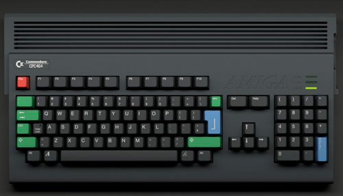
I have a bigger dreamcast controller, if you want to proceed with the test it would be great! then if you need me to change the size of all the controllers I could do it.
You are right about the dizzy image, its a tiny one and I scaled up, I really dont dedicate too much time to that system. I will improve it later. And of course continue creating the remaining systems so we could have an almost full collection
Thank you guys!
-
@chicuelo said in Chicuelo Theme:
@cosmo0
I like your point, if you want to proceed with that I leave it to you! just try to match the language of all the Marios, if you use a 3D one for sports. Try to use a 3D one too for all the other! I really like the set you have done but if you want to go further you have my thumbs up!I don't know when I would do it, probably in a few weeks :)
If anyone is motivated to do it instead of me, please go ahead :D@chicuelo : do you have an idea for a background for these "game series" ? A white background wouldn't match the theme... Or maybe another idea?
No need to make one in a hurry, as I said, I won't work on it before a few weeks at best :D -
I would definitely steer clear of using a black Amiga, as they were never available in this colour. This must be a custom build. I would personally stick with original A500, A500+, A600 or A1200 systems.
I tried the A500+ image on my test with the fixed sizing and it is looking ok to my eyes?
I have made some quick edits to all the system controllers I use, altered my theme.xml as well as tried the A500+ image.
Give me 10 minutes and i'll post a video of the theme in 1080p AND 720p, and you can see the scaling on 720p working, also you can see the revised sizes of the controllers. In 1080p they are not changed too much, I only scaled some down to fit, but I don't I scaled any up (i'll have to check) except Dreamcast.
Thanks!
-
Ok, here is a preliminary test - you can see on 720p the controller images scale perfectly.
1080p:
https://drive.google.com/open?id=13r84uApa4eX-N7i7jCq_sK6YXiVpkFiM720p:
https://drive.google.com/open?id=1xGvaOxO2e2vwkm9uw2nhtf0LB7ouUxfyWhat do you think (also note I tried an original Amiga hardware image)?
Thanks!
-
Great work! I see no difference at all!
I think the amiga keyboard looks big, it may be because the upper structure. Im going to work on finding a perfect one.
Do you need me to scale all the controllers?
Contributions to the project are always appreciated, so if you would like to support us with a donation you can do so here.
Hosting provided by Mythic-Beasts. See the Hosting Information page for more information.
