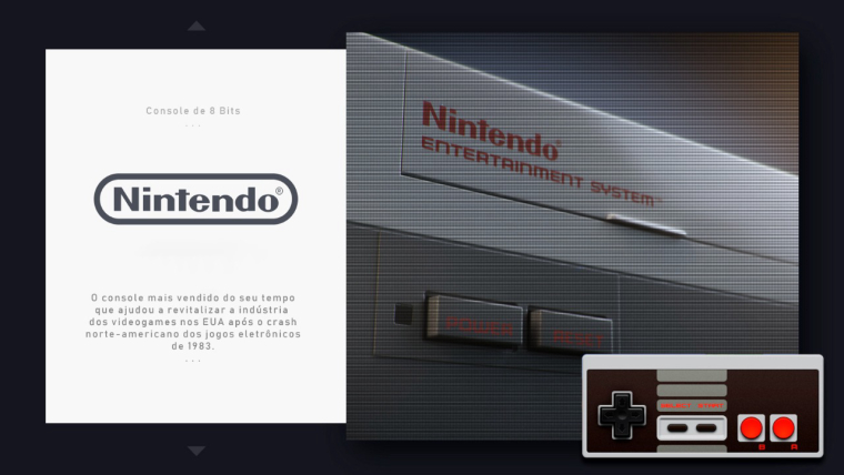
Chicuelo Theme
-
I loved this theme! This and PIXEL are my favorites.
I took the liberty of trying a small change, make a "version" with the consoles in scanlines. Big hug from Brazil!
-
This post is deleted! -
If possible:
Atari5200
Atari7800
Colecovision
Intellivision
MSX
PC-Engine CD
P S P
SegaCD (separate)
TurboGrafx-16
TubroGrafx-CD
Vectrex -
@anderocha said in Upload My Theme:
ed this theme! This and PIXEL are my favorites.
I took the liberty of trying a small change, make a "version" with the consoles in scanlines. Big hug from Brazil!Nice one! at first attempt I used scaliness too but when I tried the theme in different screens they don't look good so I removed.
I use a character and a game background because you already notice the system with the logo and the controller so you don't need to tell the story again, but its an interesting approach.
Cheers from Argentina! -
Where is the link to download?
-
@nyislanders91 https://github.com/chicueloarcade/Chicuelo
@chicuelo Maybe you should add the link to the first post and maybe rename the topic (although I'm not sure if it's possible).
-
Thank you my friend
-
@ectoone said in Chicuelo Theme:
@nyislanders91 https://github.com/chicueloarcade/Chicuelo
@chicuelo Maybe you should add the link to the first post and maybe rename the topic (although I'm not sure if it's possible).
Done!
-
Looks fantastic! Can’t wait to give it a spin, thank you.
-
@chicuelo I was wondering if you have separate images of the system art and the controllers/devices that you could share.
I was bored and just finished rebuilding your theme and turned everything into it's own element. It's obviously not as detailed (no shadows and I have not added the arrows. I also replaced the system logo/description on detailed/video view with the games description.) but it is way easier to add systems now. By using variables I can just dump system art and controller images into specific folders and the console description is defined by thesystem/theme.xmlfiles -
@ectoone said in Chicuelo Theme:
@chicuelo I was wondering if you have separate images of the system art and the controllers/devices that you could share.
I was bored and just finished rebuilding your theme and turned everything into it's own element. It's obviously not as detailed (no shadows and I have not added the arrows. I also replaced the system logo/description on detailed/video view with the games description.) but it is way easier to add systems now. By using variables I can just dump system art and controller images into specific folders and the console description is defined by thesystem/theme.xmlfilesYes I thought. At first I made the theme this way because it was the faster way, now with more time I will display the text from the xml and the images separated so it has only to load two backgrounds
-
@chicuelo If you want I can give you my version and you can change whatever you desire.
-
@ectoone said in Chicuelo Theme:
@chicuelo If you want I can give you my version and you can change whatever you desire.
It would be great, so the theme can be improved and be useful for all
-
@chicuelo Here ya go: https://github.com/EctoOne/Chicuelo/tree/separated
It only contains dummy images, set as logo, system art and controller image. You need to add at least two more folders within
_themefilescontaining the system art and controller images. The images also must have the same names as the dummy files in thelogo-examplefolder so that the variables can assign them to the correct system.
You also need to change the folder names and maybe the file extension in theconfig.xml. And you need to replace the dummy files with appropriate system logos.The
carousel.xmlis used to theme systemview only,main.xmlis used to theme the different system specific views (basic, detailed and video). Video is probably not correctly themed, because I don't use them.
If you want to add a system description just copy any of the existing system folders, rename it to the new system and edit both text lines in thetheme.xml.If you have any questions, just ask. I know that my code is kinda weird sometimes.
-
So I installed it on my Pi tonight.
It looks nice but the text in the carousel view is not crisp at all. A lot of artifacts around the text. It looks nice from a distance but up close it's very noticeable.
-
@livefastcyyoung said in Chicuelo Theme:
ooks nice but the text in the carousel view is not crisp at all. A lot of artifacts around the text. It looks nice from a distance but up close it's very noticeable.
One of the near updates is make text editable and crisp. At first I needed the theme to be ready and on small screens it looked nice, at 1920 you can see this issues so thats my next step to improve
-
Wow, this looks so elegant and clean. Massive props for the design, can't wait to try it!
-
Does it support video preview instead of screenshots ?
-
@adu said in Chicuelo Theme:
Does it support video preview instead of screenshots ?
Yes it does, in theory. I did not tried but It should handle videos
-
@chicuelo said in Chicuelo Theme:
@adu said in Chicuelo Theme:
Does it support video preview instead of screenshots ?
Yes it does, in theory. I did not tried but It should handle videos
Video isn't in correct place. They overlay the gamelist.
If you fix it is very nice themes, thank you for your work
Contributions to the project are always appreciated, so if you would like to support us with a donation you can do so here.
Hosting provided by Mythic-Beasts. See the Hosting Information page for more information.