Chicuelo Theme
-
Oh no! Your last commit for Sega / Mega CD is messed up:
https://github.com/chicueloarcade/es-theme-Chicuelo/commit/a369e850983a3269a3aff1bb53817481344d19fe#diff-fb9fbe25026bd918b37846b027e57d46Mega CD is using the 32X image, and Sega CD is using the Megadrive/Genesis image!
Surely it should be either this or this:
https://github.com/chicueloarcade/es-theme-Chicuelo/blob/7c33a4f1f07a50b5f9a7d8906d328ebeca953b9c/_assets/characters/segacd.jpg
https://github.com/chicueloarcade/es-theme-Chicuelo/blob/91b44f59ece3232cb1f6464adfab4baf664d154f/_assets/characters/segacd.jpgI don't know which you prefer to use, I don't know which is newer or the one which you want. But currently those assets are broken, as above.
Thanks!
-
@movisman said in Chicuelo Theme:
cannot show you the slide improvement on an image, but here are some pictures of the help icon realignment/colour and the slightly larger in-game preview images:
I do prefer a invisible help text, so I disabled in my build, but I think its useful so the color is ok. I think the original position on the in game menu fits better.
For all the other changes I think they are great so yo can raise the PR!
-
@movisman Yes, I overrides those images because they are not maded by me, so I used the sega cd and the genesis to replace them. I thought redesigning them but it will take a lot of time, maybe in a near future, but by now those two are ok!
-
@chicuelo said in Chicuelo Theme:
@movisman Yes, I overrides those images because they are not maded by me, so I used the sega cd and the genesis to replace them. I thought redesigning them but it will take a lot of time, maybe in a near future, but by now those two are ok!
Ah right, so it was deliberate changing Mega CD to be the 32x image, and Sega CD to be the Genesis image? Fair enough. I didn't realise the Sega CD images were not yours. Are you not allowed or do you not wish to use them?
As I run the main Sega systems, including 32x, Sega CD and Megadrive/Genesis, I prefer to have a unique image for each system, so I will keep those other Sega CD images to one side and use them in my build.
Otherwise, when scrolling through the systems there is a duplicate.
Thanks
-
@chicuelo said in Chicuelo Theme:
@movisman said in Chicuelo Theme:
cannot show you the slide improvement on an image, but here are some pictures of the help icon realignment/colour and the slightly larger in-game preview images:
I do prefer a invisible help text, so I disabled in my build, but I think its useful so the color is ok. I think the original position on the in game menu fits better.
For all the other changes I think they are great so yo can raise the PR!
Regarding the help text, as you can disable it entirely in ES, I think if it's enabled, it is useful to be able to see it.
The only comment I would make about the position on the in-game menu, the reason I have it in the same place across all menus is because if you press the start button to open the ES menu while in the in-game screen, the menu will shift back to the bottom left. This is a restriction of ES, and when I looked at the theming guidelines for ES it was suggested all menu icons be kept at the bottom left for consistency. Also it looks quite odd when you open up the ES menu and the menu shifts itself completely from one side to the other.
Do you know what I mean?
-
@movisman
I will create some new characters for it so you dont have a duplicated artwork.Ok with the help text so, as it will remain legible its ok.
Go ahead with your changes!
I wil pull your request and when I have some time I will update the mega cd and sega cd characters
-
Awesome man, thank you so much.
I will update my master, and raise a PR for you with the changes shortly.
Once you have accepted, if you want to test the system logo slide you will have to enable carousel transitions (ui settings > carousel transitions: on). Also you would need to enable the help icons (ui settings > on-screen help: on).
I can easily make an amendment if you are not happy with the PR.
Thanks
-
@movisman
Great! Im familiarized with the transitions but due the nature of the theme I use on instant.
Also I have disabled the screen text so it does not bother at all that setup.
Thanks for your help! -
No worries - you actually leave the transitions on instant, but just turn carousel transitions on. It is only the system logo which slides but it looks quite neat.
Oh and PS. Thanks in advance for creating the Sega/Mega CD characters when you get time.
Cheers :)
-
I just need to check my theme.xml as I need to verify one other thing, and then will raise a PR in a couple of hours or so.
Cheers
-
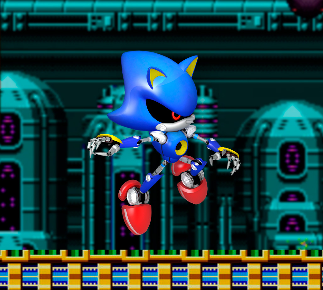
@movisman Ok, I updated the megacd / segacd character so now its on you!
-
-
Please note to test the logo slide, enable carousel transitions but make sure the style is still set to 'instant'.
Cheers
-
@movisman Great, I think it merged fine, can you check if the changes are ok?
I will update my setup to check the transition.
Thanks! -
Hmm, I am still seeing the open pull requests:
https://github.com/chicueloarcade/es-theme-Chicuelo/pullsI don't think it has been done?
Thanks!
-
Hopefully someone can come up with good images for the Wii, Wii-U, PS2 and other consoles that run well on PC. I want to use this theme but it's missing a lot of what I play in my collection these days.
-
@movisman
Maybe now? I tried from the GitHub app but it doesn't work so I merged from the web -
@LiveFastCyYoung I have plans to make those systems, as this theme was first intended for raspberry and then expanded there where a lot of systems to cover. Maybe in a few weeks I could cover them all
-
@Wildfire said in Chicuelo Theme:
Hi @pootis-spencer, I'm still working on the theme to neaten up the code, make detailed view look better (as I mainly use video view) add more systems and generally make improvements to layout and performance.
As mentioned before though this theme requires a certain setup of the gamelist.xml files and game media:
e.g. player number has to be one number so it works with the player count font (1-2 players would not work because it looks incorrect) also all of the md_image elements are fixed size so they look uniform when scrolling, this may work for flat artwork but 3D artwork could look stretched.I have created "loose" templates too which uses the "maxSize" scaling which would work with most builds but I prefer the fixed size as it looks better and suits the build I've put together.
Below are a few screenshots from the gamelist view to show the responsive design inspired by the Art Book theme. I've also included a screenshot of the Power and Kodi system and gamelist views as they feature a special layout too.
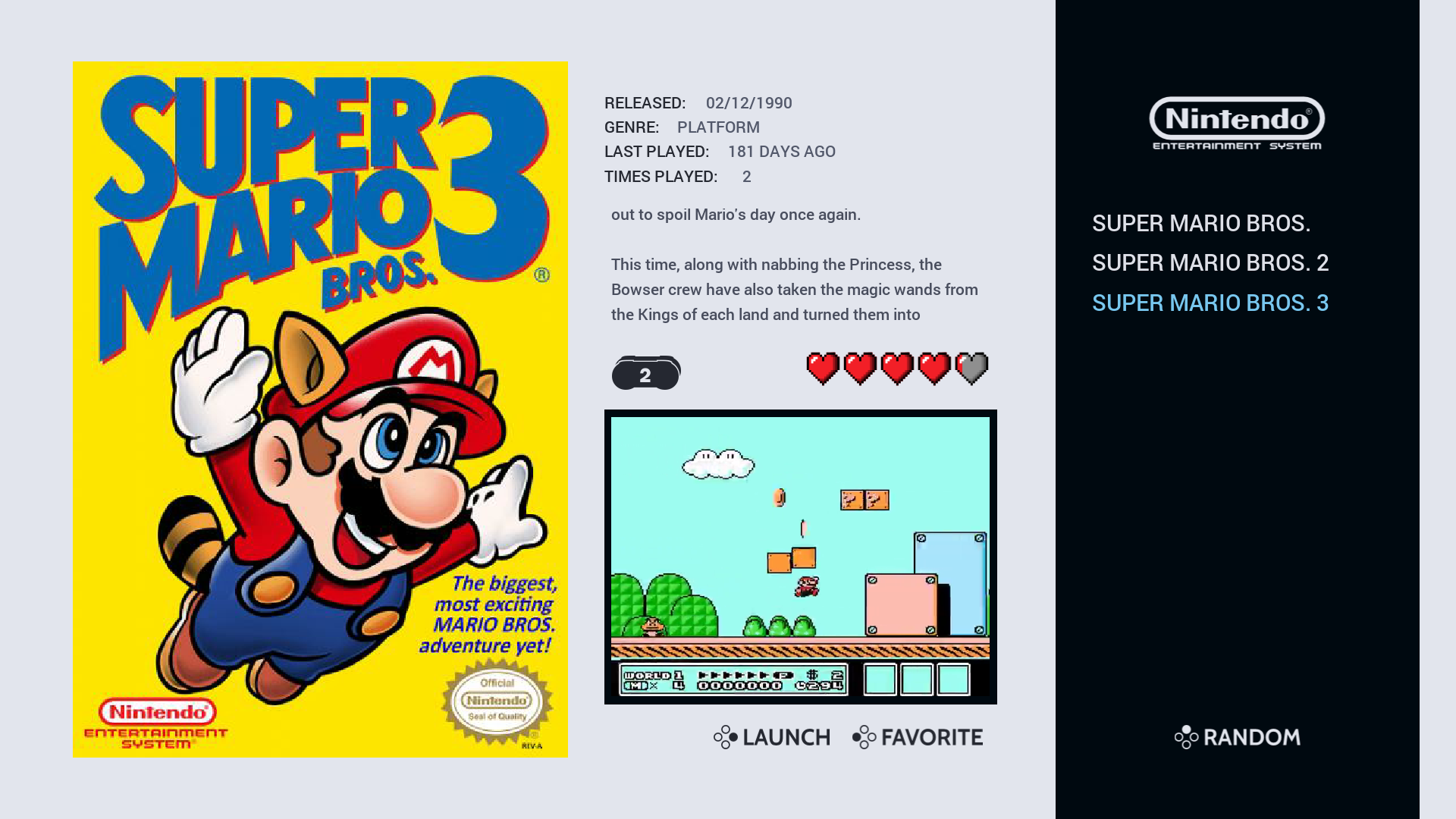
NES Video View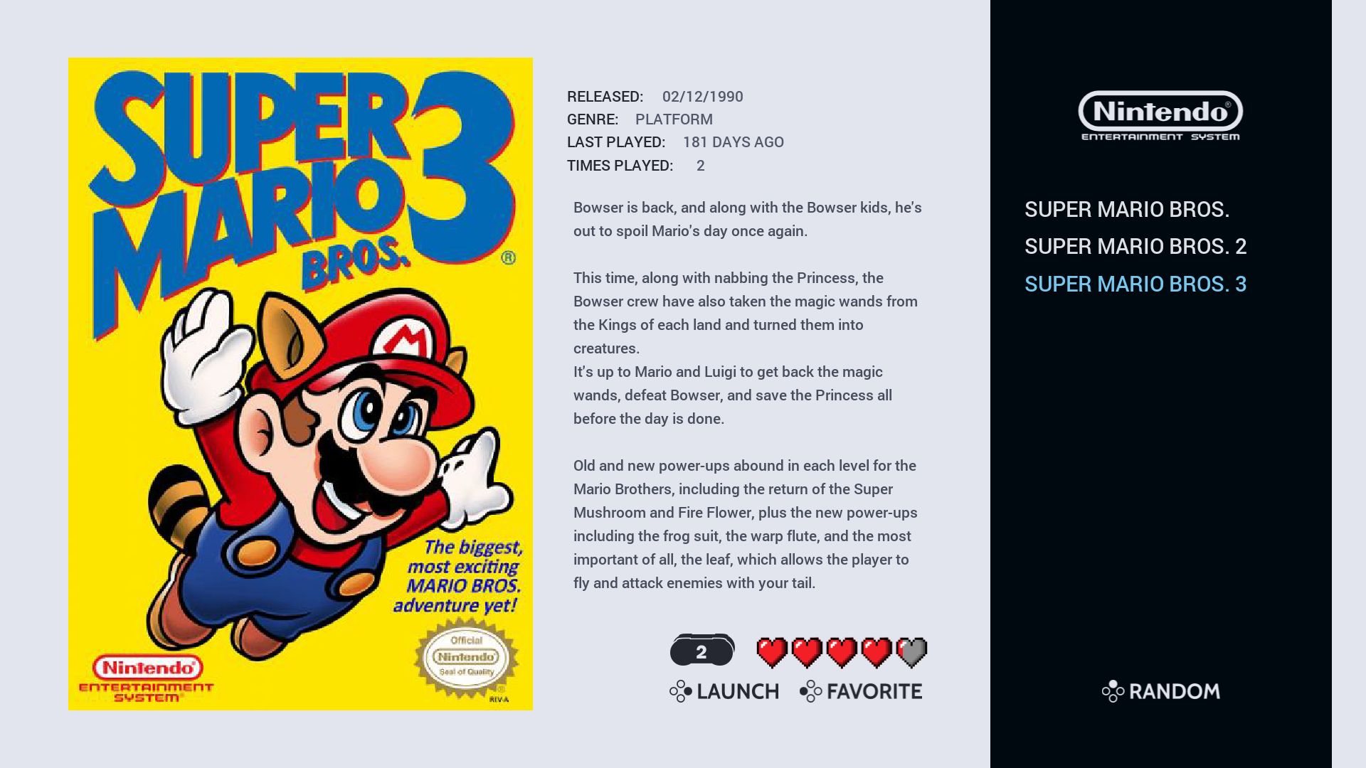
NES Detailed View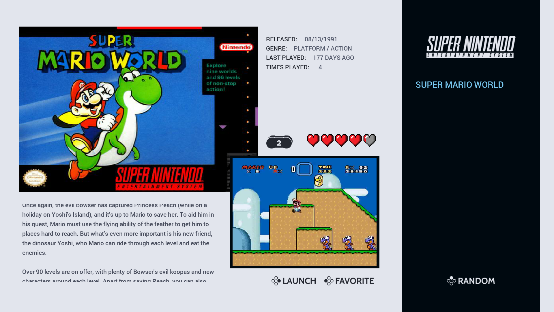
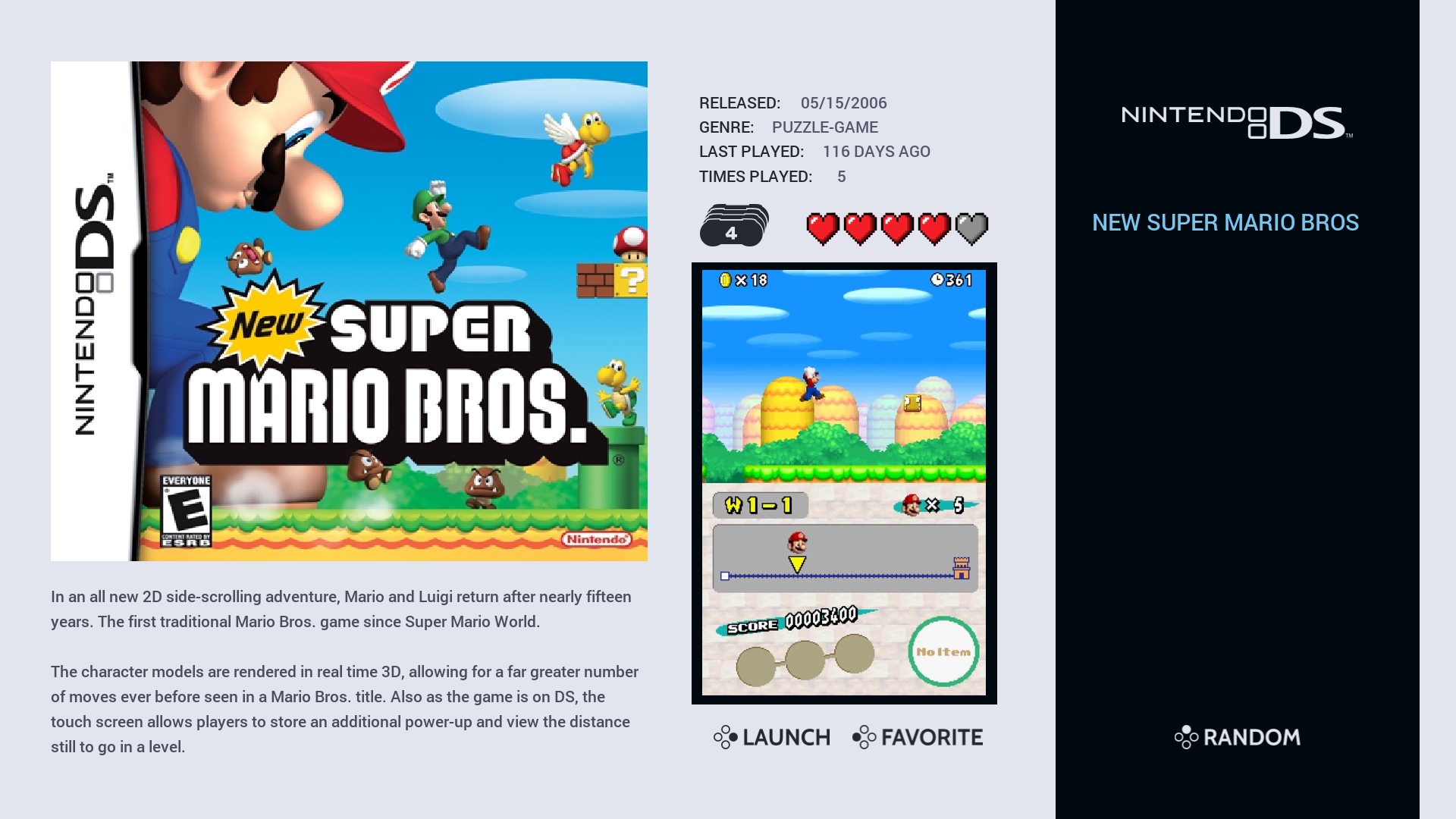
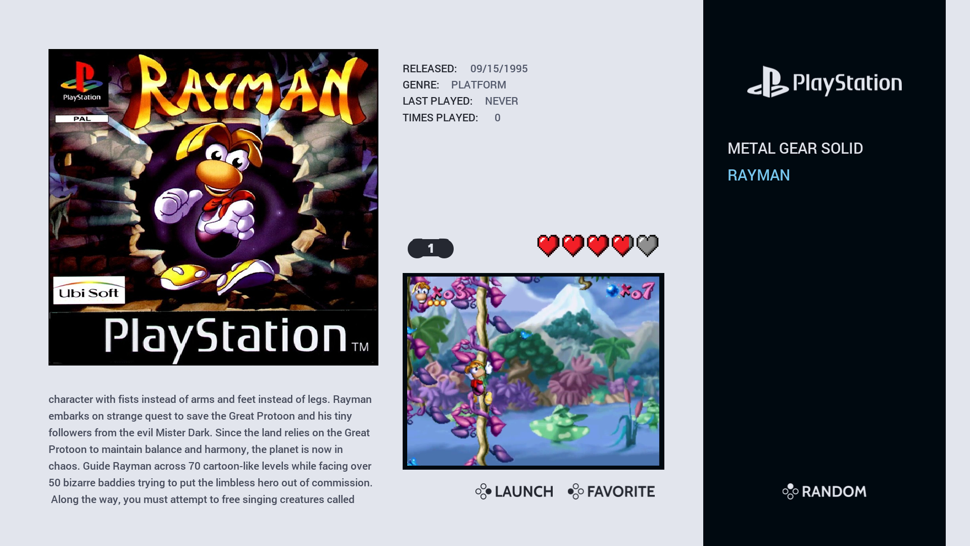
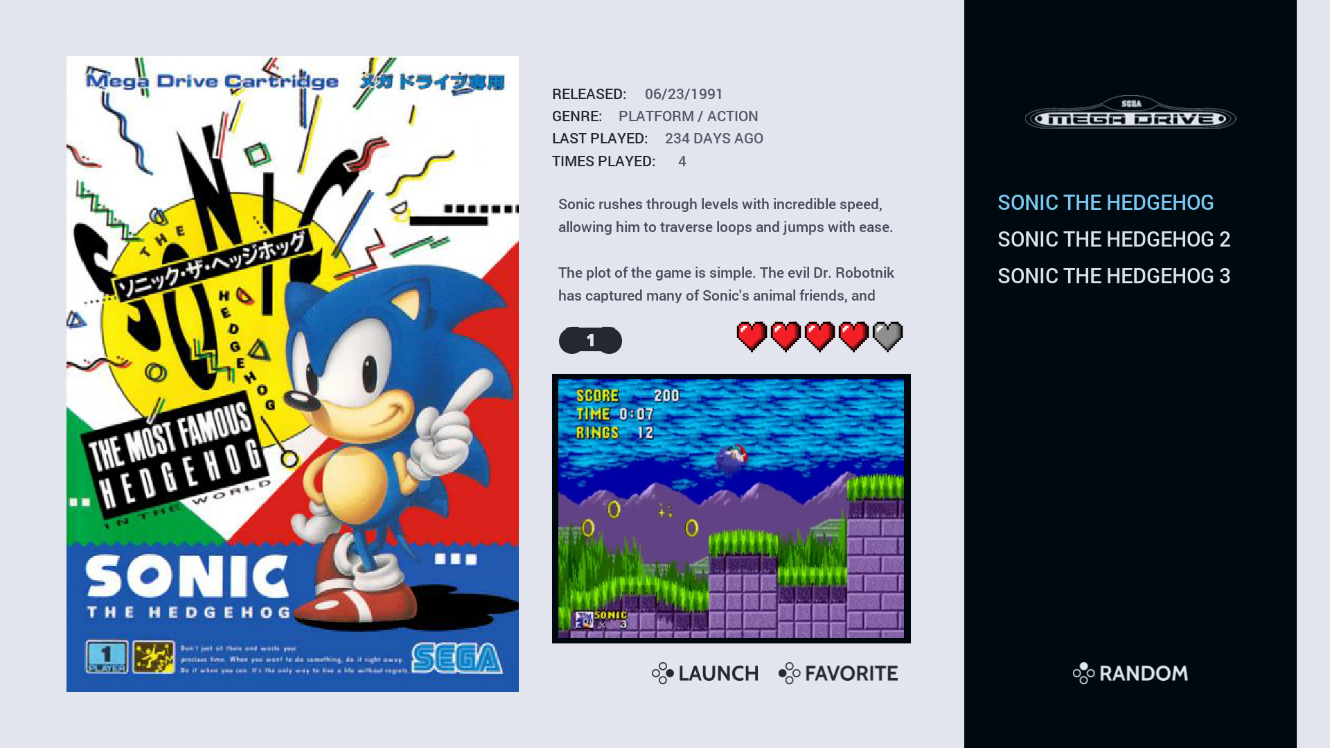
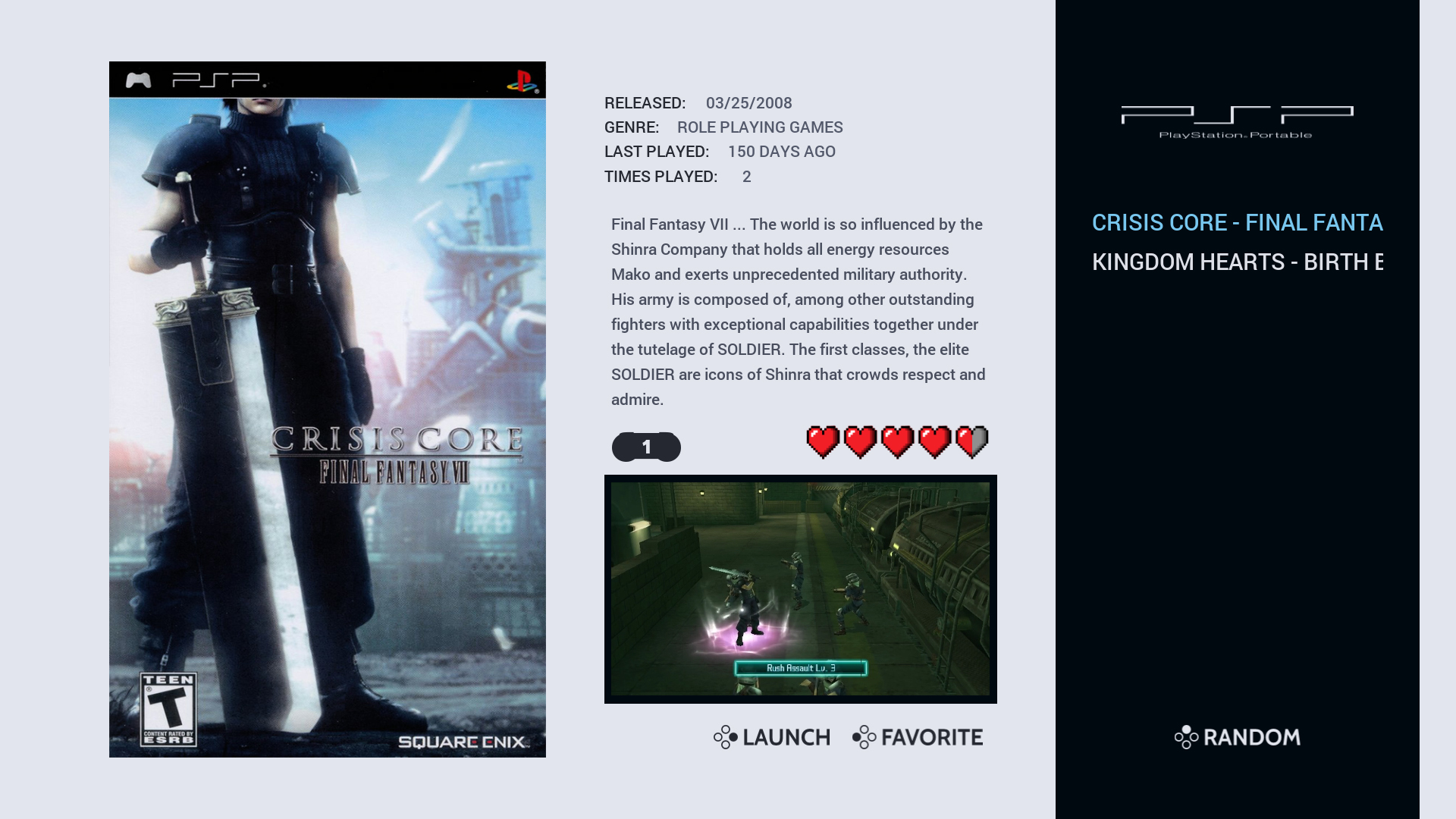
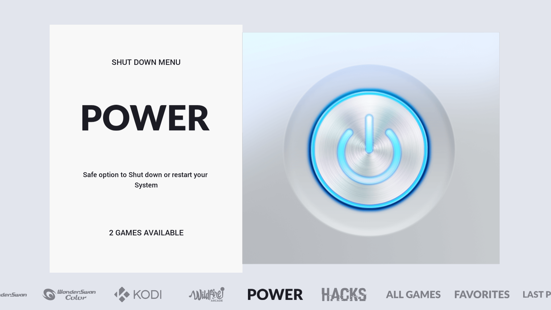
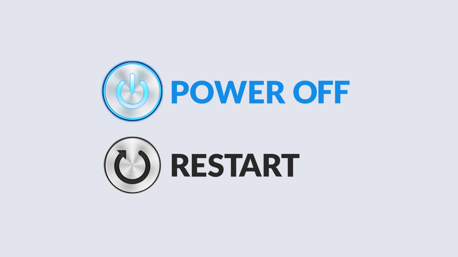
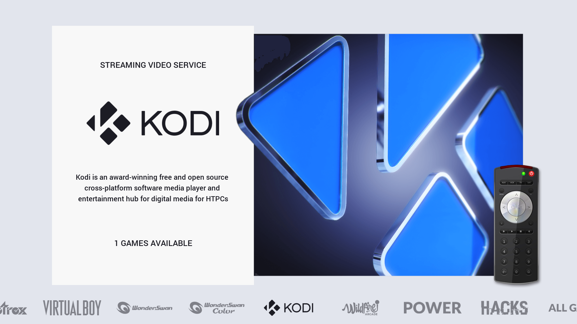
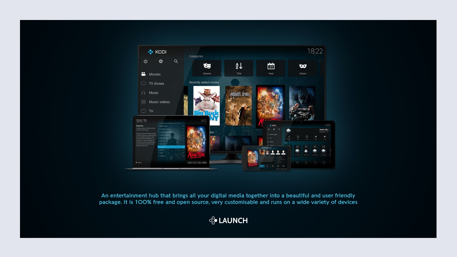
As you can see I'm now using a lighter background for the system view but I may change this back to the darker theme. I'm also thinking about changing play count and last played to publisher and developer, still not sure just yet...
I was planning to upload this weekend but I still want to make some changes and get it right before I do so, hopefully won't be too long now.
It's available?? I would like to test it.
-
@Sheyk90 said in Chicuelo Theme:
Hi @pootis-spencer, I'm still working on the theme to neaten up the code, make detailed view look better (as I mainly use video view) add more systems and generally make improvements to layout and performance.
Guys I think you could create a new topic with this variation so we dont mix all the responses
Contributions to the project are always appreciated, so if you would like to support us with a donation you can do so here.
Hosting provided by Mythic-Beasts. See the Hosting Information page for more information.