Chicuelo Theme
-
Love this new look @chicuelo! the blue text on system logo and game count looks great. Glad to her your old theme is back up again, hope you don't have any further issues with it like last time.
-
@chicuelo In the Collections we have a list like "Zelda", "Mario", "Donkey Kong",...! Than it use randomly game infos and Pictures from one Game in this collection. My Question is, can we change that info to have a custom Picture and infos for every collection?
-
@PittStone The issue is there could be many collections as everyone wnats, for example if someone would like a collection for boogerman, we have to create one just for it. Its an endless job!
-
@chicuelo Wonderful news to see you've re-shared this theme! Loving the new work, and the 'merge' version here too, I'd definitely download this one!
@PittStone - I've been asking the question of some smarter folks than me about whether collections shown in list form can be assigned an image in the gamelist screen rather than taking a random game's screenshot... so far I've been told that's a no, but it's something that may change. -
@rajbhalsod I'm currently in the process of filling the blanks collaborating with some other enthusiasts who know more about the older systems' games than I do. Once it's complete I'd be more than happy to share here for anyone who'd like to take a look. I'll post links soon as it's complete.
A lot more has been added since my post, along with a customised game list screen inspired by the changes in Epic Noir. All a work in progress right now but it's well underway!
-
@chicuelo Love it - these are like optional variations on a classic! And I truly think these are classic, evergreen themes.
-
I'd also love a 4x3 version but I can see how it would take some re-imagining. Simplest way I can think of is to keep the left text panel the full height and stack the art and controller, each half height, to total the same height on the right side. Controller could be smaller of course.
Exceptional work though, great use of colour and contrast. Keeping the game characters in the art a similar size unifies things very well.
-
@chicuelo Thank you for sharing your amazing theme again!
I'd definitely download the Epic Noir version you showed off!
-
Hi everyone :)
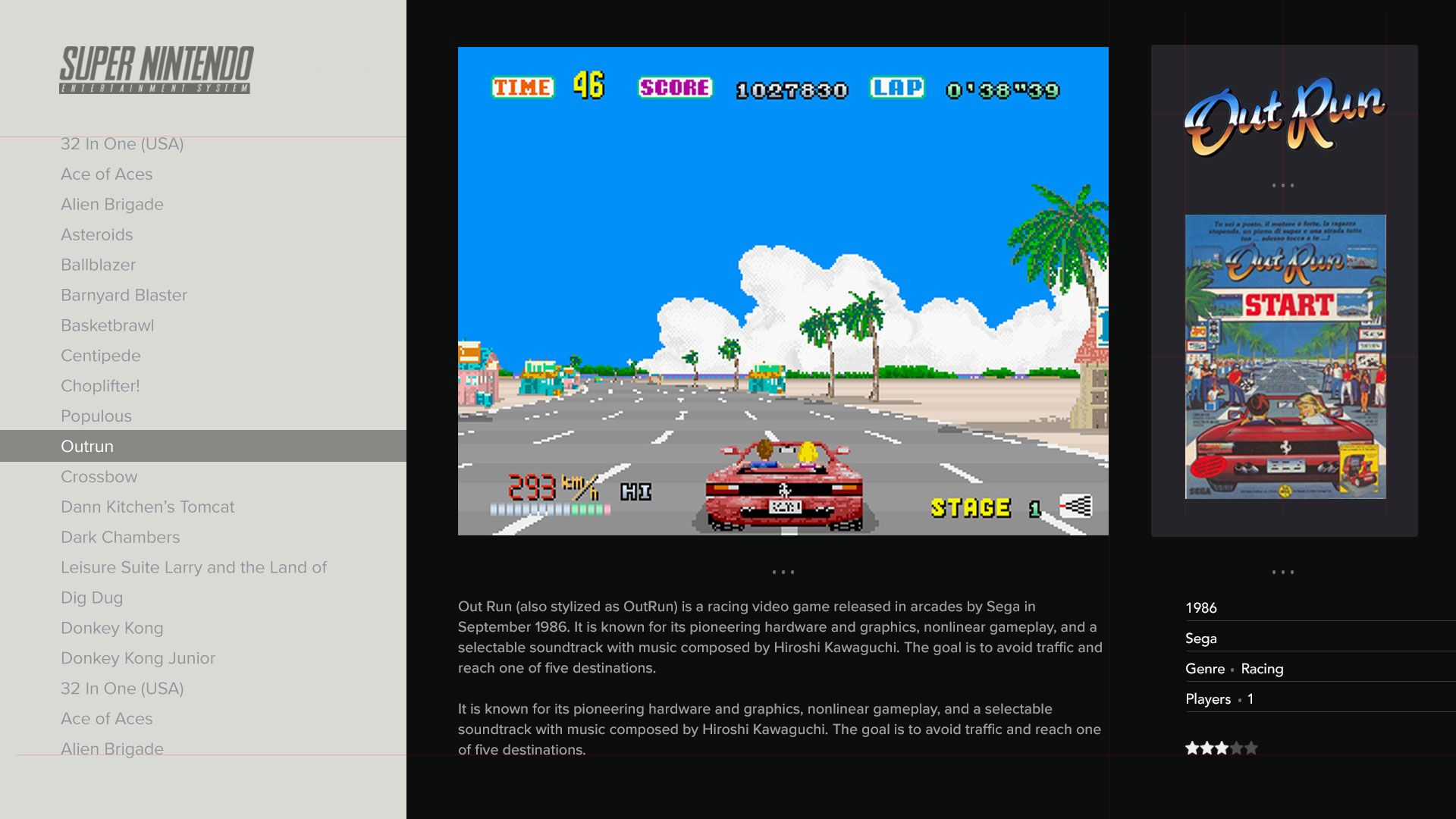
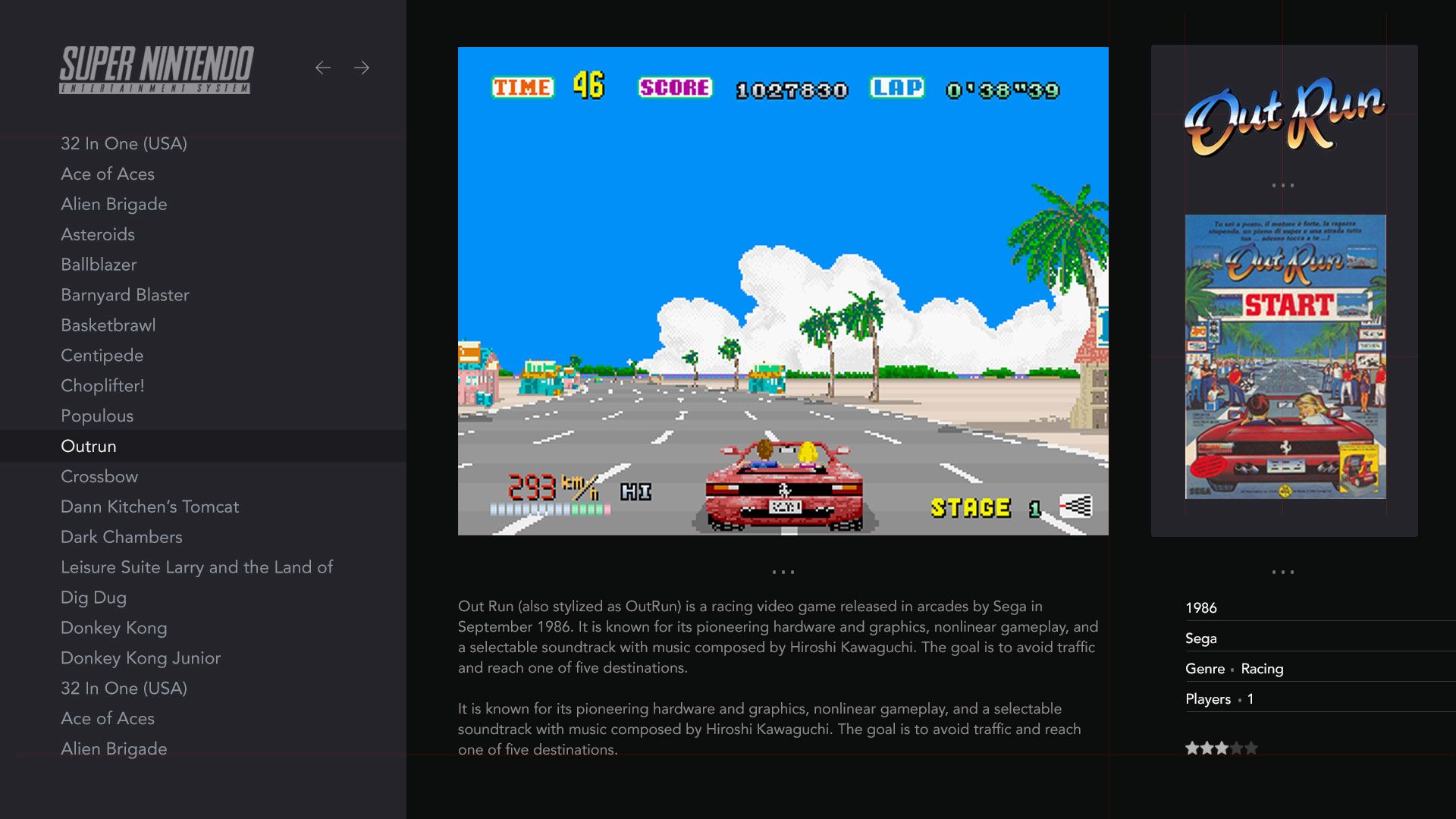
Seeing Epic Noir's clean, modern game selection menu inspired me to attempt on one with a very similar layout - adding in the idea of using the space on screen-right showing box art and marquee (wheel) art with video snaps simultaneously, like this work in progress mock-up screenshot.

I've found I cannot enable more than one piece of visual metadata, and posted a feature / help request on the projects and themes forum > here
Just curious as to whether anyone here has any advice! Hope this is okay to post here @chicuelo, I love the new theme and it really got me thinking about how to present historic game info in a clean uncluttered way.
-
@Jimiga Nice approach! I think you will have some issues with landscape game covers and portrait format game logos, but anyway it looks clean! I would make the gamelist darker than the rest to maintain the dark mode aspect
-
"go dark or go home" – someone, probably
-
@ohmycommodore Hehe go dark or go home! I like it!
Funnily enough I did these two alongside each other as a test. Dark does look better for sure.
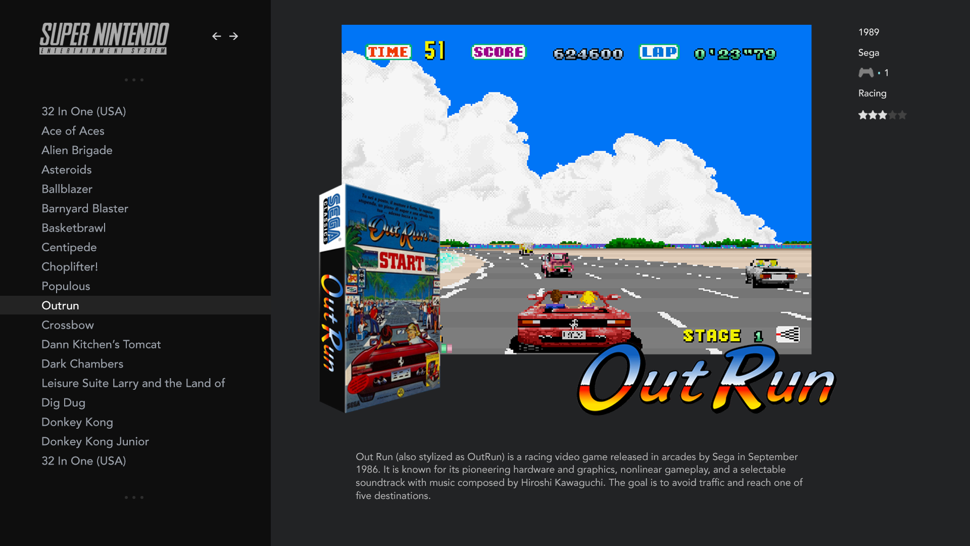
@chicuelo I know what you mean about the wider boxes/ portrait titles being a banana skin for this idea. That's where 3mix art does help. My other tweak experiment was this:
I'm researching whether it's possible to just show the year and not dd/mm/yyyy - I think it's cleaner to have just the year.
All fun, experimenting and learning! -
@Jimiga said in Chicuelo Theme:
I'm researching whether it's possible to just show the year and not dd/mm/yyyy - I think it's cleaner to have just the year.
All fun, experimenting and learning!Second one looks best.
You can have it just display the year for the release date:
<datetime name="md_releasedate">
<format>%Y</format>
</datetime>Using the format tag with %Y gets you there.
-
@LiveFastCyYoung Thanks so much! That date thing had been bugging me for ages, works a charm!
-
@chicuelo Thanks very much for uploading this again. I love the clean look of this theme (and no metadata!). One quick question - on the newest version it appears some systems are Spanish and some are English - do you have English versions of the systems?
-
@RumblinBuffalo mayebe I messed up! Scince I am from argentina, I have the spanis version on the systems I use, I will correct them!
-
@RumblinBuffalo done, they are in english now!
-
@chicuelo Thanks very much! I’ll give it a try. My last build was a couple years ago and it looks like you’ve made some cool updates as well. Appreciate your great work.
-
@chicuelo Couple more quick questions - it looks like the Sega CD logo is missing (replaced by 32X logo/description).
Also, I know it's only partially supported but the TI-99 logo seems to be a bit off centre (I'm testing on a 4:3 screen but it appears different/wider than the others?. It might look OK on 16:9 display which I will try).
And both MAME and FBA are showing "Arcade" logos/descriptions. Is that by design?
-
@RumblinBuffalo I really don´t use too many systems so I could not tell that logos are well displayed, also I do prefer calling "Arcades" to mame or fba because those are the name of the emulator, and not the systems so yes, in that case is a design/ display decition. If you want you can replace any logo of your prefefrence, or edit existing ones to match your build preferences!
Contributions to the project are always appreciated, so if you would like to support us with a donation you can do so here.
Hosting provided by Mythic-Beasts. See the Hosting Information page for more information.