Chicuelo Theme
-
@movisman
The controllers were updated for a more accurate ones, with the logo or some info, so that's ok. Ive noticed that the genesis one and another didn't have the sega logo so I will update them again.I think now we have all the setup fine again
-
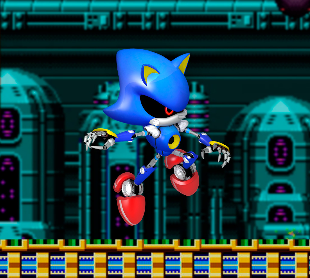
Great, no worries. Don't forget about the Mega CD and Sega CD characters - now they are different. Sega CD is a different Sonic image to Mega CD - I assume the newer Sega CD one is correct/preferable (?) or was this accidentally overwritten too?
Either way, I think they need to be the same, like Genesis and Megadrive are?
-
@movisman Thats the only character I have left to modify, I will upload it asap so you could update your script and change the xml.
I think the slide transition will be awesome -
Great, no worries. So once you have fixed that image, these are the only character images left which were modified recently:
_assets/characters/neogeo.jpg
_assets/characters/nes.jpg
_assets/characters/auto-favorites-2.jpg
_assets/characters/auto-favorites.jpg
_assets/characters/gbc.jpg
_assets/characters/genesis.jpg
_assets/characters/mastersystem.jpg
_assets/characters/megadrive.jpgAre these ones all correct? To me, I think they are but they are clearly modified from previous.
-
Regarding slide transition, it's not too exciting - it's just that the logo no longer slides in front of the text, it will slide behind it which looks a little nicer.
-
@movisman Yes, all those characters are correct. they have minor adjustments so all of them are ok.
Now you can update your files! -
@chicuelo Thanks, this controller icon is much better.
-
Great, I will take a backup and update my theme now to match with your master. I will then check my theme.xml changes.
These are my proposed amendments:
- improved carousel slide transitions if enabled - now the logo does not overlap the text (it goes behind which is nicer)
- adjusted size, position and colour of help icons if enabled
- increase maximum size of image and video slightly, so that media appears at 800x600 instead of slightly smaller. This eliminates the need for any scaling to take place when ES renders it on screen if running at 1080p
- change delay of image>video from 2 to 1.5 to make the transition just slightly snappier
I cannot show you the slide improvement on an image, but here are some pictures of the help icon realignment/colour and the slightly larger in-game preview images:
.
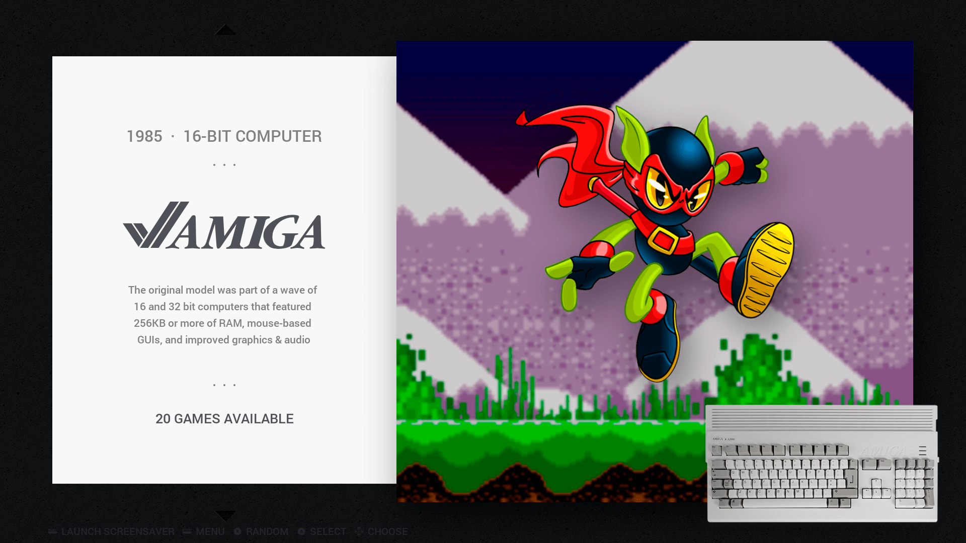
SYSTEM BEFORE:
System (before, can barely see help icons):

.
SYSTEM AFTER:
System (after, lined up text more accurately, reduced font size and used a grey colour which is readable):

.
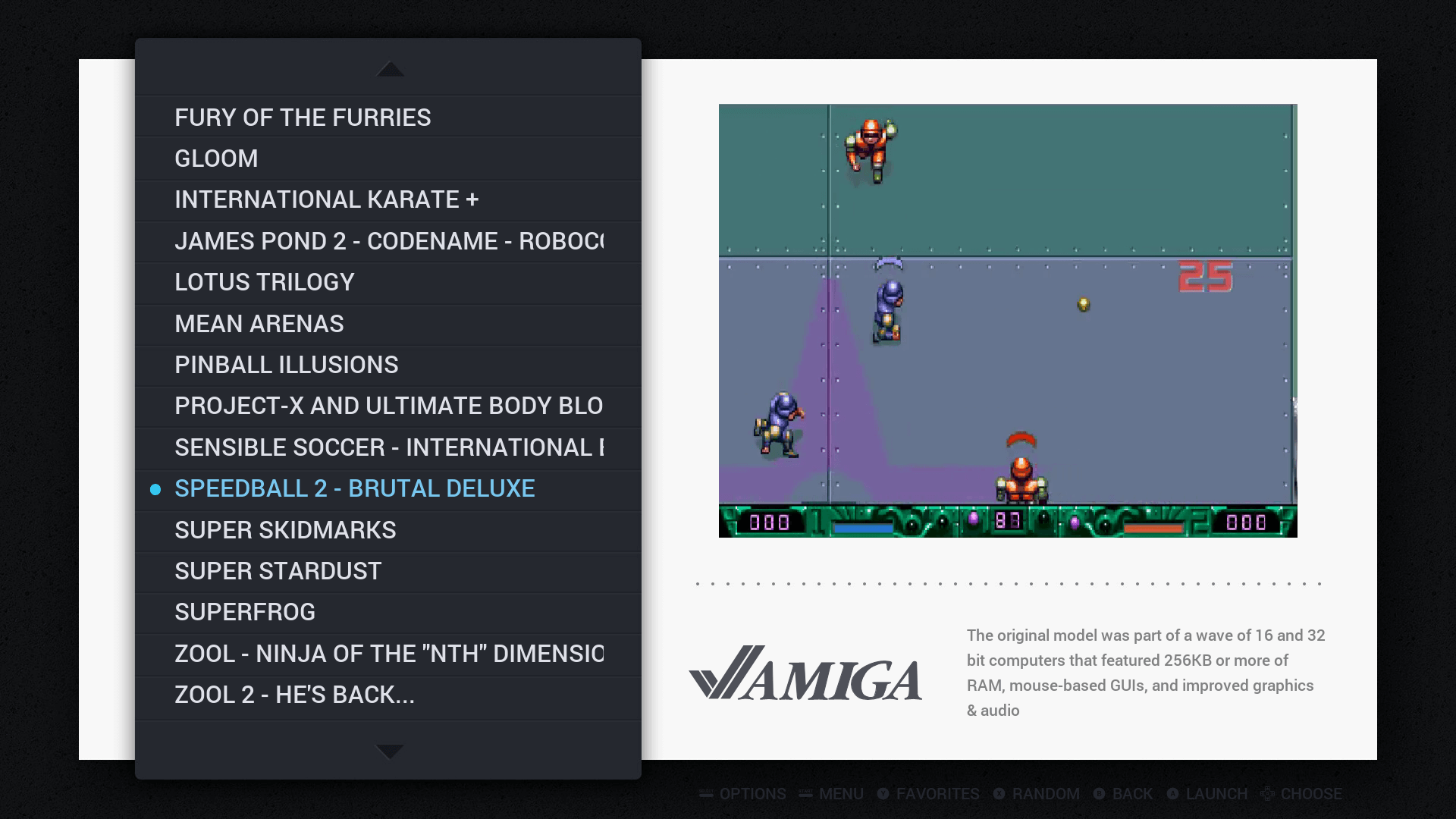
IN-GAME BEFORE:
In-game (before, help icons not visible, preview is resized to be less than 800x600, help icons in a different place which although looks good, is slightly erratic when swapping between in game and system):

.
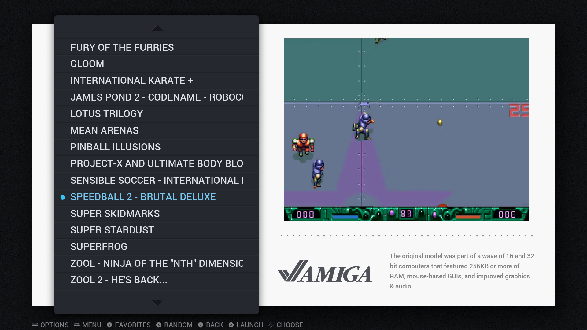
IN-GAME AFTER:
In-game (after, help icons identical to system mode, preview image/video is slightly larger and should measure 800x600 so no resize needed by ES):

What do you think?
If happy, I will raise a PR for the changes, which will also include the slide improvement if you have that transition enabled. The XML changes are only minor, no major rework of anything.
Thanks
-
Oh no! Your last commit for Sega / Mega CD is messed up:
https://github.com/chicueloarcade/es-theme-Chicuelo/commit/a369e850983a3269a3aff1bb53817481344d19fe#diff-fb9fbe25026bd918b37846b027e57d46Mega CD is using the 32X image, and Sega CD is using the Megadrive/Genesis image!
Surely it should be either this or this:
https://github.com/chicueloarcade/es-theme-Chicuelo/blob/7c33a4f1f07a50b5f9a7d8906d328ebeca953b9c/_assets/characters/segacd.jpg
https://github.com/chicueloarcade/es-theme-Chicuelo/blob/91b44f59ece3232cb1f6464adfab4baf664d154f/_assets/characters/segacd.jpgI don't know which you prefer to use, I don't know which is newer or the one which you want. But currently those assets are broken, as above.
Thanks!
-
@movisman said in Chicuelo Theme:
cannot show you the slide improvement on an image, but here are some pictures of the help icon realignment/colour and the slightly larger in-game preview images:
I do prefer a invisible help text, so I disabled in my build, but I think its useful so the color is ok. I think the original position on the in game menu fits better.
For all the other changes I think they are great so yo can raise the PR!
-
@movisman Yes, I overrides those images because they are not maded by me, so I used the sega cd and the genesis to replace them. I thought redesigning them but it will take a lot of time, maybe in a near future, but by now those two are ok!
-
@chicuelo said in Chicuelo Theme:
@movisman Yes, I overrides those images because they are not maded by me, so I used the sega cd and the genesis to replace them. I thought redesigning them but it will take a lot of time, maybe in a near future, but by now those two are ok!
Ah right, so it was deliberate changing Mega CD to be the 32x image, and Sega CD to be the Genesis image? Fair enough. I didn't realise the Sega CD images were not yours. Are you not allowed or do you not wish to use them?
As I run the main Sega systems, including 32x, Sega CD and Megadrive/Genesis, I prefer to have a unique image for each system, so I will keep those other Sega CD images to one side and use them in my build.
Otherwise, when scrolling through the systems there is a duplicate.
Thanks
-
@chicuelo said in Chicuelo Theme:
@movisman said in Chicuelo Theme:
cannot show you the slide improvement on an image, but here are some pictures of the help icon realignment/colour and the slightly larger in-game preview images:
I do prefer a invisible help text, so I disabled in my build, but I think its useful so the color is ok. I think the original position on the in game menu fits better.
For all the other changes I think they are great so yo can raise the PR!
Regarding the help text, as you can disable it entirely in ES, I think if it's enabled, it is useful to be able to see it.
The only comment I would make about the position on the in-game menu, the reason I have it in the same place across all menus is because if you press the start button to open the ES menu while in the in-game screen, the menu will shift back to the bottom left. This is a restriction of ES, and when I looked at the theming guidelines for ES it was suggested all menu icons be kept at the bottom left for consistency. Also it looks quite odd when you open up the ES menu and the menu shifts itself completely from one side to the other.
Do you know what I mean?
-
@movisman
I will create some new characters for it so you dont have a duplicated artwork.Ok with the help text so, as it will remain legible its ok.
Go ahead with your changes!
I wil pull your request and when I have some time I will update the mega cd and sega cd characters
-
Awesome man, thank you so much.
I will update my master, and raise a PR for you with the changes shortly.
Once you have accepted, if you want to test the system logo slide you will have to enable carousel transitions (ui settings > carousel transitions: on). Also you would need to enable the help icons (ui settings > on-screen help: on).
I can easily make an amendment if you are not happy with the PR.
Thanks
-
@movisman
Great! Im familiarized with the transitions but due the nature of the theme I use on instant.
Also I have disabled the screen text so it does not bother at all that setup.
Thanks for your help! -
No worries - you actually leave the transitions on instant, but just turn carousel transitions on. It is only the system logo which slides but it looks quite neat.
Oh and PS. Thanks in advance for creating the Sega/Mega CD characters when you get time.
Cheers :)
-
I just need to check my theme.xml as I need to verify one other thing, and then will raise a PR in a couple of hours or so.
Cheers
-
@movisman Ok, I updated the megacd / segacd character so now its on you!

-
Contributions to the project are always appreciated, so if you would like to support us with a donation you can do so here.
Hosting provided by Mythic-Beasts. See the Hosting Information page for more information.