[WIP][Theme] Retrolution
-
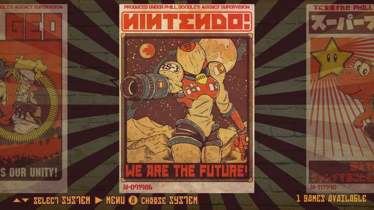
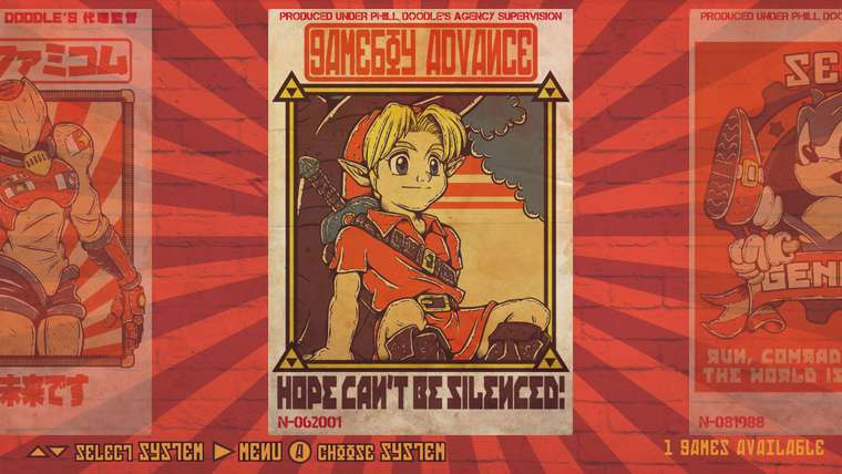
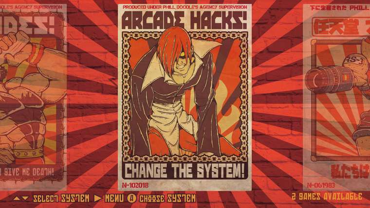
Love the old timey poster looks. Pretty sweet looking theme, keep up the good work. :D
-
Great! Like always, a 4:3 version would be nice. 😊
The theme reminds me of this:
-
Awwe man, this is looking great!
-
@Clyde lol! I'm using the same font.
-
Damn this looks awesome!
-
@lipebello Off-topic: Your redbubble account has no products, is this normal or just my browser?
-
and remember in soviet russia games play you
on serious note i quite like how this theme looks the red yoshi on the poster is a nice added soviet touch :P
-
This is pretty awesome! I'd love to see that stylized Samus as a T-Shirt
-
@blackshadow said in [WIP][Theme] Retrolution:
on serious note i quite like how this theme looks the red yoshi on the poster is a nice added soviet touch :P
Soviet you say ? @lipebello - maybe you can use some Dendy artwork on the NES system to keep it in line with the theme (NOTE: I know the Dendy didn't appear until the '90s, so it's not theoretically from the soviet period).
-
@Clyde I think they removed it, I had some removed from republic as well, lol
-
@mitu lol, didn't knew about that. In the 80s we had a bunch of 2600 and NES clones too, because of our dictatorship period.
-
A little change in the design

-
Looks awesome... :D
Vote for the first design!
-
@jrochagouveia i think i'm gonna bring the red background back and use the posters on the carousel. :)
-
@lipebello I don't know, I like both of them. The second design has a better contrast, the first one drowns a bit in all the red. :)
That said, I like both the wheel of the first design and the horizontal carousel of the second.
Maybe you could make two versions? :D (or four, wheel and carousel with either red or dark background)
-
@Clyde Yup, i'll make and use the logos anyway. It's just a matter of making 2 different main theme.xml files.
-
@lipebello Zangief poster is the best one... Can't wait for it.
-
@jrochagouveia - It's one of my favorites too! i'll definitely will make a shirt of it.

-
@lipebello Yep, after seeing both of them, I definitely like the dark background more. 😊
That said, could you try a colour that is in the middle between the light and the dark version? Though I like the dark version more, it admittedly looses a bit much of the red.
Just a suggestion, feel free to ignore it. 😇
-
@Clyde Agreed. i've changed the color to give more contrast and also gave the wall texture more depth.

Contributions to the project are always appreciated, so if you would like to support us with a donation you can do so here.
Hosting provided by Mythic-Beasts. See the Hosting Information page for more information.