Pixel Theme
-
Yeah, I had thought originally that your theme had the text like @ruckage where his was actually all pixels and it would have to be redone to fit.
-
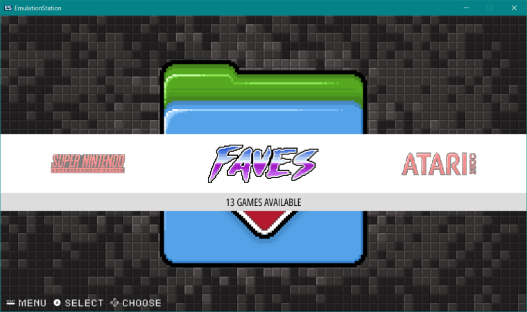
Hmm, I guess Pixel needs to be re-designed to take advantage of the carousel theming...
-
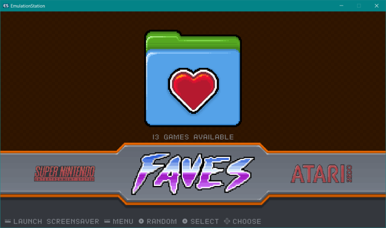
Pixel2 looks way better. LOL. Perhaps some changes to color. Just ganked the FBA theme and copied it over Favorites.
-
@rookervik

This looks incredible! -
One day I'll finish. Hopefully soon. Off to watch a little anime before bed.

-
@rookervik which anime?
-
@hyruleslink Finishing up "Hajimete no Gal" and watching "Mahou Tsukai no Yome" from this season.
-
Here's a pretty big question: Are there any people using Pixel theme that have not updated at least to the version of ES that has video previews and layering?
I need to know this as I am thinking about adding video previews in along with these collections and also moving the carousel down so you can see the pixel art on the system selection screens.
I feel that the ES improvements have been in long enough that it's safe to go ahead and add these features to the main branch of Pixel.
Please note: adding these changes and using the pixel theme on an old version of ES will not work.
-
@rookervik I'd just move forward and make the changes. Even if people are reluctant to update retropie then ES itself can always be updated separately, and if they really don't want to update ES then they can just stick with the version of Pixel they're currently using.
There are so many nice improvements to ES it's a shame not to take advantage of them. -
@ruckage Yeah. I could honestly not care less about video previews. And it's a little bit of a hassle to add with the layering I use. But so many people ask for it. I am a little excited to move the carousel, though. That will look so much better. Shrink the pixel consoles a little so they fit above the carousel. Wish I could come up with something to replace all the tetris blocks. Haha. But that's where Pixel 2 comes.
-
@rookervik if the layering issue you are referring to is due to pixel having multiple background layers, that shouldn't be an issue anymore. When z-index support was added, I adjusted how the video is handled so that by default it should be rendered above any extras. Default z-index values are listed here
-
@jdrassa Awesome. I spent a week or so trying to get video working in the pixel version I had and couldn't get the videos to play over the background. This is wonderful news.
-
Ok, tired for the night. Spent a couple hours on the logos. Don't know what's taking so long. Adding anti-aliasing seems to be taking me longer than normal. Probably cause of the gradient coloring on the letters.

-
@rookervik Yes, please! I would very much love to have video previews in Pixel :_D
-
Ok, we just about ready with this? Not going to mess with moving the carousel yet. I'll save that for a weekend.
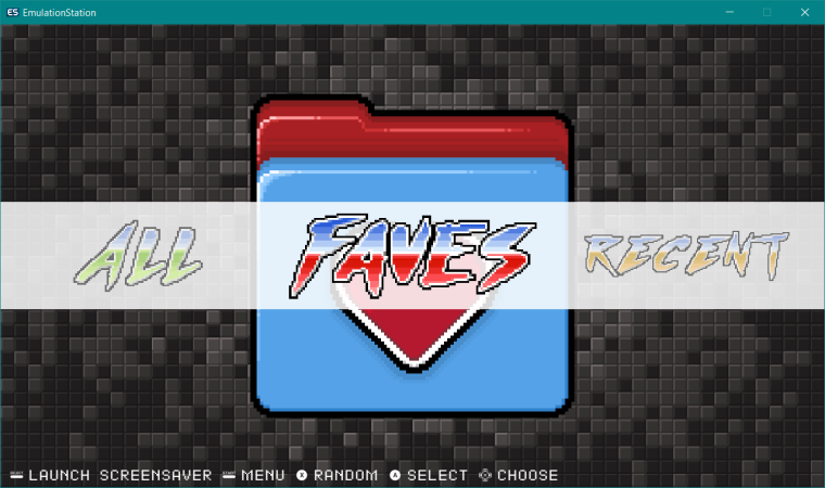
Update: Collections are now live in regular Pixel theme github. You can update it with the setup script.
Update2: Pixel-Metadata has been updated with Collections. Update through the setup script.
Let me know of oddities or bugs. I'll try to get them squashed before I add videos and move the carousel.
-
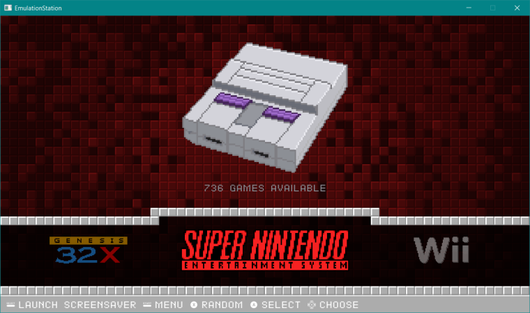
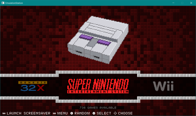
Now for some carousel changes. Finally figured out what my logo scaling issue was.
-
This looks pretty good. Now might need to do some color tweaks on the backgrounds, but I don't really feel like it. LOL.
-
@rookervik Quick question. Is it just me and my monitor resolution, or does the SNES icon on the regular pixel theme overlap the trivia information about the SNES and it's resolution? I'm still loving Pixel Metadata after the help that @ruckage gave me though.
-
@sgtjimmyrustles it probably overlaps. That's not a position I set custom for each system. It's a position to load every console image from and display them all to a certain size. I believe there are quite a few that overlap. But the overlapping didn't bother me so I left them. The wider your aspect, the less it will overlap.
-
@rookervik said in Pixel Theme:
@sgtjimmyrustles it probably overlaps. That's not a position I set custom for each system. It's a position to load every console image from and display them all to a certain size. I believe there are quite a few that overlap. But the overlapping didn't bother me so I left them. The wider your aspect, the less it will overlap.
Interesting. Maybe if I shrunk the images down to a certain size, I could stop the overlap. Either way, like the update, it's nice.
Contributions to the project are always appreciated, so if you would like to support us with a donation you can do so here.
Hosting provided by Mythic-Beasts. See the Hosting Information page for more information.