Pixel Theme
-
@rookervik said in Pixel Theme:
@sgtjimmyrustles it probably overlaps. That's not a position I set custom for each system. It's a position to load every console image from and display them all to a certain size. I believe there are quite a few that overlap. But the overlapping didn't bother me so I left them. The wider your aspect, the less it will overlap.
Interesting. Maybe if I shrunk the images down to a certain size, I could stop the overlap. Either way, like the update, it's nice.
-
@sgtjimmyrustles you can change a single line in the pixel.xml (I think) to make them smaller. Look for "Bottom Console Image" and change the
<maxSize>0.25 0.25</maxSize>smaller... like 0.2 or 0.15.Unless the themes are also setting the size. Then it's a massive ordeal. And I need to work on fixing that. Pixel was made before I learned you can ignore all those positions and size and just call for an image on the theme.xml to change an option like color, or image location.
Pixel2 already has that incorporated. Time for an upgrade. LOL
-
@Rookervik I am REALY happy with Pixel allready, the actual theme plus the old carbon theme's sounds are a perfect match; sounds retro and looks retro :)
D
Even so, I love the new one, waiting for the update wich while its true that it would undo my changes it will enhance the UX -
@sergioad you can download any previous version using git command and keep your desired version as custom theme in
~/.emulationstation/themes/.I'm on the phone now, but I can give you the exact command later.
-
@meleu thanks, tough; I changed my opinion, I am now all in with the new version after reflexioning
-
@rookervik I like this one, it keeps some aspects of the stock ES carrousel wich many refers it as a belt but also adds many enhancements
-
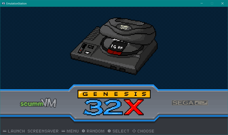
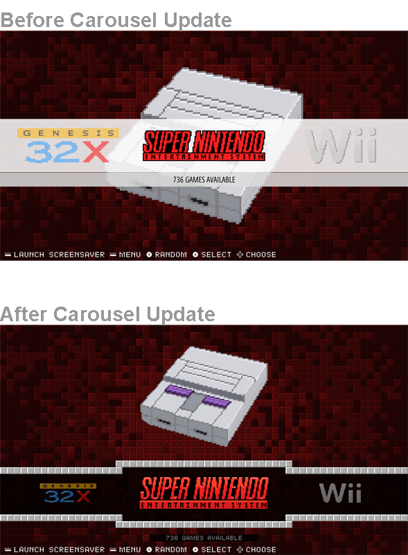
Oh, this is kind of mandatory Pixel update. Haha. Pixel 2 looks totally different. LOL. I always hated how the carousel went through the middle and you couldn't see the artwork. I just didn't want to change the carousel until that change was in the retropie image. We've come far enough that I can make this change I wanted over a year ago but have been putting off.
This is pixel 2:

-
Incredible, the retro feel is strong with this one.
-
@rookervik
The carousel changes look great. -
@rookervik both Pixel 1 (if you use the carrousel from the 2nd. image) and 2 looks realy amazing, definitively my go to theme
-
@rookervik said in Pixel Theme:
Oh, this is kind of mandatory Pixel update. Haha. Pixel 2 looks totally different. LOL. I always hated how the carousel went through the middle and you couldn't see the artwork. I just didn't want to change the carousel until that change was in the retropie image. We've come far enough that I can make this change I wanted over a year ago but have been putting off.
Looking good, but I do kinda miss the checkerboard background.
-
@sgtjimmyrustles As long as I didn't screw anything up, the only thing that has changed on Pixel is video previews were added and the carousel was moved down so you can see the artwork. Kinda pointless to spend all that time on art and have it covered by a massive white carousel. Background is still the pixel blocks like it always has been. Pixel 2 is a different theme. I haven't released it yet.

Just remember, Pixel and Pixel 2 are not the same theme. It's not an update. Pixel 2 will be a different download.
-
@rookervik Ready for it, just waiting until it is finished :)
-
@sergioad said in Pixel Theme:
@rookervik Ready for it, just waiting until it is finished :)
Can't wait either!
-
@rookervik On the Pixel-Metadata theme, while viewing the recent, all and last played categories, there're folder icons and some text behind the game's information in the lower right. This makes it hard to read and should probably be removed.
-
@quackwalks Ok, that sounds like I didn't copy the correct themes' xml files when creating the collections. Thanks for this. I will try to fix that after I have something to eat.
Update: I have made the changes. You can try to update the theme and see if that fixes it. I didn't test it. I don't have any metadata right now. I'm a mess. LOL.
-
Thank you very much friend, just onet thing that I noticed is that a remanent of the ES carrousel is visible on the basic gamelist mode
-
@rookervik That fixed it. Thanks a bunch!
-
@sergioad OH YEAH! I forgot those 2 images were linked. This is where it gets complicated for me. The background images in Pixel all have color codes. So I can't easily use a search and replace to fix all of the backgrounds in one pass. I am going to have to modify each system one-by-one. Haha. So I think I am going to fix up the xmls while I'm at it.
Give me a little time. I'll get those BASIC views fixed. I might even change the basic view to a detailed view but put the system graphic in the box art slot. I think that would look a lot nicer than the normal wide empty space.
-
6 out of 97 systems updated with new formatting. Long, long, way to go.
PS, this does not mean any visual changes, (other than fixing the background in BASIC view) only code is different making later changes much easier.
Contributions to the project are always appreciated, so if you would like to support us with a donation you can do so here.
Hosting provided by Mythic-Beasts. See the Hosting Information page for more information.