New Comic Book Theme!
-
@rodclemen Is this any good?

I did make a tutorial vid, but after the recording I discovered that OBS did not capture the drop down menus. So I will have to redo it.
-
@Zenjiro oh yes! :)
-
As promised here is a small tutorial video 13min long: System Image Tutorial Download for best quality.
I did not have any audio as it is very self explanatory, but I will dictate some notes here for some context.
- Prerequisite is that you install the Shaka-Pow font before you start up your Image Editor Suite.
- Start with a 2400x900 (8" by 3") pixel canvas with 300dpi
- Create 5 Blank Layers: Base, Stroke - White, Stroke - Black, Stroke - Color, and Gradient.
- (Optional) If you have an image with colors that you wish to use you can add it as another layer. I used the cave.png file that was provided to me, as the base for all the colors in this system image.
- On the Base Layer create a Text Layer using the Text Tool with Shaka-Pow font at 150.0 pt, and have the text centered, then adjust the text box so that you can center the word(s) in the dead center of the canvas. It does not need to be perfect, as you can always adjust the canvas size later if needed, but life is easier if you do it now.
- Next adjust the text kerning so that they are just barely touching one another.
- (!!ATTENTION!!) Now create a "Path" of the text by right clicking on the Text and selecting "Path from Text" Once you have created the Path you must not move the Text layer at all, else it could cascade and you will have to start over again. It is best to no longer touch the Text at this point. If you want duplicate the layer so that if you do make a mistake you can revert it.
- Move the Text Layer so that it is on top of the Stroke - Black, but below the Gradient and Stroke - Color Layer.
- Next select the Stoke - White layer and change your color to all white.
- Select the Paths Tab and right click the path you just created select "Stroke Path..."
- Line Width should be 25.0pt, Cap Style Square, Joint Style Miter, and Miter Limit should be 4.0. Select Stroke.
- The White Stroke should appear behind the text, and you will repeat the same process, only this time you will select the Stroke - Black Layer, and the only things to change is the Color (to black obviously), and Line Width which should be 16.35pt
- Do the same thing again but for the Stroke - Color Layer, using the color of your choice. Line Width should be between 1.50pt and 2.50pt. I normally use 2.50pt. You also want to change the miter to 11.0, this helps with certain letters like 'N', 'M', 'V' which have sharp pointed edges, and with the triangle in the 'A'.
- Now import the Dot-matrix, and keep everything if prompted, place it above the Text Layer, but below the gradient and move it around on the canvas till the small dots are just barely on the text still.
- Right-click your Text Layer and select "Alpha to Selection" this should highlight everything that is text with a selection line.
- (!!ATTENTION!!) Be sure to select the Dot-matrix layer after all the text has been added to the selection, before continuing.
- While on the Dot-matrix layer, invert the current selection, then clear/delete. You should be left with only the text having the dot-matrix on it. You can then, and should, deselect everything.
- Next duplicate the Stroke - White Layer and place the Duplicate Layer below the original. Rename it if you want for your convenience.
- Hide the original Stroke - White Layer, it will not be obvious at first that it is hidden as the duplicate is right underneath it, then with the fill tool, color it whatever color you want. Normally the Stroke - Color layer and this layer are the same, but this is art, make it whatever you want it to be.
- Move the layer down a little and to the right. Then turn the original Stroke - White Layer on.
- Move the Duplicate Colored layer till it aligns well with one of the edges of your choice and move it down to your liking.
- Next go back and select the color you used for the Text, and add the text to your selection again. Then select the Gradient - Layer
- With the gradient tool (I normally use Linear Gradients, but choose what you like and experiment if you want) add the gradient on the Gradient - Layer. The Gradient - Layer should be below the Stroke - Color Layer and above the Dot-Matrix Layer.
- Lastly, select the Duplicated Stroke - White Layer that you colored earlier and add 4 Drop Shadows. Each one with a blur radius of 30.00. And each one with a different X,Y combination. (20,20) (-20,-20) (-20,20) (20,-20)
- At this point you are pretty much done.
- For the Retropie you will need to make some finalizing adjustments. ALWAYS scale the final product to have a width of 2000p with a dpi of 72.0dpi any higher and it will not render on the Raspberry Pi. Then export the image as a png file and uncheck all options.
- I did not show it in the video, but I would recommend using something like PNGquant/Pngyu and compressing it from a 256bit to 128bit image. Which can cut the overall size of the image down 70-80%
- After-Thoughts Some System's or Collection's images might be larger than the 2400 x 900p feel free to adjust the canvas to the length that it needs to be, before creating the stroke path. You will also need to ensure all other layers are also adjusted to the new canvas size. Just be sure that once you are ready to export you make sure the final product is no larger than 2000p with 72.0dpi.
-
@Zenjiro I will have a look tonight! but thank you SO much for all that hard work!
-
@Zenjiro WOW geatest job. Really complete. Congratulations ans my respect.
-
I've recently make a small break through that might allow me to show how to get a near accurate recreation of @TMNTturtlguy's Comic Newsprint filter, in GIMP, that is used to give the comics there texture/feel. Right now I am just playing around with it but, it is completely possible to do. More to come.
My current method is okay, but it has its issues. This new one should be a better method
...and now I have more work to do, with redoing all the comics I have already made.
Edit: May have spoke to soon. Hit some snags. But I will keep tinkering with it and post a tutorial on how to do the Newsprint filter once I get it looking right.
-
Small update from me. I have merged the 3.2-Beta into the master branch. https://github.com/Zenjir0/es-theme-ComicBook
I will probably not abandon this project for a long while, but development will be sporadic, since I am the only one working on it. Help is always appreciated. It will be slow, but any errors, or issue anyone posts in the github I will make a priority to address.
Thanks to everyone who supports and uses this theme!
-
I have added over 30+ tickets to my fork's issue tracker to show all the themes/collections, and ideas I have planned for the future. If anyone wishes to tackle any of them, or add suggestions, and other ideas feel free to. https://github.com/Zenjir0/es-theme-ComicBook/issues
-
@Zenjiro I see you put my images in naomi and atomis, thanks a lot.
-
@salor10 You're welcome. And anyone who submits any content to this project, I will be sure to include and give credit in the Thank You section of the Readme, as well as in the changelog for the theme that was supplied.
-
I would love to see one as a vertical scrolling because i like the theme but i love more vertical scrolling theme's.
-
@Ecks Simple enough to do. Just go into the comic_book.xml file change the carousel settings to the following:
<carousel name="systemcarousel"> <type>vertical</type> <color>eeeeeecc</color> <logoScale>1.5</logoScale> <maxLogoCount>1</maxLogoCount> </carousel> -
@Zenjiro Thanks but for vertical styles i like one's like Royal_Primicia which i would of loved to see that type of style with this theme.
-
@Zenjiro, what is the config for the filter newspaper you use in GIMP? I want to create some systems and want to be uniform.
-
@salor10 So there are actually 2 that I am playing with. The big issue is that GIMP is moving away from the one I am using and it is not available in the newer default GIMP install. There might actually be a way to get the same effect with the newer version but I have not tinkered with it much.
You can get the older plugins from here
You want to be using the "Gear/Old" Newsprint distort, and not the "GEGL/New" version.
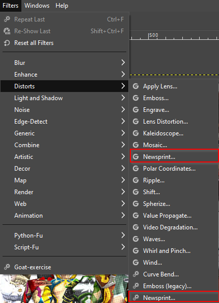
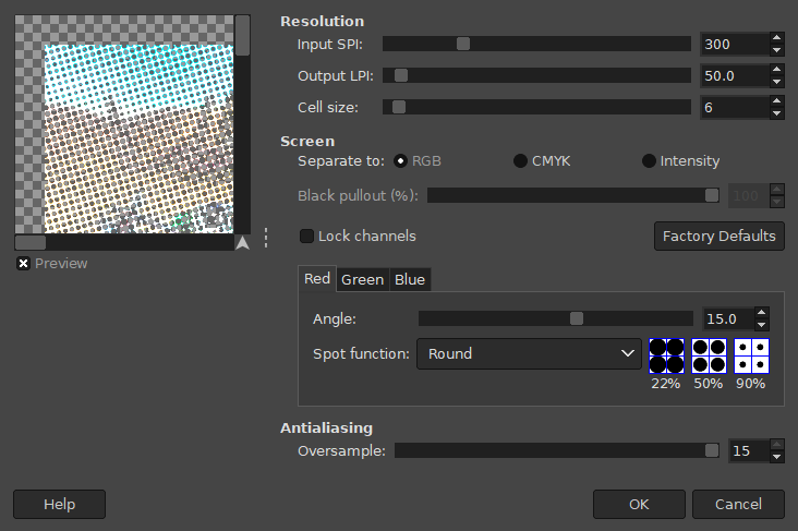
All of my themes I have added I need to redo. So I am going to suggest what I will be doing moving forward, which is nearly identical to what all the other themes already use. These are pretty much the settings @pjft suggested here with the exception of cell size being 6 instead of 5.
- Make a duplicate layer of the image(s) you wish to apply the newsprint filter to
- Select the duplicated layer you just created, be sure it is layered on top of your original.
- Filters > Distorts > Newsprint
- Set cell size to 6
- Choose Separate to RGB
- Set each color (Red, Green, and Blue) to an angle of 15.0 degrees
- Set Antialiasing Oversampling to 15 (max)
- Press OK to apply
- Change the Opacity of the Newsprinted Layer to your desired level (I use anything between 5-10%)
Then be sure once you are finished, to scale the image down to 1280x720p and change the DPI from 300 to 72. Then you are ready to export.
If you wish for me to add your finished product to my branch I recommend providing the RAW .xcf file and I can ensure it is applied/finalized correctly before merging it in.
Hope this helps, can't wait to see what the community can produce!
-
@Zenjiro Really it's a geat help . I make a openbor theme images.
-
Openbor System.

Bannerlogo

Comic_rip
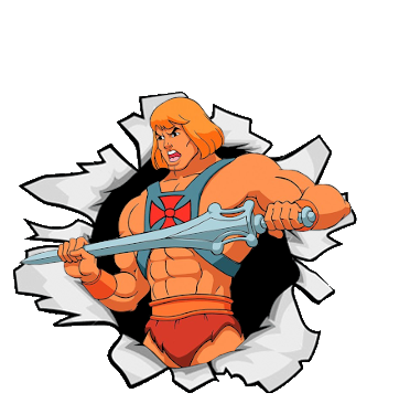
Comic
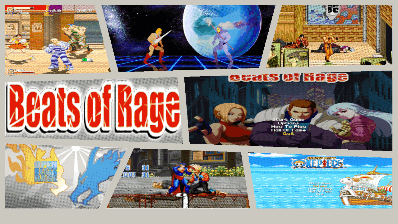
If you want i will send to you the masters.
-
@salor10 Awesome job!
If you want i will send to you the masters.
Entirely up to you, if you want me to add it to my branch I will need them. I will be sure to credit you for the contribution.
-
@salor10 Those look really great, though I have one little suggestion for improvement of the Beats of Rage picture. The picture in the middle right is oviously stretched which makes the characters look out of proportion and "fat". I would recommend to find a fitting one that doesn't need stretching. 🧐
-
Contributions to the project are always appreciated, so if you would like to support us with a donation you can do so here.
Hosting provided by Mythic-Beasts. See the Hosting Information page for more information.