New Comic Book Theme!
-
@Zenjiro Thanks but for vertical styles i like one's like Royal_Primicia which i would of loved to see that type of style with this theme.
-
@Zenjiro, what is the config for the filter newspaper you use in GIMP? I want to create some systems and want to be uniform.
-
@salor10 So there are actually 2 that I am playing with. The big issue is that GIMP is moving away from the one I am using and it is not available in the newer default GIMP install. There might actually be a way to get the same effect with the newer version but I have not tinkered with it much.
You can get the older plugins from here
You want to be using the "Gear/Old" Newsprint distort, and not the "GEGL/New" version.
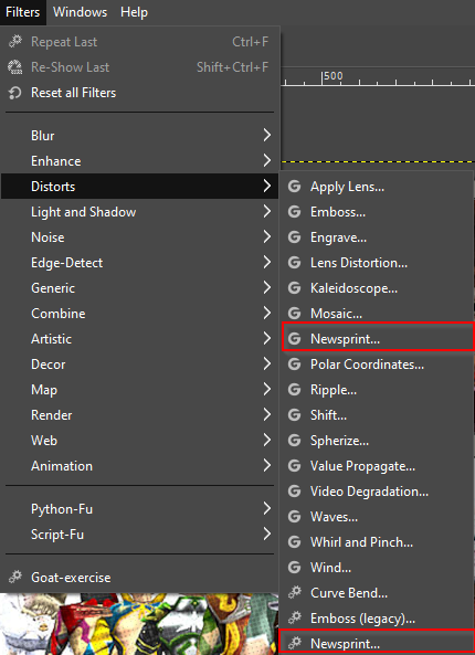
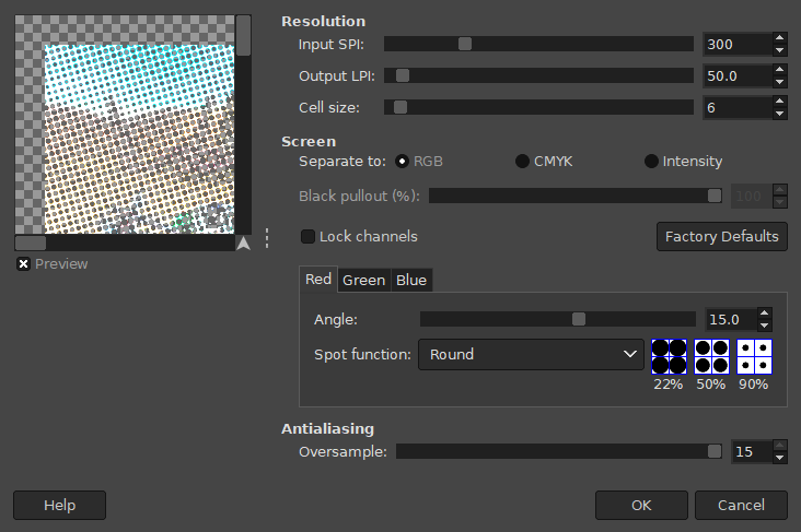
All of my themes I have added I need to redo. So I am going to suggest what I will be doing moving forward, which is nearly identical to what all the other themes already use. These are pretty much the settings @pjft suggested here with the exception of cell size being 6 instead of 5.
- Make a duplicate layer of the image(s) you wish to apply the newsprint filter to
- Select the duplicated layer you just created, be sure it is layered on top of your original.
- Filters > Distorts > Newsprint
- Set cell size to 6
- Choose Separate to RGB
- Set each color (Red, Green, and Blue) to an angle of 15.0 degrees
- Set Antialiasing Oversampling to 15 (max)
- Press OK to apply
- Change the Opacity of the Newsprinted Layer to your desired level (I use anything between 5-10%)
Then be sure once you are finished, to scale the image down to 1280x720p and change the DPI from 300 to 72. Then you are ready to export.
If you wish for me to add your finished product to my branch I recommend providing the RAW .xcf file and I can ensure it is applied/finalized correctly before merging it in.
Hope this helps, can't wait to see what the community can produce!
-
@Zenjiro Really it's a geat help . I make a openbor theme images.
-
Openbor System.
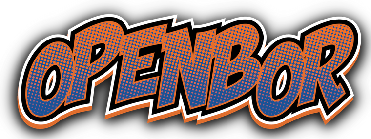
Bannerlogo

Comic_rip
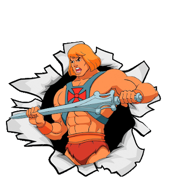
Comic
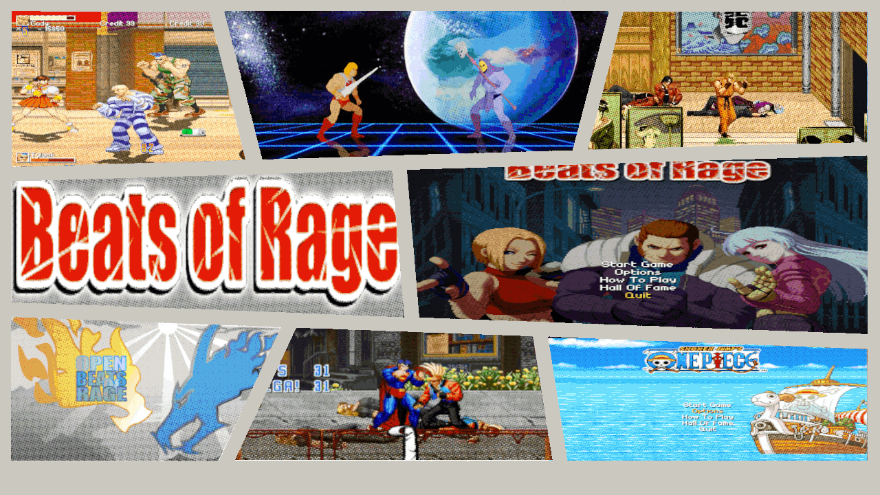
If you want i will send to you the masters.
-
@salor10 Awesome job!
If you want i will send to you the masters.
Entirely up to you, if you want me to add it to my branch I will need them. I will be sure to credit you for the contribution.
-
@salor10 Those look really great, though I have one little suggestion for improvement of the Beats of Rage picture. The picture in the middle right is oviously stretched which makes the characters look out of proportion and "fat". I would recommend to find a fitting one that doesn't need stretching. 🧐
-
-
I remake system. more colors according.

-
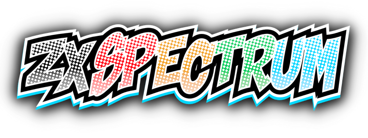
I do it for ZXSpectrum, the original i don't like so much.
-
How do we go about making new system images? is there a template we can use? or do we submit a request?
I need to make system images for:
Atomiswave
Naomi
Neo-Geo CDThank you for such an amazing theme, it is still my all time favorite theme, absolutely love it.
-
@salor10 said in New Comic Book Theme!:
I remake system. more colors according.
[Openbor image]
How do I add this image to the theme? can you point me to the instructions, I am brand new at this and appreciate the help. Thank you.
-
@KazeOne I have those themes in my fork
I also made a post that might answer some of your questions.
I still plan on adding, and doing more stuff for this theme, but currently lack the motivation to do it, as I am actually playing some the games in my back log now, and been thinking about getting into streaming.
If anyone does want a particular theme or edit request just submit a ticket on github and I will priorities those.
-
Someone knows how to fix the "stars" of every game rating not showing properly?
-
@sergio_mikkos Depending on the version of Emulationstation and how you have it setup in the gamelist.xml file. It can be several things.
I was able to reproduce the issue on my Raspberry Pi 2B, as well as on Jrassa's EmulationStation port for Windows. From what I can tell it is probably something to do with the new Z-indexing (Image Layering) As the image is present but the grayed out image is overlapping the colored image.
But this is might be an issue with Retropie's EmulationStation itself. As this behavior does not appear on fabricecaruso's EmulationStation.
-
@Zenjiro Thanks!
In the stars I can appreciate a bit of the red color outlining the star, so I guess the problem is with the Z-indexing you said.
Is there any way to manually fix it?
And another question: I just saw that the theme is being updated by you (great work dude!) and now the last version is 3.2 Beta, how can I update the theme to this new version or download it from scratch (maybe from the Retropie Setup Menu)? Actually I am using the Comic Book Theme downloaded from the retropie setup menu which I guess is the original TMNT version.
Thanks!
-
@sergio_mikkos If you are going to use my fork I recommend starting fresh or renaming it to something like comicbook_revived or anything other than the default. I moved several folders and images around so if you were to overwrite what you already have it will probably break something.
Best thing to do is to download it from my github page and manually add it to your themes directory.
As for fixing the overlay of the two images, I can poke around, but can't guarantee I can get it working. I am a very novice themer and have self taught myself several things during this project.
-
@sergio_mikkos hahahahaha well... I fixed it
It was stupid simple to do.
I will update it to my fork, but it you want to do it manually, all you need to so is open the comic_book.xml in the text editor of your choice. (I use Notepad++) And edit the following:
From this:
<rating name="md_rating">
         <pos>0.87 0.66</pos>
         <size>0 0.038</size>
         <filledPath>./_assets/star_filled.png</filledPath>
	 <unfilledPath>./_assets/star_empty.png</unfilledPath>
        </rating>
To This:
<rating name="md_rating">
         <pos>0.87 0.66</pos>
         <size>0 0.038</size>
	 <unfilledPath>./_assets/star_empty.png</unfilledPath>
         <filledPath>./_assets/star_filled.png</filledPath>
        </rating>
What is happening is that when it is applying the images on the screen it first applies the star_filled.png then the star_empty.png, which causes the overlap. So the edit just changes the order of apply the empty star image first, then the filled one.
-
@Zenjiro great dude!! :D
I will download it and install it as soon as you update your fork :)
Thanks!!
-
@sergio_mikkos It has already been updated. The version naming I am using is subjective. I will typically create a new branch if I am experimenting with new features. The latest is 3.2-Beta2 and small tweaks like the one you pointed out will simply be added whenever I make a push to the repo, and if anyone else finds small graphical errors I will do the same, and make adjustments to the images.
The reason it is Beta is because I made so many changes/alterations that there might be some small issues here and there, as well as possible compatibility issues with older devices, but overall it is complete in its current form.
Contributions to the project are always appreciated, so if you would like to support us with a donation you can do so here.
Hosting provided by Mythic-Beasts. See the Hosting Information page for more information.