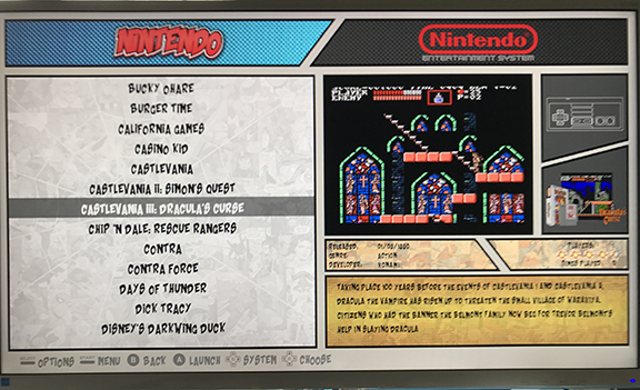
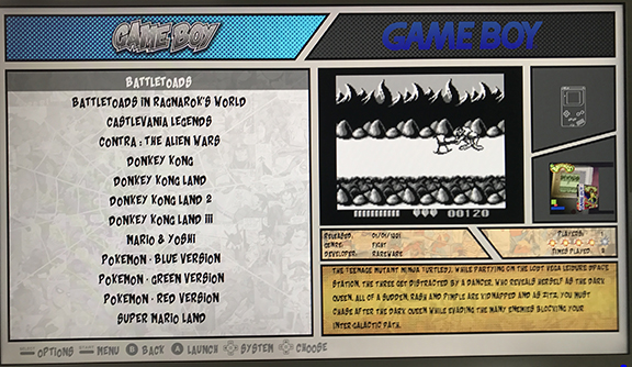
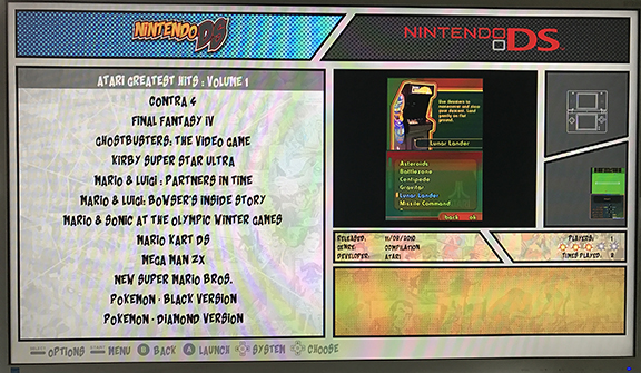
New Comic Book Theme!
-
Here you have a photo, to replicate it place 1 video and 1 logo for a console game:

Also the game box it's not centered...
-
@Nismo Thank you! I was able to recreate the issue and i have come up with a fix. I have placed the marquee back in the main comic_book.xml with a size 0 0 and off the screen. I have kept the marquee in the individual system theme with the proper location. Now the theme.xml will override the comic_book.xml for arcade cabinet systems and there should not be conflicts with other home console systems.
Update Link v2.2
On another note, i do like your idea of having the game logo in the right hand box, unfortunately i don't have game logos for most of my games, and definitely not saved as marquee in my gamelist. I suspect a lot of users do not have this either. Great idea though, i do really think it will look nice.
The box art - this is a puzzeling issue for me. I noticed it on my game boy md_image scraped art. Here is what I have, most of my scraped art is a 3 or 4 image compilation from the universal xml scraper. I did this well before my knowledge of how to put together themes, and before video previews, so it looked really nice on the standard theme options. Now, i would like to show them like yours, but i have to re-scrape them for a lot of games/systems. The <maxSize> boundaries are set to the size of the gray box that the art goes into, so my 3 image art fits perfectly into the space, but my single image does display like yours. I am wondering if there is an alignment issue with the <maxSize> function. Does that function allow you to center the image in the maxSize or does it align it to the right? I have provided images of my issues as well. This did not happen with <size> They were always centered with <size> @pjft, since you are good at reading the code, would you mind looking into this to see if you can verify what might be happening? That would be great.
Lastly, i need to do some research on how to take screenshots from my pi! I know there is a way, just need to figure it out so i can stop these terrible phone pictures!


-
@pjft Thanks, i was able to recreate the issue and fix it. I think that it should be easily removed from the video view at some point, but at least the work around is easy. I just had not clue it was an issue. Like you, i only have marquee for actual marquees from standup arcade cabinets, so it doesn't affect me. I do like how @Nismo game logo art would show up in that box though, that is a very nice touch to the theme! Unfortunately that would be a lot of work for most users to scrape game logos and update properly in their .xml files.
-
It's easy to add logos for console games and to update your gamelist. Take a look at my oldroom theme thread, you can find there logos and how to update your gamelist.
I still need to upload lot of system media, for sure..
-
@TMNTturtlguy I would probably expect @Nismo to have some insight into how to center the image there. Maybe there's an alignment parameter?
I am happy to take a look at the image code tomorrow when I'm not on my phone, but I don't think it should be the case. I believe even carbon or the simple theme use max size for the images and they are centered.
Could you share the code for that image in the thread? Maybe it's something others would be able to spot?
-
@pjft here is my code, it is from the theme.xml file.
        <image name="md_image">
		<pos>0.982 0.6</pos>
		<maxSize>0.127 0.149</maxSize>
		<origin>1 1</origin>
	</image>
as you can see in my screenshots in the earlier post, the larger images are centered correctly and if i increase their size, they spill out of the bounding box. I notice when i increase the max width, the image expands to the left, and the right side of the image stays in the same location. It does not expand to the left and right as i would expect it to if the image was centered.
@Nismo since you are very skilled in theme building, any ideas on what i might be able to do? how do your horizontal boxes show? do you have an snes or n64 boxes to show an example of?
-
@TMNTturtlguy if I recall correctly, for it to be centered, origin must be 0.5 0.5. As it is you're anchoring it to the bottom right edge, I believe.
-
@pjft ah ha - this has been my issue all along. I haven't downloaded the theme builder as I started this before that became available. My initial understanding that >1 1< was center of the screen overall and the position was based off of that. I did not think it was within each image box itself. I will have to give that a try later on tonight to see if it works! Thanks for the tip.
-
@pjft sure enough, that was the issue. Thanks again
-
@Nismo Thanks again for your testing and recommendations. Both issues are now resolved through my testing. I am posting updated versions. I believe your system is more advanced than other users, so i really appreciate the issues you are able to identify for me and help make this a much better theme!
-
-
Sorry for the delay, I downloaded the latest version and all issues seems fixed.
I'm still thinking there's no need of two system logos... XD. I'll tweak the theme to display the game logo at top right... ;-)
The only issue I notice, it's the 3D Box for the game it's so small to appreciate any details...
I think you can still rush a little more the available space to make the images a little bigger.
-
@Nismo no worries on the delay! I agree with you that the game logo will look nice on the top right, i just think that not many users have all of those logos downloaded and in their gamelist. I might modify my personal one as you are doing because it will look cool!
-
I notice that the black lines on sega CD are not displaying correctly:

Also I modified md_image to make 3D box biggest as possible (both width and height) to appreciate more details.
Before:

After:

Code:
<image name="md_image">
	<pos>0.923 0.525</pos>
	<maxSize>0.155 0.195</maxSize>
	<origin>0.5 0.5</origin>
</image>
But since gamepads are usually wider, I think cuold be better if you can make the gamepad box less taller to increase 3D Box height size. Example of my desired size:

And as a request, I miss system logos for Game Gear, Master system, Sega 32X, Sega CD, SG-1000, 3DO, Atari 5200, Atari Lynx, Neo geo pocket, Neo Geo Pocket color, Turbografx 16, PC Engine, Zx spectrum, Commodore 64, Amiga, Atari ST.
Thanks in advance...
-
@Nismo Thanks for even more support! I will try to get to these in the near future.
I am also working on another theme, I was hoping to get video to play on the system view, but it does not appear that is possible. Any thoughts?
-
Impossible, video only plays in video view, but you can make a request so maybe some nice people with coding skills like @fieldofcows, @pjft, @jdrassa or @Zigurana can include that option to play background video in system view...
What to do think about make the 3D Box place taller to appreciate more details?
Two themes at same time?, seems you have a lot of free time... just joking.
-
Another suggestion, I don't know why menu.png inside art it's not a standard size, it's not 720p or 1080p, it's 792p wich is close to 720p, and it's filesize it's 448kb. (I noticed it's a 4:3 stretched image).
So for better performance on rpi I would reduce it to no more than 225kb, or just make a 1080p one with more quality and leave the filesize no more than 512kb.
The same for every comic.png in every system, too much filesize for a 608p image... I would make a 1080p or 720p version with the tips I told you before...
The thing it's to have the theme better optimized. That's because the white screen in old ES versions.
If you want, I can help to you to resize the images if you upload for me a copy of original/uncompressed ones.
-
@Nismo Thanks, i will look further into this as well now that the theme is more optimized on the new ES updates i will try to optimize my art sizes. I will try to make as many of these changes from your last few posts at the same time to minimize all the update releases. (none of the images are stretched from 4:3, they are all originally 1920x1080 and then resized until I had them running smooth on the old ES, I kept some naming conventions as 4:3 as my original theme was 4:3 for an arcade cabinet and i found changing the file name in the .xml files a waste of time!)
regarding the box size, interesting idea, not sure what i will do but i will consider it. The intent of that box is for general scraped art, so by making it tall, it is optimized for tall box art, but what about horizontal box art, now that will look small in the opposite direction. Also, for those who use universal xml to create compilation images, the square format i currently have is optimized. I will look at the code you posted and optimize the max size for the largest possible square shape for now and will consider enlarging at a later time. Once I get further along i can send you the photoshop file for the menu.png and you can modify your system as you would like.
2 themes at once! yes i am crazy - I have a few actual standup arcade projects i am building and i am trying to make each one unique. The ComicBook theme is/was my first ever theme attempt, so now i am working on my second and hoping to have a more clean file structure. Probably won't look as cool, but will be different for sure. I also only have 17 system views, so it isn't to terrible to create what i need, the real work is all the other systems i do not use that others will need :) More to come, probably not until the end of the weekend on this theme. Thanks
-
I'll be happy if you almost make the remaining comic look system logos...
@TMNTturtlguy said in New Comic Book Theme!:
(none of the images are stretched from 4:3
Yes, you are right, I was confused by the black bars from windows 10 image viewer when you are not in full screen.
Thanks for taking my suggestions into consideration. Good look with your new theme.
Regards.
-
@TMNTturtlguy hi!
A question, if I may: would you happen to have the original images for each system before you apply the dithering filter?
I recalled an old iPhone app I had, called Halftone, that does the kind of visual effect I think you're trying to achieve, but whether it's because of the screen size on the phone, or something else, it looks nice.
I wonder if it'd help to, prior to applying the Halftone filter in Photoshop, manually force resizing the images to an integer multiple, and then using the filter on it.
Not my area of expertise, mind you. It's just that everything in the theme looks so sharp, but those particular images look slightly rougher, that in trying to think of ways to make them consistent.
Have a great weekend!
Contributions to the project are always appreciated, so if you would like to support us with a donation you can do so here.
Hosting provided by Mythic-Beasts. See the Hosting Information page for more information.