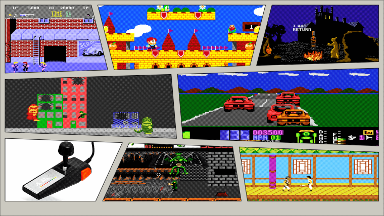
New Comic Book Theme!
-
@Kischa I have no intentions of sharing all of my files, i have literally hundreds of files for these themes, and each version has their own set of files. Currently I have shared the base files and that will get you pretty much everything you need to create your own backgrounds. The logos are created using illustrator and PS and the text in illustrator is converted to outlines and duplicated 4 times and layered. Once this is done, the text is non editable and the file won't do you any good anyways. All of the png are available in the folders, so you can use those how you would like. All I ask is that you make mods on your own end and don't share them here, unless you send them my way first and we agree to implement it for everyone.
As for 4:3 and 5:4 - this theme has to be created individually for each aspect so that the line work and images align with the backgrounds. The theme will work on 5:4, however my guess is that the line work and images won't align perfectly. I have no intention of creating this for 5:4 as i don't have a monitor that aspect ratio, and I don't have the time to create a 3rd version of the theme. Sorry.
Thanks for the kind words on the theme.
-
hi @TMNTturtlguy , love your work! Any chance to include Super Famicom menu as well?
-
@pjft @Nismo @modmaster and all others,
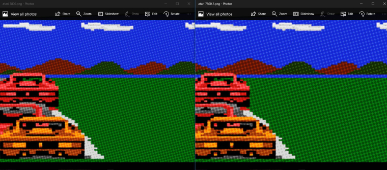
Here are 2 updated options for the newsprint affect we are trying to achieve. I was able to use gimp per @pjft instructions and then take back into photoshop and finally i have compressed using riot to get the images to 512kb. That is an important step we need to consider in our testing is how it looks at 512kb. I have created 2 similar options, the difference is a slight change in the dot size. Please let me know your preferences.
Here are the images as well as a side by side comparison of the 2:
Option 1

Option 2

Comparison

-
@LorThe3rd how is your current system set up? Do you have a separate rom folder for Super Famicom or do you use the snes for your roms?
-
@TMNTturtlguy I personally think I like version 1, with the smaller dots, but let me try to get these on my LCD and see how it actually looks, rather than on my computer screen.
But regardless, which one do you like the most? Do you even like any of these at this stage? I don't want to feel that we are getting you to invest your time in a direction that does not match what you envision.
Thanks a lot for the effort here!
-
@TMNTturtlguy yes, I do have 2 separate rom folders, one for sfc, one for snes.
-
@LorThe3rd i just need to make sure i name the theme folder the same as the es_system.cfg names it. I don't have any of those systems in my es_systems.cfg file, so i don't know exactly what the folders are called. Can you confirm the folder names for super famicom and possibly famicom or family computer entertainment system - i believe that is what it is called? please forgive me.
-
@pjft Thanks for your testing and help. I think we are getting closer to my original intent with a clean newsprint look that is sharp, i am not exactly happy with the single round dot look, as the filter as applied in photoshop is really nice looking. The problem is that we need to maintain small image sizes, i can't have a 5mb file for each background, so i think this will get us to a good place. It isn't my exact vision, but it is a sharper image and it sounds like the common consensus is that the sharper dot image is preferred over the heavily dithered effect of the original images.
-
@TMNTturtlguy said in New Comic Book Theme!:
family computer entertainment system
Super famicom ---> sfc
Famicom ---> famicomcoz it works on Pixel Theme :)
-
@LorThe3rd Thanks! I will take a look at pixel and create them based on that layout. I assume you are ok with the same background images i am using for NES and SNES? the systems basically play the same games correct?
famicom = nes
Super Famicom = snes -
The one with smaller dots looks better on my tv... just my personal taste.
-
@Nismo what are your feelings overall compared to the originals? any other ideas, better? worse?
-
I like the results, it's an amazing theme, the only thing it's the 3D boxes images a little small for me.
But at the end, this is your theme, we only can provide suggestions and tips. I love this theme anyway.
-
@Nismo stay tuned for updates on other aspects! Currently working on the system image backgrounds and logos...I will look into the box art next, and if i decide not to change it, i will give you the photoshop file so you can adjust as you would like!
I am also still looking into comic style controllers, but that might take a lot of time to get through every system....and might be months down the road.
-
@TMNTturtlguy Good news for us!!! Thanks!
-
@TMNTturtlguy Yes you nailed it. you update the es systems cfg file to add systems. Still point it to each emulator, basically you just get to define a new theme and romset. This can be done with any combo of things to define your system.
-
@modmaster Thanks! I will also look at this tonight. Do you think we need to do the hacks in the comic style? Or do you like the offset look that you get when you put the different green letters over the comic style? I can do it either way you like, but it might be more of a shock with a different text style like you show it?
As for the pixels, unfortunately the effect does not work on solid black or solid white, you have to have some element of color in order for the pixels to show up. The filter works like a printer cartridge, magenta, yellow, and blue. If those values are not present, the then dots are not generated. The only way to do that would be the dot pattern overlay like i showed earlier, however that creates a simple black dot and muddies the image a bit more than the colored dots. I think i am ok with the crisp white behind the controllers.
-
@TMNTturtlguy Ok no worries mate, I will check out the files in the theme folder...beside that Jesus, your working hard on your skin and here on the forum...Im standing up and giving you a big lång applause 👏
Thanks again!!!
-
@TMNTturtlguy I think I like the idea of keeping the comic style with an outrageous color. But if it's easy enough make both... then whatever you like better.
That makes sense now with the pixels... Yeah I like the crisp white too. I guess if you were really stuck you could but controller on a subdued comic background... as long as it doesn't get too busy... I'm happy either way.
-
@modmaster What do you think about this? I had to drop the 3rd and 4th layers of the comic style so it is just 2 colors, otherwise it gets to busy and the HACKS does not stand out. The opacity gets weird with the pixel on the green letters and the pixels below, even at like 95% it is still muddy, so i went with out opacity. I can make Hacks smaller, so we can still read the full name as well. I am really open to suggestions as this is a cool idea so just let me know what you think or what else we should try.

Contributions to the project are always appreciated, so if you would like to support us with a donation you can do so here.
Hosting provided by Mythic-Beasts. See the Hosting Information page for more information.