New Comic Book Theme!
-
@pjft Thanks, the problem is i built the original theme for my Arcade machine 4:3 with screensaver. I have now converted the 4:3 to 16:9, but it is still built for the screensaver build. I now have to go in and update it to the main branch. In order to do that i need to get a new SD card and start a new main branch build! Time and Money, who has enough of either?
-
@TMNTturtlguy Got it. Well, then, just want to make sure you make the most of your time, because nobody has enough of that :)
-
This has got to be one of the best ES themes I have seen. I can't wait to give it a spin. Thank you for your hard work.
-
Great work, amazing, I love it. Thanks for sharing your work.
Waiting for the HDTV version...
-
@TMNTturtlguy Im running the up to date ES as not too bothered about the screensaver at the moment
-
This has got to be one of the best ES themes I have seen. I can't wait to give it a spin.
-
@TMNTturtlguy
Just a suggestion, but maybe instead of using the old system logos to the top right of the detailed view you could put the date the console was released and maybe discontinued in the same style font your currently using for the systems. -
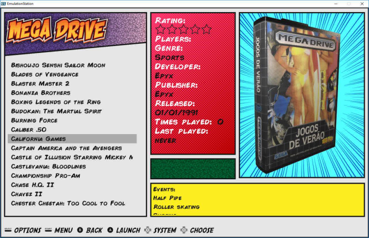
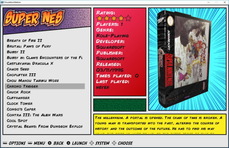
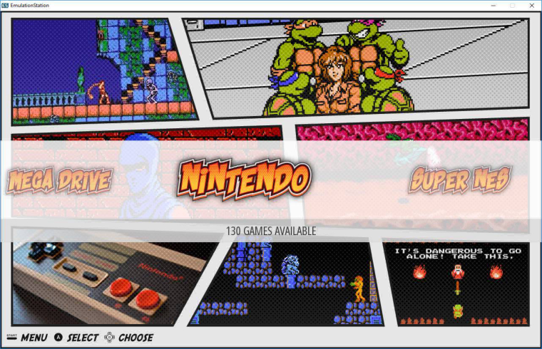
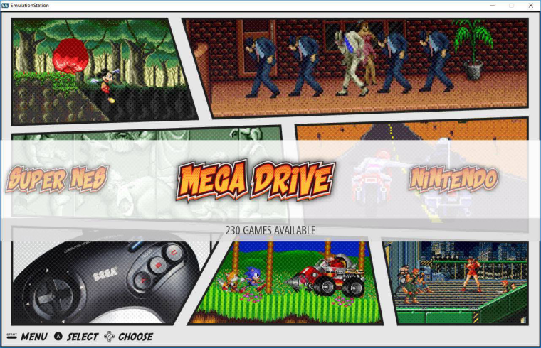
I have seen these images in a social network for a long time
-
@xbrazukas please read the original post at the beginning of the thread where I give full credit to the design inspiration to @lipebello and I even ask permission. @lipebello no longer logs onto this forum, however if you continue to read through the threads I did communicate with his brother, who never got back to me. Futhermore I again reference this in my update post sharing the 16:9 theme. I have created all artwork outside of the system logos and controller art from the carbon theme, which I also received permission to use from @Rookervik. The theme gives credit to everyone in the read me and .xml files. As you can see my theme is heavily modified from the images you have posted and at no time have I tried to deceive anyone. Thank you for this post, but please do take care to read through the entire posts before shooting off responses. Thank you
-
@TMNTturtlguy Your work is wonderful the image that I posted I imagined that it was from your work I am from Brazil. These photos that I posted someone put it and talking about this work but did not say who was tyava working on it. Then I started looking and I found you. One more time, look, I just posted the pictures thinking that it was you who had done it. Your work is wonderful.
-
@xbrazukas Thanks for the reply, no problems at all.
-
UPDATE: Just a quick update. I got called away for an unexpected work trip this week which has not allowed me to work on the theme. I hope to work on the theme some this evening and try to post a work in progress on github. More to come soon. Thank you for your patience, I assure you I will get the theme posted in the near future.
-
@TMNTturtlguy There's no expectation whatsoever - we know everyone contributes on their free time, and anything that happens is always greatly appreciated.
Thanks for the heads up, though! :)
-
UPDATE: WORK IN PROGRESS 16:9 THEME POSTED!
Post update #1 in boldPLEASE READ FIRST: This is a true work in progress post of the ComicBook Theme v1.0. This is my first upload to github as well, so please forgive me if something isn't correct on that site. Here are important notes:
-
This is not a finished version, This is a work in progress.
Please only download if you are ok testing this theme.More updates will be coming. Update: positive feedback suggests the theme works well in both screensaver and updated main branch ES installs! -
This is a 16:9 aspect ration version only
-
This has been created on the screensaver build by @fieldofcows and @pjft. This was built on an ES that does not support maxSize. Please read the readme.txt on github or in the download for more information.
I fully expect weird issues to arise when used in the main branch of ES,Update: the only issue is that some video/images will stretch to fill my size settings in the black box. My hope is by changing size to maxSize in the video preview it will fix the issues,but i am not sure if positioning has changed with all of the new modifications that have been made. -
This will support all systems, however not all systems are completed with updated logos/graphics.
-
Future updates are planned to bring this up to the main branch version of ES, however this works perfectly with the screensaver version with OMX player enabled. Again, please read the readme.txt.
-
Please see the images and video posted earlier in this thread for what the theme should look like if working properly.
I am hoping that you will test this theme and provide feedback on what works and what needs adjusted. Please understand not all systems have updated graphics, so please do not send comments that systems are not completed. If you have adobe photoshop/illustrator experience and are willing to contribute to update systems, let me know and i can share the base files with you, and you can add them as pull requests on github.
Thanks for all the help, support, testing, and comments!
-
-
@TMNTturtlguy Thanks for putting this together and for sharing! It works wonders on the main ES code base ;)
I suspect you're referring to the image maxSize? At the moment it just keeps the image stretched to the size you declared, which to me is not a problem in any way. Looks gorgeous!
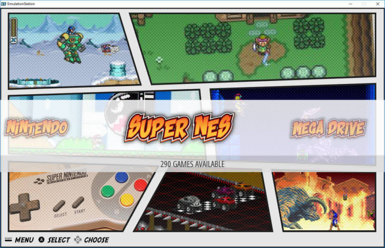
The screenshot images in the main system views look slightly overly dithered for my taste on a large screen, especially when compared to the wonderful high-res system names, but it's likely a matter of personal taste.
Can't complain whatsoever - will very likely keep this around for a while, either in testing or the full version in the end :)
Well done. Enjoy your break!
-
@pjft thanks for the update! Glad to hear it is working in the main ES!
Question regarding the systems screen background, do the black outlines still look crisp on the larger scale? I used a pixel filter on the images to give them an old newspaper print feel on purpose. The real issue is trying to save the backgrounds at a reasonable file size while allowing to still look ok on a large screen. I did loose some clarity there, but on my testing on a 4K I found it to be a good balance of performance and newsprint look. I do agree, i wish it were clearer, but the files get to large. The black outlines are a separate .svg file so that they should stay pretty sharp at larger screen sizes.
Thanks for testing and the kind words!
-
@TMNTturtlguy I'll look into it later when I have the chance and report back:)
-
the theme looks amazing thanks for all the work you put in. what should i have my vram set at. i keep getting white screens...
-
@TMNTturtlguy The black outlines look crisp, as well as the font and such.
Yes, I do get the feel for the old newspaper print - I suppose that's kind of what I was going for with "dithered" :)
Thanks! Have a great weekend.
-
@jfick13 with a pi 3 I am set at 120. I have a memory split of 256 (or higher, not sure higher does anything though). At vram 120 I can cleanly run at least 16 systems whiteout any white screen or lag effect. I also have my monitor or HDTV set to game mode.
How many systems are you running?
Thanks
Contributions to the project are always appreciated, so if you would like to support us with a donation you can do so here.
Hosting provided by Mythic-Beasts. See the Hosting Information page for more information.