RetroPie forum home
    • Recent
    • Tags
    • Popular
    • Home
    • Docs
    • Register
    • Login

    Pixel Theme

    Scheduled Pinned Locked Moved Projects and Themes
    themepixel
    690 Posts 92 Posters 894.6k Views
    Loading More Posts
    • Oldest to Newest
    • Newest to Oldest
    • Most Votes
    Reply
    • Reply as topic
    Log in to reply
    This topic has been deleted. Only users with topic management privileges can see it.
    • chipsnblipC
      chipsnblip @chipsnblip
      last edited by chipsnblip

      here's what i'm using for auto-favorites:
      console:
      console
      logo:
      logo

      can't really decide on a background color for this set, so for now it's #d27d2c

      the console image is a light modification of Gold Treasure icons by Clint Bellanger, and the logo is based on the BlackChancery font.

      1 Reply Last reply Reply Quote 3
      • RookervikR
        Rookervik Global Moderator
        last edited by

        Oh I forgot to make these. Haha. Full-time work has slaughtered my free time. I basically just sleep on my days off. I'll try to get on this.

        1 Reply Last reply Reply Quote 1
        • RookervikR
          Rookervik Global Moderator
          last edited by

          I promise I haven't completely forgot! Work is still consuming all my time until we can get a few more people hired.

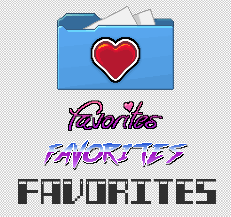
          Messing with Favorites right now. I haven't looked at anyone elses' so I hope no one has done one that looks just like it.

          0_1504465770908_857b00ca-1c39-4878-a948-96433e44949d-image.png

          Obviously not finished. Just trying things out.

          1 Reply Last reply Reply Quote 2
          • RookervikR
            Rookervik Global Moderator
            last edited by

            0_1504567233996_f5a0ba41-f640-49e9-8c91-c9bc896b2886-image.png

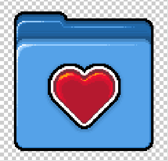
            Still needs some tweaking.

            1 Reply Last reply Reply Quote 1
            • S
              steeeb
              last edited by

              Looking forward to when the favourites icon/system screen is done as I'm using the functionality currently but with it looking horrid :P

              1 Reply Last reply Reply Quote 0
              • sergioadS
                sergioad
                last edited by sergioad

                Me too, Pixel is my favorite theme along with the Famicom mini, Retrorama and the in work SFC mini theme, I really love pixel art and hand drawn themes, I also like modern flat themes but those while nice looking and uniform lacks the charm and nostalgy that hand drawn and the pixel art has

                1 Reply Last reply Reply Quote 0
                • RookervikR
                  Rookervik Global Moderator
                  last edited by

                  Been working 40+ hours a week for 2 months now. When I get home I have no energy to do anything. Sorry for updating so seldomly.

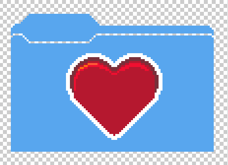
                  I have, ever so slowly, been working on adding collections to pixel. I haven't had time to browse the forums so I am not sure what everyone else is doing. I just did a folder. Hopefully it doesn't look like someone elses' artwork.

                  0_1507299658678_9972c5b6-1cd3-4126-8a3c-f4f1dd48ef3e-image.png

                  But now I'm having trouble choosing a font and going with it. While I can pixel, I'm not the greatest designer. LOL.

                  I'll keep working on it. If I could find a font I liked, and could use it on all 3 of the collection systems, I could finish this up pretty quickly.

                  Also have to work on Luminous.

                  Again, sorry for the lack of updates. Blame stupid work. Work sucks. But at least I make plenty to help buy groceries, pay bills, and help around the house. :D

                  dankcushionsD ruckageR 2 Replies Last reply Reply Quote 4
                  • dankcushionsD
                    dankcushions Global Moderator @Rookervik
                    last edited by

                    @rookervik i love the second font/colouring!

                    1 Reply Last reply Reply Quote 0
                    • ruckageR
                      ruckage @Rookervik
                      last edited by

                      @rookervik
                      I agree with @dankcushions , that second font looks great.

                      SNES mini/Nes mini/Famicom mini theme developer.

                      If you'd like to support my work you can donate here: Donate

                      1 Reply Last reply Reply Quote 0
                      • meleuM
                        meleu
                        last edited by

                        Now we are three!

                        • Useful topics
                        • joystick-selection tool
                        • rpie-art tool
                        • achievements I made
                        1 Reply Last reply Reply Quote 0
                        • sergioadS
                          sergioad
                          last edited by

                          Four

                          1 Reply Last reply Reply Quote 0
                          • RookervikR
                            Rookervik Global Moderator
                            last edited by

                            Well that makes it fairly easy to decide. LOL. Might try to reduce the pixel dpi a little one it (make the image bigger but still display the same size on the screen) to give it some better resolution. I'll fiddle with it tonight after Yahtzee. I work the afternoon shift.

                            1 Reply Last reply Reply Quote 1
                            • hiulitH
                              hiulit
                              last edited by

                              I prefer the 3rd one :P

                              My little contributions to the RetroPie project:

                              • Shell-Script-Boilerplate
                              • Fun-Facts-Splashscreens
                              • Limit-Last-Played-Games
                              sergioadS 1 Reply Last reply Reply Quote 1
                              • sergioadS
                                sergioad @hiulit
                                last edited by

                                @hiulit That one is great too

                                RookervikR 1 Reply Last reply Reply Quote 1
                                • RookervikR
                                  Rookervik Global Moderator @sergioad
                                  last edited by

                                  @sergioad Haha, 3rd one doesn't have any coloring... it was just the outline for the next attempt at a logo.

                                  hiulitH 1 Reply Last reply Reply Quote 0
                                  • hiulitH
                                    hiulit @Rookervik
                                    last edited by hiulit

                                    @rookervik I meant the one that looks from the 80's, like OutRun :)

                                    My little contributions to the RetroPie project:

                                    • Shell-Script-Boilerplate
                                    • Fun-Facts-Splashscreens
                                    • Limit-Last-Played-Games
                                    1 Reply Last reply Reply Quote 0
                                    • RookervikR
                                      Rookervik Global Moderator
                                      last edited by

                                      0_1507595513446_3ee72eaa-58cc-4f61-8b9b-5334b379302c-image.png

                                      Can change folder colors. Not sure what to do for "All". Other than maybe an infinity symbol, or some sort of dual box with the boxes having a check mark in them.

                                      sergioadS 1 Reply Last reply Reply Quote 2
                                      • sergioadS
                                        sergioad @Rookervik
                                        last edited by

                                        @rookervik Maybe a folder with a list view symbol to contrast with Carbon's icon virw controller?

                                        1 Reply Last reply Reply Quote 0
                                        • RookervikR
                                          Rookervik Global Moderator
                                          last edited by

                                          Thought maybe a more stylized folder would look nicer.

                                          0_1508080915168_1df79ab3-18a4-4791-96be-a0a1f99f4473-image.png

                                          ruckageR 1 Reply Last reply Reply Quote 3
                                          • ruckageR
                                            ruckage @Rookervik
                                            last edited by ruckage

                                            @rookervik
                                            Personally I prefer the original folder design though both do look good.
                                            Have you come up with an 'All Games' icon yet? I also found that the most difficult to think of an icon for.

                                            SNES mini/Nes mini/Famicom mini theme developer.

                                            If you'd like to support my work you can donate here: Donate

                                            RookervikR 1 Reply Last reply Reply Quote 0
                                            • First post
                                              Last post

                                            Contributions to the project are always appreciated, so if you would like to support us with a donation you can do so here.

                                            Hosting provided by Mythic-Beasts. See the Hosting Information page for more information.