System select icons spacing
-
Re: Tutorial - How to make a theme for Emulationstation and RetroPie
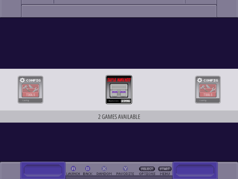
Hi everybody, i'm trying to make my own theme for personal use and I'm getting some trouble with the system select screen space between the icons. I want it with no space or very little. How could I do this? The tutorial doesn't mention this specific thing.
(PS.: I will not share this theme because uses images from other themes, it's just for personal use)
-
@danielmewhouse This is the part of the xml you need to play with:
		<carousel name="systemcarousel">
			<pos>0 0.62</pos>
			<size>1 0.22</size>
			<color>00000000</color>
			<logoSize>0.16 0.09</logoSize>
			<logoScale>2 2</logoScale>
		</carousel>
You could also add this to that block:
<maxLogoCount>5</maxLogoCount>This will increase the number of logos displayed to 5. One in focus and 2 either side.
-
@jonnykesh Thank you for help me. I've tried this solution but didn't work'd at my Linux PC. This attribute needs a specific EmulationStation version to work, or just work at Retropie? My actual version is V2.0.1A
-
@danielmewhouse Yeah, these are recent changes to ES. Can't remember exactly but definitely v2.5.x and only in the RP branch.
-
@jonnykesh thanks man. So I'll try to code my theme directly at my RPI.
-
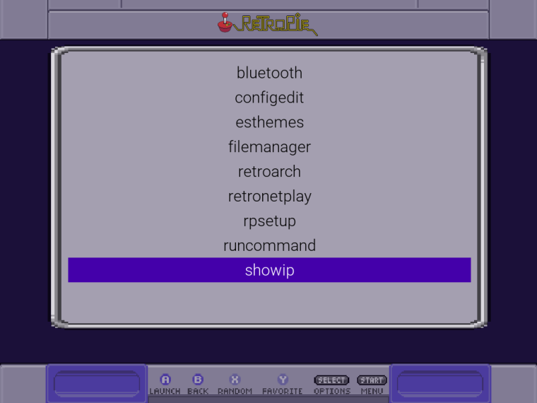
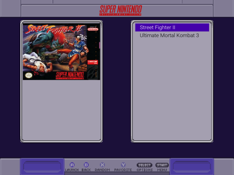
@jonnykesh Hi man. Wanna share the result of my first attempt to create a custom theme. Credits for @ruckage for the icons and graphics. The carousel is untouched because this was made on Linux PC version of EmulationStation.


-
@jonnykesh said in System select icons spacing:
@danielmewhouse Yeah, these are recent changes to ES. Can't remember exactly but definitely v2.5.x and only in the RP branch.
Hi. I stopped procrastinating and done the things right: installed Xubuntu Minimal on my test machine, installed RetroPie with the scripts and BOOM!!! Now I could use any theme with the new ES on my X86_64 pc!!!
A hint for someone trying to do the same way I've done: use Lubuntu instead of Xubuntu. Is hard to manage the system to boot straight to ES on XFCE, so many things to interfere... Lubuntu is more friendly to this and lighter than Xubuntu.
-
@danielmewhouse said in System select icons spacing:
Credits for @ruckage for the icons and graphics
From https://github.com/ruckage/es-theme-snes-mini:
You are free to modify the theme for your personal use only - please do not share modified versions of this theme.
Commercial distribution is prohibited -
@mitu I didn't posted a modified version of Ruckage's theme for download, just showed what i've done for MY personal user when he didn't released a 4:3 compatible theme. So, not rule break here.
-
It looks more simplified than the original.
-
@pokeengineer yeah, I know... But was just for fun and knowledge. Now I'm using the official SNES mini theme on my 4:3 Bartop and PSX mini on my Retropie Laptop.
-
Just so you know, I wasn't saying it's bad. I personally like it, I was trying to say it looks cleaner. Sometimes I hate how I phrase things.
Contributions to the project are always appreciated, so if you would like to support us with a donation you can do so here.
Hosting provided by Mythic-Beasts. See the Hosting Information page for more information.