RetroPie forum home
    • Recent
    • Tags
    • Popular
    • Home
    • Docs
    • Register
    • Login

    Mega Drive/Genesis Mini Theme - Like Snes Mini Classic Theme

    Scheduled Pinned Locked Moved Projects and Themes
    theme making
    69 Posts 16 Posters 27.6k Views
    Loading More Posts
    • Oldest to Newest
    • Newest to Oldest
    • Most Votes
    Reply
    • Reply as topic
    Log in to reply
    This topic has been deleted. Only users with topic management privileges can see it.
    • S
      steeeb @frgn
      last edited by

      @frgn is this theme available to download anywhere? Looks great.

      1 Reply Last reply Reply Quote 0
      • L
        legendos
        last edited by

        @frgn

        Hi, what about your theme?

        do you have any news about it?

        Best regards.

        1 Reply Last reply Reply Quote 0
        • LuckydogL
          Luckydog
          last edited by

          Did nothing ever come of the Genesis theme? The one picture I saw looked amazing.

          L 1 Reply Last reply Reply Quote 0
          • L
            legendos @Luckydog
            last edited by

            @Luckydog

            I think he is very busy. Longer than he thought.

            But... in late September, the official mega drive mini will be launched.
            This will definitely have a very good theme i think.

            As similar as the snes mini theme i hope.

            At least that's what I think.

            That will definitely serve as a template, so anyone will release a clone of that for us! :)

            Best regards!

            1 Reply Last reply Reply Quote 0
            • paffleyP
              paffley
              last edited by paffley

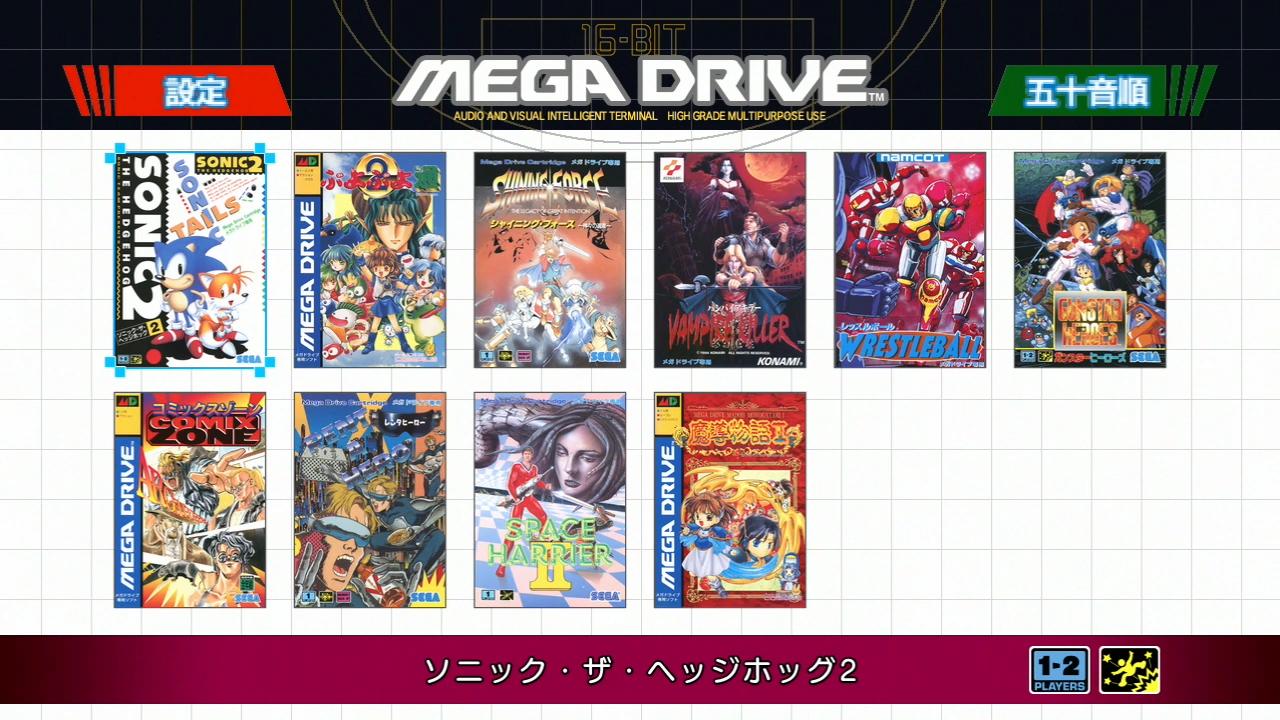
              With all the latest screenshots of the megadrive mini, do we think this could be the game select screen on the retail version?

              Can anybody on here translate the text in the red and green top blocks?

              mdm.jpg

              L 1 Reply Last reply Reply Quote 0
              • Thorr69T
                Thorr69
                last edited by

                Not sure, because my Kanji is 20 years rusty. But I can say that the first two characters in the Green mean '50'. I have no idea how it applies in the context. (They advertise 40 games, not 50, but every other release of this type from them had many hidden games added.)

                RPi 3b
                Official PSU
                Official RetroPie image
                Pandora's Box 5 controller

                paffleyP 1 Reply Last reply Reply Quote 0
                • paffleyP
                  paffley @Thorr69
                  last edited by

                  @Thorr69 said in Mega Drive/Genesis Mini Theme - Like Snes Mini Classic Theme:

                  Not sure, because my Kanji is 20 years rusty. But I can say that the first two characters in the Green mean '50'. I have no idea how it applies in the context. (They advertise 40 games, not 50, but every other release of this type from them had many hidden games added.)

                  Thanks @Thorr69 very interesting, I'm only assuming that this is the game select screen as it has a picker background on the sonic 2 boxart.

                  1 Reply Last reply Reply Quote 0
                  • paffleyP
                    paffley
                    last edited by paffley

                    My google translate see's the word 'SORT' in the green box.

                    1 Reply Last reply Reply Quote 0
                    • Thorr69T
                      Thorr69
                      last edited by

                      It means 50-Order, which is Alphabetical Order. (The 50 portion relates to the 50 syllables in Japanese.)
                      The red is the Config menu.

                      RPi 3b
                      Official PSU
                      Official RetroPie image
                      Pandora's Box 5 controller

                      paffleyP 1 Reply Last reply Reply Quote 0
                      • paffleyP
                        paffley @Thorr69
                        last edited by

                        @Thorr69 said in Mega Drive/Genesis Mini Theme - Like Snes Mini Classic Theme:

                        It means 50-Order, which is Alphabetical Order. (The 50 portion relates to the 50 syllables in Japanese.)
                        The red is the Config menu.

                        Thats super thank you @Thorr69

                        1 Reply Last reply Reply Quote 1
                        • L
                          legendos @paffley
                          last edited by

                          @paffley

                          I would not have thought that, but the menu looks really ugly to me.

                          I hope that this picture is not taken from the real theme.

                          I like the theme from frgn much more.

                          I hope that frgn will soon be back here, with good news about his theme.

                          Best regards!

                          1 Reply Last reply Reply Quote 0
                          • paffleyP
                            paffley
                            last edited by paffley

                            @legendos Yeh I thought the same at first but the more you look at it and think about it, it makes kinda sense not to go down the route of Nintendo with their classics (pixel approach). I've recreated it as my personal megapi build and it looks great imo.

                            1 Reply Last reply Reply Quote 0
                            • frgnF
                              frgn
                              last edited by frgn

                              Hi guys. I apologize for missing. I was really a lot of work. And even now I have very little free time. In addition, it was quite difficult for me to draw a layout - I am far from being an painter, and I not a UI / UX designer. :(
                              I have now come to something like this:

                              4.png


                              3.png


                              2.png


                              1.png

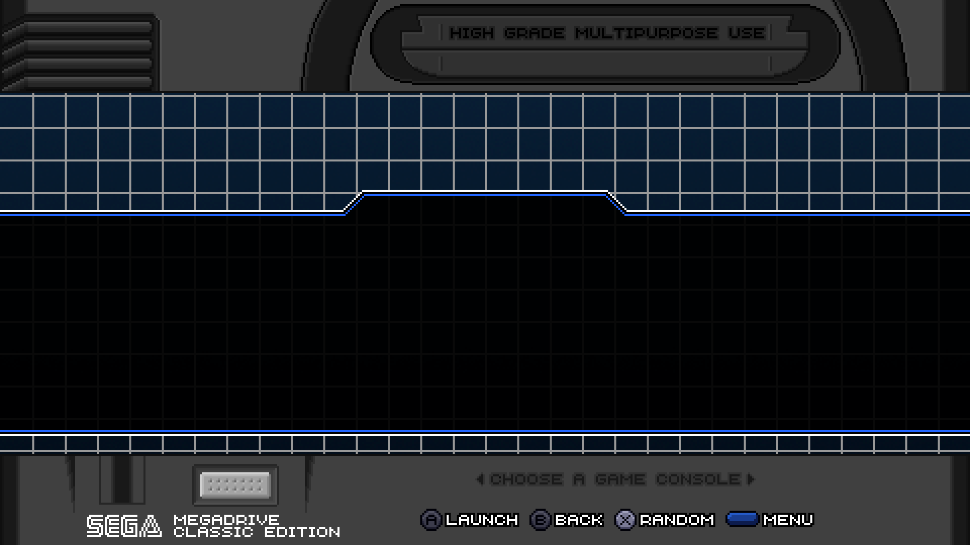
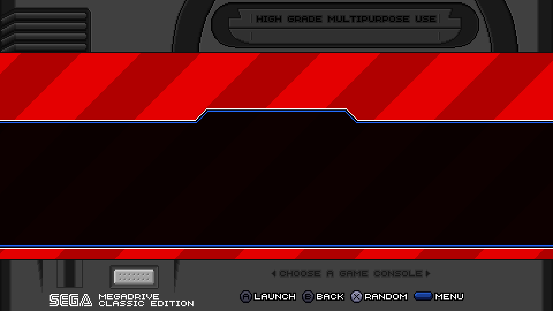
                              • The fields were completely redrawn (in the style of the first revision of the Sega Megadrive) and various backgrounds were added (in accordance with the regions).
                              • Logos and icons will remain in their place. I still do not promise anything about metadata.

                              Is it worth moving in this direction, or does anyone have any comments?

                              Aloha from Russia, and sorry for my bad English. ¯\(ツ)/¯
                              My RetroPie themes repo - https://github.com/free-gen/
                              Blast16 to MDMINI mod
                              DONATE HERE

                              L 1 Reply Last reply Reply Quote 2
                              • paffleyP
                                paffley
                                last edited by

                                I think it looks great, definitely move forward with this version @frgn :)

                                1 Reply Last reply Reply Quote 1
                                • L
                                  legendos @frgn
                                  last edited by legendos

                                  @frgn

                                  Nice that you are back!
                                  After the ugly screenshot from the retail theme of the mega drive mini a few posts further up, you are my rescue! :)

                                  I like your interpretation of the md1.
                                  I have allowed myself to modify it a bit. I think so I can show you better what I (and maybe others) would like to have in it.

                                  I am not a graphic artist. so it may not look as good here and there.

                                  frgn ... I hope that you might like a few things, and you could possibly take them over.

                                  PS: the power indicator and the bar on the top (high definition graphics) is not from me. I got it from another website:
                                  htt*****/art/Sega-Mega-Drive-EUR-PAL-304163586

                                  or take a look at here:
                                  https://imgur.com/lQ5cPws

                                  PS2: The lettering "High Definition Graphics" is not the right one. The real lettering is:
                                  "High Definition Graphics - Stereo Sound". If you want to take it over.

                                  Here is a link that shows the real eu version with right lettering etc.:
                                  https://imgur.com/Y4seflK
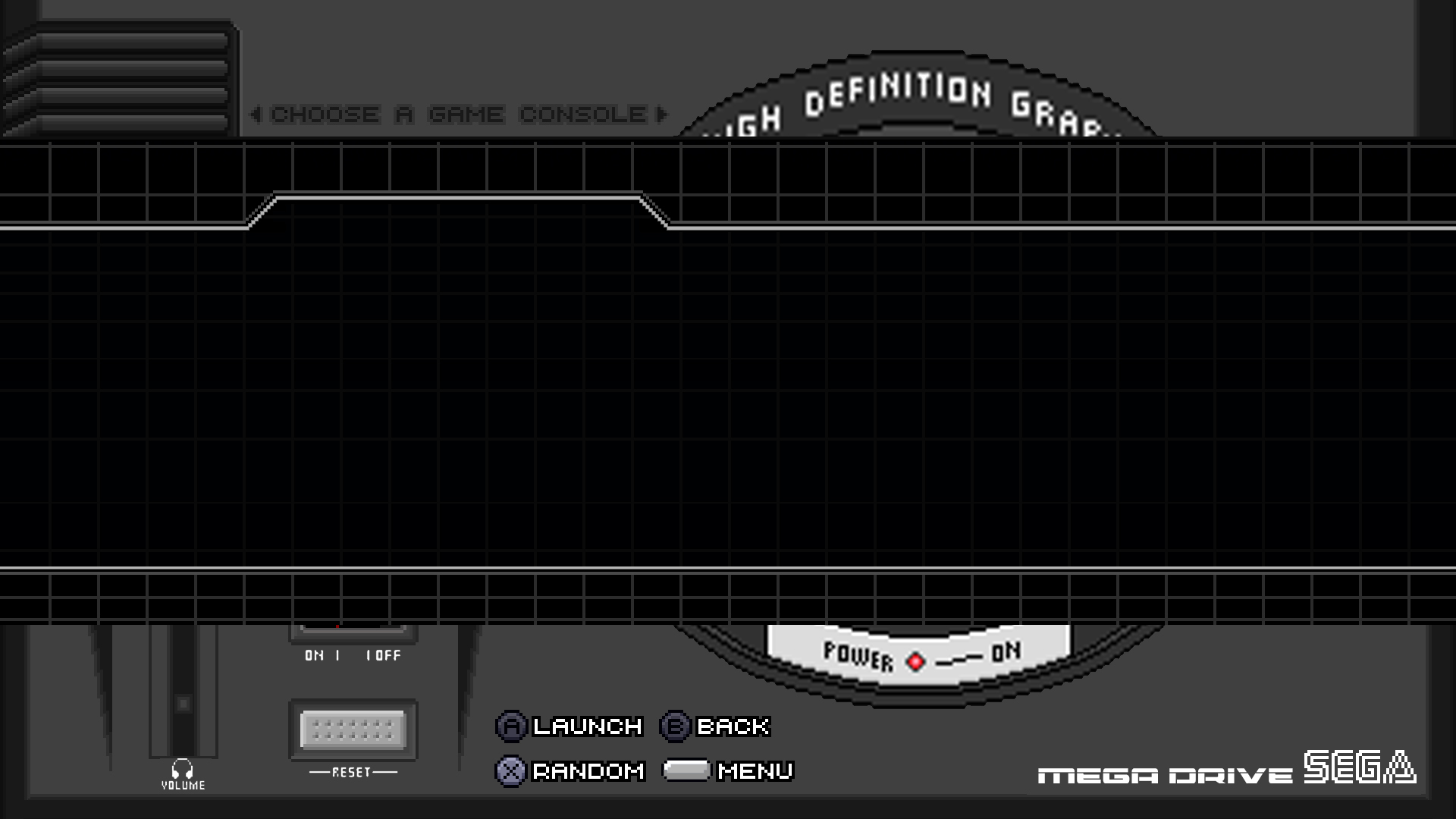
                                  mega_drive_test11.jpg

                                  Best regards!

                                  frgnF 1 Reply Last reply Reply Quote 0
                                  • L
                                    legendos
                                    last edited by legendos

                                    pleaese delete this, thanks.

                                    1 Reply Last reply Reply Quote 0
                                    • frgnF
                                      frgn @legendos
                                      last edited by

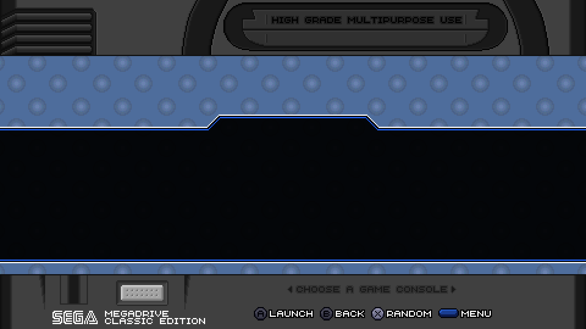
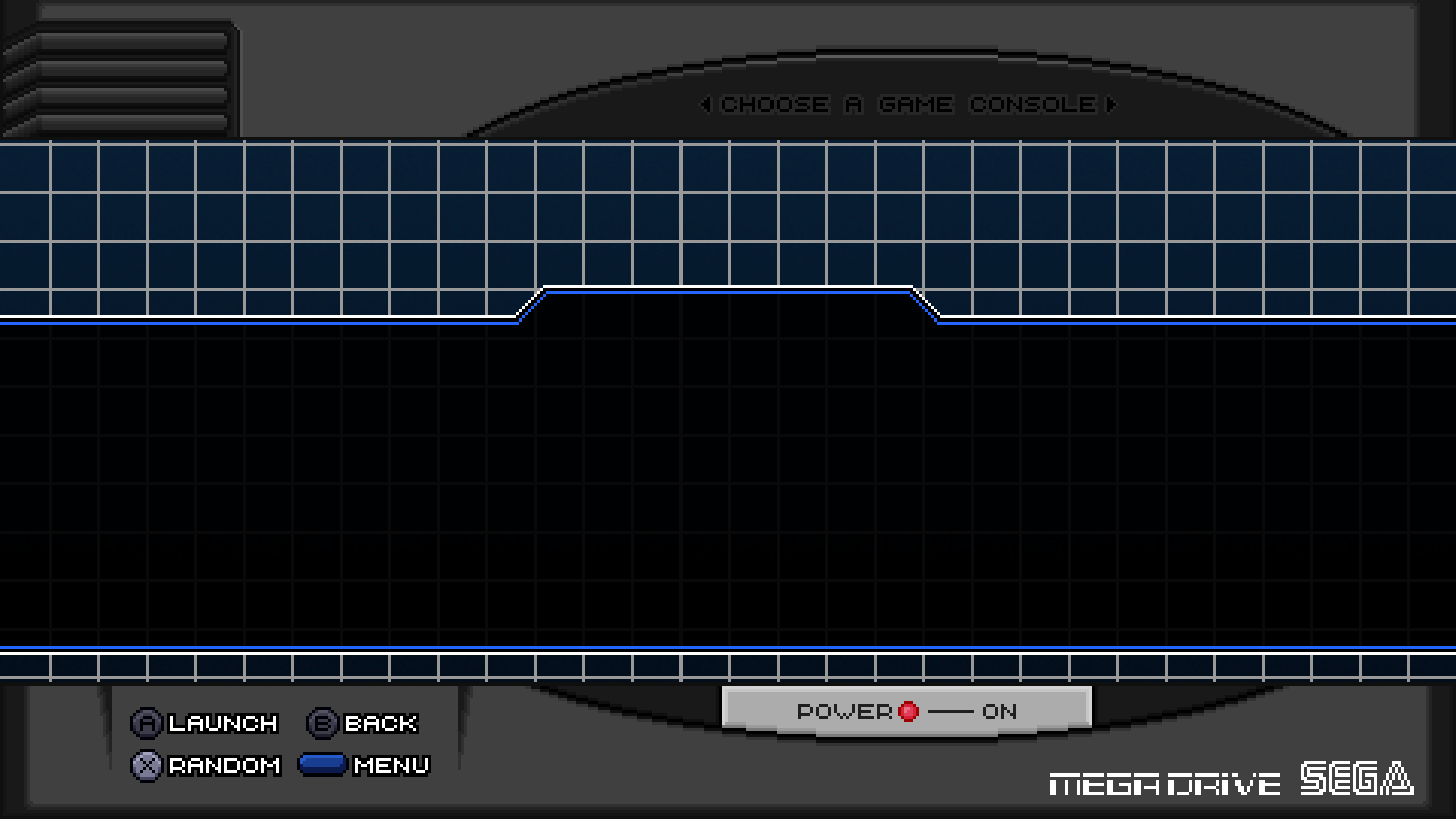
                                      @legendos "High Definition Graphics - Stereo Sound" - does not fit at the top. if you make this area even wider, then it seems to me to be completely not aesthetically pleasing. so I decided to leave there a message about choosing a game (or a game system).
                                      I also decided to try to get rid of the images of buttons and switches - with them the layout seems “dirty”, besides, they do not carry any semantic load and simply occupy the usable area (which is quite small). I tried to display action buttons instead.
                                      Of course the option is not final. maybe I missed something else important.


                                      layout 2.png

                                      Aloha from Russia, and sorry for my bad English. ¯\(ツ)/¯
                                      My RetroPie themes repo - https://github.com/free-gen/
                                      Blast16 to MDMINI mod
                                      DONATE HERE

                                      L 1 Reply Last reply Reply Quote 0
                                      • L
                                        legendos @frgn
                                        last edited by legendos

                                        @frgn

                                        Thanks for your reply!
                                        and thank you for trying to implement some of my ideas.
                                        I think It looks a little bit cleaner now. I like it!

                                        Your idea to place the controller buttons to the section where the volume, and reset buttons are is very good.

                                        Maybe you can bend the semicircle (with the letter "choose a game console", and the energy-indicator) a bit more ?
                                        It looks a bit stretched out and more like an oval instead of a circle.

                                        Even if it does not work, it still looks better to me now!

                                        Good work! :)

                                        What do the others say to it?

                                        Regards!

                                        1 Reply Last reply Reply Quote 0
                                        • frgnF
                                          frgn
                                          last edited by frgn

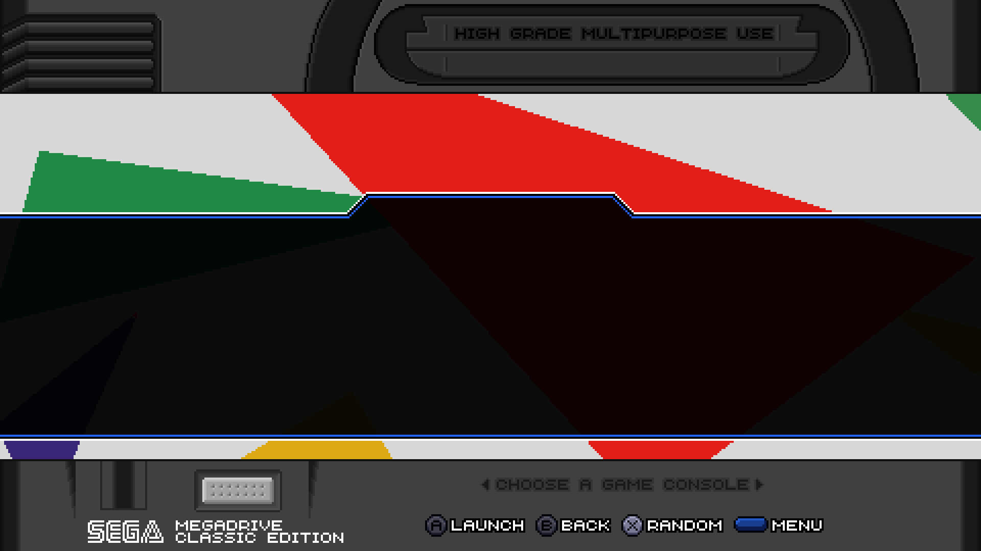
                                          at the moment, the layout may look like this and have three different layers.
                                          maybe someone else has any comments / suggestions / ideas?
                                          This theme seems to me to be ready, but I cannot exclude that it can be done better.
                                          (Click on the image to view it in full size.)

                                          1.png


                                          Aloha from Russia, and sorry for my bad English. ¯\(ツ)/¯
                                          My RetroPie themes repo - https://github.com/free-gen/
                                          Blast16 to MDMINI mod
                                          DONATE HERE

                                          L 1 Reply Last reply Reply Quote 0
                                          • L
                                            legendos @frgn
                                            last edited by

                                            @frgn

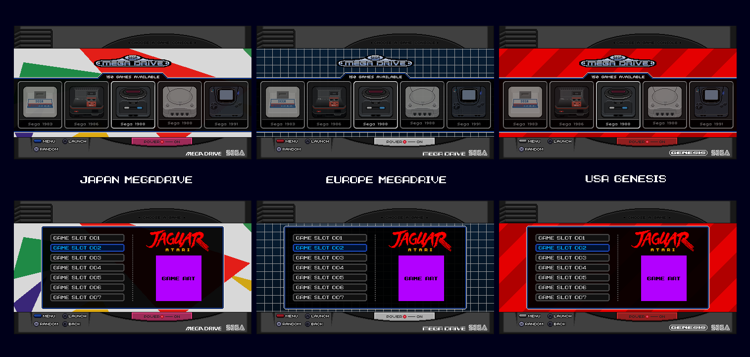
                                            No other suggestions from me.

                                            I'm happy with it! (:

                                            As already asked by frgn, what does the others say?

                                            Best regards!

                                            1 Reply Last reply Reply Quote 0
                                            • First post
                                              Last post

                                            Contributions to the project are always appreciated, so if you would like to support us with a donation you can do so here.

                                            Hosting provided by Mythic-Beasts. See the Hosting Information page for more information.