New Theme Testing
-
...(just thinking out loud here)...
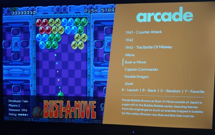
Where you have the line for "A - Launch B - Back X - Random", could you also add "Y - Favorite"?
That'd be a quick way for folks to remember that pressing Y adds that game to the favorites list.
Looks good though!
-
@dmmarti I just had those three because I want to keep it simple for when I bring it in to class. I don't want too many button prompts.
I just updated the zip file in the OP, which now has a "y - favorite" prompt.
Since space is limited there, I couldn't do start and select without having to jam it in there and make the font so small it is unreadable.
-
New update is up in OP. Added new button prompts and retropie logo
-
@lilbud That's a good theme and for a school project it will blast your class ;)
I just noticed that the size in letters differs from "MEGA DRIVE" to "MASTER SYSTEM".
Annother thing... If I'm in selection screen I see the A-B-X button in gamelist AND in bottom ;) -
@cyperghost Yeah, the font size is different so I can fit longer text in the same space without it looking out of place.
Same with stuff like neo geo pocket color. The name would be too long.

Also, I put my arcade stick in the art show and it won second place out of the woodshop projects. This was the first year in a long time that shop projects were put in the art show, as the talent simply wasn't there. But the talent seems to have come back, and to a high enough quality, where the teachers were proud to show the stuff off.
-
Shot of the theme running on a tv

-
This theme looks excellent!
-
@lilbud looks really good! First real competition for Chicuelo theme for my bartop arcade! Is there an “all games” list inclusion in your theme? That is the list I use 95 percent of the time and comes up by default on my arcade.
-
@BJRetro Yep, all games (as well as favorites and recents) are included
-
-
@LiveFastCyYoung I could give it a shot, never even heard of it until right now.
If it doesn't need anything too drastic, I'll try and get it to work on his build.
-
@lilbud Increasing the vram helped a lot. I'll keep testing and see if I see any other issues.
-
@LiveFastCyYoung Yeah
Remember how I was touting that my last theme (Nintendo Switch theme) could run with only 20mb vram?
This is the exact opposite, more is better.
-
@lilbud @LiveFastCyYoung Hi, no particular problem with this theme. Except the fact that if you have (at least) one system in es_system.cfg that does not exist in the theme, ${systemColor} is not found, and getHexColor throws an exception -> Everything becomes black. Ensure every system you have is described in "assets\colors\systems".
-
@lilbud I like your theme a lot, but there are 2 things in ES source code.
First : there is a bug in void SystemView::renderCarousel(const Transform4x4f& trans)
When you switch system, as logoCount is 1, you cannot see 2 logos at the same time.
The actual code is -> Must be changed to ignore if an animation is running :if (logoCount == 1) // Should add -> && mCamOffset == 0
{
bufferLeft = 0;
bufferRight = 0;
}Second : As you don't display logo at center, you have to reposition your carousel. When you scroll ( it is very annoying if it is horizontal ), logo disapears partially : it stays in the bound of the carousel. for that, a property "logoPos" is missing. With that propery, your carousel could be posed at 0 0 and sized 1 1, and logoPos set at 0.6603221083455344 0.171875.
With those changes, your systemview is perfect... But it needs some changes in ES code...
I did it in my Windows version ( i didn't publish it yet as I have other unfinished changes pendings ), but I don't know how to do that in RetroPie's version neither how to contact people how manage it... I can only tell how to fix it...
@mitu : Do you know how do to that ?
-
@f-caruso said in New Theme Testing:
@mitu : Do you know how do to that ?
You can always send a pull request to the RetroPie's repository with the fix you found, I'm sure it will be appreciated.
For the 2nd part (logosPos?) - is this a new feature or just something that @lilbud should add to the theme ? -
@mitu said in New Theme Testing:
feature
"logoPos" would be a new feature. ES supports logoSize but not logoPos ->
You cannot set the position of the logo inside the carousel, it is always centered. -
@f-caruso What system are you talking about
Also, I only became aware of your custom emulationstation build yesterday. I haven't had the time to test yet.
What changes have you made to the source code that might cause issues?
-
@f-caruso I just tested the theme on your ES build, (after switching the language to english and figuring out the controls) The theme seems to work completely fine.
Also, if you can figure out the exact position and place the whole carousel there, no need for your logo's position thing.
Yeah, if you change the ES code, then the theme can be modified. But I'm really not seeing the advantage over the current carousel position. Kinda seems like the same exact thing to me.
-
@f-caruso said in New Theme Testing:
i didn't publish it yet as I have other unfinished changes pendings
"What system are you talking about" : When I tested your theme, i had i "WiiU" system. Everything went black cuz I didn't have a systemColor for wiiu...
For the rest, as i said : "i didn't publish it yet as I have other unfinished changes pendings"...
Contributions to the project are always appreciated, so if you would like to support us with a donation you can do so here.
Hosting provided by Mythic-Beasts. See the Hosting Information page for more information.