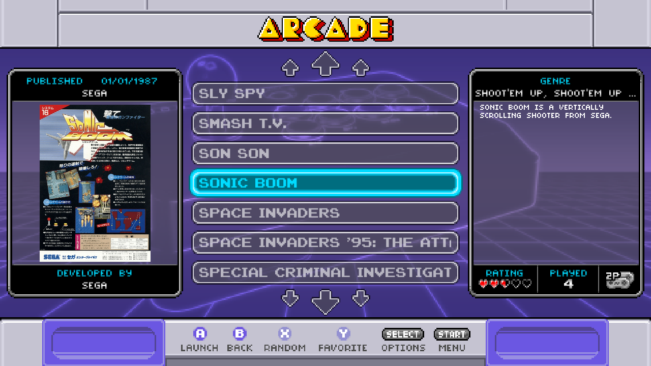
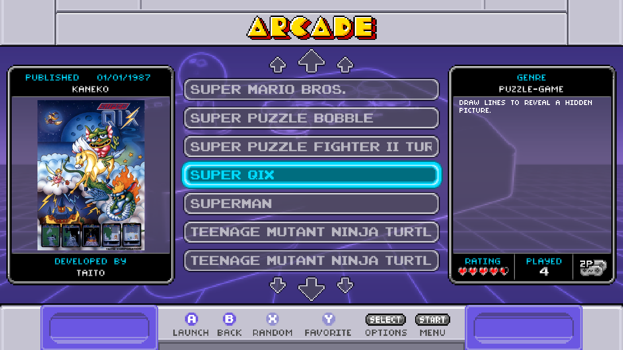
[Solved] Very short descriptions don't wrap.
-
-
Could be either of them, but I was referring to EmulationStation.
-
@sleve_mcdichael could you pls try some things and report back to tackle to cause?
Use entries which description do not wrap properly for the tests:
- When using snes-mini theme: Change an entry and add one, two, three, ... words separated by spaces at the beginning of text and check if/where they wrap?
- Revert the changes from 1. and make all characters UPPERCASE (ideally by using an editor command, do not to alter the whitespace). How does it wrap then?
- Revert the changes from 2. and copy the same text (Copy-Paste) from the description one or two times (to have a longer description for Carbon). Switch to Carbon theme. Does it wrap now, if yes where?
- Revert the changes from 3. and manually change all visible whitespaces with key space (ASCII: 0x20), change to snes-mini theme. What does the wrapping look like?
Code in question starts here AFAICT.
-
@Lolonois thanks for looking into this. Here are my results:
1:
One two Sonic Boom is a vertically scrolling shooter from Sega.wraps between "A" and "VERTICALLY" (text is rendered uppercase.)One Sonic Boom is a vertically scrolling shooter from Sega.does not wrap and cuts off with an ellipsis atVERTICALLY ...2:
ONE TWO SONIC BOOM IS A VERTICALLY SCROLLING SHOOTER FROM SEGA.wraps between "A" and "VERTICALLY".ONE SONIC BOOM IS A VERTICALLY SCROLLING SHOOTER FROM SEGA.does not wrap and trails off atVERTICALLY ...3:
Carbon theme wraps it with a second copy of the text, between "vertically" and "scrolling" in the second copy:Sonic Boom is a vertically scrolling shooter from Sega. Sonic Boom is a vertically scrolling shooter from Sega.3a (bonus): in Carbon:
Sonic Boom is a vertically scrolling shooter from Sega. Sonic Boom is a vertically scrollfits on one line.Sonic Boom is a vertically scrolling shooter from Sega. Sonic Boom is a vertically scrollinwraps to a second line.Sonic Boom is a vertically scrolling shooter from Sega. Sonic Boom is a vertically scrollidoes not fit, and does not wrap, it trails off with an ellipsis atvertically scr....4: if that's the same as pressing spacebar then I actually tried this first and it had no effect. If that means something else, I will need a more detailed instruction.
5 (bonus):
Sonic Boom is a vertically scrolling shooter from Sega.with a newline at the end, does wrap in snes-mini. If I remove the newline it cuts off short, again. -
Thanks for the information and thanks for the extra info on the Carbon theme.
At 4: I suggest to manually replace every visible space in the description with a "fresh" space, just to eliminate that there are for some reason unusual spaces provided by the scraper/games db description.With the given I currently assume the issue gets caused by how ES calculates the available width, depending on the textbox dimension and the padding (sourced from a theme).
At the moment I don't expect a quick solution, also because I am not a theme-guru. ;-) But the issue is evident.
-
Turned out to be not theme related. Filed a PR #803 to fix this. That the effect also appeared in the carbon theme was a very useful extra information @sleve_mcdichael . Feel free to report back if the effect is still present in the snes-mini theme after test-driving the PR.
Cheers
-
@Lolonois said in Very short descriptions don't wrap.:
Feel free to report back if the effect is still present in the snes-mini theme after test-driving the PR.
Unfortunately I still see the issue in be99449:
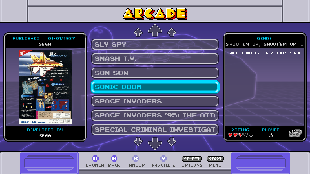
pi@retropie:/opt/retropie/supplementary/emulationstation-dev $ cat retropie.pkg pkg_origin="source" pkg_date="2022-08-14T00:41:47-07:00" pkg_repo_type="git" pkg_repo_url="https://github.com/Gemba/EmulationStation" pkg_repo_branch="fix_short_desc_wordwrap" pkg_repo_commit="be9944921e47ebfa57acae8200d495f356774c2b" pkg_repo_date="2022-08-13T18:37:11+02:00" pkg_repo_extra="" -
@sleve_mcdichael seems this issue has multiple causes. Could you pls start this ES with the switch
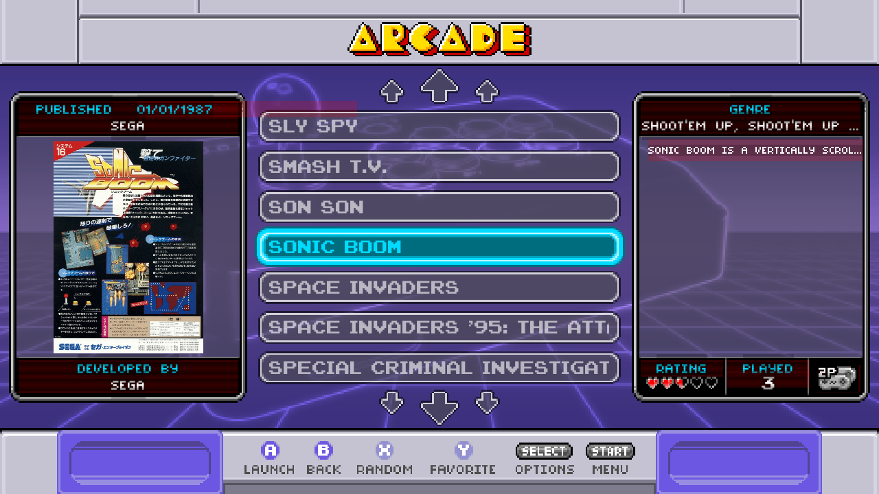
--debug, attach an keyboard and press Ctrl-t (this will highlight every textcomponent size/boundary) and create another screenshot?Additionally, as I have seen on a cursory look, this theme needs to be configured for the screen dimension. Could you post your config XML file too? (via pastebin, ix.io, ...).
-
@Lolonois Before and after highlighting:

config.xml: https://pastebin.com/k7KAEGwSI also modded lines 11 and 12 in
layouts/1280x720.xml: https://pastebin.com/hbGw65kJSome of the changes I've made to these files are discussed in the last few pages of https://retropie.org.uk/forum/post/273774
[Edit: it does seem to be fixed in Carbon theme, at least:
Sonic Boom is a vertically scrolling shooter from Sega. Sonic Boom is a vertically scrollfits on one line, and if I add a letter so it ends onscrollithen that final word wraps properly to a second line instead.] -
Thanks again for the feedback and update. @sleve_mcdichael
I tried to get snes-mini-theme to run at my box but unfortunately my resolution is not supported (1600x1200).
However, from you screenshot earlier (note the red highlight overruns the gray bezel on the right) and also from looking at the
description_pos_5.xmlhere (which gets included by your layouta.xml) is missing a<size/>element.Seems adding a matching
<size/>element for your resolution should fix the wrapping in that theme. -
@Lolonois said in Very short descriptions don't wrap.:
However, from you screenshot earlier (note the red highlight overruns the gray bezel on the right)
You don't mean the release date field, right? Are you talking about this narrow strip here?:
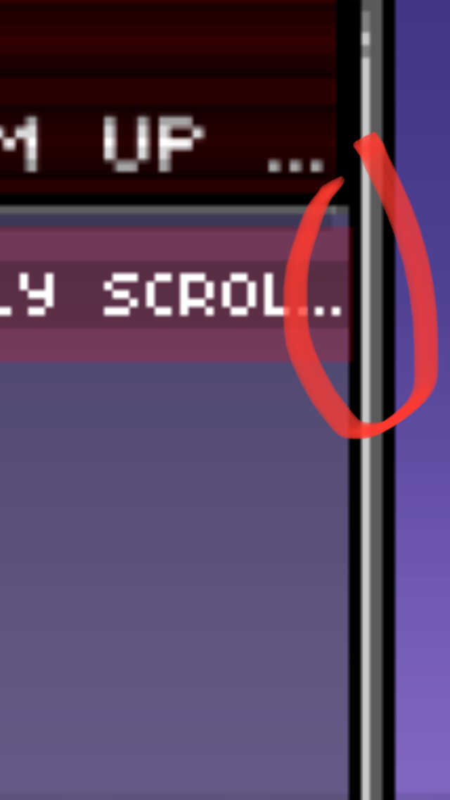
and also from looking at the
description_pos_5.xmlhere (which gets included by your layouta.xml) is missing a<size/>element.Seems adding a matching
<size/>element for your resolution should fix the wrapping in that theme.The
<text name="md_description">field is assigned a<size>element inbase.xmlat line 113. I changed the horizontal component here to 0.24; now the red highlight fits entirely within the description bezel, and the text trails off one char sooner:
-
@sleve_mcdichael yes, you got my suggestions right. Thanks for testing. Seems there is no "quick win" with the
<size/>element. Means in turn there is something else is still buggy in ES with the context of this theme (and maybe other themes).
To analyze it I will have to spin up a Rpi and attach to a monitor with supported resolution of the snes-mini-theme.TTYL
-
I am confident to have this fixed. See updated PR.
Thanks @sleve_mcdichael for revealing an eight year old bug.
Seems the original author of ES never assumed that the linespacing can be less than 1.2 times the highest char in the font, respective assuming a linespacing set to less than this value.
Any theme with a linespacing less than anticipated value may show the effect as in the snes-mini-theme. snes-mini-theme theme uses 0.75 linespacing, carbon by default 1.5 (see Textcomponent.cpp constructor). Thus carbon showed not this effect.
However, the variable
isMultiline(here) evaluated to false even if the text was wrapped internally on two lines (thus it should be true) and from there things derailed.As I was on it, I refactored the onTextChanged() method of the Textcomponent.cpp to be ~25% faster (which is significant given the fact this method is very, very often called). On my system >6000 times only until ES shows its carousel. If you navigate a little the number increases quickly. But this will be a separate PR.
HTH
-
-
@sleve_mcdichael cheers and thanks again for reporting back. :-) One more thing: As a courtesy for other other forum users (and robots from some search engines): Could you please edit the title of your first post and add [solved] somewhere? Thanks.
Contributions to the project are always appreciated, so if you would like to support us with a donation you can do so here.
Hosting provided by Mythic-Beasts. See the Hosting Information page for more information.
