replacing logo
-
@cylum editing the themes in /etc are not recommended.
-
Thanks for the heads up.
Great work on the wiki BTW.
-
@cylum thanks, its a group effort I can hardly take credit for it all.
Though I do have some bigger plans for it... hopefully sooner than later
-
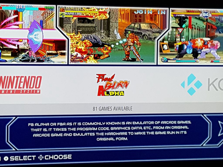
well I was successful in changing the logo and did back the original but im guessing that it can't get any bigger than the way it's shown
-
@sketch2k278 it will scale a little better if you remove the white space and it will get a little bigger if you make it an svg
-
@herb_fargus thanks for the tip, but when I tried to make it an svg it just shown up invisible, so I just used png..... does it have to be saved a certain way in order to show??
-
@sketch2k278 yes you have to convert strokes to paths.
there is a guide I think @UDb23 did on the forum somewhere on converting pngs to svgs
-
@sketch2k278 Video tutorial here. Give it a try.
-
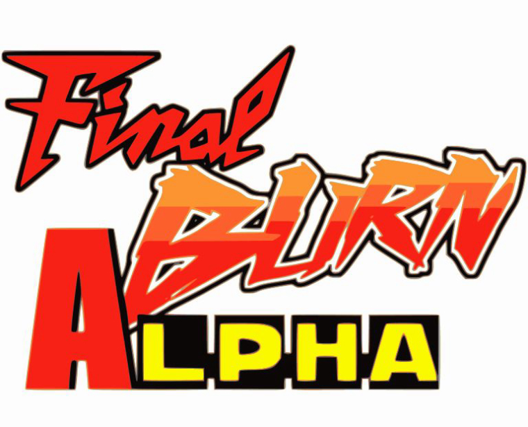
@UDb23 Thanks for the vid, quite helpful but the final look didn't quite look as I hoped(not too bad though), plus the size was increased (3,045 kb saving as svg due to the scan increase) plus some of the lettering like the A in Alpha just caused issues when separating the color layers. This is what it looked like before the scan increase
-
@sketch2k278 Almost 3 MB for a simple logo seems really big to me as file size!
I would suggest you apply separate single solid colors to you original png so that tracing will better identify the different shapes and outlines. You can then easily reapply the right colors in inkscape. -
@UDb23 does it have to be saved a certain svg format?? I notice that there were multiple selections when it comes to saving in that format
-
@sketch2k278 plain svg (not inkscape svg).
-
@sketch2k278 Just did a quick test. With the original png you posted (178kb) I get a 168 kb SVG.
-
@UDb23 how did you get 168kb svg?? what did you do exactly, if you don't mind me asking
-
Did you create the first logo (PNG)?
-
@FlyingTomahawk yes I did, the very 1st post of the logo is in png format, shoot.... if you like to take a crack at it I wouldn't mind that at all lol
-
Did you use various fonts to write those 3 words and then put them together to get that one image? Or was it already like that?
I guess first thing would be to cut those 3 words apart in Photoshop then take one by one to Inkscape, edit them then put them together and save as svg.
Sure a good challenge. -
Thanks for give me information very use ful for me
-
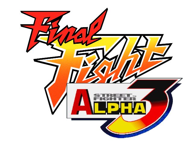
@FlyingTomahawk what I used was the word "Final" in the final fight logo, I used the font "Fighting Spirit turbo" for the word BURN (to mimic the word fight), the font "impact" for the A and the rest of the word in alpha I got from Street Fighter Alpha 3. I wanted to make the words more Capcom like and tried to mimic to the best of my abilities
-
@sketch2k278 FInal result 66 kb.
Svg downloadable here (for 30 days).
Based on image you posted here. As previously suggested first step: separate areas with different colors in Photoshop elements. Also made background transparent.
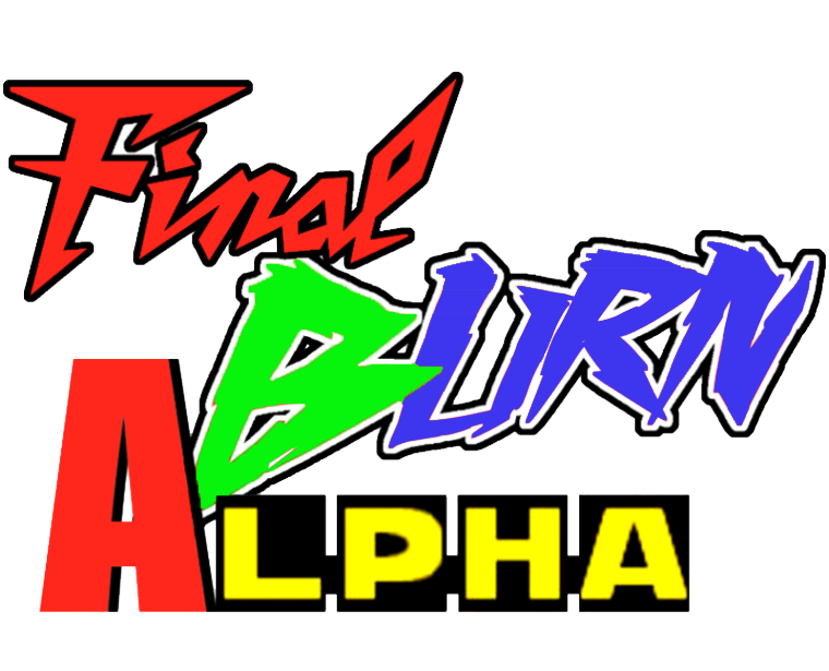
Step 2: tracing in inkscape (color, 6 pass, UNcheck all lower windows options: smoothing , grouping and background remov.)
Step 3: ungroup result; Blue and Red elements cleanup (deleting unwanted spots around letters)
Step 4: apply Gradient fill to green and blue
Step 5: delete original image
Step 6: Group all, resize document to drawing, save svg (default options).FInal SVG image look like this:

Of course image should/could now be edited further to get exact gradient (easy at this stage) as original and/or edit nodes to make it smoother if needed.
Contributions to the project are always appreciated, so if you would like to support us with a donation you can do so here.
Hosting provided by Mythic-Beasts. See the Hosting Information page for more information.