Game List Z-index fun
-
@Syhles I am looking for things not possible before this was implemented or how it made themes easier, by comparison.
Also it was supposed to be "limitations broken" and not "limitations not broken", I apologise for that.
-
About the marquee border, my guess is he edited each marquee image.
Regarding that select bar, just load it as image, position it over the gamelist and make sure the z-index is lower than the gamelist.
The select bar is static and won't move. -
@Hex
We used to need to theme around how things were layered (or drawn) on screen, we weren't able to choose how low or high an object was layered (it's z-index).This is purely speculation on my part until @ruckage tells me if I'm wrong or right.
These examples seem to be done by setting the overlay to a higher z-index then the gamelist, and it's an overlay specifically for the selector bar, that has been specifically made to match up with the gamelist boxes background and fit perfectly over each place a games name can be seen in the gamelist.
Think of the z-index like you're looking down on a pizza. The order it is on the z-index determines it's height (sort of).
Say this is how a pizza normally is (each number is a Z-index)
- Dough or crust
- Sauce
- Cheese
- Pepperoni
In this order you see the edges of the crust, the sauce may poke through in certain areas, the rest is cheese, and on top there's pepperonis covering part of the cheese from view.
Now let's say we changed the order of our pizza layers (our z-index)
- Dough or crust
- Sauce
- Pepperoni
- Cheese
Now when we look down on the pizza we can still see the crust at the edges, the sauce is still poking through the cheese here and there, now the pepperonis are covered from view from the most part, and the top layer is entirely cheese.
I'm not entirely sure of all the applications we can use the z-index for it's something for the themers to experiment and get inventive with.
Like @ruckage did with this selector bar. I didn't think of using the z-index like this and I completely understand what the z-indexs purpose was.
Sorry for derailing your thread @ruckage
and hoped this helped @HexAlso sorry for the wall of text I'm long-winded and over explain.
-
@Syhles
</waits patiently for @TMNTturtlguy to make a suitable pizza-pie reference...> -
@Zigurana
As someone who understands ES way better then I do was my explanation on the z-index correct? -
@Syhles Sure, I think it makes sense like that.
Looking at it from a procedural point of view:
ES will render the elements ranked by their z-index, starting with the lowest value (i.e. 0 for background images), and elements with higher z-values can blot out elements with lower z-indexes when they overlap on the screen.
See also here. -
Wow, didn't expect to wake up to this many replies. I'll be back shortly to answer your questions and show a video of it action.
-
You never cease to amaze us.
Looking really forward to that video. -
@Zigurana I got it

-
@Zigurana said in Game List Z-index fun:
@Syhles
</waits patiently for @TMNTturtlguy to make a suitable pizza-pie reference...>Sorry! I was actually sleeping for a few hours or I would have been on it for sure! Now I am trying to get the kids to daycare! It isn't easy being green. (Wait is the Kermit the frog.....ohhhhh well. I made a funny!)
-
Below is a video showing the gamelist working. It also shows it working with a patterned background (slightly more complicated but the same principle).
@Syhles is correct, everything is layered. So the setup is you set the gamelist z-index to render at the back, next you have the overlay image rendering on top of that (z index higher than gamelist), and in my example the background renders above everything else (zindex higher than both the game-list and overlay.
The actual overlay image in my first examples is a graphic designed to cover exactly a single line in the game-list, however I use the <tile>true</tile> tag to repeat it vertically 9 times.
This works well if the background is a single colour but things get slightly more complicated if you have an image or pattern in the background. To make that work your overlay needs to be a duplicate of the backgound but with transparent areas for the game-list to show through.
So first you would have your background:
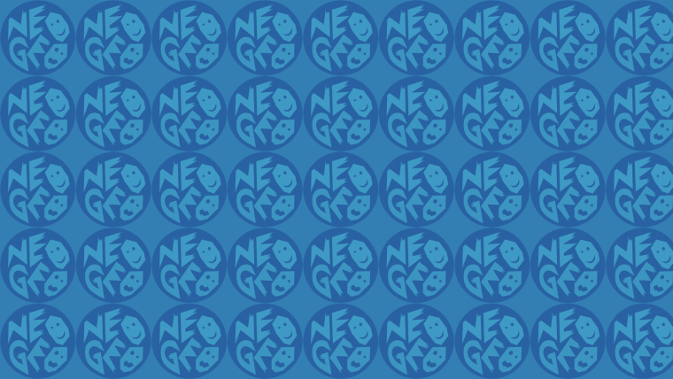
Next the gamelist
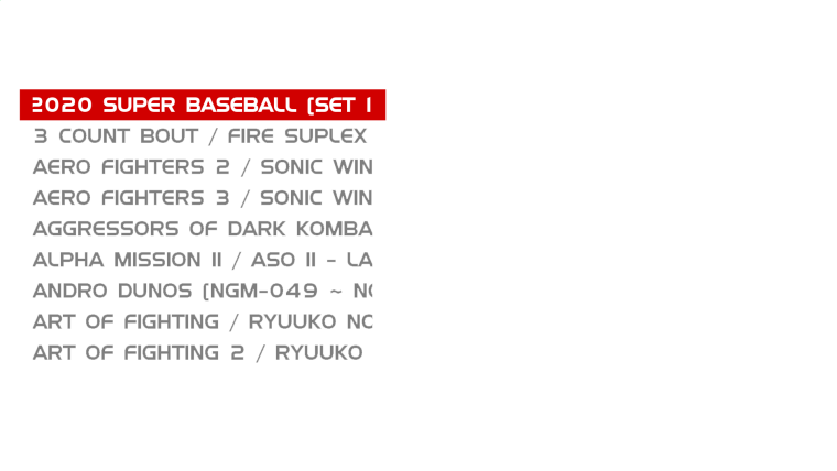
And on top of those your overlay (copy of background with alpha transparency.
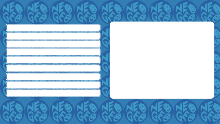
I hope that explains it better.
The z-index is a really useful addition, so many possibilities. You may have noticed the preview screenshots have scanlines - that is also an overlay.
Regarding the border around 'marquee images', they are all edited to have that as I wanted an outline on them for this particular theme.
-
-
@lilbud
I'm going to be an old grump now but would you mind not cluttering up the topic with pictures of Kermit the frog. -
This post is deleted! -
@ruckage
Yay I was correct it seems.On a more serious note, it would be nice if you made a more in-depth step by step tutorial for this, I followed how to do this, also didn't think of the patterned background working that easily.
Thanks for sharing how to do cool things.
-
@ruckage Thanks for clearing that up. I am sure it is jusk like Andoid z index. The only difference is android draws shadows below to show z-index thus giving it an awesome feel
-
@Syhles said in Game List Z-index fun:
@ruckage
Yay I was correct it seems.On a more serious note, it would be nice if you made a more in-depth step by step tutorial for this, I followed how to do this, also didn't think of the patterned background working that easily.
Thanks for sharing how to do cool things.
I'll see if I can come up with a tutorial, most of the work needed is image editing, the xml side of things is easy.
@Hex said in Game List Z-index fun:
@ruckage Thanks for clearing that up. I am sure it is jusk like Andoid z index. The only difference is android draws shadows below to show z-index thus giving it an awesome feel
Not sure what you mean about Android z-index and shadows. You could easily add shadows between layers if you wish though in ES.
A good way to think of z-index is as an extra axis (like 3D). You position you images using x and y coordinates which left/right, up/down repectively, so z is just in/out.
-
@ruckage
Thanks hope you share more inventive ways of using the z-index for things. -
Yes I agree this is great.
Android as in the OS. I am also an Android Dev so I was not sure if it was the same thing or not.
-
@ruckage Amazing job! Although, I can't help but think, wouldn't this be easier if the gamelist could just render an image in place of the selection bar? I might have to look into it.
Contributions to the project are always appreciated, so if you would like to support us with a donation you can do so here.
Hosting provided by Mythic-Beasts. See the Hosting Information page for more information.
