Io - New Theme
-
I'm a web developer by trade, so I generally end up having set ways that I label things. In this example, if something is a background, then it's labelled with "bg_". So here, the overall background colour is labelled "bg_color", the background of the Help bar is labelled "bg_help", etc.
The Io theme doesn't really have a background image as such. Each background box is a single element using a 16x16px white PNG, stretched the right size and then has a colour applied to it with the <color> tag. If I labelled "bg_color" as just "background", you would most likely just be pulling in a square white PNG.
Would I be right to say that I can get the system view background from the very first "extra" XML element inside the <view name=system>?
That sounds like it might be the way to go. One question though, does it get just the background path? Sometimes a theme might have a plain white background image/pattern, and then it has the colour applied with the <color> tag (as it is with Io). Would your script grab the colour as well, or just the image?
-
@mattrixk I've made some tests with the first "extra" element inside the system view really seems to be way to go. I'm not on a RetroPie now, but later I'll post some generated images for IO theme here... ;-)
Would your script grab the colour as well, or just the image?
It takes the color too.
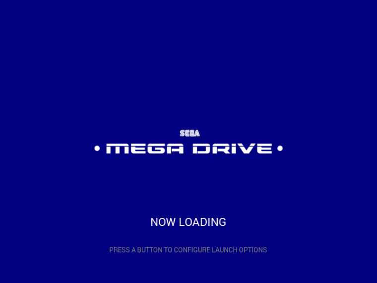
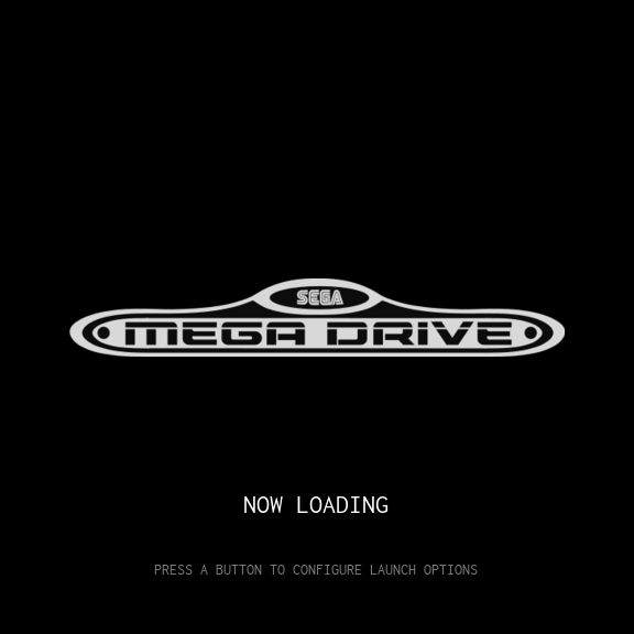
Here is an example of a generated image where the script took the color from the
megadrive/theme.xml(material theme):
The script has an option named
--solid-bg-color, when this option is not present, the script applies the color on the background in a "semitransparent way" (I don't know how to describe it, oh my poor english... :/ ). If the user use the--solid-bg-coloroption the script applies a solid color to the background image (if the background has a picture, it will be fully covered by the color, in other words, the picture will can not be seen). -
@mattrixk Unfortunately getting the first "extra" element inside the system view isn't that trivial... Well, doing this way worked fine for io theme, but some other themes stopped working. And it's related with where the
<include>is placed. The solution I'm thinking is to dump every<include>d file in one big temporary xml file and get the data from this file. Will do it later...Cheers!
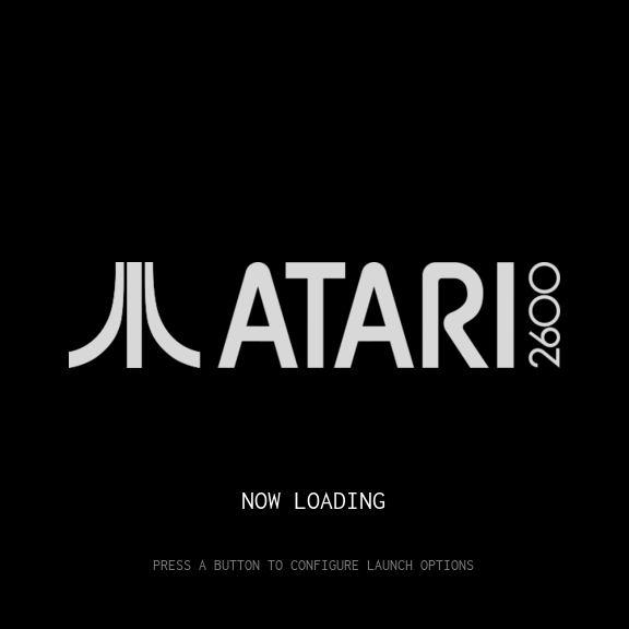
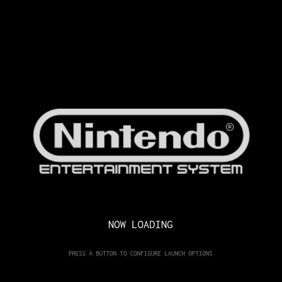
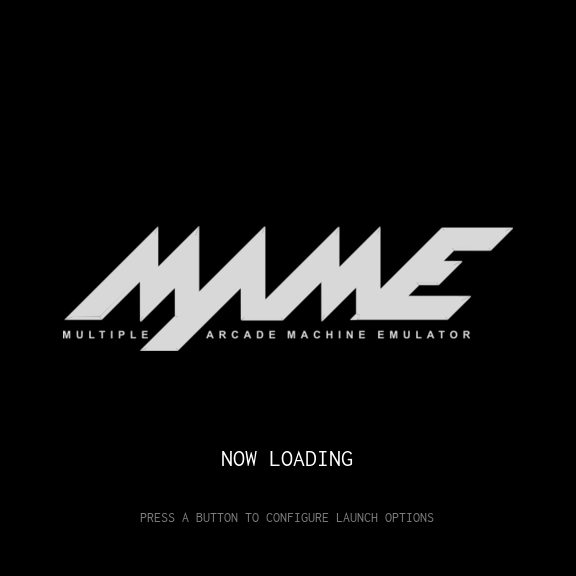
EDIT: as I promised, here are some automatically generated launching images for IO theme.
-
I created Capcom images for IO theme
Grap them here even if they are not high quality but the IO theme is my favourite one because of it's simpelness.
The darker icon is named
system-black.pngand is shown if the system is selected in ES. The greyer icon is namedsystem-white.pngand shows the unselected status.


create folder capcom in your roms folder
create theme.xml there<?xml version="1.0"?> <theme> <formatVersion>4</formatVersion> <include>./../io.xml</include> <view name="system"> <image name="logo"> <path>./system-black.png</path> </image> </view> <view name="basic, detailed"> <image name="logo"> <path>./system-white.png</path> </image> </view> </theme> -
Made favourites icon-set for IO. I just added a text outlined with barbed wire. My first attempts with PSPX (it was given free for years ago!) Does a nice job...
The pic are free to use but please respect the work of others!
DELETED! Reason: Ugly!

DELETED! Reason: Ugly!

How to use:
- Name the grey picture
system-white.pngthe black one is namedsystem-black.png - Create a folder
favouriteswithin IO theme - Create
theme.xmlfile like posted in black box
<?xml version="1.0"?> <theme> <formatVersion>4</formatVersion> <include>./../io.xml</include> <view name="system"> <image name="logo"> <path>./system-black.png</path> </image> </view> <view name="basic, detailed"> <image name="logo"> <path>./system-white.png</path> </image> </view> </theme> - Name the grey picture
-
I made 2 new FAVs icons... the one above look ugly and martial!
Seems to be it was late last night ;) I may delete 2 two pictures above
Even the color palette is made as @mattrixk used #d8d8d8 for the light grey.
Thank to him
!

-
@cyperghost Why don't you submit a PR with these images to IO repository: https://github.com/mattrixk/es-theme-io
-
@meleu Well therefore I have to take part to github. That's annother platform I need to maintain ;)
But I give GitHub a chance... So I can store project code in clouds ;) -
I created a complete new set for the coming "virtual systems"
I will later fork them to IO theme on github. The FAV selection from posting above can be used as special FAV usecase. For myself I decide this icon for the Little Favourite Launcher, So you have a independet choice of two unique favorite systems ;)@mattrixk I hope that this could be included to IO theme. I think there is no need for a carbon style auto-systems. I tried to create a consistant looking of the new three "virtual systems". All in all is the IO a good subset of a theme and it is very easy to create new items for it. So we should push it to be ready for updated ES systems ;) I hope you don't mind if I create some new subsets.
1. Recently played games


2. List of all games


3. List of Favourite Games (My Games)


Credits: <div>Icons made by <a href="http://www.flaticon.com/authors/madebyoliver" title="Madebyoliver">Madebyoliver</a> from <a href="http://www.flaticon.com" title="Flaticon">www.flaticon.com</a> is licensed by <a href="http://creativecommons.org/licenses/by/3.0/" title="Creative Commons BY 3.0" target="_blank">CC 3.0 BY</a></div> -
@cyperghost No minding at all mate, go nuts. They're some nice looking icons.
-
@mattrixk Thank you
IO VS is available on github
I made a PR @mattrixk
You can get IO VS (=IO + virtual systems) on https://github.com/crcerror/es-theme-io
If @mattrixk agreed the PR you can get it also his github in #1 posting ;)I added 3 new systems to introduce new "virtual system" which will be included (hopefully) asap in new ES system @pjft
- auto-lastplayed: That is effectively, a list of games with play count larger than 1, and sorted by last played time, descending
- auto-favorits: An entry for all games you marked as "Favorite"
- auto-allgames: An entry with all games in your system
Enjoy and keep up the good work guys ;)
-
Done last entry -
custom-collectionsHere is my candidate: It's indeed custom and breaks with the auto-systems. The look is a bit unique and uses three colors:
White as border for the stroke for both black und the grey.
That breaks rules i know... but I want to come away from the signing tablet used in the first three entries.So here they are:
Set 0


credits:
<div>Icons made by <a href="http://www.flaticon.com/authors/picol" title="Picol">Picol</a> from <a href="http://www.flaticon.com" title="Flaticon">www.flaticon.com</a> is licensed by <a href="http://creativecommons.org/licenses/by/3.0/" title="Creative Commons BY 3.0" target="_blank">CC 3.0 BY</a></div> -
@mattrixk @meleu @pjft @obsidianspider @backstander @Zigurana, dear users on this form...
I made a buch of Costumized Collections screens here.
Please give feedback which is best. After that a PR will be opened.
I think my first commit is ugly - the shapes are to fine for TV resolution :(
Old style ratio 1:2
Set 1


<div>Icons made by <a href="http://www.flaticon.com/authors/madebyoliver" title="Madebyoliver">Madebyoliver</a> from <a href="http://www.flaticon.com" title="Flaticon">www.flaticon.com</a> is licensed by <a href="http://creativecommons.org/licenses/by/3.0/" title="Creative Commons BY 3.0" target="_blank">CC 3.0 BY</a></div>Set 2


<div>Icons made by <a href="http://www.flaticon.com/authors/picol" title="Picol">Picol</a> from <a href="http://www.flaticon.com" title="Flaticon">www.flaticon.com</a> is licensed by <a href="http://creativecommons.org/licenses/by/3.0/" title="Creative Commons BY 3.0" target="_blank">CC 3.0 BY</a></div>
New Layout Ratio 1:3
Set 3


<div>Icons made by <a href="http://www.flaticon.com/authors/madebyoliver" title="Madebyoliver">Madebyoliver</a> from <a href="http://www.flaticon.com" title="Flaticon">www.flaticon.com</a> is licensed by <a href="http://creativecommons.org/licenses/by/3.0/" title="Creative Commons BY 3.0" target="_blank">CC 3.0 BY</a></div>WAF SCORER
Highest WAF level! (Already tested!)
Set 4


<div>Icons made by <a href="http://www.flaticon.com/authors/bogdan-rosu" title="Bogdan Rosu">Bogdan Rosu</a> from <a href="http://www.flaticon.com" title="Flaticon">www.flaticon.com</a> is licensed by <a href="http://creativecommons.org/licenses/by/3.0/" title="Creative Commons BY 3.0" target="_blank">CC 3.0 BY</a></div>Also high acceptance (WAF Score 8 of 10)
Set 5


<div>Icons made by <a href="http://www.flaticon.com/authors/bogdan-rosu" title="Bogdan Rosu">Bogdan Rosu</a> from <a href="http://www.flaticon.com" title="Flaticon">www.flaticon.com</a> is licensed by <a href="http://creativecommons.org/licenses/by/3.0/" title="Creative Commons BY 3.0" target="_blank">CC 3.0 BY</a></div>ADDED CREDITS: Respect the work of others!
-
I am not fully aware of how the overall theme looks and feels, so my comments will be based purely on personal preference and aesthetics.
I find Sets 1 and 2 to be overly crowded, and that the text superimposed to the icon in black and white significantly reduce the readability. In that sense, 3, 4 and 5 would be my candidates, and in that context I'd probably go for 3 as 4 and 5 seem to be very much inspired by Apple's Finder icon, which I'm not sure I'd associate with customized collections.
Also, as most icons in IO seem to be Carbon's icons in black and white, @UDb23 is also working on Carbon so we may have other options on the table as well if there's any specific intention to keep IO and Carbon aligned.
On a personal note, to reduce the text, I'm not sure if I wouldn't make the title "My Game Collections", to be aligned with your text for the favorites one, "My Games".
Thanks for putting these together!
-
@pjft Yes ... I've tested the SET 0 and found out it is horror to read.
SET 1 und SET 2 are good to read but they are overcrowded and the symbol does not look nice if you are in list mode.So remains SET 3, 4 and 5
Set 4 and 5: The finder symbol
That was a suggestion of my wife. It shows two equal faces in two colors - I think it's a nice description of customization. The symbol needed a bit of modification the orignal can be downloded here. For myself it was long long time ago I worked with vector graphics so the finder symbol was a bit modified in coloring and exported as PNG.
The font (in SET 4) was a small test - it looks beatifull on PC screen but lacks readabiltily in TV. So the computer font that I used for all my sets is pretty good to read! That was a bit of luck, too!
Set 3: The Fitter
Well this set fits perfect in the whole set. And I think it's on the save side.
At first I don't wanted the look equal to all but it's not as easy because the symbol don't descripe a definated system they are more semantic.I see no problem to mix ratio 1:2 and 1:3 they look pretty good.
the ratio 1:2 means 512pixels in height and 1024 in width.
That's more than half HD resolution :)How the set is in TV mode looks like?
AFAIS it is a good fitting and the symbol+text do a good description-job. You may right in your opinion of to much text but if you are in the list mode the you need a good and readable description and here the icons got their strenghten.

Comment @pjft
My Game Collections", to be aligned with your text for the favorites one, "My Games"...
Yes I saw the issue, too - but I think for these virtual-systems it is a good choice to have text and pictures together. It isn't like the symbol for Nintendo or Atari everybody knows - it's just a small info note. Well what would you suggest instead of "My Games"? "My Favorite"? What's then difference between collections and the auto-favorite?
I'm open for every suggestion. Please keep in mind I'm not a native speaker so maybe a better translation is conceivable. Last words of course a needed @mattrixk
@all
Thank you very much - have a nice weekend
-
-
@cyperghost
We'll done; I like the symbols over the "list" (collection) icon.
Don't have the IO theme installed but as far as I could see, if I may suggest, I'm not sure if the font you used for the logos fits well with the other fonts of the theme that are really very simple & clean. -
We'll done; I like the symbols over the "list" (collection) icon.
Thank you very much. I appreciate this so everyone got his own liking and tastes are different :)For me personally the symbol with written text on it look a bit to overloaded and they are looking bad if you are in the emusystem and see the inverted picture. I think it's on @mattrixk to choose or maybe the carbon images can be converted. I won't take bad!
The computer font is very clear to read and fits the retro style :)
-
@mattrixk I made a new set. This set gots now 1:3 aspect ratio which will fit better. I hope they are fine.
@pjft I created new texts - Thank you for your newest branch of ESComplete new set of VR-Symbols with text
Aspect ratio is 1:3 (=512:1536 pixels)
Set 1: auto-allgames


Set 2: auto-favorites


Set 3: auto-lastplayed


Set 4.1: custom-collection


Set 4.2: custom-collection


-
This post is deleted!
Contributions to the project are always appreciated, so if you would like to support us with a donation you can do so here.
Hosting provided by Mythic-Beasts. See the Hosting Information page for more information.