[Theme Changes] Attention Theme Makers: Upcoming Game Collections in ES
-
@pjft PR has been submitted for carbon with basic support. Default is to render the "system" name as text when a logo is not found. It is using variables so you should be able to just add logos in the right place with the right name and it should pick them up. For example, to add a logo for favorites, you would place the logo here:
es-theme-carbon/art/logo/auto-favorites.svg. -
With Collections, is there just text added to a games metadata that says what collection it belongs to? Or will I have to have the same game physically in 2 folders to make Collections work?
Can a game be in multiple collections?
-
@HurricaneFan answers: No. No. Yes.
But it's still not implemented - except for favorites. :)
-
@UDb23 Thanks!
Here's a video:
My thoughts:
I love the text. In fact, it looks great!
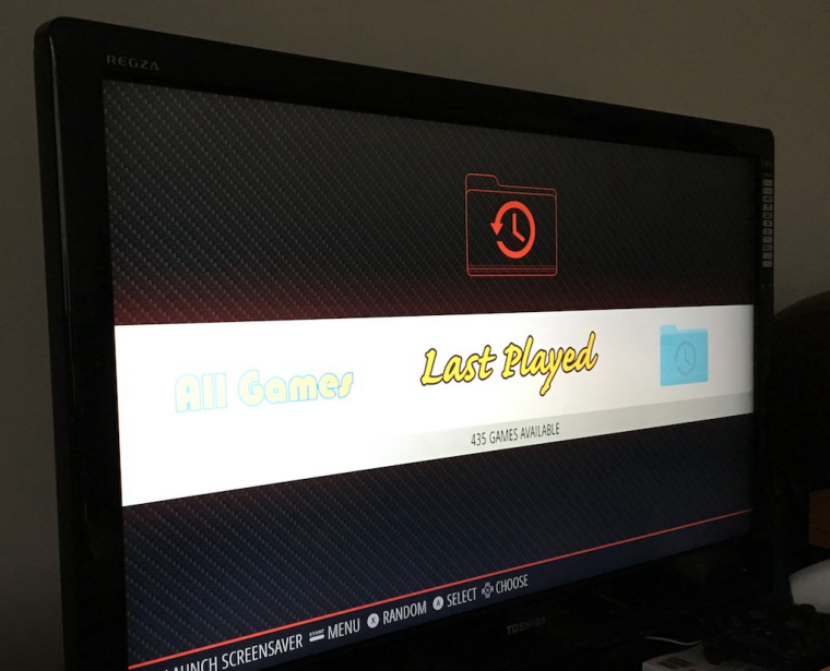
I tried to use for Last Played just your icon, and then the controller from the theme; and for Favorites I used your "Last Played" text and the icon in lieu of the controller from the theme.
I think I like the setup for the "All Games" system the best: stylized text (like the one you also did for Last Played), but with a line-art controller, to fit the original theme's look and feel.
I wouldn't mind getting a folder icon for those, in line-art, with the aspect you have - it's just that having them all filled doesn't at the moment match the rest of the theme.
But that's my opinion.
Thank you! :)
-
it's just that having them all filled doesn't at the moment match the rest of the theme.
But that's my opinion.I agree. Last night I threw together a few similar line art images to use temporarily. Of course these aren't a perfect match either. The line weight should really be somewhere in the neighborhood of 1.5 pt.

-
@pjft Thanks for the video. I agree using text in the bars + lineart controller looks best.
Will provide some proposal for line-art controllers and the missing "favorites" and "my collection" text logos. I have some other TTF fonts that should look nice so that each will have a different font. -
@mediamogul They look quite good.
As said I'm going to try a similar "lineart" version out of the folder icons I made previously. -
I'm sure they'll look great. Thanks to all you guys for the hard work you've put into this feature addition. From idea to execution, it's been a long time in the coming, but it was well worth the wait.
-
@pjft said in [Theme Changes] Attention Theme Makers: Upcoming Game Collections in ES:
with a line-art controller, to fit the original theme's look and feel.
How about this type of "controller" ?

(black background not included, just to show the white lines)
Line thickness resembles the same as other controllers.SVG here.
If you like it then I will create the other "controller" icons too.
About the "text only logo" for custom system would you prefer all same font (bauhaus) like "all games" or different font for each ?
-
Just I reminder: you can personalize also standard ES systems using the SVG custom Logo pack.
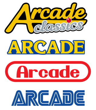
Just an example; alternatives to the default arcade logo:

-
About the "text only logo" for custom system would you prefer all same font (bauhaus) like "all games" or different font for each ?
It's a very good and tricky question. On one hand, duplicating the font keeps collections looking uniform and on the other it runs the risk of creating a "generic" look and feel.
-
@UDb23 You may can download newest IO theme for inspiration. I took me 4 attempts to create a icon set. I exchanged all icons there, made overlay with little symbol and added text. It's really not easy to make a good and gentle look but now I'm satisfied.
Sorry I've never released the icon set here but I'm looking forward how the carbon will look like :) Are there plans to update also the simple theme?
-
@UDb23 Looks stellar!

My only feedback or comment is whether to test the bold "wayback" arrow to also be lineart rather than filled. None of the controller icons in the theme have "filled" areas, at least as big.
But this is really a minor nitpick.
As for the font, I like having different fonts for each of the menus, and potentially different colors, as it can give them a unique, distinguishable feel. All the other systems have their unique fonts.
But overall, looking great, thank you! :)
-
@pjft said in [Theme Changes] Attention Theme Makers: Upcoming Game Collections in ES:
whether to test the bold "wayback" arrow to also be lineart rather than filled
Same thought here, I wasn't sure wether to fill it or not; and had no time to actually check how it looks in ES. Looking at your screenshot I agree that "empty" is better and more consistent with the other controllers. Will finalize text logos and "controller" soon.
-
it can give them a unique, distinguishable feel.
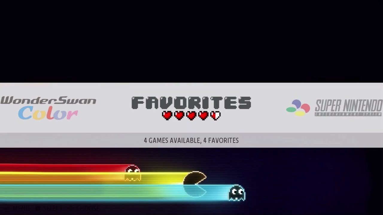
Alongside a basic font choice, I wonder if a small graphical addition might help cement the look to match the other system logos. As an example, RecalBox makes great use of this idea in their 'Favorites' logo.

-
@cyperghost Will check your IO theme.
I usually use just Carbon but if other themes will support these new custom systems I sure can help with specific icons if needed ;-) -
@UDb23 It's not mine mattrixk created it. I use IO because it's a slim theme. I think it's just 1MB in size :) Sorry I wrote, that I exchanged all icons ... I ment I just created the icons for virtual systems 4 times :)
But your carbon looks good.
-
@mediamogul said in [Theme Changes] Attention Theme Makers: Upcoming Game Collections in ES:
small graphical addition might help cement the look
Looks great !! Haven't seen that before. And also the "footer" pac man graphics: wow!
Is that footer fixed or "per system" ? Can it be done in ES ?
Or is it just the background image being black in the upper part and having the graphics in the lower ? -
Is that footer fixed or "per system" ? Can it be done in ES ?
Or is it just the background image being black in the upper part and having the graphics in the lower ?I'm not really sure. It's been a little over a year since I last tried RecalBox. It's really sharp looking though.
-
@mediamogul Were you per-chance referring to the hearts under the name?
I believe creating something like the "ghosts" for Carbon would not be ideal, as Carbon is meant to be a low-memory, lightweight theme - hence all backgrounds being the same image.
Still, wonderful idea for a new theme. :)
Contributions to the project are always appreciated, so if you would like to support us with a donation you can do so here.
Hosting provided by Mythic-Beasts. See the Hosting Information page for more information.