[Theme] Metro Theme - WIP/Released
-
A few days ago i started a mock up on a metro styled theme. I spend the last few days working on putting it together. It is still highly a work in progress but it's slowly coming together. I am planning on making boot screen, launching screens, options icons and the theme it's self most likely with all the supports.
Something may or may not change, im still unsure about the marcots and might or might not look into adding console systems instead. As for now they'll be place holder and probably be the finishing/final touches.
[Supported Resolutions]
1080p
720p[To Do List]
Finish All Systems/Logos/Mascots
Finish All Rating Icons (Per System)
Polish Icons/Logos and Mascots Images
Fix/Change Fonts and Text Spacing
Support More Resolutions[Download Link]
.:Theme:.
https://github.com/Omnija/es-theme-metro.:Icons:.
https://mega.nz/#!woEiVBKJ!ZriEIhgxMZfzR6lkEE82OhKX91ci5Ozqk_Y_nrXecak[Prototype -Mock UP]
https://retropie.org.uk/forum/topic/11524/prototype-metro-theme-mock-up/6[Current Progress]
[Splashscreen]
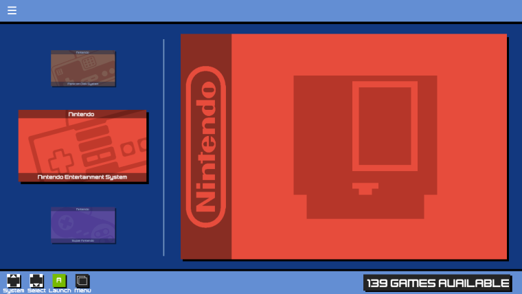
[System View]
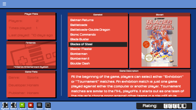
[Detailed View]
[Video View + Video Support]
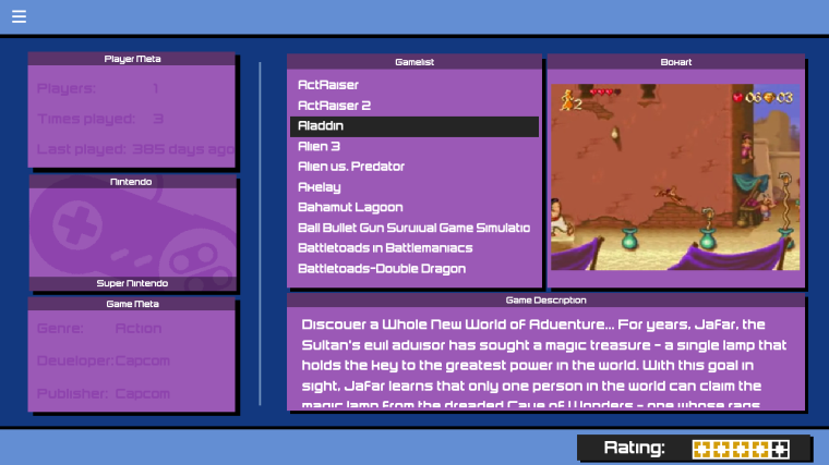
[Basic Gamelist]
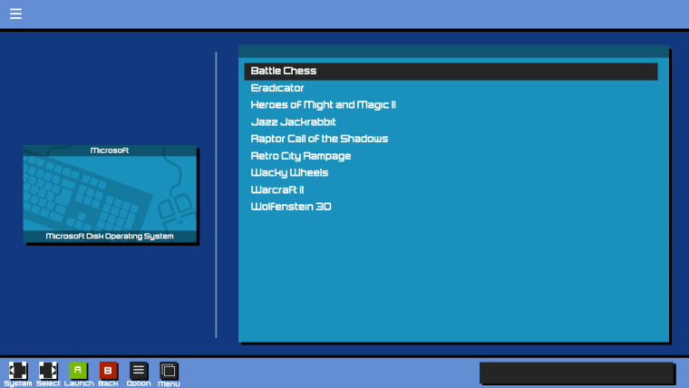
-
here's an example of stand alone folder will and can look like.
[Individual Progress]
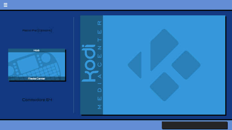
I decided to create a tmp folder so you can create you own place holders for systems i have not completed yet. I will also be doing something like this which will speed up some progress on getting everything set up by using the tmp pieces to pre-setup everything else.
[Under Contruction/Temp]
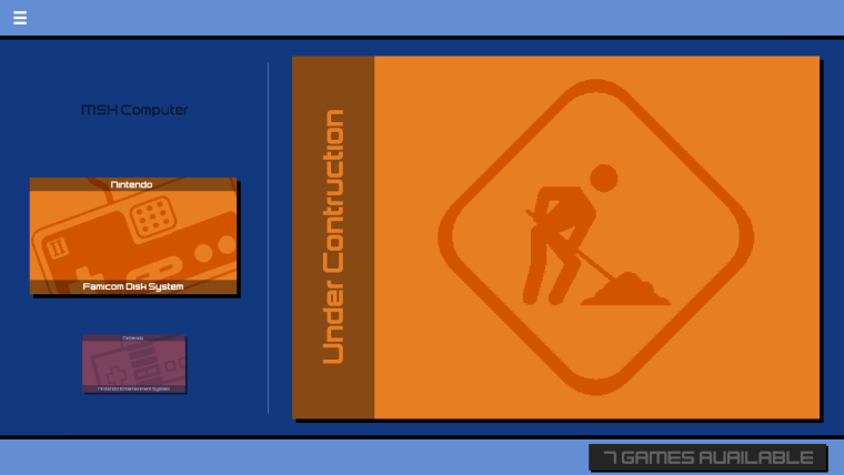
Icons will always be completed and most likely logo's but as for the mascot will most likely be set to tmp until finishing touches later on. Icons are a main priority due to the way they are used, and rating symbols might or might not change...
[Icons and Colouring]
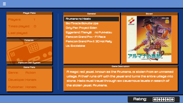
For the footers, it will be created and added but probably later after i've completed all the icons and setup all the systems. Different consoles will also have different colours, as for the background .. it's not been determined yet.
Edits:
[Custom Collections]
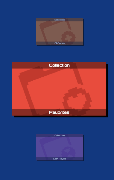
-
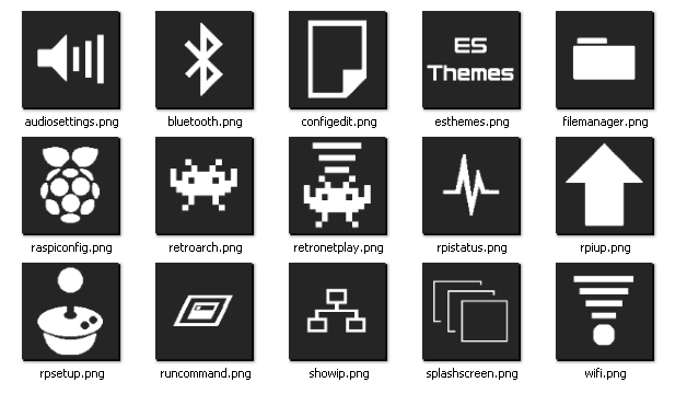
Some more updates... i took a break from making the system controller icons and did some advancements on the retropie menu icons.
[Icons]
[Frontend View]
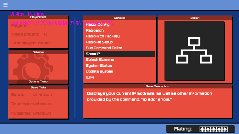
If you are wondering why the extra icons? I have 2 custom scripts to check my cpu/mem split and update the rpi.
-
@omnija This isnt' getting the love it deserves. I dig it a lot.
I especially like the System images in the carousel, that then follow through into the Basic and Detailed views, and the way you've split Player Meta and Game Meta into 2. It's giving me ideas...
-
@mattrixk Thanks, i always try to aim at something unique or different with simplicity when i make themes... sadly they never seem to get any attention.
Side note: main post has been updated with the new corrected [System View] . I decided to go with system cartridges instead of game representatives.
lately i've been playing around with the rating and thought it be fun to have the cartridges as the rating as well.
[Nes]
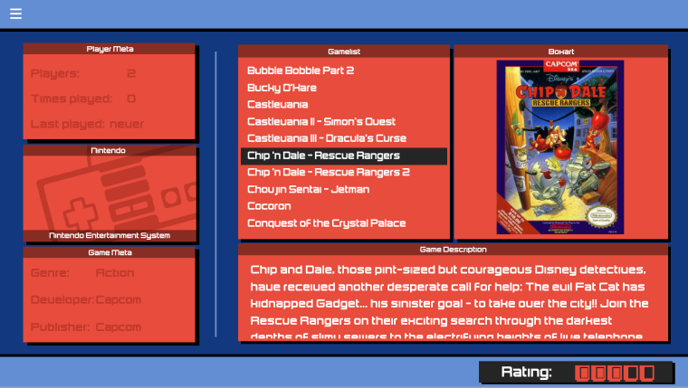
[Snes]
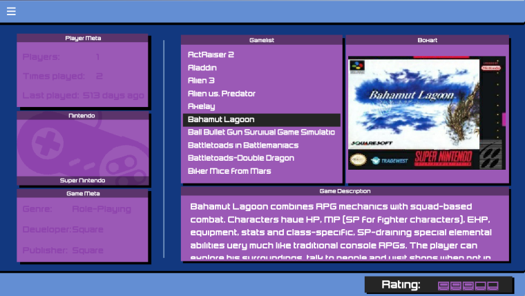
As for the coloring i'm still not content with it.
-
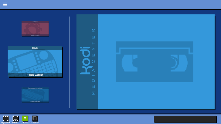
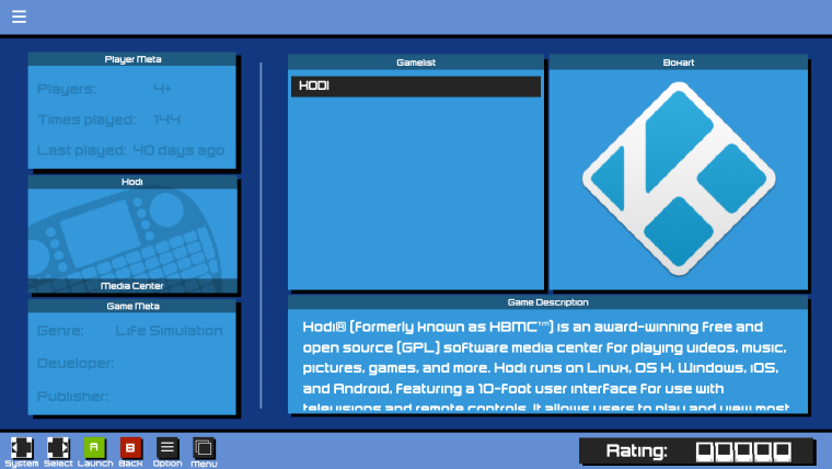
Uploaded the Icons and the (DEMO) theme to the main post, it's not completed and still very Rough around the edges.. but it's a start and it's just incase i don't get the chance to later. Here's some screenshots of what it sort of looks like now sample with the footer added.
[Systems]
[Gamelist]
-
I got around to fixing the ratio aspects and is now fully compatible with 1080p.
I also got around to arranging the new custom collection icons and made them stand out better.
All Games - Database

Favorites - Heart

Recent - Hour Glass

Custom - Plus Sign

I've started working on adding rating icons for independent systems which i have to go back and redo from 20 to 32 ratios. Changed partial fonts for better visibility as well as an alternative background. Polished "some" of the mascots/logos so they were less... fuzzy visibly. If you where also un-aware the github link has been posted.
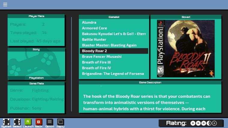
I've also made 2 launching screens which go with the colour of the themes.
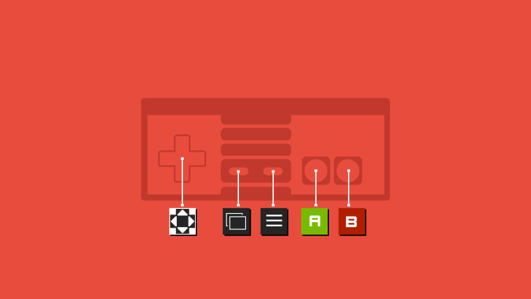
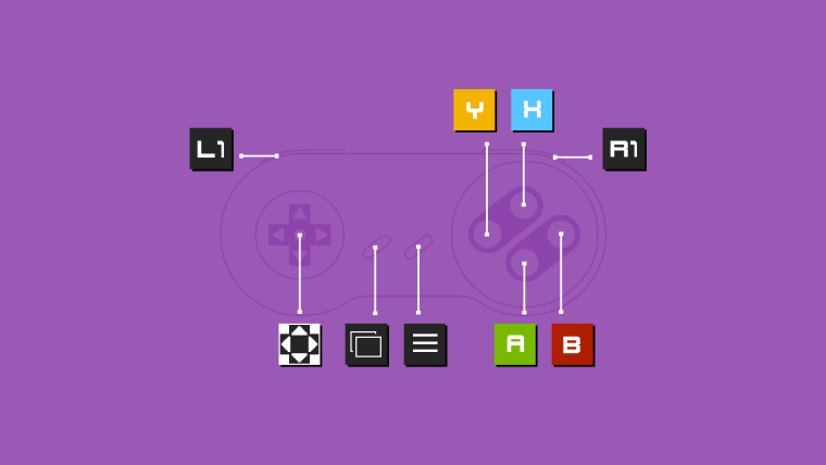
My gf also wanted me to make a bezel for it, to look sort of like a tv with speakers and such... so yup.
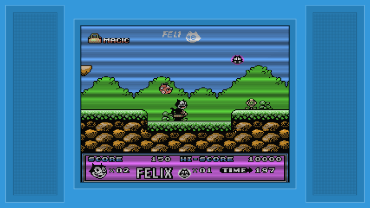
-
I had some time today to get around attempting at spicing it up a bit (didn't like the black bars) Nothing huge for now, but figured it was time for some change. It helps seperate and blend the button keys and the games then the ratings in one way or another.
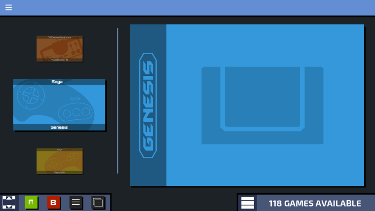
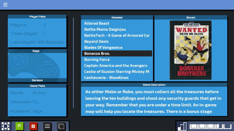
-
really great!
thank you for sharing -
@omnija This theme looks great! Just a headsup, the A & B buttons on your controller splashscreen are labeled in reverse of what they are supposed to be. The B button is always to the left of the A button on the Nintendo controllers.
Contributions to the project are always appreciated, so if you would like to support us with a donation you can do so here.
Hosting provided by Mythic-Beasts. See the Hosting Information page for more information.