[Theme Changes] Attention Theme Makers: Upcoming Game Collections in ES
-
@udb23 And shadows are usually done with those functions in SVG.
-
@udb23 oh. I had no idea.
Maybe that's something that can be added - I'd suggest not investing in shadows and such things yet as it may be that those can be added in the coming weeks/months, would that be a reasonable thought process?
-
@pjft @UDb23 you can do transparencies, shadows, and blurring with png formats, plus ES handles png files better, and they are easier to create. I understand that the svg format scales better, but having invested a ton of time playing with .svg and .png formats and the help of @pjft in researching and dissecting how ES handles the files I would suggest at least trying to use a png file type and see how it goes. This will solve the issues with the current logos, as well as keep us from investing time into trying to add features for svg files.
-
@tmntturtlguy said in [Theme Changes] Attention Theme Makers: Upcoming Game Collections in ES:
you can do transparencies, shadows, and blurring with png format
I'm aware of that ;-)
To create overlays I combine both bitmap AND vector images, using the best of the two worlds. There has been already plenty of discussion in this forum about bitmap (raster) vs vector and what it implies for ES.
Vectors (SVG) often means more effort to create 'em but also means graphics are perfectly scalable (resolution independent). That's the reason why I still prefer SVG for ES logos.@pjft ES relies on a "miniSVG" library if I remember well. Getting full SVG support (like in web browsers or programs like Illustrator & Inkscape) would probably be quite complicated and, even more, probably be too much taxing for the Pi's processing power.
-
@pjft said in [Theme Changes] Attention Theme Makers: Upcoming Game Collections in ES:
@udb23 oh. I had no idea.
Maybe that's something that can be added - I'd suggest not investing in shadows and such things yet as it may be that those can be added in the coming weeks/months, would that be a reasonable thought process?
Standardized svg (ie 1.2 TINY) is pretty barebones. When you try to do additional effects such as transparency and drop shadows, all it does is rasterize them into alpha transparent bitmaps dropped into clipping masks when exported. It's basically what happens with eps, you end up with lots of embedded bitmaps or linked files. For a simple drop shadow this might be size efficient, but once you get into complicated vectors with lots of effects, the final output won't be much better in the case of file size than simply using PNG (often time's it's much worse).
The only non-proprietary standard that currently has support for vector transparency is EPS 3.1 (equivalent to Adobe Illustrator 10) - and that's only transparency, things like drop shadows and layer effects are still not supported in any non-proprietary vector format without being converted on output. Adding support for proprietary formats such as Adobe Illustrator, Corel Draw, Affinity Designer, Freehand or other such files would be an overly complicated endeavor. It's best to just mimic effects your looking for in your actual vector drawing in a way that is compatible with the most basic svg functions with the creative use of gradients, shapes and intersections.
I do logo design for a day job and stock vector imagery on Adobe Stock and Shutterstock on the side, the guidelines for vector compatibility in the stock vector space are extremely tight, one open curve or added effect is instant image rejection, so this specific issue is something I'm very familiar with. If anyone needs any tips on how to achieve vector effects without using "effects" i can help out.
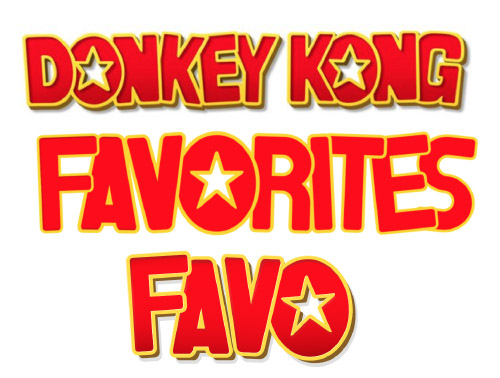
I tossed together a quick mockup of the donkey kong effect done in ES svg safe vectors, it's easy enough to mimic if you want to spend a couple minutes.

-
@capeman Nice! For my logo I used a horizontal gradient for the red areas with top and bottom darker red to simulate internal shadows.
How do you simulate internal left side shadow of original donkey kong style ?
I placed a shape on the left side with a vertical gradient; looks quite nice but is tricky in the (rounded) corners as you overlap with the horizontal gradient. -
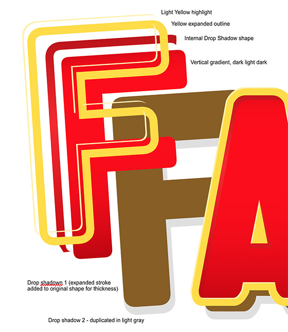
@pjft I achieved this effect in about 5 or 6 steps. Check out my exploded view of all the shape layers i used:

-
Expanding strokes is your best friend, it's basically taking the stroke/outline and turing it into a shape of its own. At that point you can duplicate the outline and use boolean functions (add, subtract, intersect, etc) to chop away pieces and make shapes that mimic effects like these.
I would recommend if you like to do vectors and want a really good app for it that doesnt cost an arm and a leg, Affinity designer is a top choice. Its $50 for life, no monthy cost like adobe. It uses alot of corel draw's best drawing features and is way more functional and stable than Inkscape.
-
@capeman thanks for the tips!
I was using intersection to create the shapes to be used for shadows. Didn't think about using strokes, really clever idea.
Will complete the logo accordingly.Will also give the program you suggested a try, cost seems absolutely reasonable.
-
@udb23 I used to use Corel Draw back in 2000 when i started doing vectors, i used it up until around 2008 when i switched to mac, and since then i had been trying to find a good application that had the same bezier drawing ability as Corel. Illustrator is a powerful app, but it's drawing tools feel like they're stuck in 1998, its unacceptable to need 5 different tools to simply edit points and curves. Inkscape was the closest i found to proper point editing, but it was just too feature lacking. I tried freehand but macromedia got bought out by Adobe and freehand was discontinued about 8 years ago. So for a long time i just settled on using Corel in a virtual machine on mac, the experience wasnt ideal. Then finally a couple years back the Affinity package hit the scene, it was everything i was looking for, proper editing tools, fast new architecture, great price, no subscription, and a mac first mentality (it's since released on windows also). Sorry for the convoluted history lesson, but the journey to a good vector drawing app has been a long and arduous one to say the least. Consider this my recommendation for Affinity Designer, i can't say enough good about it.
-
@capeman thanks for the valuable info.
I too started with graphics ( mainly for fun, not as a job) many years ago with Micrografx Picture Publisher (photo editing) and Designer (vectors). They were the main competitition to Corel products. Adobe being too expensive for private use at that time.
Currently using Lightroom and PSE 15 from Adobe (full license, no subscription as I don't like that business model as customer) for photography related editing (+ some retropie ;-) ).
Inkscape for vectors.Will definitely check and probably buy the software you're using for vectors. Fully agree that inkscape lacks features and is quite unstable; it's free after all.
-
Hi Guys....
Looking forward to the new custom-collections. How exactly will this work for theming? You create the custom-collections dir then inside that have separate theme dir's with individual xml and images etc.? What's the plans to add the roms to the custom dir's? similar to the 'add' favorites inside the edit metdata ui?
Sorry for all the questions ha! I'm currently creating some themes and wanted the heads up really.
Love what you've done so far.....absolutely amazing work with the favs,last and all sections. Thumbs up
-
I've been using Adobe Illustrator for close to 25 years now, so it's become firmly entrenched in my workflow. I also feel that it's earned the reputation as being the most powerful set of tools for this type of work. However, you make a compelling case for Affinity Designer and I think I might try it myself to shake things up a bit. The reviews have always been favorable and they're practically giving it away at $50. If nothing else, I would welcome a simplified routine and tool set for personal projects.
-
@mediamogul I use illustrator in my professional workflow for making ads and all of my other normal layout based projects. It's a champ at handling graphics and embedded imagery... the deterrent for me is that in my personal work i do Illustration, and it's very heavy on bezier editing. Illustrator was created in a time when bezier editing was very new, and the tools had not been refined, but because people got used to doing it that way, they never changed the way the tools work. So illustrator does everything well except... well... illustration.
Corel draw came along and changed the basic way these tools work, inkscape and Affininty both use the easier Corel bezier tool structure, it's a world apart from illustrator.
This is my portfolio on shutterstock of my illustration if you want to see it, this is why im so particular about how the node editing tools work. https://www.shutterstock.com/g/aoshlick
Also because of the way shutterstock and other stock agencies work, every image in my whole collection doesnt have a single effect, or even a stroke. All line work has to be expanded strokes or drawn shapes (which i opt to do, its very time consuming). Working this way makes for very compatible SVG graphics, which is why I would be a great resource to anyone who is making vectors for ES.
If anyone wants to send me a vector that's rendering funny, I'm the man to optimize it, haha.
-
This is my portfolio on shutterstock of my illustration
Ha! I love it! I'm especially head over heels for the hero tooth with the toothpaste pompadour, but they're all fantastic. Your technical skill is certainly on display there, but it's also immediately obvious that you love what you do. Do I also detect that you may be a fan of 1930s-40s animation and cartooning?
-
@mediamogul Thanks! You detect correctly sir! Love me some old school! And the tooth is one of my best sellers.
-
I'm a big fan of that original rubber band cartoon character style myself and have a pretty extensive collection of animation from that time. My two favorite creative forces are Ub Iwerks and anything out of the Fleischer animation studio. About fifteen years ago, I was lucky enough to work on animating a television commercial that parodied the "Let's all go to the lobby" characters and to this day it's still one of the most fun projects I've ever been involved with.
-
That's rad! Just gave me an idea too, wouldn't a version of that specific animation, but done in pixel art, make one hell of a Retropie startup screen? Not that i'm volunteering, haha.
-
It would indeed. I'm always keen to avoid copyright and trademark issues, but imagine Pac-Man, Mario and a few other notable characters stylized in a merger of 16-bit pixel art and that classic rubber band style, confidently high-stepping in line to the jaunty tune.
"Let's all go to the lobby and play ourselves some games"
-
@mediamogul I literally cannot upvote that idea enough
Contributions to the project are always appreciated, so if you would like to support us with a donation you can do so here.
Hosting provided by Mythic-Beasts. See the Hosting Information page for more information.