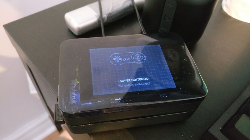
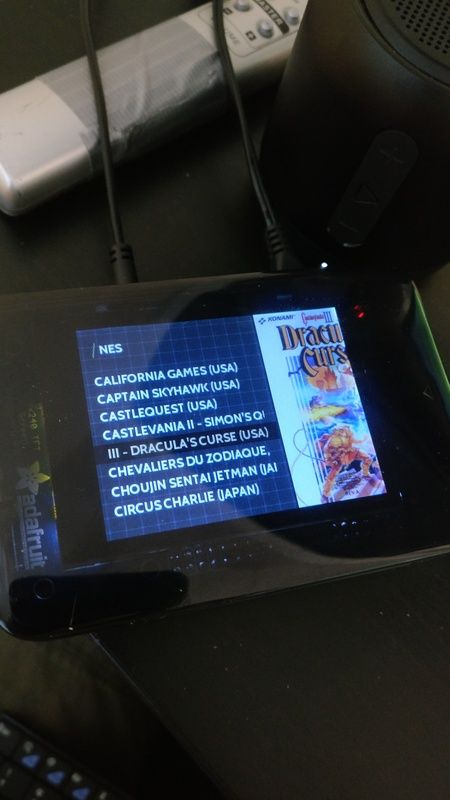
[New Theme] 'TFT' a theme made for small screens
-
@edmaul69 airwalk studios did a great port of it
-
Tried this on my crt tv and it was cut off on both the right and left sides. The font was also HUGE. I also tried the 4x3 version of the normal crt theme. Nothing is cut off but the meta is tiny. The titles them selves are fine but the description and ratings are unreadable.
-
Looks dope, can't wait to try it, having a piTFT myself! Just wondering, it looks like the image displayed is only a cut of the left side of an original square image. Since the action usually (naively) happens in the middle, would the previews look generally better if you offset the image a bit so we can see the action in the middle? I don't know how hard it would be to do, but I'd be curious to see the outcome :)
-
@felleg great idea! With the new z-index ability I think I can make that work. Will take a shot at it this weekend and post results. Thank you.
-
Updates 6/9/2017:
- Created new simplified system logos
- Added new system logo to detail, video and basic views
- Brought in controller artwork from the Carbon theme (all credits to Carbon's theme creator for them)
- Updated System View with controller artwork
- Updated position of image and video based on @felleg recommendations (important note: with these changes the theme requires the latest version of retropie/es running with z-index support - without that support the theme will look really wacky). Thank you @felleg - hope this looks good on your end.
Image position changes
- With the origin option, this turned out to be pretty straightforward to implement and I really like the look of it
- It's not perfect for every image but it does look better
- The biggest note though is the theme now requires the latest version of retropie/es with z-index support. To create the faux crop effect the image has to be positioned off screen and underneath the gamelist.
New System Logos
- For the size of the screen this is meant to be used on I decided to move towards a simpler text based logo for each system
- The result of this is that they all end up looking very similar but I am thinking through ideas on that as well (wondering if each system has some type of iconography that could be used after its name)
-
Awesome update!! Will check it out whenever I can! P.s., what is the best way to scrape for screenshots instead of boxart?
-
@felleg I currently use UXS + screenscraper.fr (https://retropie.org.uk/forum/topic/5291/soft-universal-xml-scraper-v2-easy-scrape-with-high-quality-picture) with a custom profile to only scrape screenshots (among other metadata like name and description)
I uploaded the profile to github just now here:
https://github.com/anthonycaccese/es-theme-tft/blob/master/_inc/uxs profiles/no-video.xmlThe specific part around scraping screenshots is...
<Element Type="Picture">
		<Source_Type>XML_Download</Source_Type>
		<Source_Download_Path>%Local_Path_File%</Source_Download_Path>
		<Source_Download_Tag>-screenshot</Source_Download_Tag>
		<Source_Download_Ext>jpg</Source_Download_Ext>
		<Source_Value>Data/jeu/medias/media_screenshot</Source_Value>
		<Target_Type>XML_Path</Target_Type>
		<Target_Path_Type>%XML_Path_File%</Target_Path_Type>
		<Target_Value>game/image</Target_Value>
	</Element>
I have heard that selphs scraper also can work with screenscraper.fr but I need to check to see if that can also be configured to look up screenshots instead of boxart. I will see what I can find.
-
@alphatoanant thanks! I tried using uxs, but it kept crashing for some reasons unknown. If there's a way to do it with sselph's, that's the one if be interested in!
-
@felleg it looks like there is a way to prefer to screenshots when using sselph's scraper
Check out the flag "consoleImg" in https://github.com/sselph/scraper/blob/master/scraper.go
The default value is "b" (boxart) if nothing is set. "s" can be used to scrape for screenshots and you can comma separate a few values to define preference order.It looks like it can only be set if you running it from the command line though
I did find this request that goes into another option of manually editing the defaults so you can run it from the gui - https://github.com/sselph/scraper/issues/130
Thinking of one of those approaches might work. Hope this helps.
-
@alphatoanant Thanks for this!
Luckily, I finally got the chance to test your test for real today. Man, I absolutely ADORE this theme. It's in my top 3 favorite themes as of yet. Can't wait to see it appear in the official RetroPie repo! It looks unbelievable on my TFT. Weird detail, but I like how vibrant the grid in the background looks. It's much more noticeable than the grid in your standard CRT theme (even when connected to HDMI), in comparison. It's a shame you're missing a few systems in there, like the 32x, dreamcast, N64 and DOS. Since there is no text, it's hard to pick the right system if they're missing ;)I wish there was a quick way to change from boxart view to screenshot view, let me know if you know of a trick. Since like the automatic view mode is great at picking the few videos I have (and frankly is looks quite stunning with videos!).
Last little detail: I noticed on your github page, there are small arrows in the console select screen, but my version of the theme doesn't have theme. What happened to them? :P

Edit: last thing I noticed, my boxarts don't seem to be re-aligned in z (the suggestion you implemented), but it does re-align the videos. Is the re-alignment for videos and screenshots only, or is this a bug?
EDIT EDIT: Seems like it's only affecting "portrait" boxart, like NES and Genesis. SNES centers the image fine. Weird.

-
suggestion for your TFT theme! Since you had a CRT snow video for files with missing videos in your previous CRT theme, maybe you should do the same for this theme when a screenshot or a video is missing! :)
-
@felleg thank you for your feedback and photos!
I have made some updates...
"missing a few systems in there, like the 32x, dreamcast, N64 and DOS"
- I have added those 4 and committed the changes to github
- if there are any others missing just let me know and I should be able to turn them around soon
"I wish there was a quick way to change from boxart view to screenshot view, let me know if you know of a trick"
- unfortunately, there isn't a way I know of. ES currently only looks for the <image> property in a gamelist so I believe whatever is defined for a given game is the image that will be displayed. I have seen some conversation of new media properties in other threads but that's likely a ways off.
"I noticed on your github page, there are small arrows in the console select screen, but my version of the theme doesn't have theme. What happened to them?"
- This is simply a miss on my part =)
- I'll try to commit the code for this in the next week
"last thing I noticed, my boxarts don't seem to be re-aligned in z (the suggestion you implemented), but it does re-align the videos. Is the re-alignment for videos and screenshots only, or is this a bug?"
- This one is puzzling me =)
- I have the use case set up in my test env but haven't wrapped my head around why its happening yet. Will keep digging
"suggestion for your TFT theme! Since you had a CRT snow video for files with missing videos in your previous CRT theme, maybe you should do the same for this theme when a screenshot or a video is missing! :)"
- The main reason I didn't implement was wanting games without a video to be able to fallback and display their screenshot
- I am thinking of this though
-
@alphatoanant Thanks for your response! I will pull the newest version of the theme right away. Hype!
-
@alphatoanant Hey Anthony, i tried to get in touch with you via Instagram regarding your TFT theme. Now I found this post here :-) Is there any way i can message you?
Cheers,
Ale -
Found your message. Sorry for missing that, talk soon.
-
@alphatoanant Cheers!
-
Love this and your Picade and CRT themes. I notice this one is a bit light on different systems though. Would there be any chance of a PCE-CD, SG-1000, 3do, daphne, atari 5200 and Atari 7800 svgs for example? Thank you!
-
The new theme Cygnus -Blue flames is also great for small screens ( 5 inch and more)
New edit : I did an important update today. The theme now has a default interface for uncovered systems. See here
Contributions to the project are always appreciated, so if you would like to support us with a donation you can do so here.
Hosting provided by Mythic-Beasts. See the Hosting Information page for more information.