[Theme Changes] Attention Theme Makers: Upcoming Game Collections in ES
-
https://stackoverflow.com/questions/13503243/what-does-dirty-flag-dirty-values-mean
It means it needs the name needs to be updated as it has changed (or not been initialized). I don't want to have to always compute the name every time we render as it's expensive and unnecessary. :)
@Capeman I'm not considering adding yet another option at this stage, unless there's a significant number of requests. If/when there are changes to the theming architecture to support console icons (and to make clear, that is not on my particular roadmap, as theming is not my forte), then there may be a bigger case to remove them, but for now it seems to be useful for those particular use cases.
But open to feedback, as usual.
-
@pjft I told him where the magic of uppercase+romname+[] is ... so I see no problem of compiling onself.
I agree with you that there no changes will be made ...
But what do you think of an "advancedsettings.cfg" - file?
I know you want ES easily be setted up ... but that's the only way I see to get things optional or selectable without overloading the Main Menu in ES.Thanks for the link ... writePending would sound more specific.
-
@cyperghost It's not only about the menus. Creating, maintaining and updating that code - together with testing the possible combinations with new features - can easily turn into a big mess.
-
I'm with you
-
@mattrixk said in [Theme Changes] Attention Theme Makers: Upcoming Game Collections in ES:
I dunno, it seems kind of necessary. Take Tetris for example. There are at least 30 games for different Systems simply called "Tetris". It's not until the early 90s that they start to be called other names (Super Tetris, Vs Tetris, Tetris II, etc).
I see your point to an extent, but if you have box art enabled, you would know right away which system or version you were playing. I'm just suggesting that it would be an option you could turn off. Even if there were 30 versions of tetris or multiple versions of lion king, you would probably only favorite the one you like best anyway.
-
@pjft said in [Theme Changes] Attention Theme Makers: Upcoming Game Collections in ES:
I'm not considering adding yet another option at this stage, unless there's a significant number of requests. If/when there are changes to the theming architecture to support console icons (and to make clear, that is not on my particular roadmap, as theming is not my forte), then there may be a bigger case to remove them, but for now it seems to be useful for those particular use cases.
But open to feedback, as usual.If the need to keep them is there maybe possibly cleaning up the naming structure would make it a little more appealing to read.
2 Examples:
Atari games added to favorites say ATARI2600 with no space
Mame games say MAME-LIBRETROIt appears to me (the non-coder noob) that the name is derived from the folder the rom is contained in, maybe instead if it pulled the system name from the <fullname> tag for the system under es_systems.cfg that would make for a cleaner look since those names are meant to be read by the user, where as rom folder names are meant for the backend.
BUT of course if the name IS pulled from the folder name, i suppose i could just edit es_systems.cfg to look for a folder called just MAME instead of MAME-LIBRETRO and change the folder name and it should update accordingly, right? OR just move all of my FBA and MAME over to the arcade folder.
Sorry if I'm nitpicking but I'm a perfectionist when it comes to UI. Web designer problems i suppose.
-
@capeman pretty sure I'm reading the short system name that's in the systems config file.
Meaning that you can likely edit them yourself, correct. :)
-
I think the name in brackets in the collections is handy, though yes, it does clog up some whitespace that adds to the look of some themes. It's a compromise and works well enough as is.
If these lists could be formatted so your favourite games, for example, could be presented under headings... that would eliminate the redundant text but retain the functionality.
SEGA GENESIS
Sonic
NHL 94
etcC64
Jumpman
Lode Runner
etcOne step beyond that might be a toggle to turn on or off these headings, essentially switching between something like this, and the current presentation. A grouped vs ungrouped sort of thing.
-
@pjft Update on icons and text logos.
Did some testing about the size of standard Carbon theme System and Controller SVGs.
Picked a couple of them (size in pixels):
Systems
macintosh: 566,92 118,865 no border
G&W: 566,92 129,21 left & right border
Intellivision: 566,92 89,33 no bordercontrollers
lynx: 598 350 border top 62 bottom 52 left 46 right 53
mac: 598 350 border top 17 bottom 15For Systems it seems width (566) is fixed ) and it makes sense for icon spacing. There's for sure also a limit in height but height of SVG varies.
Controllers have fixed max size: 598 by 350.
With this info I resized the custom Folder controller icons so now they should appear of similar size of the other controllers.
Can you please test them ?The following new text icon is a test for correct icon sizing and for "simulating" shadows (check inside of F letter).

As ES does not support transparency or blur, I'm placing shapes with ad hoc gradients.
It is a long process to do so let me know if you like the "donkey kong" favorites style and, if shadows appear nicely in ES, I will
then complete the logo.I had little time to dedicate this WE so you need to be patient for new "all games" and "collections" logos ;-)
You can find all this updated stuff here.
-
@udb23 I do like this new style for favorites, actually :)
What do you mean by ES not supporting shadows or transparencies, though?
-
@pjft I mean that ES has only limited support for SVG (subset of SVG format functions).
If the SVG contains trasparencies or blurring these will not be displayed.Unless there has been an update to ES to fully support SVG standard...
-
@udb23 And shadows are usually done with those functions in SVG.
-
@udb23 oh. I had no idea.
Maybe that's something that can be added - I'd suggest not investing in shadows and such things yet as it may be that those can be added in the coming weeks/months, would that be a reasonable thought process?
-
@pjft @UDb23 you can do transparencies, shadows, and blurring with png formats, plus ES handles png files better, and they are easier to create. I understand that the svg format scales better, but having invested a ton of time playing with .svg and .png formats and the help of @pjft in researching and dissecting how ES handles the files I would suggest at least trying to use a png file type and see how it goes. This will solve the issues with the current logos, as well as keep us from investing time into trying to add features for svg files.
-
@tmntturtlguy said in [Theme Changes] Attention Theme Makers: Upcoming Game Collections in ES:
you can do transparencies, shadows, and blurring with png format
I'm aware of that ;-)
To create overlays I combine both bitmap AND vector images, using the best of the two worlds. There has been already plenty of discussion in this forum about bitmap (raster) vs vector and what it implies for ES.
Vectors (SVG) often means more effort to create 'em but also means graphics are perfectly scalable (resolution independent). That's the reason why I still prefer SVG for ES logos.@pjft ES relies on a "miniSVG" library if I remember well. Getting full SVG support (like in web browsers or programs like Illustrator & Inkscape) would probably be quite complicated and, even more, probably be too much taxing for the Pi's processing power.
-
@pjft said in [Theme Changes] Attention Theme Makers: Upcoming Game Collections in ES:
@udb23 oh. I had no idea.
Maybe that's something that can be added - I'd suggest not investing in shadows and such things yet as it may be that those can be added in the coming weeks/months, would that be a reasonable thought process?
Standardized svg (ie 1.2 TINY) is pretty barebones. When you try to do additional effects such as transparency and drop shadows, all it does is rasterize them into alpha transparent bitmaps dropped into clipping masks when exported. It's basically what happens with eps, you end up with lots of embedded bitmaps or linked files. For a simple drop shadow this might be size efficient, but once you get into complicated vectors with lots of effects, the final output won't be much better in the case of file size than simply using PNG (often time's it's much worse).
The only non-proprietary standard that currently has support for vector transparency is EPS 3.1 (equivalent to Adobe Illustrator 10) - and that's only transparency, things like drop shadows and layer effects are still not supported in any non-proprietary vector format without being converted on output. Adding support for proprietary formats such as Adobe Illustrator, Corel Draw, Affinity Designer, Freehand or other such files would be an overly complicated endeavor. It's best to just mimic effects your looking for in your actual vector drawing in a way that is compatible with the most basic svg functions with the creative use of gradients, shapes and intersections.
I do logo design for a day job and stock vector imagery on Adobe Stock and Shutterstock on the side, the guidelines for vector compatibility in the stock vector space are extremely tight, one open curve or added effect is instant image rejection, so this specific issue is something I'm very familiar with. If anyone needs any tips on how to achieve vector effects without using "effects" i can help out.
I tossed together a quick mockup of the donkey kong effect done in ES svg safe vectors, it's easy enough to mimic if you want to spend a couple minutes.

-
@capeman Nice! For my logo I used a horizontal gradient for the red areas with top and bottom darker red to simulate internal shadows.
How do you simulate internal left side shadow of original donkey kong style ?
I placed a shape on the left side with a vertical gradient; looks quite nice but is tricky in the (rounded) corners as you overlap with the horizontal gradient. -
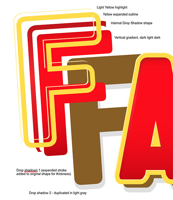
@pjft I achieved this effect in about 5 or 6 steps. Check out my exploded view of all the shape layers i used:

-
Expanding strokes is your best friend, it's basically taking the stroke/outline and turing it into a shape of its own. At that point you can duplicate the outline and use boolean functions (add, subtract, intersect, etc) to chop away pieces and make shapes that mimic effects like these.
I would recommend if you like to do vectors and want a really good app for it that doesnt cost an arm and a leg, Affinity designer is a top choice. Its $50 for life, no monthy cost like adobe. It uses alot of corel draw's best drawing features and is way more functional and stable than Inkscape.
-
@capeman thanks for the tips!
I was using intersection to create the shapes to be used for shadows. Didn't think about using strokes, really clever idea.
Will complete the logo accordingly.Will also give the program you suggested a try, cost seems absolutely reasonable.
Contributions to the project are always appreciated, so if you would like to support us with a donation you can do so here.
Hosting provided by Mythic-Beasts. See the Hosting Information page for more information.