PS1 theme
-
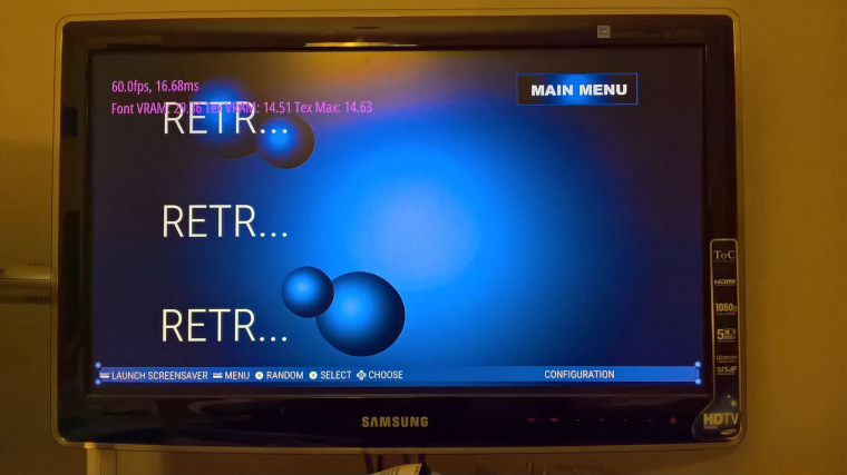
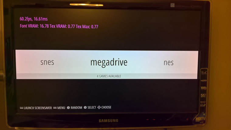
All right, I am putting out a test build that only supports, NES, SNES, GENESIS/MEGA DRIVE, GAMEBOY AND GBA. (ironically not PS1 yet, LOL) This is for all of you to try and give feed back. The system select icons are done at a 720P resolution and i m debating if i need to make them 1080P so the text doesn't pixelate. Opinions? These are pain to build to get the look just right.
This theme is also made to work at any resolution, 4:3 or 16:9. NO video support as of yet. Have fun
link here
Removed link bugs oops -
-
@dd-indeed I'll have to check on that. Somwere there's an oops. I'll reupload a new file in a tad after I test
-
I unpacked the package and moved the folder into the Raspi. There was two subfolders, one was named Mac-something and the other one was ps1_beta. I'll delete that Mac-folder first, maybe that's the reason.
-
@dd-indeed you should have put the subfolder on. Not the folder with both folders.
-
Allright, I'll move the main subfolder up in folder structure, next to the other theme folders.
Edit: Got it, now it works:

-
Quick feedback:
The images makes it slow down a bit, when you move between the working console images. But when going into the PS1/PSP/RetroPie icons, they move smoothly due the lacking photos and finish. Otherwise, I love it!
-
@lostless looks good so far. Still could use some more systems of course. I only need the splash logos myself. I am going to remove the consoles to use on mine. I really prefer the simplicity with no photos. Thanks for making this sweet theme. Cant wait for more.
-
@dd-indeed I've only tested on a pi3 and noticed no slow down. What are you using?
-
Pi3 too. But, it seems that the carousel-effect does that. I now disabled it and it's much more smoother. But with carousel, it looks even better. I lifted up the RAM limit for EmulationStation up to 300 MB, but that didn't do any difference.
-
@dd-indeed I've seen slowdowns other themes with a lot of separate assets. To make mine work at different resolutions and ratios, I had to separate out all the different elements and not just make them all part of the backeound image.
-
Okay, cool. I'm not worried about it, it's great theme, just what I had wanted. And this is still in beta nevertheless, so surely you will optimize and polish it more.
Edit: Btw, when we were talking about the fonts, I think that this is the true PS1-style font:
(http://www.dafont.com/zrnic.font) -
@dd-indeed lol that's the font I originally used that someone said that looked too modern.
-
For real haha ? They used the same font on PS2 stuff, so maybe that's why some people think it as too modern. But it's up to you, I like the looks nevertheless, but of course, I wanna help you to polish this into something it truly should be. You could create some variations of the theme with different fonts, if that's not too much asked.
-
@dd-indeed

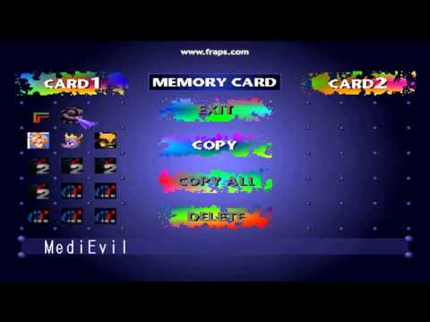
Look at this and the only 2 fonts. I'm trying to recreate this as close as possible. The thin plain font for the game name and the big bold for the paint splatters. If you want to add your own font, by all means make it your own. -
Aah, so you wanna use that bold font for the consoles and that thin font for the game lists?
-
@dd-indeed that's the plan to make it close to the original as possible.
-
Okay, now that you explained it, go ahead. The bold font for the consoles is the right one, but as you propably also know, the thin font for the gamelists is not correct yet. The one on the original console is very narrow font, when you look other images of that memory card manager menu.

A-letter and 1-letter are narrow ones especially.
-
@dd-indeed I'm going to put it in the close enough category unless someone wants to find it. Unless theres a way to make a font more condensed.
-
@dd-indeed I'm going to put it in the close enough category unless someone wants to find it. Unless theres a way to make a font more condensed.
I have too much time haha:
It's free to use and it's the closest I could find. Some minor differences can be found, when comparing this last image to the example list of the font. Like the middle line on E-letter and the circular shape of the R-top. I keep looking for another options.
Contributions to the project are always appreciated, so if you would like to support us with a donation you can do so here.
Hosting provided by Mythic-Beasts. See the Hosting Information page for more information.
