[Theme] Art Book
-
@anderocha That looks awesome! Is there a place where the new artwork and code is located?
-
@anderocha nice work! looks clean.
-
@gnargoyle I have uploaded a version of art book for 5:4 resolutions to github just now.
You can download it here: https://github.com/anthonycaccese/es-theme-art-book-5-4
This should address the font, size and spacing oddities you were seeing on your 5:4 monitor
-
Several years later, still the theme that I use the most on my set up. Well done. Hope you're doing great @alphatoanant
-
Thank you @pjft 😊 . Wow, I just realized how long its been since starting this. Thank you for all of your help getting this built over the years. 😄 I still have an item simply entitled "grid view" on this theme's to-do list and have been reading up on the latest posts to see how things work.
I am doing well and hope you are too.
-
@alphatoanant Haha, not at all. Time flies indeed! :)
All is good on our end, glad to still see you around that all is doing great.
-
@alphatoanant apologies, actually a question: would you have plans for a Singe system?
https://retropie.org.uk/forum/topic/27426/request-add-daphne-singe-emulator
It's kind of like Daphne, but has a plethora of other games that aren't compatible with Daphne.
Just curious, as it's been recently added and it opens a lot more games to play.
Hope you're doing great!
-
@pjft awesome I love laserdisc games - glad to see this available.
Yes would be happy to add this. I'll research logos, see what is out there already or think about a design for one from scratch.
Maybe something like the original laserdisc logo but with Singe lettering instead: https://upload.wikimedia.org/wikipedia/commons/thumb/6/64/Laserdisc-logo.svg/1280px-Laserdisc-logo.svg.png
Boxart wise I remember from building the system theme for Daphne that most of these games fit well with arcade flyers so I'll go with a portrait layout for now.
Reading through that thread it looks like the folder name for the system theme would be "singe" is that correct?
-
@alphatoanant I imagine it might end up being "singe" - there is no current RetroPie-Setup script, but I imagine that singe would make sense indeed.
I think the old Laserdisc logo with Singe lettering - or, honestly, even "Laserdisc" already - would be awesome. These systems did have arcade flyers indeed for the most part, so that is the correct layout indeed.
Thank you so much, and let me know if I can help as well :)
-
@pjft well that was quick =). Just made a first commit on the singe system theme. Decided to keep it simple out of the gate by just using the laserdisc logo.
-
Awesome, that was quick indeed :) I'll set it up during the weekend, thank you!
Hope you're doing well.
-
@alphatoanant just saying, looks awesome! Thank you! :)
-
Just added the Sharp X1 to my build and was wondering if logo could also be added to theme?
-
@peligwe yes totally will look at it today
-
@peligwe ok I have added the x1 system theme and it’s up on GitHub. I added 2 options for a logo. One with the sharp logo (system.svg) and one without (system-alt.svg).
-
Just pulled down the latest version. As always thanks for the quick response and great work.
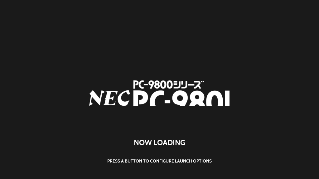
Unfortunately the splashscreen generator didn't like your logo for pc98.
-
@peligwe thank you I’ll check to see what’s going on with that
-
@alphatoanant Happy New Year!
I'm tinkering again. Today I got a desire to scrape up a mix image of front and back of boxes, so I started a small sampling with the Virtual Boy (only 27 roms). The scrape mix looks great, but I wish I had more real estate.
I'm using the video view.
I thought since the NES has a potrait layout for its large boxes, I thought simply adding "<include>./../_inc/templates/portrait.xml</include>
" into the virtual boy theme would change the layout. It didn't, it broke it.So I reverted back.
What am I not seeing? Can I get some pointers on how to change the layout of the small hand held systems to be similar to the consoles such as NES and MegaDrive?
-
Hi @phoenixflood! Happy New Year to you too - hope you have been well.
What you are trying should have worked so I am not sure but lets step through it...
VirtualBoy theme.xml (es-theme-art-book/virtualboy/theme.xml) in the base theme should look like this before any changes...
<theme>
   <formatVersion>4</formatVersion>
   <include>./../theme.xml</include>
   <view name="system, basic, detailed, video">
      <image name="logo">
         <path>./_inc/system.svg</path>
      </image>
   </view>
</theme>
Then to get it to use portrait layout it should only need one addition like this...
<theme>
   <formatVersion>4</formatVersion>
   <include>./../theme.xml</include>
   <include>./../_inc/templates/portrait.xml</include>
   <view name="system, basic, detailed, video">
      <image name="logo">
         <path>./_inc/system.svg</path>
      </image>
   </view>
</theme>
Is that what your change looked like when things broke?
-
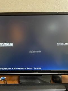
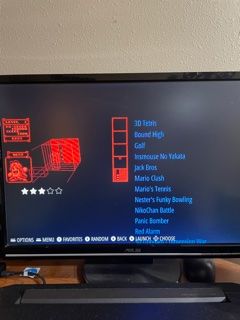
@alphatoanant Yup, I put that line in there exactly like that, and you can see how it changes. It even changes the main menu.
Here's the before:
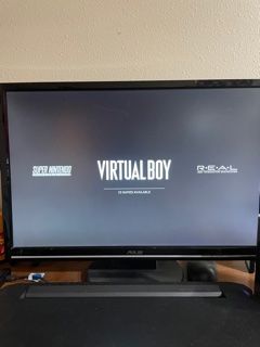
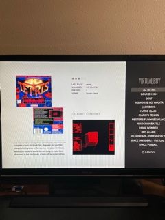
Then I add the line:
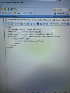
Then here's the result:
Contributions to the project are always appreciated, so if you would like to support us with a donation you can do so here.
Hosting provided by Mythic-Beasts. See the Hosting Information page for more information.