[RELEASE] PSX-MINI Theme
-
@frgn
Looking good so far.Don't forget you'll need to change the system logos on the icons before releasing this as I can see at the moment you're still using my logos.
Earlier images you posted had the system names displayed using gradient text which I thought looked good (see below).
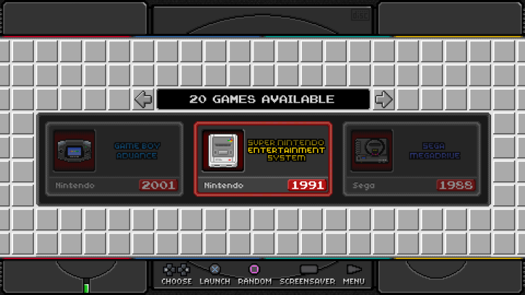
I actually liked that carousel style overall as it was quite different to anything else and would make for a more unique theme, I think it would look cool with those rectangular icons scrolling within the window (just confine the carousel to that rectangular area and set the transition style to instant).
I haven't had chance yet but I'll see if I can find you a font which suits playstation better as well, I'm sure there must be psx font somewhere.
-
@ruckage
Hi dudeI refused the logos with a gradient, because they seemed a bit boring to me. carousel looks more interesting with unique logos. and I have a question - why do you consider them yours? these are the same logos from the pixel theme. yes, they are slightly modified to fit them in the proportion of the icon, but it's still them. Here is an example for comparison.

with the same success I can do the same thing - take the finished images from the pixel theme, change them so that they fit into the narrow space of the icon, and call them your own. come on.
I want to note that I did not argue with the fact that you have copyrights.
I changed the scale of the grid, redrawed the icons and completely changed the details to make the project unique. therefore, I would be glad if you did not overdo the stick. Really.
I can, of course, change the logos from the pixel theme, but in the end they will hardly differ from your logos.about the carousel - I already tried this option and he did not suit me. I like the carousel in the style of nes classic, and this idea belongs to nintendo.
so thank you for giving a push to the development of the theme, but finding fault with every little thing is this is already not constructive discourse.I hope for your understanding. have a nice day.
-
@frgn
No, you do not have my understanding. I drew all of my logos from scratch, they are not taken from pixel or any other theme, I'm sure @Rookervik will confirm this, and the fact that I documented all the work as I did it shows that this is my work.I have been more than understanding to you and have even offered help and tried to be supportive but I will repeat, do not use the logos or Icons that I have personally spent many hours drawing.
I am not being unreasonable here, I put the work into these themes and want to keep the icons/logos unique to my themes, my license is clear:
License
This theme is being actively developed, a great deal of work has been put into the theme and art so please do not use the graphics I have created in other projects (with the exception of any graphics that are an exact copy of of those from the real 'NES classic'/'Famicom mini' menu).
You are free to modify the theme for your personal use only - please do not share modified versions of this theme.
Commercial distribution is prohibited
-
This post is deleted! -
@ruckage Well, look. I took the logo from the pixel theme, removed the halftone (left two colors). moved part of the logo down to fit it into the icon. and at me it turned out the same, as at you.

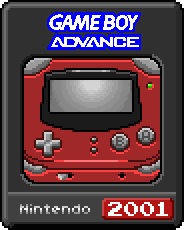
and this is a logo from your theme.

You modified the logos from the pixel theme. you used these logos as a base. I also use them as a base. so they are so similar, that's all. do not forget that I, like you, create everything in a pixel art, and on such a scale it's difficult to do something unlike.
I advise you to just forget about it. the topic will be released in the coming days, and you do not have to tell me what to do in this situation. I do not use your layouts, I use layouts from pixel theme.maybe I'll find the time (as you're boring me), and change the colors of some of the logos. but I can not promise. I do not want to sacrifice authenticity because of your hysterics.
-
I don't appreciate being accused of plagiarism and being called a liar.
Here is an image showing my logos vs the logos from the pixel theme that @Rookervik created just to prove my logos are my own work (I shouldn't need to do this).
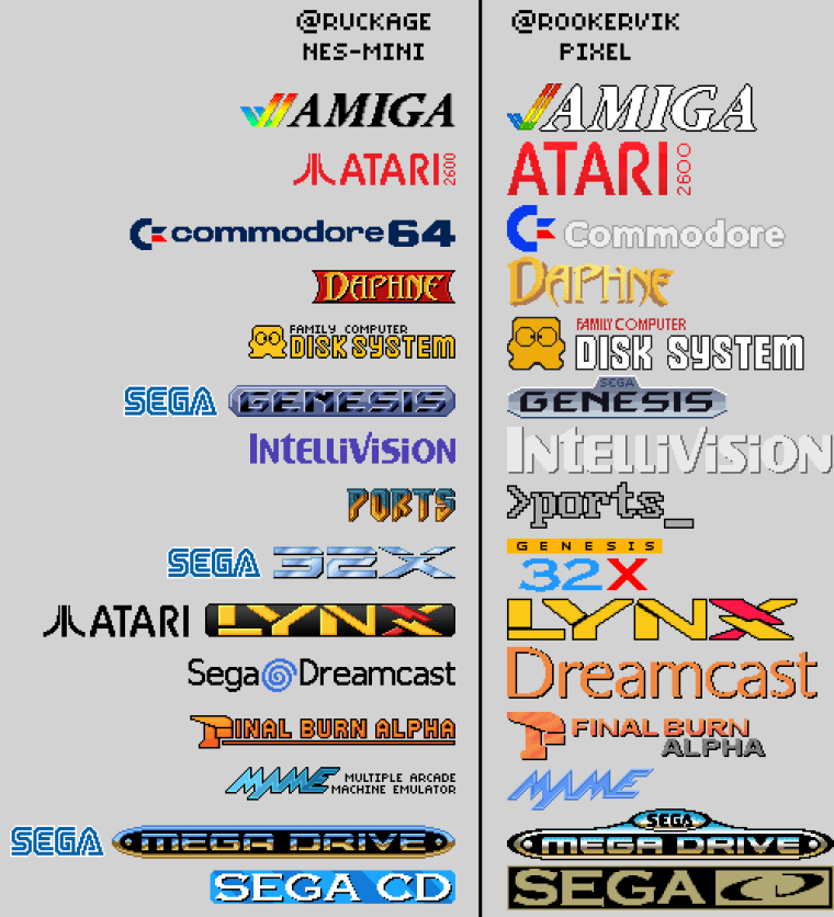
@Rookervik also has a clause in his license saying :
DO NOT modify this theme or use any assets in other themes or projects.
Graphics Copyright ©2017 Eric HettervikSo I'm not alone in having such a license.
You are in the wrong. Do not use my images. -
@ruckage as it is convenient - on this picture there is no logo of gameboy. and yet you do not understand me. I use logos from the pixel theme. not from your theme. that they seem similar to you - it's temporary. it's just a draft.
I repeat for especially gifted ones - I. NOT. USE. YOUR. IMAGES.
I know that I have a problem with English - but is it really incomprehensible? -
okay. I realized that @ruckage was too worried about his work. you see, we do not have such a thing in Russia. how to put it more correctly. here all spit on copyrights and similar things. but nevertheless I went to meet @ruckage and fulfilled all his conditions (I can not stand when frameworks appear in creativity). so, I agreed with him in everything, although it was not easy. but when it came to logos - I could not hold out any longer. that's true, no one in our country paid such attention to such a trifle.
I have already given two examples in which the logo gameboy does not differ from the pixel theme. and now I looked at the picture given to the @ruckage , and realized that I was mistaken.
I took the first available logo for comparison. so I apologize for the hasty conclusions. if it's so important - ok, I'll redraw these logos.
Here, for example, is logo of Playstation. I just drew it, taking the original from Google.
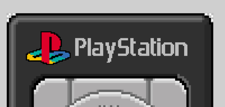
-
-
@ Frgn I find the carousel and the icons super. Very good work. If you make the logos completely completely, then you can say I have done everything myself. For the work I would set up a donation. Back to the systems so I use: Atari 2600/5400, nes, snes, gb, gbc, gba, nds, mastersystem, megadrive, gamegear, fba, mame, amiga, turbografx, scummvm, ports, sega cd, sega 32x, psx, psp, dreamcast, dosbox.
-
I wanted this theme because I find it will be successful. Now that I see frgn is trying to fight over the use of Pixel logos, I'm pretty disappointed at the way he treated it. I will still get this theme, as long as it gets sorted out.
-
@ruckage I know you haven't used any assets from my artwork. I respect you immensely. I think some of your pixel logos look WAY better than mine!
Like you said, we didn't create these original logos. They are ACTUAL system logos. We made our pixel art look as close as possible. OBVIOUSLY they will look similar. :D
And as an artist, seeing other people take your artwork and modify it is a little hard to handle. That's why I asked others not to modify mine. Because I didn't just put artwork together from sources, I created every piece from scratch. All 80+ of them. :D
Anyway, don't worry. I love your work. Keep it up!
-
@rookervik
Thanks for the response. I also love your work (I was actually thinking some of your logos were better than mine, and your system art is amazing :D) and I would never just copy it. Apart from anything else there is a great deal of satisfaction creating the art yourself. I've still got a fair way to go before I catch up with your 80+ systems in your theme - I beat you to the custom collections at least ;).I had the similar reasons for not wanting modifications of my themes or people using my art. I wanted the theme in general and particularly my logos/icons/backgrounds to be unique to my themes. Just because we choose to share our work for free (which I'm happy to do, I don't want to just make things to use myself, I like to share them) it doesn't however mean we give up ownership of that work.
-
@ruckage @mitu
I agree that I have crossed the line a little, and I apologize for everything I wrote above. I actually initially believed that these logos were borrowed from a pixel theme. I should have studied it better and compared them before drawing conclusions. @ruckage , I'm an asshole, excuse me.
about logos - I decided to draw each anew. the result you can see below.
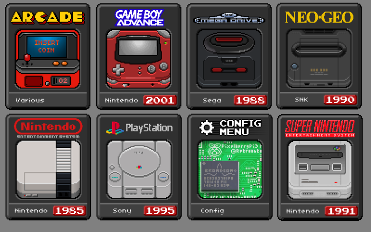
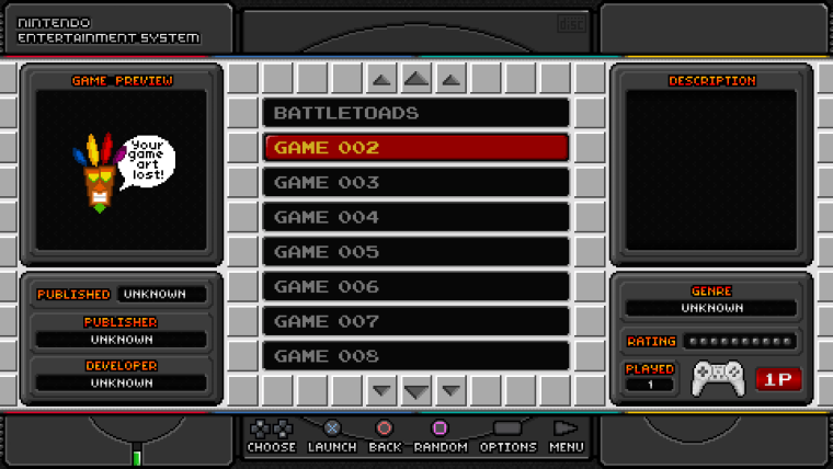
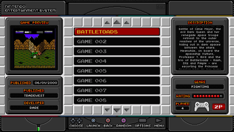
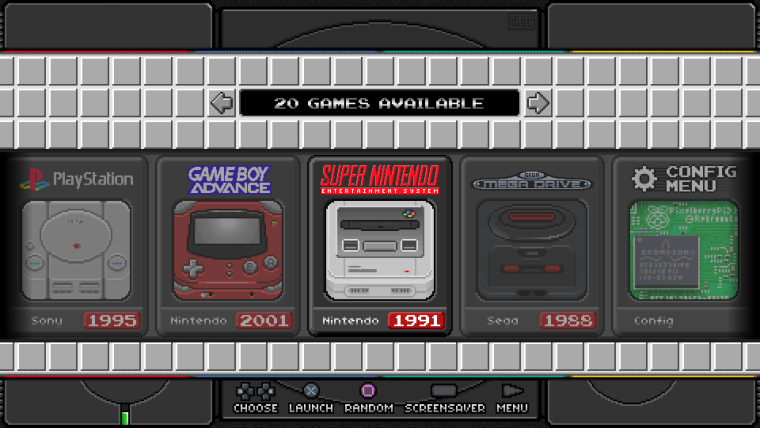
pixel art requires a lot of time, but the concept is not violated.
and even this is not the final version. I look at them, and it seems to me that i can do even better.
@Thore
request is accepted. the theme is completely ready for work (I have already made different layouts with buttons and two kinds of background, which change in the text file setup.xml). now she just does not have enough variety of systems. as soon as I finish these icons, I will be able to release beta.and by the way. does anyone here know how to add a theme to the retropie theme manager? so that it is available for download from the emulation station shell.
-
@frgn Looks really great and i can't wait to use it (even though i don't have a psx-pi),.i especially really enjoy how everything really stands out and is labeled in detailed view.
As for this whole copyright thing... i know it's non of my business but you know... if it's release online/github/zipped and open source it will be used.. so whether it's @frgn or some else, i just don't see why the hate and hostility. I just hope everyone can move past this soon.
-
@omnija said in PSX-MINI Theme:
As for this whole copyright thing... i know it's non of my business but you know... if it's release online/github/zipped and open source it will be used.. so whether it's @frgn or some else, i just don't see why the hate and hostility. I just hope everyone can move past this soon.
Just because something is provided for free doesn't make it open source, that would be under a specific license that would allow completely free use. My themes were not released under an open source license.
-
@frgn The new update looks great. Looking forward to the beta. These would be my wishes for systems: amiga, atari2600, atari7800, atari lynx, dreamcast, final burn alpha, gamegear, gameboy, gameboy advanced, gameboy color, mame, mastersystem, megadrive, n64, nintendo DS, neogeo, neogeo pocket color, nintendo nes, pc, pc-engine, ports, scummvm, sega32x, sega cd, super nintendo snes. And maybe the new nintendos, NES CLASSIC MINI and SNES CLASSIC MINI ;-). Many Thanks for all.
-
Well, I think the theme is ready.
At the moment, it supports several screen resolutions in a 16: 9 aspect ratio.
Other aspect ratios are not supported!
Over time, I implement support for different aspect ratios.For those who for the first time in this thread - initially it was just a modification of the nes mini theme. I just made it for myself, and at some point decided that she might like other people who have raspberry pi in the playstation 1 case.
But the nes mini theme was protected by a license, so I had to rework everything from the beginning.Сhanged the scale of the grid, the general style and icons of the systems.
Now it looks as if the guys from SONY also decided to release a portable version of their console with built-in games. Anyway, I hope that it looks dignified.
If so, my idea was a success.Examples:
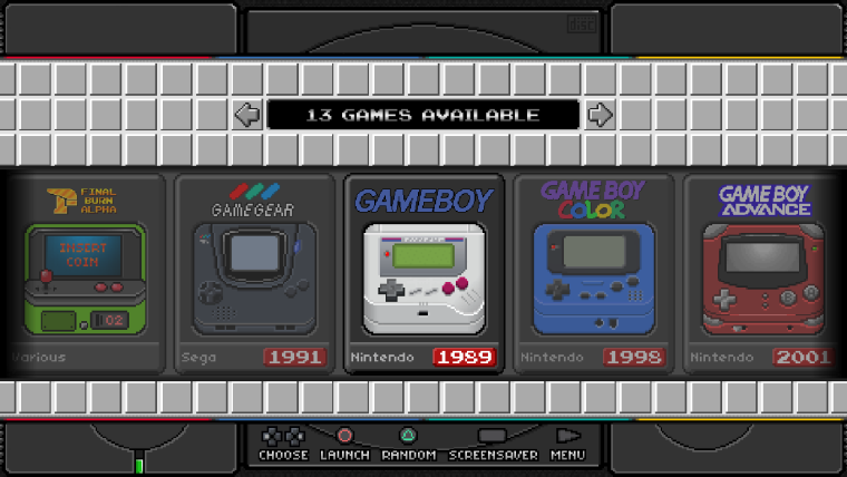
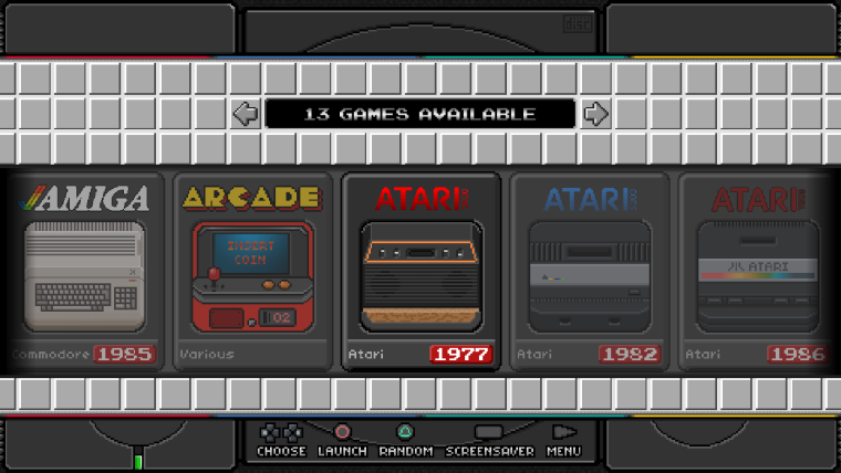
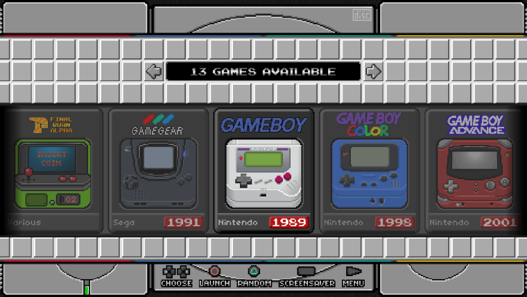
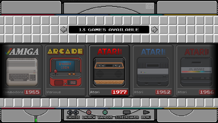
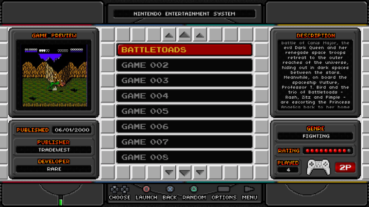
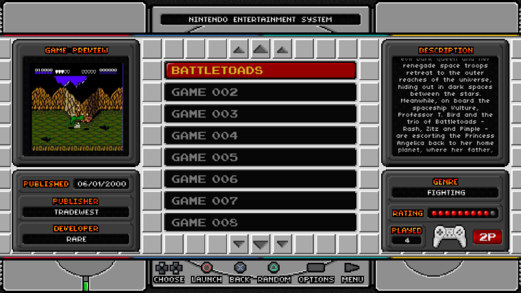
The theme includes 30 gaming systems (not counting retropie).
Full list:
- Amiga
- Arcade
- Atari 2600
- Atari 5200
- Atari 7800
- Atari Lynx
- Dreamcast
- FBA
- Gamegear
- Gameboy
- Gameboy Advance
- Gameboy Color
- MAME
- Sega Master System
- Sega Megadrive
- Nintendo 64
- Nintedo DS
- Neo-Geo
- Neo-Geo Pocket Color
- NES
- PC (DosBox)
- Pc Engine
- Ports
- PSP
- Playstation
- Retropie menu
- Sega 32x
- Sega CD
- SNES
- Turbografx 16
A small instruction on how to change layouts:
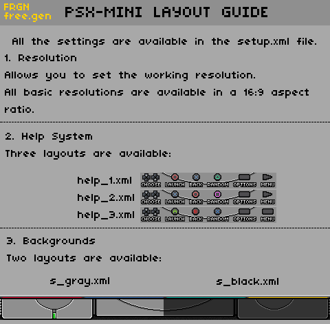
By default, the screen resolution is 1920x1080, the layout of the buttons is help_1.xml and the style is gray.
========================
DOWNLOAD PSX-MINI THEME
========================
Donate
If you like this project and you want to support me, then you can do it here.
The funds received will be a good incentive to continue the development of the project.
-
Very nice, I am already to try it out. Now it would be nice if the Scummvm, NES-Mini and SNES-Mini Systems would come :-) Thank you for the work, i made you a small donation.
-
In the psx-mini XML file, towards the bottom of the page, it lists the menuopen sound file as using the incorrect file name of "lauch.wav" instead of "launch.wav". Easily fixable.
Might be good to know for a future update. :)
Contributions to the project are always appreciated, so if you would like to support us with a donation you can do so here.
Hosting provided by Mythic-Beasts. See the Hosting Information page for more information.