SNES mini theme
-
@ruckage Well I for one am looking forward to any new development on the snes/nes mini themes (when ever that may be of course). They are without a doubt fantastic to look at and work perfectly with the plethora of snes/nes rpi cases that are out there. Im most looking forward to replacing the apple II icon I made, because it just looks like crap next to your stuff. I just cant replicate your pixel art style very well.
-
@toaster_strudel said in SNES mini theme:
I can only imagine that it also keeps away posters who aren't trolls as well.
Stick around the forum and you'll find out.
-
@ruckage guess right now is still not the right time to request a system still, but if you have a list up it would be great to add the NeoGeo CD in the near future since it appears that Retropie is capable to pull the libretrocore to a tee.
Patience is a great virtue.
-
@ruckage Fantastic work looks awesome! I would love to use these images in a book I am working on would that be possible?
-
@ruckage any easy or even hacky way to get rid of the "played" count in the theme? I'm using GPIO to turn off my retropie miniconsole and emulationstation doesn't always save Metadata properly on logout.
That way the play count is all over the place and it triggers my OCD to have just a random number lying there that doesn't actually represent my real play count for each game. I would rather get rid of it alltogether. I know it's kind of an exceptional case, but if would be great to know if I can just get rid of that part of the theme.
Thanks in advance.
-
@Serj-Targarien said in SNES mini theme:
@ruckage any easy or even hacky way to get rid of the "played" count in the theme? I'm using GPIO to turn off my retropie miniconsole and emulationstation doesn't always save Metadata properly on logout.
As far as I know, you'd need to edit the theme xml and remove all references to md_lbl_playcount and md_playcount.
-
Hi. You can but you will just be left with an empty box where those details should be.
Open the theme.xml file and change it to the following (it will make those details 100% transparent:
<theme> <formatVersion>3</formatVersion> <include>./config.xml</include> <include>./base.xml</include> <view name="basic, detailed, video"> <text name="played_label" extra="true"> <color>00000000</color> </text> <text name="md_playcount"> <color>00000000</color> </text> </view> </theme> -
@smartazz104 @ruckage thanks a lot. I'll do that until I can ensure Metadata saves correctly. May even leave it like that if it's aesthetically pleasing, as I'm not interested in keeping a play count at all.
-
Hi guys, I love this theme. Maybe you have already explain this but I haven't find it.
How can I add the custom collection (nes-classic, snes-classic) to the home? I have added the custom folder named like icon ("snes-classic") but doesn't appear to the ES home.
Thank you
-
What a wonderful theme. Any chance of adding an official "Rom Hacks" custom collection with art/icons?
-
@ruckage hello a question out of curiosity, he has thought to implement the new options that he has created fcaruso for the subjects in case they are added by jdrassa to Es de retropie. I mean grid and other theme options that I think you know. Thank you for your work
-
Hi @jero .
I did start work on grid view for this last year (see this post) based on the grid support by @A12C4 but hadn't released it as gridview wasn't in the main retropie branch at the time. I believe grid view is now part of the main branch so I will go back to it and update the theme to support it. The new additions by @f-caruso will also only be considered when they are part of the main branch ( @jdrassa is currently working on that so fingers crossed). -
I'm using this! It's bloody beautiful! Nice job and thank you!
-
Then I'll be attentive to the changes, it would be great news because its theme is the best I've seen and add everything new f.caruso would be great. So I will cross my fingers and I will also heheheh.
Another question is that there are many possibilities in your theme to show layout, has thought for the future to be able to implement in the theme, a possibility to use a different layout for each system and not a general option as it now has and make several levels. This counting on the new possibilities. For example, imagine that it is in the carrousel passing systems and choose one, when entering it we could have a level made in the gamelist of folders with image equal to the example of the capture of f.caruso.
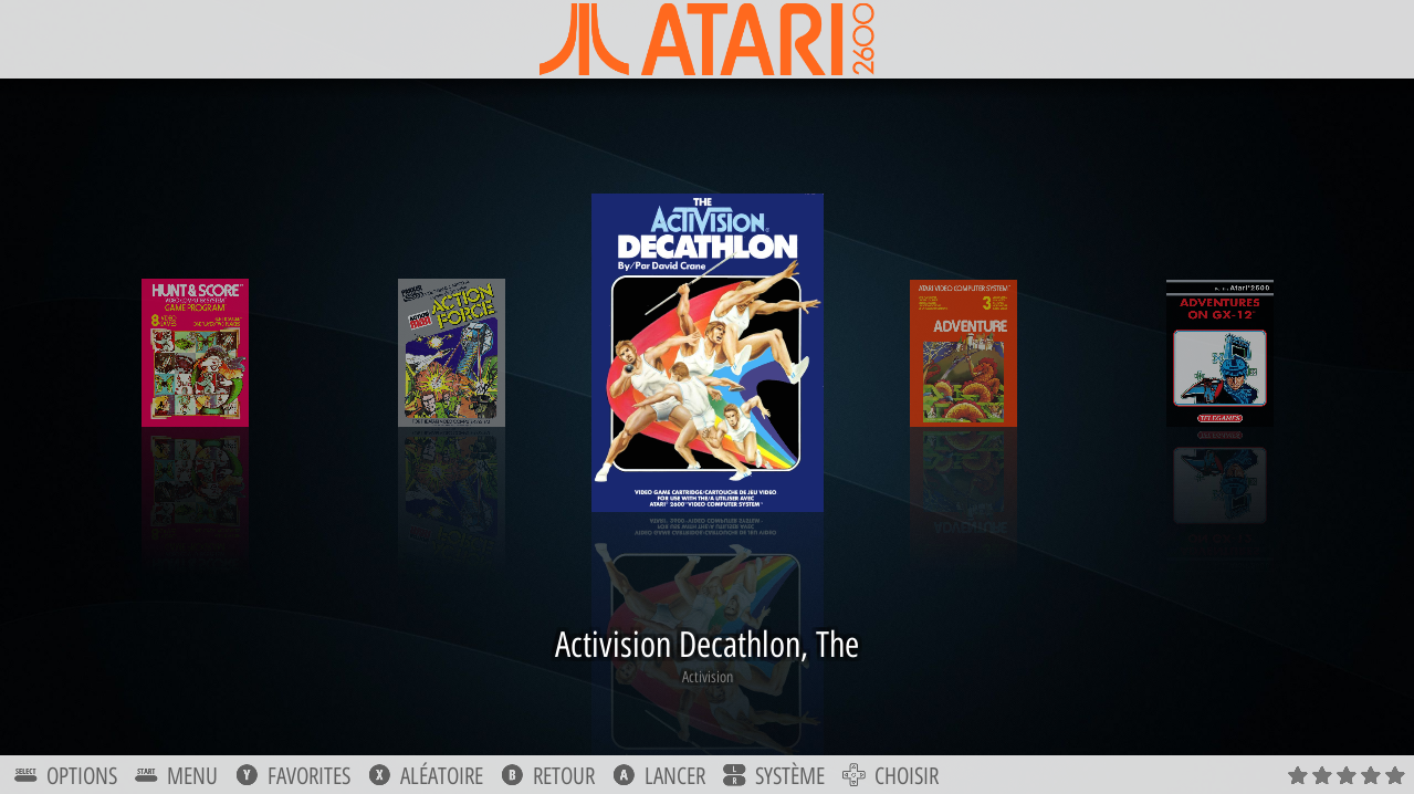
They could be for example the Arcade sytema and in a following level of arcade, taito, neogeo and others. In next level in one of the folders we would have another nives where it would be kind of games and next level is the layout of games choice. Serialgo big to be able to organize everything. Especially I'm thinking about windows where the number of systems is large and a carrousel with 80 systems is deadly jejejej. Well it's just an idea. I see so many possibilities in his theme, which is for me the most advanced and treated with love
-
Here are a few very minor edits that I made, feel free to use them directly or as inspiration.
Famicom icons with original non-yellowed plastic color:
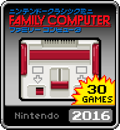
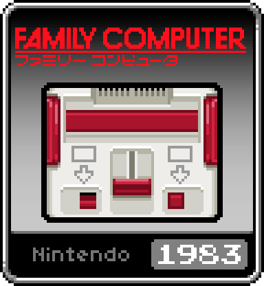
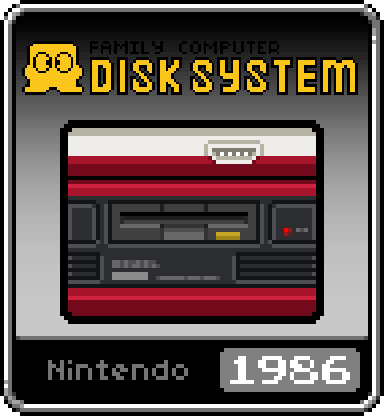
Mega CD icon:
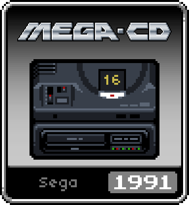
Background taken from the NES Classic Mini website, works really well with the SNES theme:

Another background, inspired by the original SNES Classic Mini menu:

-
@ruckage Sorry if I've asked this before, I thought I asked it but I can't seem to find my post, but is there a template for making new icons we could use? I've got some systems there aren't icons for that I need to make an icon for and working around the gradient isn't the best. I could probably kludge together a template but it seems a waste if there's one already there. Also there a regular font file that can be used for making the icons?
EDIT: NM, it came together faster than I thought. Link below if anyone wants it. Just use the custom collection background for whatever you collect or make a new one. I'd still love to know what font is used on the icons though.
https://drive.google.com/open?id=1eOsLiTfDdj0E6mk9PDG_ZPu1Smx6aR3l
-
Hey, someone could please do a background and item from scummvm?
-
Is there a Satellaview/MSU-1 icon to use? (I've been thinking about trying to add it just like the NES/SNES Classic collections are, so I can get all the NES/SNES games organized)
-
@Furluge Hi Furluge. Thanks for sharing this. I'm trying to add a Scummvm icon to the system (very happy to use the custom collections backgrounds as you suggest doing). I'm a total newcomer to editing themes though - I tried reading the Github guide to creating your own theme but struggled to follow it tbh, and wasn't sure how to apply it to editing an existing theme on my SD card. Essentially, I'm just looking for a guide that tells me how to replace the un-themed Scummvm text in the system view with my Scummvm icon. I wonder if you might be able to point me towards something that helps with this?
Thanks ever so much - reading back through this thread (and forum in general), it's refreshing to find somewhere online where people actually seen to want to help each other :)
Mark
-
I've tried dropping my Scummvm icon in to the art folder with the other art, and have been going through the code in every xml file I can find in the theme folders and can't find anything to help me. The folder structure is different to what the Github theme builder tutorial suggests it will look like (probably because this is a much better and more advanced theme than that is showing how to build, I expect).
I'm totally stumped and endless Google searches have just sent me in circles.
@ruckage , I'm out of ideas. I'm really sorry to badger you directly, as I can see you already spend so much time replying on here in addition to developing the theme. And the theme is SO good. I'm just trying to build a Retropie system up for my brother for his birthday with pretty much no clue what I'm doing. The Scummvm games defined our shared childhood so I can't in good conscience leave them out.
Is there any way at all for me to 'apply' my scummvm logo over the placeholder text I currently see in system view? Or have I massively over simplified what needs to be done to achieve this?
I've made a monkey-island-inspired custom splash video already and this theme will work perfectly with it - there's plenty of brilliant, slick, modern looking themes around, but nothing that nails the retro look as well as - or with the polish of - yours.
Anyway, if you've read this far then thank you - both for the theme, and for any help or wisdom you might be able to throw my way!
All the best, Mark.
Contributions to the project are always appreciated, so if you would like to support us with a donation you can do so here.
Hosting provided by Mythic-Beasts. See the Hosting Information page for more information.